What Is a Chart in Excel?
Charts in Excel serve as powerful tools for visually representing data. Whether you’re analyzing sales figures, tracking trends, or comparing different categories, Excel offers a variety of chart types to suit your needs.
Types of Charts in Excel
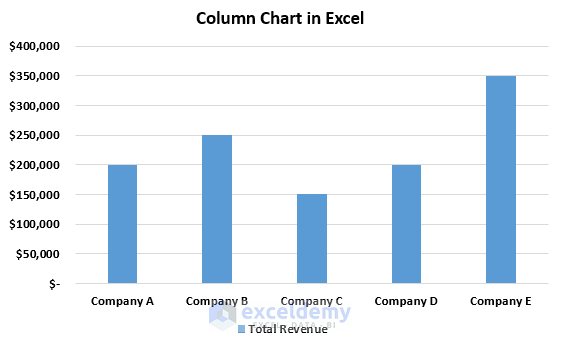
1. Column Chart (Vertical Bar Chart)
- Categories are plotted on the horizontal axis, and values on the vertical axis.
- Ideal for comparing different categories and their values.
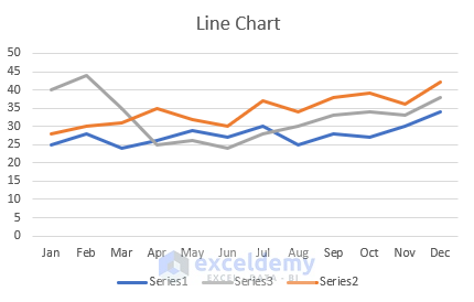
2. Line Chart
- Category data is evenly distributed on the horizontal (X) axis, while values are evenly distributed on the vertical (Y) axis.
- Used to visualize trends over time.
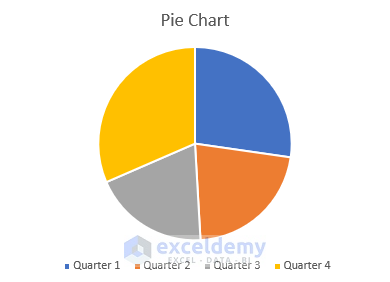
3. Pie Chart
- Displays one data series through slices of a pie, showing proportions or percentages.
- Useful when you have a single data series with non-negative values.
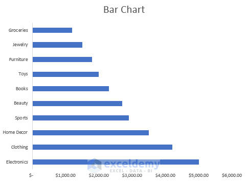
4. Bar Chart
- Categories are plotted along a vertical axis, and values along the horizontal axis.
- Allows easy comparison between individual items. Available in 2-D and 3-D formats.
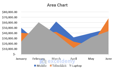
5. Area Chart
- Combines features of a bar chart and a line chart.
- Illustrates trends over time and total values across a trend.
- Available in 3-D format as well.
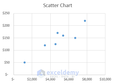
6. Scatter Chart
- Represents data points for two variables in a two-dimensional plane.
- Each data point is a dot, scattered based on the variables’ values.
- Add more data for better comparison.
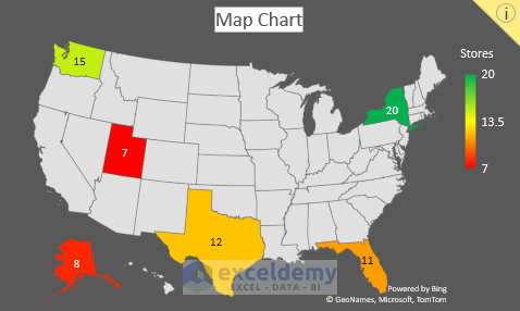
7. Map Chart
- Represents values and categories across geographical regions.
- Requires region/country/state or postal code data.
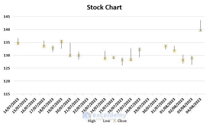
8. Stock Chart
- Displays stock price data (e.g., opening, closing, high, low, volume).
- Helps analyze stock price fluctuations.
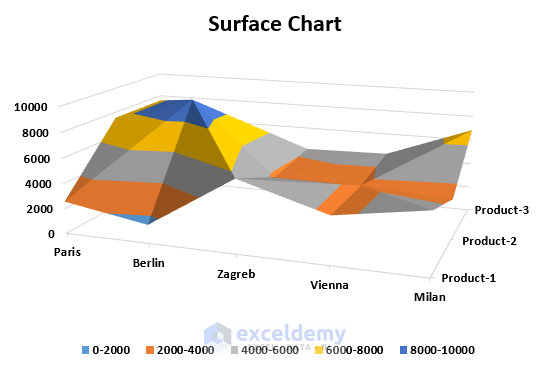
9. Surface Chart
- Three-dimensional chart showing relations among three data sets.
- Uses topographic maps, colors, and patterns to highlight value ranges.
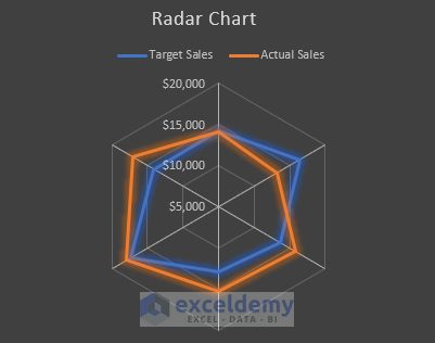
10. Radar Chart
- Compares multiple data series.
- Axes radiate from a central point, connecting data points using lines and areas.
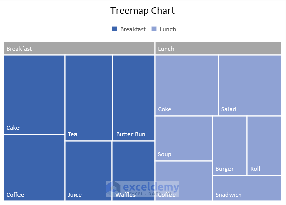
11. Treemap Chart
- Hierarchical view of data, useful for comparing different category levels.
- Color-coded for clarity.
- Available since Office 2016.
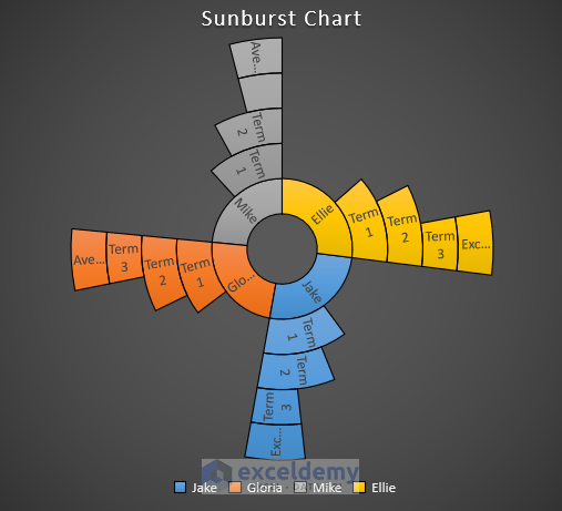
12. Sunburst Chart
- Also displays hierarchical data.
- Rings or circles represent hierarchy levels.
- Available since Office 2016.
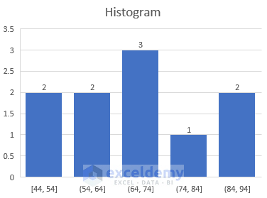
13. Histogram Chart
- A histogram chart displays the frequency distribution of data within a specified range.
- Each column in the histogram represents a “bin,” which groups data points.
- Available in newer versions of Excel (since Office 2016).
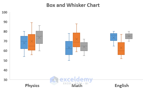
14. Box & Whisker Chart
- Used to display data distribution into quartiles and highlight the mean.
- Vertical lines (whiskers) extend from boxes to represent variability.
- Available in newer versions of Excel (since Office 2016).
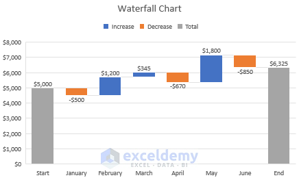
15. Waterfall Chart
- Shows the running total of financial data.
- Helps understand the impact of additions or subtractions on the total.
- Color codes differentiate positive and negative data.
- Available in newer versions of Excel (since Office 2016).
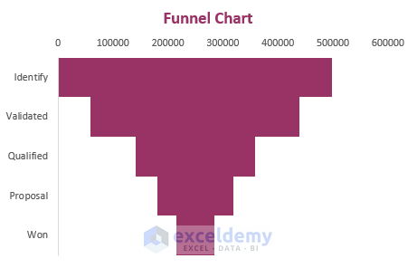
16. Funnel Chart
- Displays values across multiple levels in a process.
- Shape resembles a funnel due to descending order of values.
- Available in newer versions of Excel (since Office 2016).
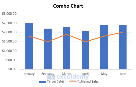
17. Combo Chart
- Combines different chart types for comprehensive data analysis.
- Includes a secondary axis for better understanding.
- Available in Excel 2013 and newer versions.
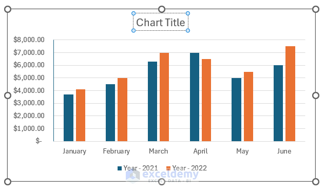
Creating a Basic Chart in Excel
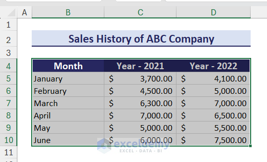
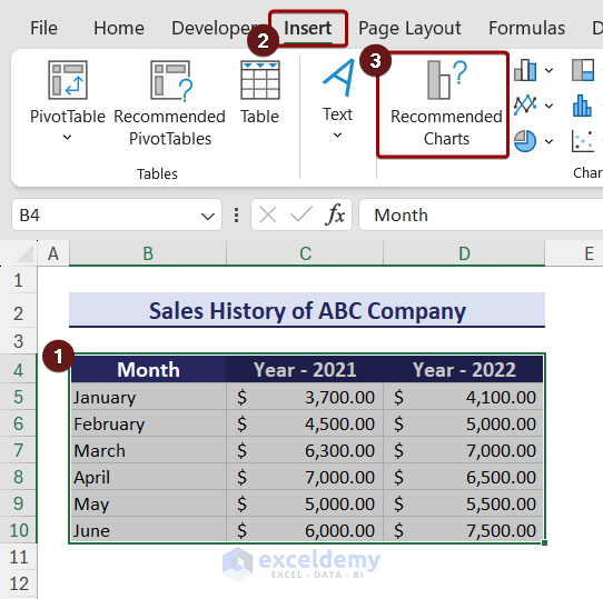
Suppose we have a dataset in the range B4:D10 that contains the yearly sales history of a company.
- Select Your Data:
- Highlight the data you want to use (B4:D10).
- Insert the Chart:
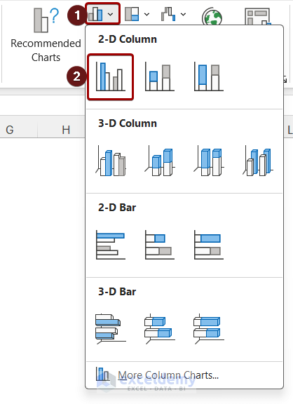
- Go to the Insert tab.
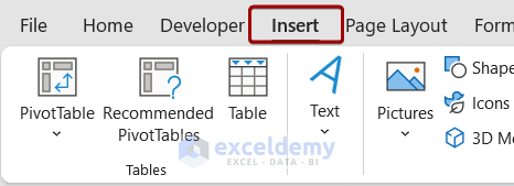
- Go to the Charts group.
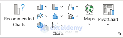
-
- Click on the Insert Column icon. A drop-down will appear.
- Select Clustered Column from the 2-D Column section.
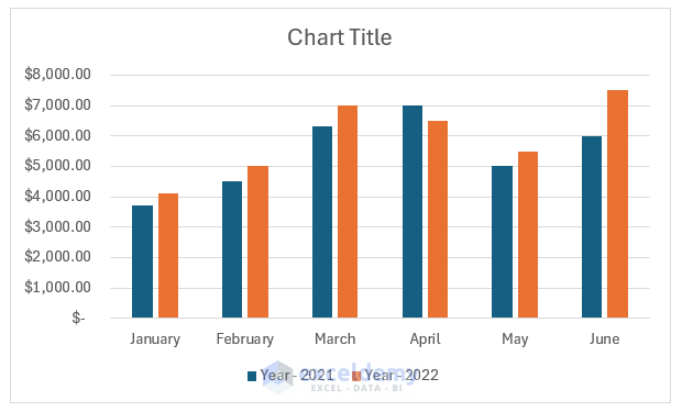
A Clustered Column will appear on the worksheet.
Creating a chart using the Recommended Charts option
The Recommended Charts option gives different types of charts based on your data.
- Select your data. go to the Insert tab and choose Recommended Charts from the Charts group.
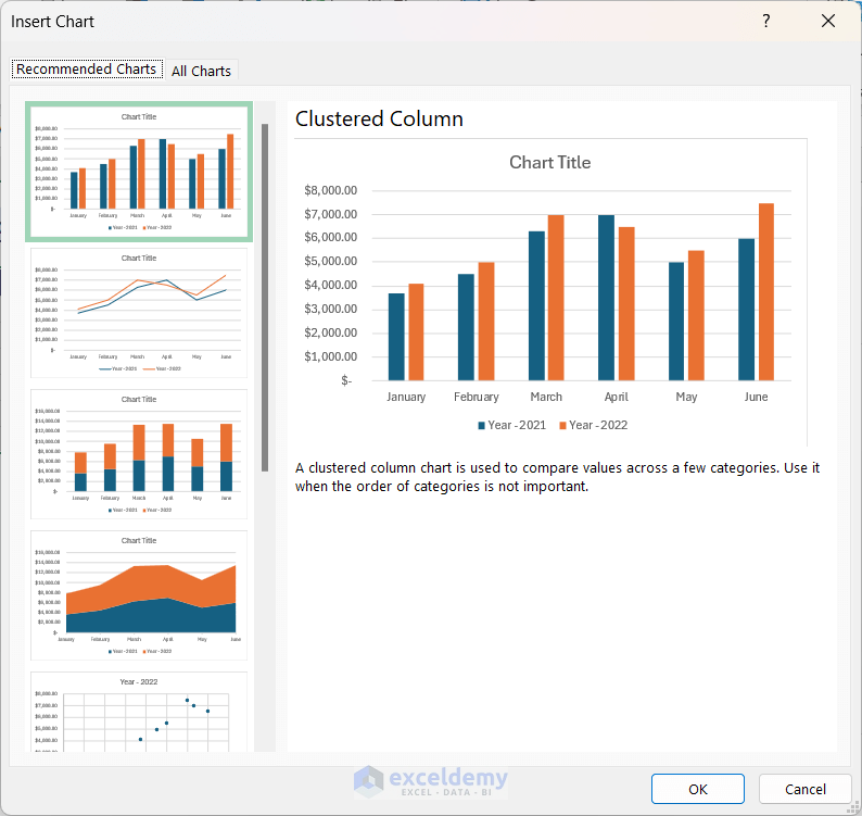
- Select the desired chart from the Insert Chart window and click on OK.
Changing the Chart Layout and Style
- To change the layout:
- Select the chart and go to the Chart Design tab.
- Click on Quick Layout and choose a desired layout.
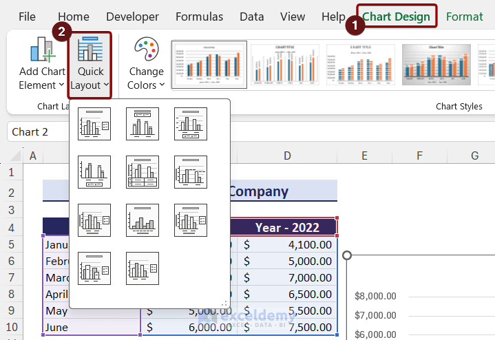
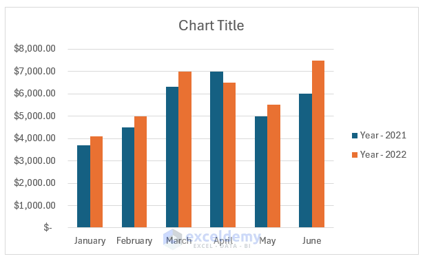
After selecting the desired layout, the chart will automatically change.
- To change the chart style:
- Still in the Chart Design tab, select a style from the Chart Styles group.
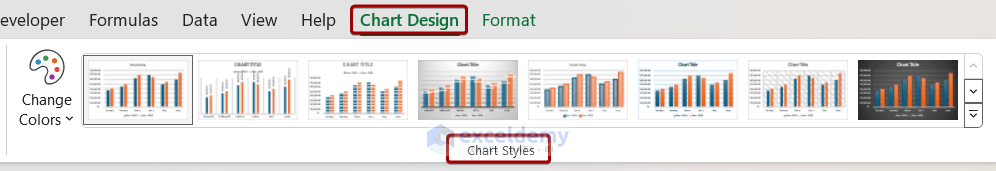
After selecting a style, the chart will automatically update.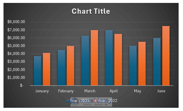
Adding, Changing or Removing Chart Elements
- Excel charts consist of several elements, including axes, axis titles, chart titles, data tables, data labels, error bars, gridlines, legends, lines, trendlines, and up/down bars.
- To add a chart element:
- Click on the chart to activate it.
- Go to the Chart Design tab.
- Click the Chart Elements icon.
- Choose the desired element (e.g., data table with legend keys).
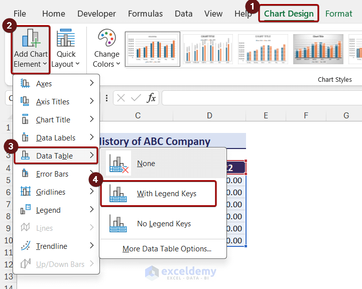
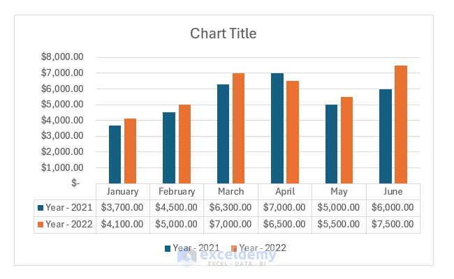
After that, you can see the chart with a data table.
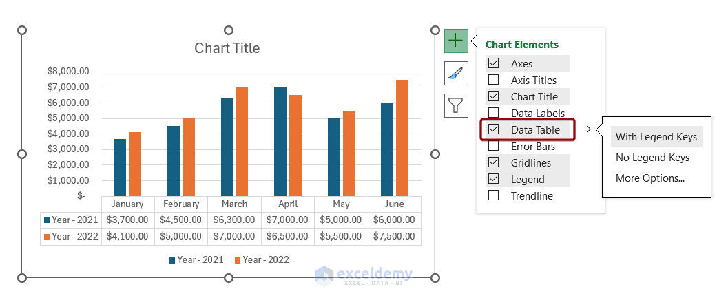
- When you select a chart, a plus icon appears on the top-right side. If you click on the plus icon, you will see the chart elements. You can select or deselect the elements to add or remove them.
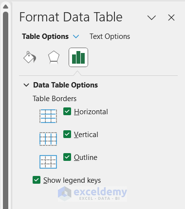
- Double-clicking the data table opens the Format Data Table pane for further customization.
You can also remove elements by selecting them and pressing the Delete key.
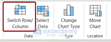
Switching Row and Column Data
- Sometimes, you need to change how data is grouped in a chart.
- To switch row/column data:
- Select the chart.
- Go to the Chart Design tab.
- Choose Switch Row/Column from the Data group.
-
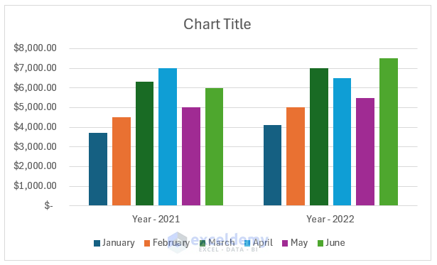
- This rearranges the data to show month-wise data within a year.
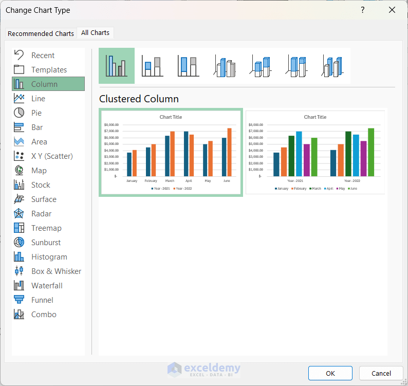
Changing Chart Type
After creating a chart, you can change its type:
- Select the chart.
- Go to the Chart Design tab.
- Click Change Chart Type in the Type group.
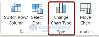
- Select the desired chart type and click OK.
Formatting Charts
Make your chart visually appealing:
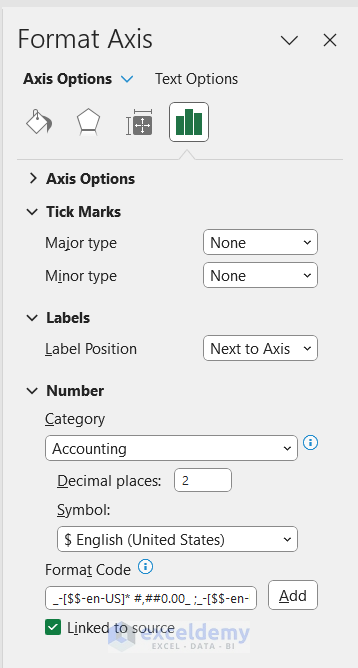
- Format Chart Axis:
- Right-click the Y-axis and choose Format Axis.
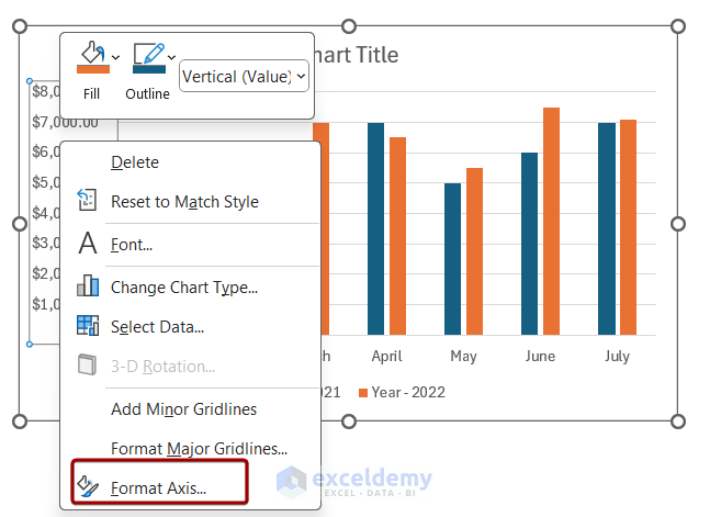
- Right-click the Y-axis and choose Format Axis.
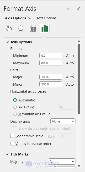
- The Format Axis pane will appear on the right side of the screen.
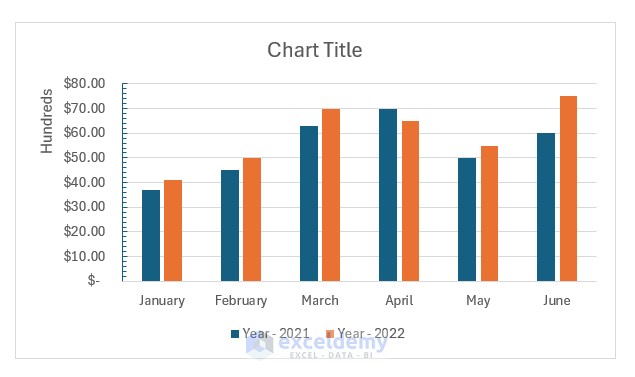
- Adjust display units and tick marks (e.g., set units to hundreds and place tick marks inside).
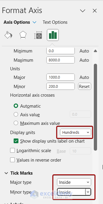
- Repeat for the X-axis.
You can also change the position of the labels and number system of the axis from the Format Axis pane.
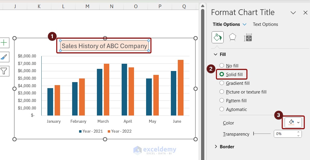
2. Formatting the Chart Title
- Click the chart title box and type your desired title.
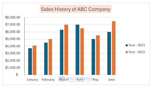
After adding a title, the chart will look like this: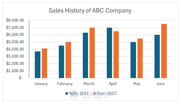
- Double-click the title to open the Format Chart Title pane.
- Explore different title and text options.
3. Formatting the Legend
- Double-click the legend to open the Format Legend pane.
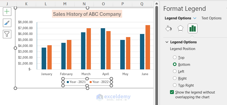
- Customize legend position (e.g., right).
4. Formatting Data Label
Data labels provide essential information about your chart. Here’s how to format them in Excel:
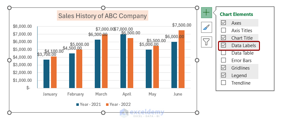
- Add Data Labels:
- First, select your chart.
- Click on the plus icon (Chart Elements) that appears near the chart.
- Check the Data Labels option.
- Now your chart displays data labels.
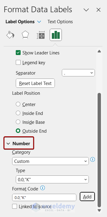
- Customize Data Label Formatting:
- Double-click on any data label to open the Format Data Labels pane.
- In the pane, you’ll find various options tailored for data labels.
- Let’s change the number formatting:
- Go to the Number section.
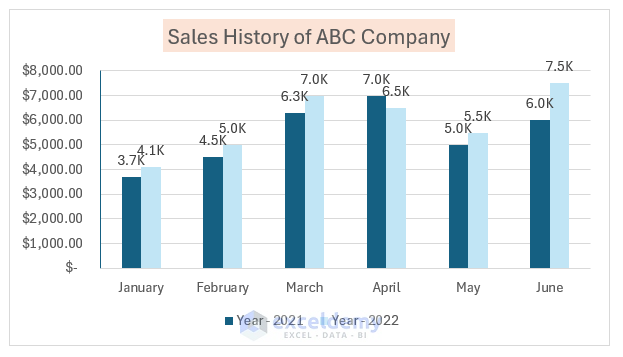
- In the Format Code box, type 0.0,”K” and click Add.
-
- The data labels will now reflect the new format.
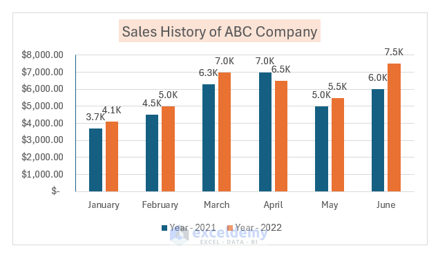
5. Format Data Series
Data series formatting enhances chart appearance. Follow these steps:
- Double-Click on Data Series:
- Double-click on the data series to open the Format Data Series pane.
- Here, you can customize the series appearance.
- For example, select a color from the options.
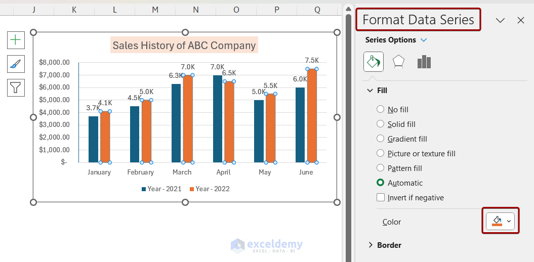
-
- After applying a new color, the chart will look like below.
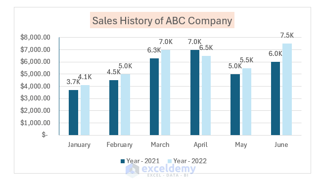
- Adjust Series Overlap:
- You can also change the gaps between series:
- Adjust the Series Overlap value.
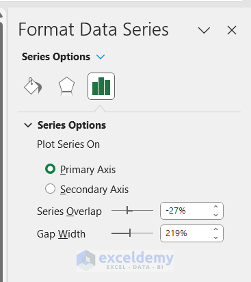
-
- Increasing it to 0 will reduce gaps between series bars.
- Increasing it to 0 will reduce gaps between series bars.
- You can also change the gaps between series:
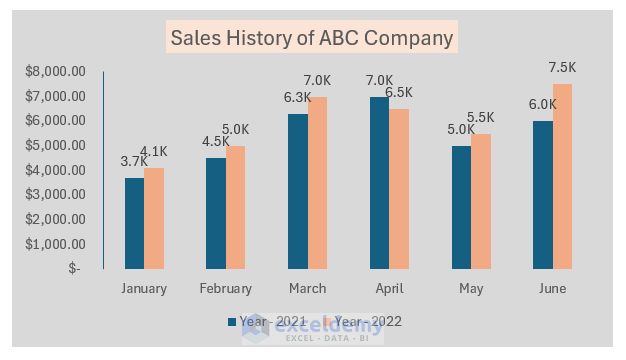
6. Format Chart Area
Make your chart visually appealing by formatting the chart area:
- Double-click on the chart area to open the Format Chart Area pane.
- In the pane, select Solid Fill and change the fill color.
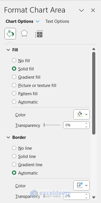
- The chart area color will update accordingly.
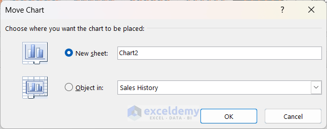
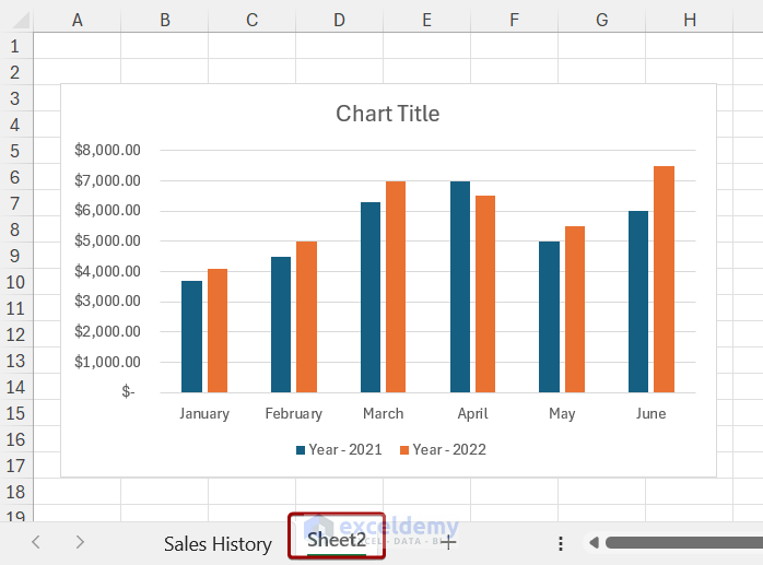
Moving a Chart
In Excel, there are times when you need to move the chart to a different sheet. You can do that using the Move Chart option. Follow the steps below to move a chart in Excel:
- Select the chart to get the Chart Design option.
- Click on the Move Chart option.
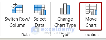
- Select New sheet in the Move Chart box and click on OK.
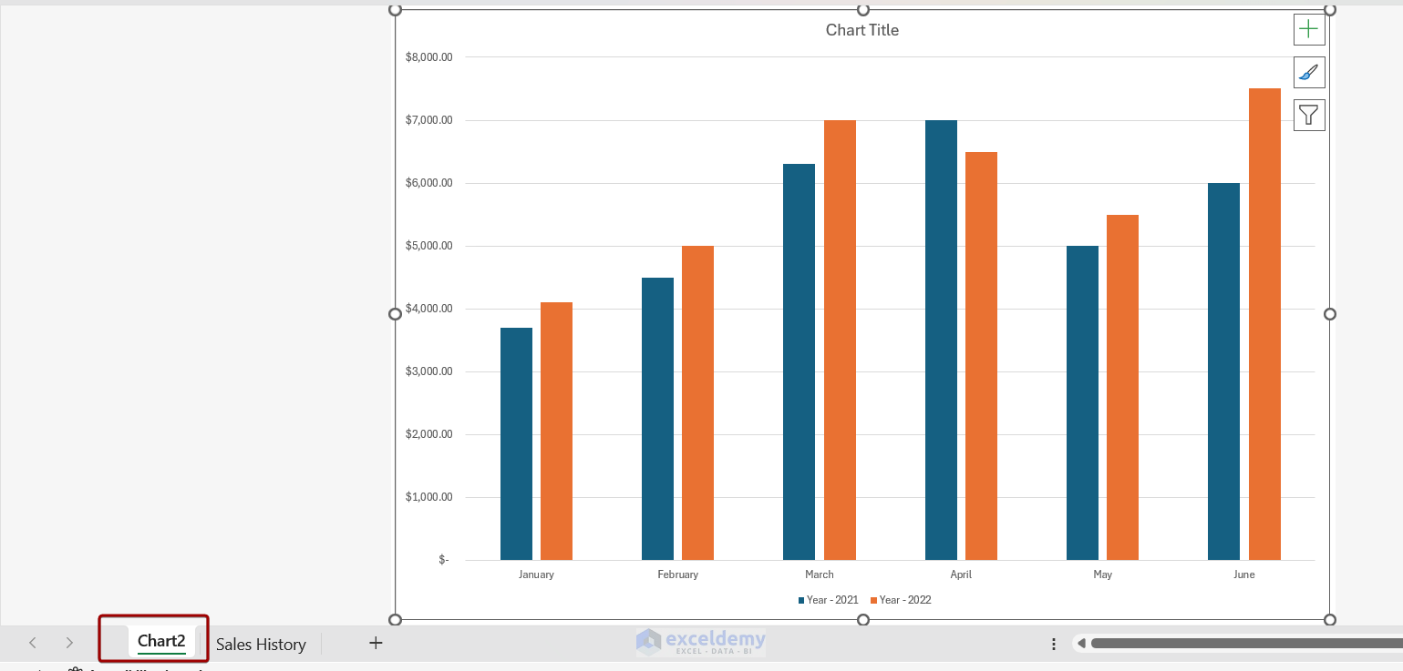
As a result, the chart will be moved into a new sheet.
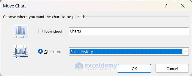
You can also move the chart as an object on a different sheet. You need to select the second option from the Move Chart box and choose the desired worksheet.
Copying a Chart
While creating dashboards or reports, you need to copy a chart. You can copy a chart and paste it elsewhere. Follow the steps below to copy a chart:
- Right-click on the chart and click on Copy from the context menu.
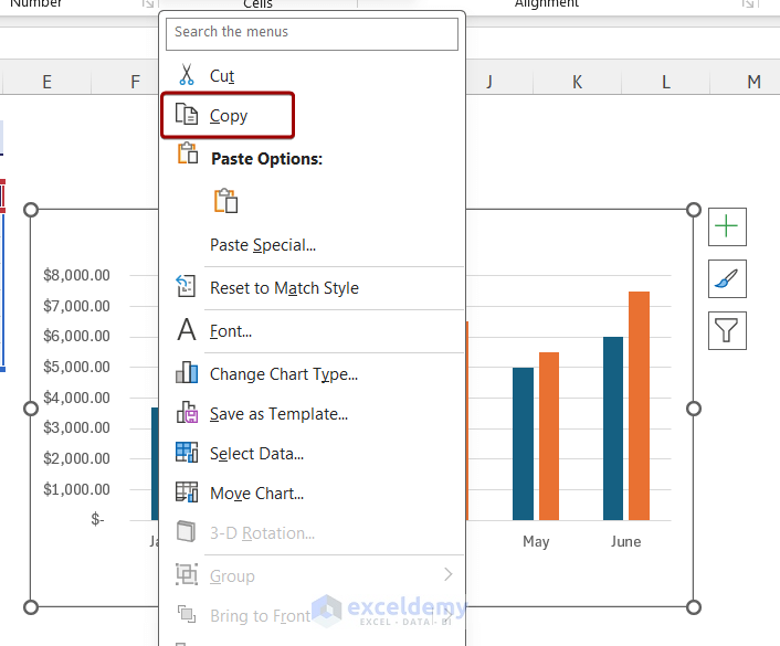
- After that, go to your desired location/file and press Ctrl + V.
Here, we have pasted the chart into a new worksheet.
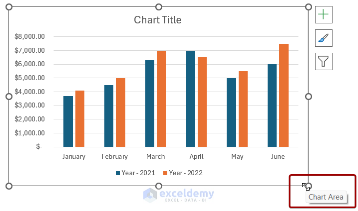
Resizing a Chart
Resizing a chart is often necessary when you are working with a lot of data. You can resize the chart using the double-headed arrow. To resize a chart, follow the steps below:
- Select the chart and place the cursor on the small circle of the chart. The cursor will change into a double-headed arrow.
- You can then drag the cursor to decrease or increase the chart size.
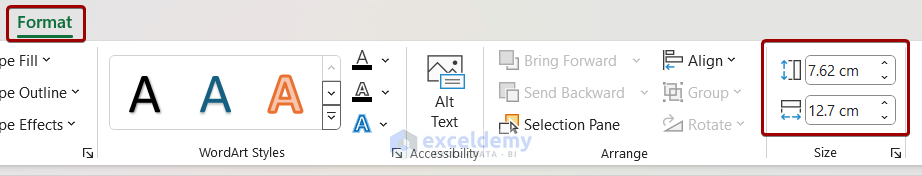
- You can also resize the chart using the Format tab.
- Click on the chart and the Format tab will appear.
- You can resize the chart from the Size group.
Filtering Chart in Excel
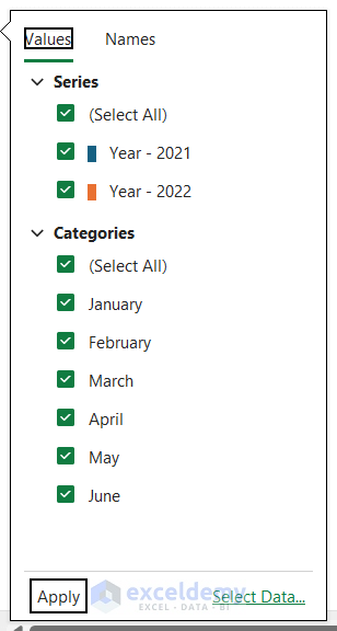
Filtering a chart can help you visualize a specific amount of data in Excel. To filter a chart, you can follow the steps below:
- Select the chart and click on the Filter icon.
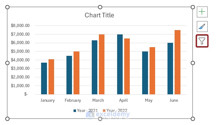
- You can check/uncheck Series and Categories from the filter options. Here, we unchecked April and May from the Categories section.
- After that, click on Apply.
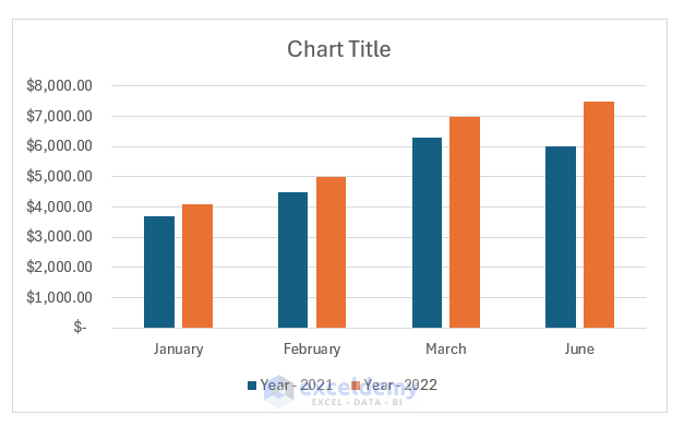
After applying the filter, the chart will show the selected data.
Keeping Charts Up to Date
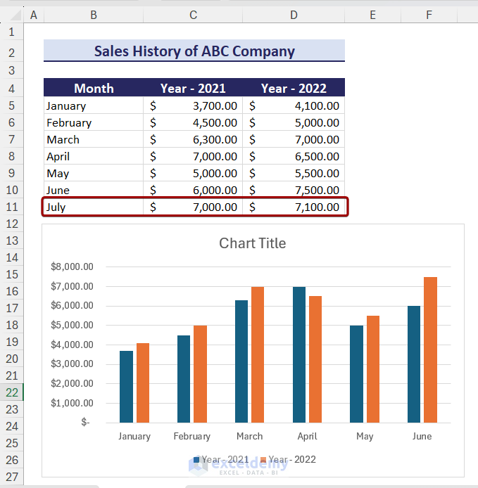
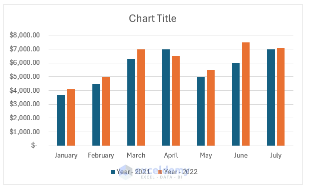
Sometimes, after creating a chart, we need to add new data to the chart. In that case, the chart doesn’t update the data automatically. For example, if we add the data for July to the chart, the chart doesn’t update the data.
To keep charts up to date, you can follow the steps below:
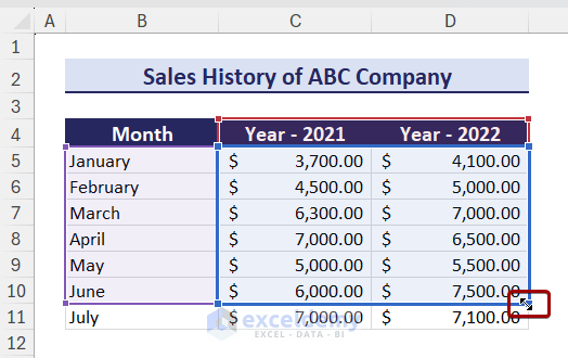
- Select the chart area and the chart data will be selected automatically.
- Adjust the chart data range using the double-headed arrow.
The chart will show the new data.
Tips: Before creating a chart, you can convert the chart data range into a table and then, create a chart using the data. This way the new data will automatically be updated in the chart.
How to Select the Best Chart in Excel
There are many types of charts in Excel. To select the best type of chart, you need to understand what type of data you are working with. You need to keep the following things in mind while selecting the chart:
- Understand the data.
- What you need to show with your chart.
- Identify the chart type.
- Determine patterns and trends.
- Different charts for different data.
Download Practice Workbook
You can download the practice workbook from here:
Excel Charts: Knowledge Hub
- Refresh Chart in Excel
- Add a Trendline in Excel
- Customize Excel Charts
- Excel Axis Scale
- Data for Excel Chart
- Add Data Series in Excel Chart
- Add a Data Table with Legend Keys
- Create Dot Plot in Excel
- Create Thermometer Chart in Excel
- Bubble Chart in Excel
- Excel Doughnut Chart
- Excel Pareto Chart
- Burndown Chart in Excel
- Excel Distribution Chart
- Make a Comparison Chart in Excel
- Progress Chart in Excel
- Excel Control Chart
- How to Plot an Equation in Excel
- Excel Chart Not Working
- Excel Advanced Charting
- Find Intersection of Two Curves in Excel
- Show Intersection Point in Excel Graph
- Create a Weight Loss Graph in Excel
- Make a Budget Constraint Graph on Excel
- Create Mekko/Marimekko Chart in Excel
- Create Activity Relationship Chart in Excel
- Secondary Axis in Excel
- Markers in Excel
- Dynamic Excel Charts
- Excel Standard Curve
- Gantt Chart in Excel
<< Go Back To Learn Excel
Get FREE Advanced Excel Exercises with Solutions!
