This is overview:
Download Practice Workbook
Download the practice workbook here.
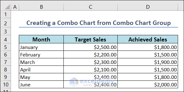
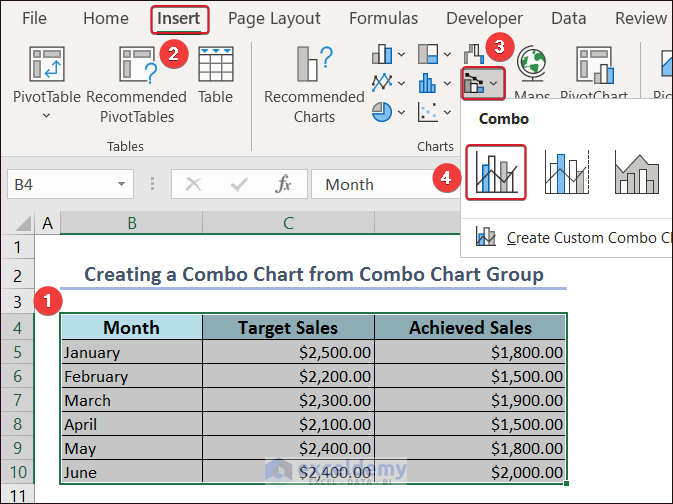
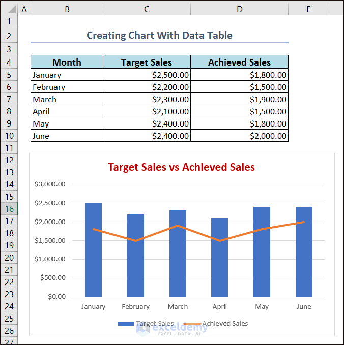
Example 1 – Creating Combo Charts
The following dataset showcases Month, Target Sales, and Achieved Sales.
- Select the entire data and go to the Insert tab.
- Click Insert Combo Chart.
- Select Clustered Column – Line.
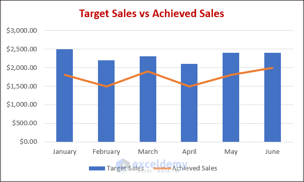
The Combo Chart is displayed.
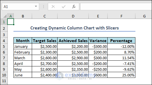
Example 2 – Dynamic Column Chart with Slicers
The dataset contains Month, Target Sales, Achieved Sales, Variance, and Percentage.
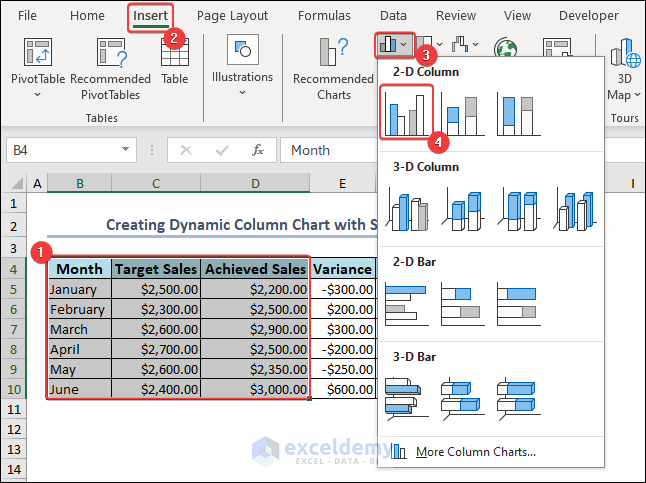
- Create a 2-D column chart: select two sets of data and go to Insert.
- Click Insert Column or Bar Chart.
- Click Clustered Column to create a 2-D column chart.
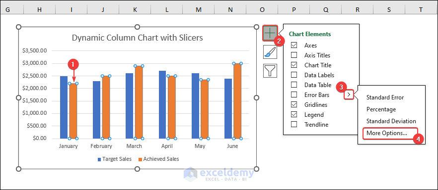
- Select one set of columns (Achieved Sales) and click Chart Elements.
- Click the extension of Error Bars and choose More Options… .
- Select Error Bar Options in Format Error Bars.
- Set the Direction to Both in Vertical Error Bar.
- To set the error amount from the table, click Custom in Error Amount.
- Click Specify Value to define the error amount from the table.

- Define zero values for the Positive and the Negative Error Value options, choose Variance.
- Click OK.

Error bars are set.
- To increase the width and decrease the gap between the bars, select the bars and go to Format Data Series.
- Set Series Overlap and Gap Width to 0%.

- To see the slicers only and remove the column bar in Achieved Sales, select Achieved Sales and go to the Format.
- Select Shape Fill and click No Fill.

- To label the slicers, select all slicers and click Chart Elements.
- Click the extension of Data Labels and select More Options…

- Go to Error Bar Options and check Value From Cells.
- Define the labels from the dataset (F5:F10) and click OK.

- You can change the slicers label positions in Label Position. Here, Inside End.

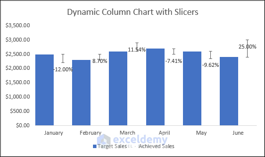
- Customize column colors, label fonts, colors, etc .
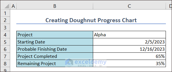
Example 3 – Doughnut Progress Chart
This is the sample dataset.
- Select the dataset and go to Insert.
- Choose Insert Pie or Doughnut Chart.
- Click Doughnut.
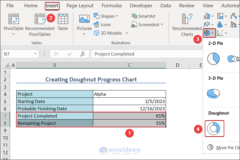
The doughnut chart will be created.
- To define the doughnut chart with the completion percentage, go to Insert and click Text.
- Choose Text Box.
- Draw a text box in the middle of the doughnut chart, select it and use the following formula:
=Doughnut!$C$7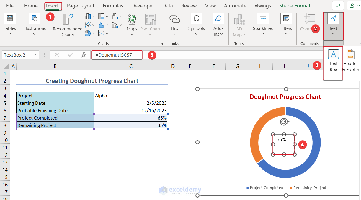
Doughnut defines the sheet name and C7 defines the cell value to show in the text box.
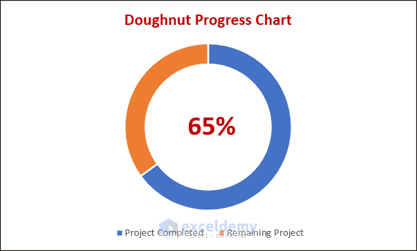
- To modify the text, select Font in the Home tab.
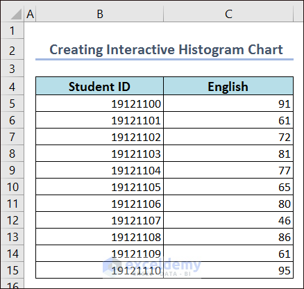
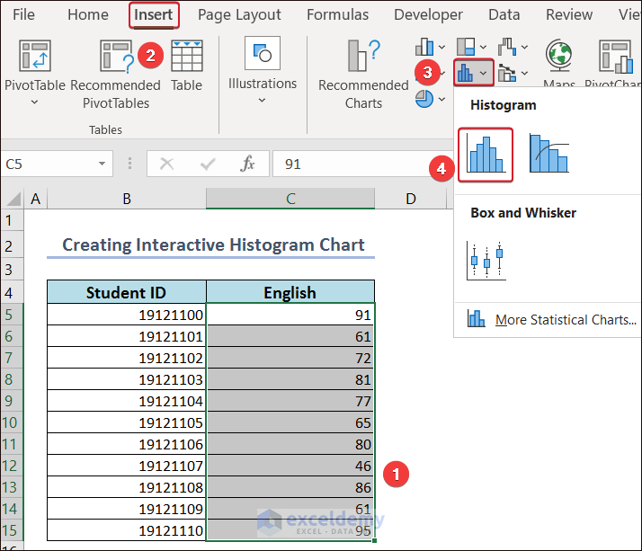
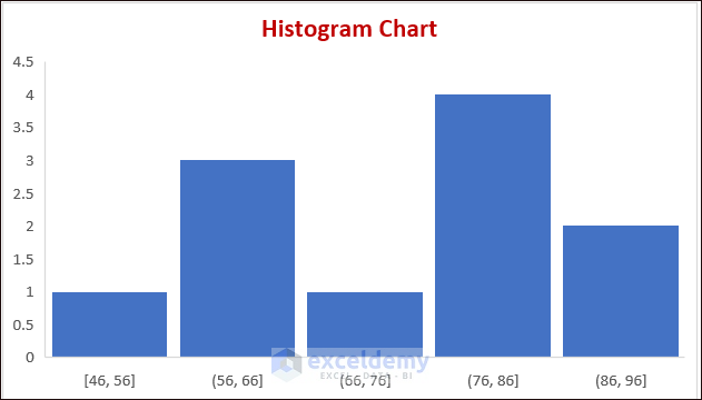
Example 4 – Creating an Interactive Histogram Chart
Use the following dataset to create an interactive Histogram Chart.
- Select the dataset and go to the Insert tab.
- Click Insert Static Chart on the ribbon and select Histogram.
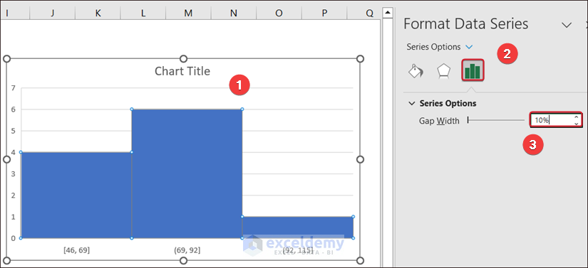
- Double-click the chart rectangle.
- In Format Data Series, increase the Gap Width in Series Options.
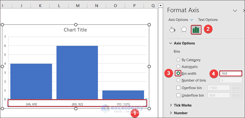
- Click the bins.
- In Format Axis, select Axis Options and change the Bin width.
- Name the graph (Histogram Chart), remove gridlines, and edit the chart.
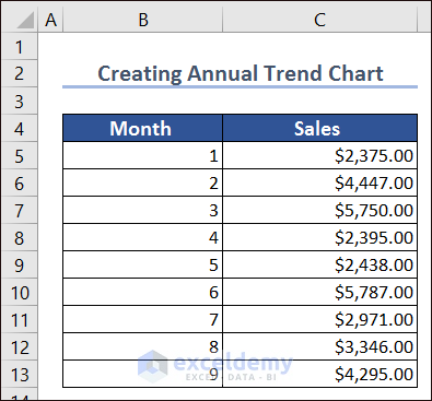
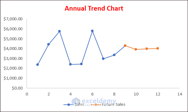
Example 5 – Annual Trend Chart with Monthly Detail
- Use the following formula to predict future sales based on previous sales.
=FORECAST.LINEAR(B14,$C$5:$C$13,$B$5:$B$13)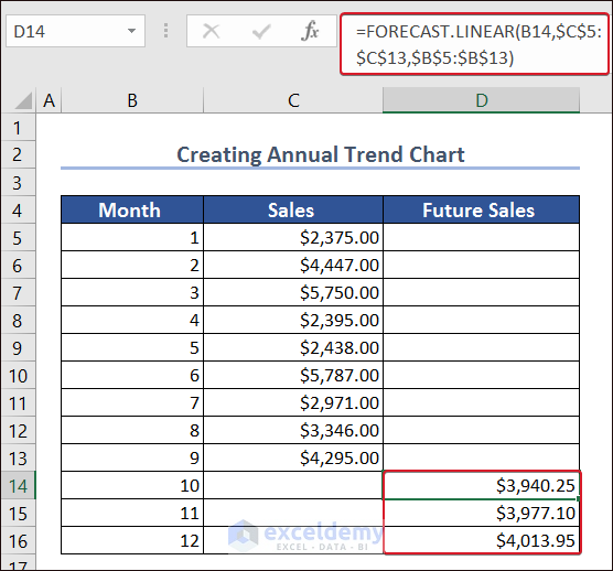
- Enter the sales value of month 9 into D9.
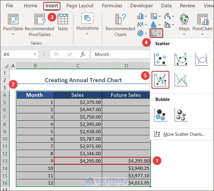
- Go to the Insert tab and select Insert Scatter or Bubble Chart.
- Select Scatter with Straight Lines and Makers.
The Annual Trend Chart with Monthly Detail is displayed.
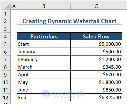
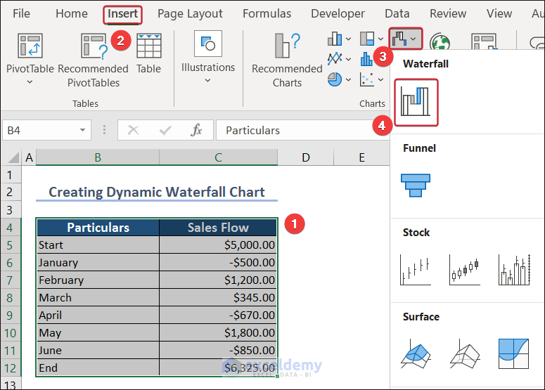
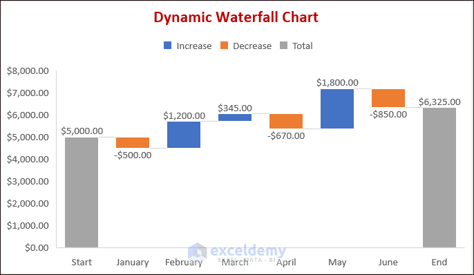
Example 6 – Creating a Dynamic Waterfall Chart
Consider the dataset below.
- Select B4:C12.
- Go to the Insert tab >> click Waterfall, Funnel, Stock or Surface Chart >> select Waterfall Chart.
- Select the end bar. The Format Data Point toolbar will open.
- Check Set as total.
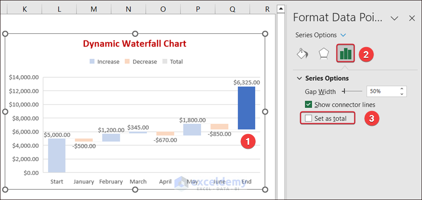
- Select the first bar and check Set as total.
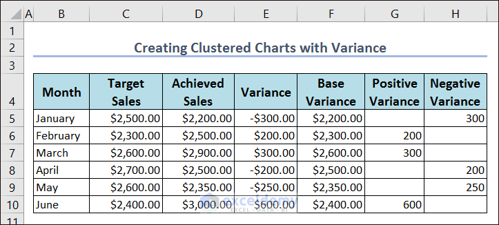
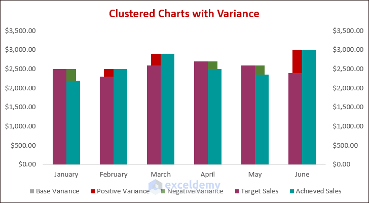
Example 7 – Clustered Charts with Variance
Consider the dataset with the amounts listed between Target Sales and Actual Sales and their variances.
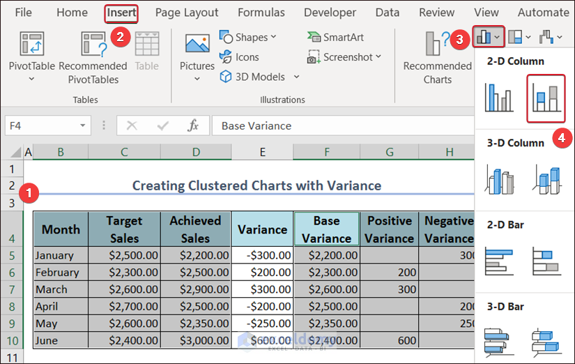
- Select the data and go to Insert.
- In Insert Column or Bar Chart choose Stacked Column.
- Select Target Sales and choose Secondary Axis in Format Data Series.

- Choose Achieved Sales as Secondary Axis.
- Select Achieved Sales in the chart and click Insert.
- Go to Insert Column or Bar Chart and choose Clustered Column.
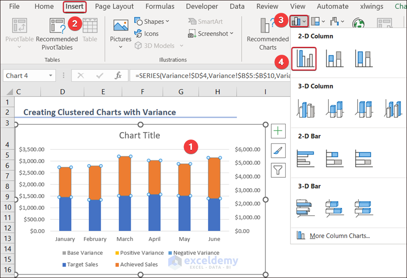
The Clustered Chart with Variance will be displayed.
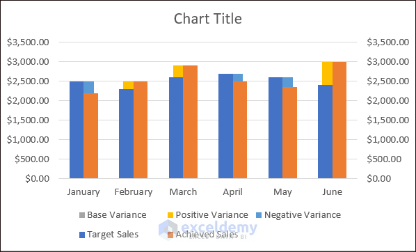
- Edit the chart.
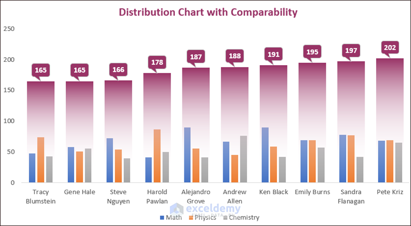
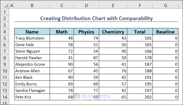
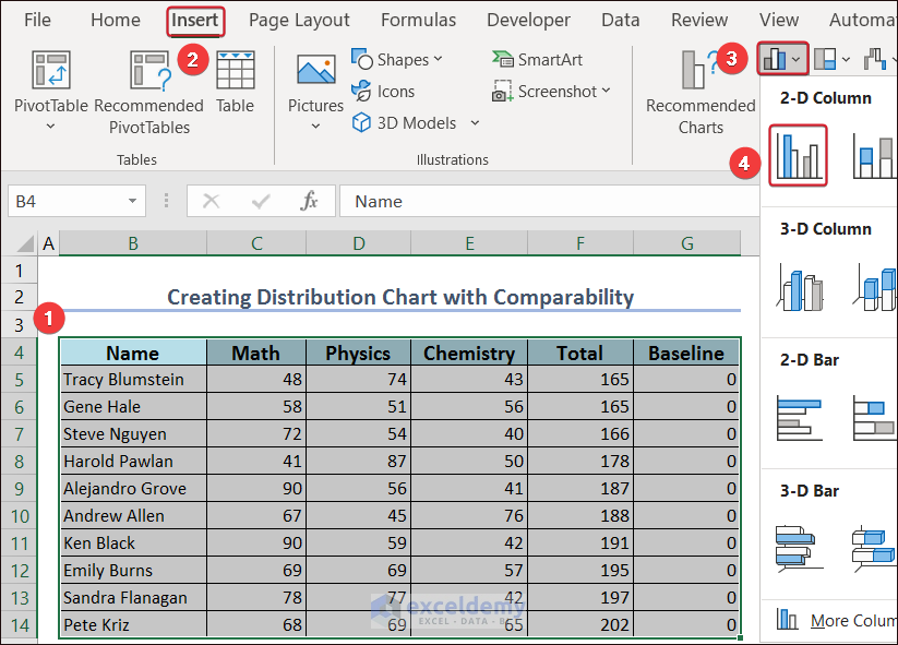
Example 8 – Distribution Chart with Comparability
- Create a dataset.
- Select the entire dataset and go to Insert.
- Click Clustered Column in Insert Column or Bar Chart.
- Select the Total column and right-click.
- Select Change Series Data Type…
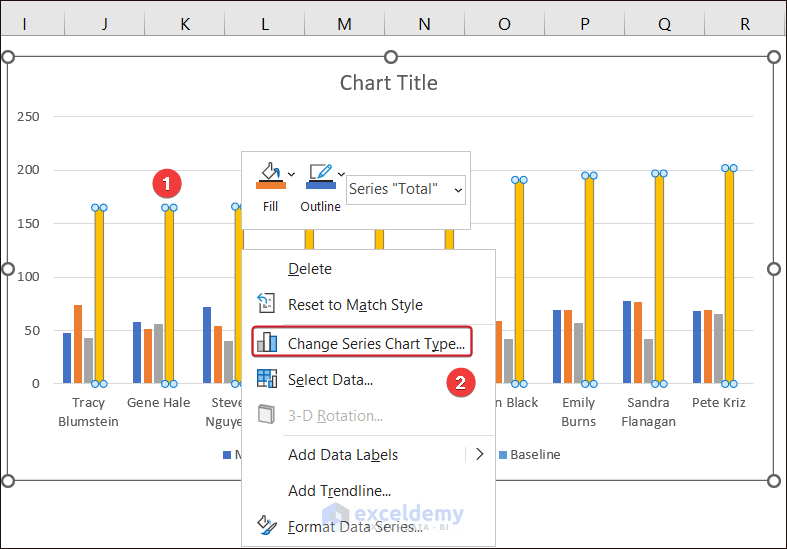
- In Change Chart Type, set the Chart Type to Line.
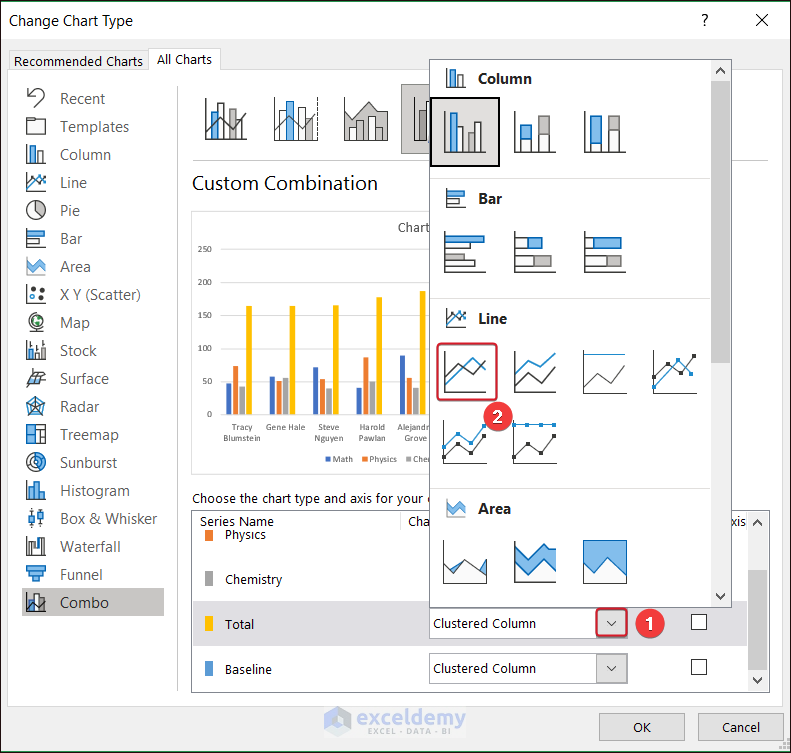
- Change the Chart Type from Baseline to Line.
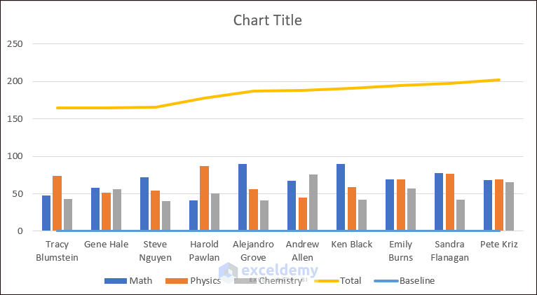
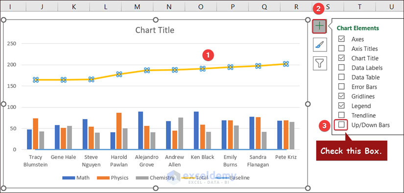
- Select the Total line and click Chart Elements.
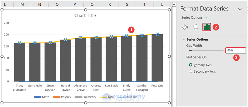
- Check Up/Down Bars.
- Decrease the Gap Width (40%).
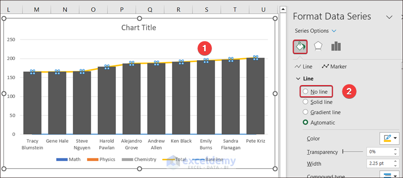
- Remove the Total and Baseline lines by clicking No line in Fill.
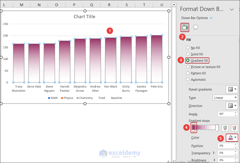
- Select the bars and choose Gradient fill in Fill.
- Set the Gradient stops to the top and bottom and remove extra stops.
- Set a color for the top gradients stop.
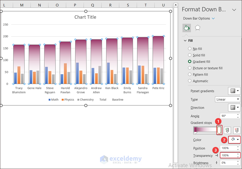
- Choose White color for the bottom stop and make it 100% transparent.
- Add Data Labels, remove the Total and Baseline from the grapes and edit the chart.
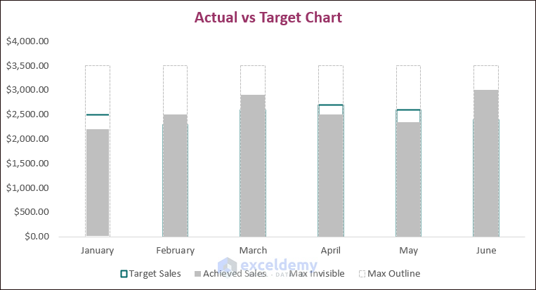
Example 9 – Actual vs Target Chart
Modify the Clustered Column chart.
- To create an outline outside the actual and target amounts, use the following formula in the Max Invisible and Max Outline columns.
=MAX(C5:D10)+500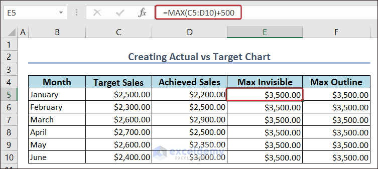
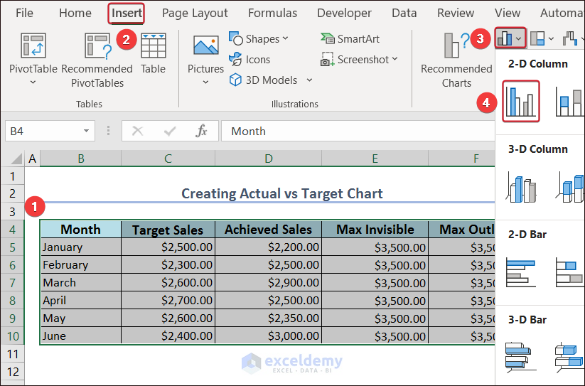
- Select the entire dataset and go to Insert.
- Go to Insert Column or Bar Chart and choose Clustered Column.
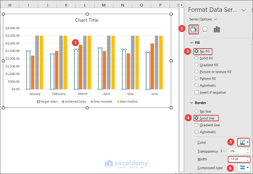
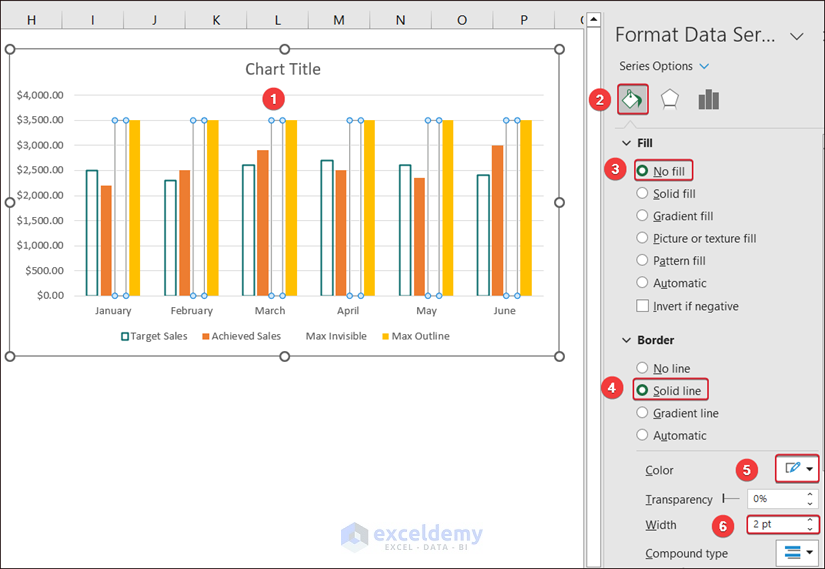
- Select all Target Sales columns and go to Fill & Line.
- In Fill, select No fill.
- In Border, choose Solid line.
- Select a color for the outline and set the width: 1.5 pt.
- Select the Actual Sales column and change the color in Fill & Line.
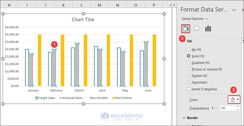
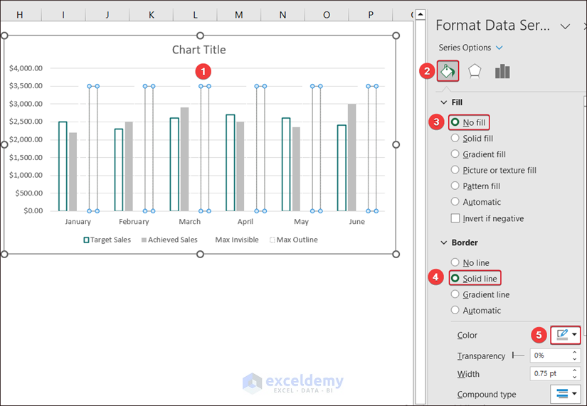
- Select the Max Invisible columns and go to Fill & Line.
- In Fill, select No fill.
- In Border, choose Solid line.
- Select a color for the outline and set the width: 2 pt.
- Select the Max Outline columns and go to Fill & Line.
- In Fill, select No fill.
- In Border, choose Solid line.
- Choose a color (similar to the actual sales color) for the outline.
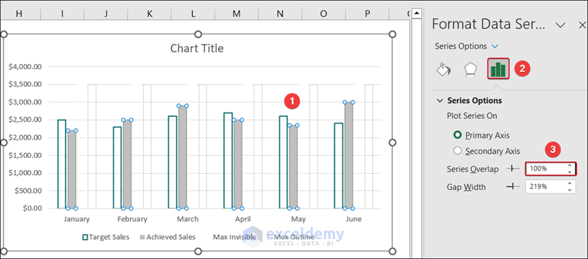
- Select any column and go to Series Options.
- Set the Series Overlap to 100%.
The Actual vs Target chart is displayed.
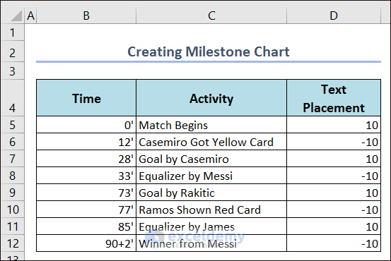
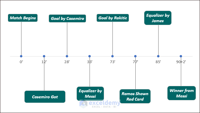
Example 10 – Milestone Chart
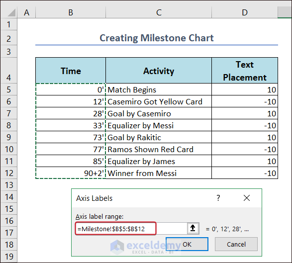
Consider the following dataset.
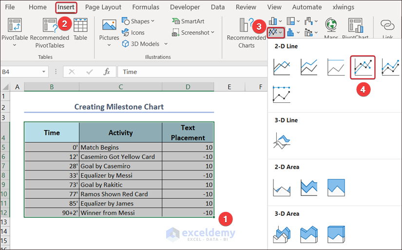
- Select the dataset and go to Insert.
- Select Insert Line or Area Chart and click Line with Markers.
- Right-click the chart and go to Select Data…
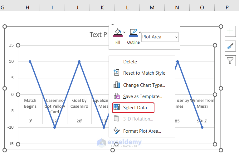
- Delete the available series by clicking Remove.
- Click Add to create a new series.
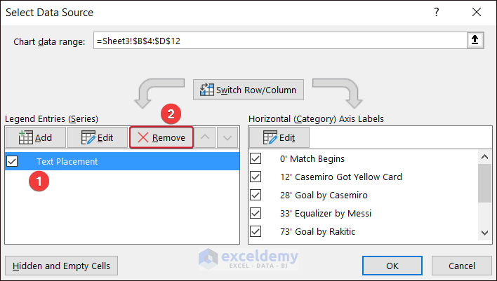
- Define a series (Time), and the range C5:C12.
- Click OK to create a series.
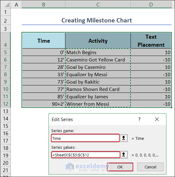
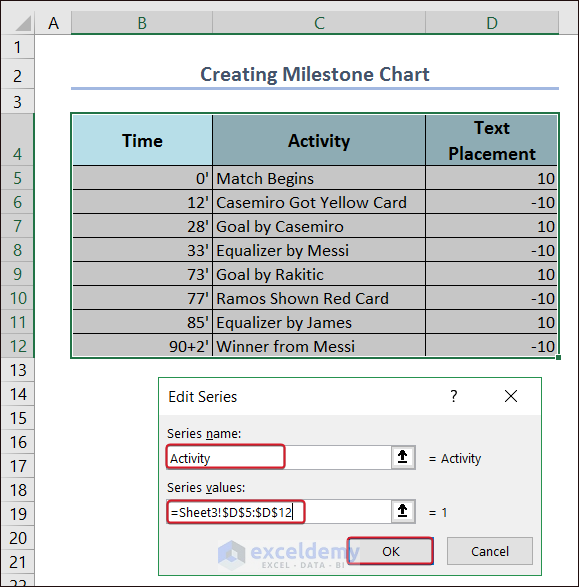
- Create the Activity series.
- Click the chart and right-click.
- Choose Change Series Data Type…
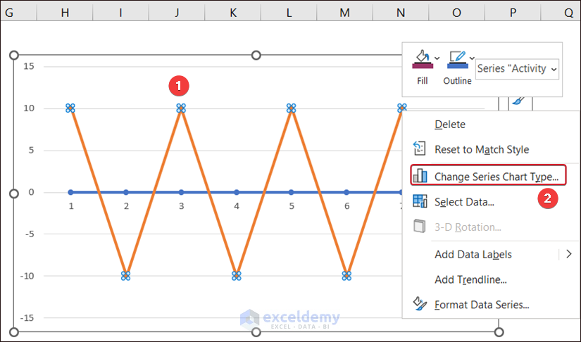
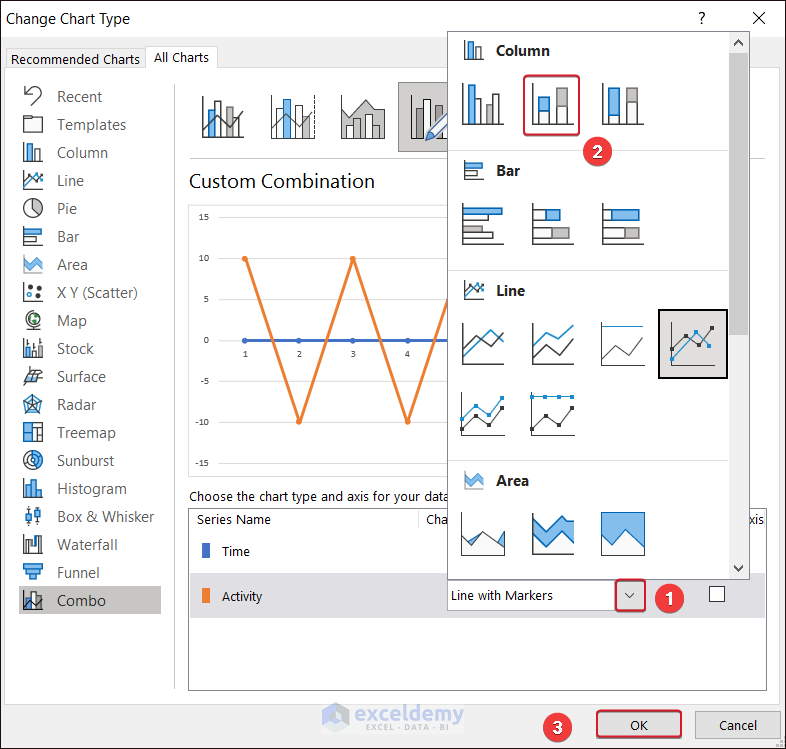
- Click the extension of Chart Type in the Activity series and select Stacked Column.
- Click OK.
- To edit the horizontal axis, go to Edit.
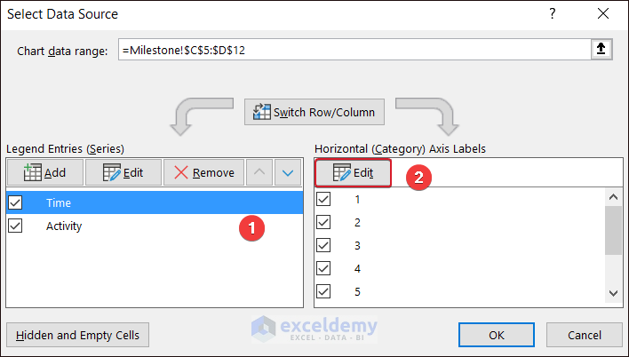
- Define the range in the dataset.
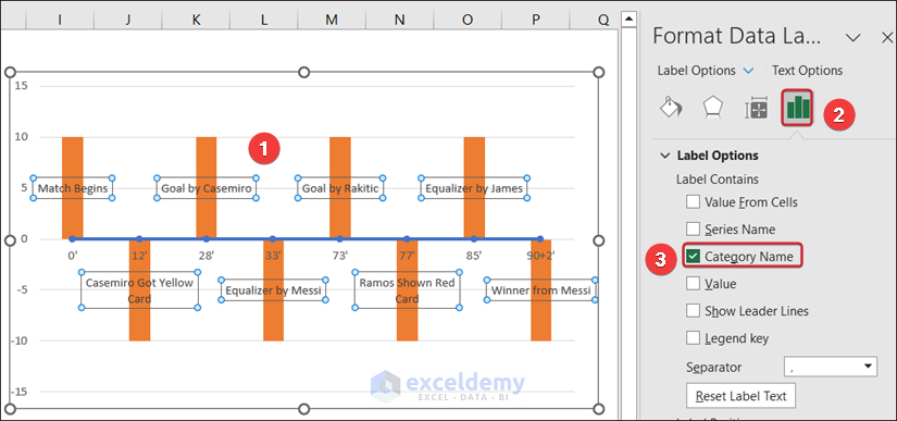
- Select the data labels and go to Label options.
- Check Category Name and uncheck the other options.
- Go to Chart Design and choose Add Chart Element.
- Select Error Bars and click More Error Bars Options…
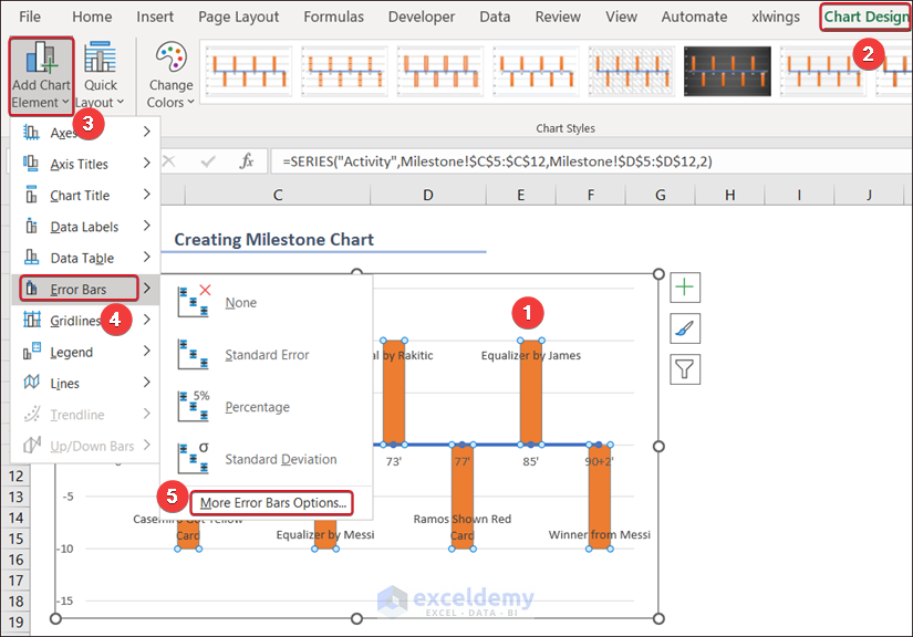
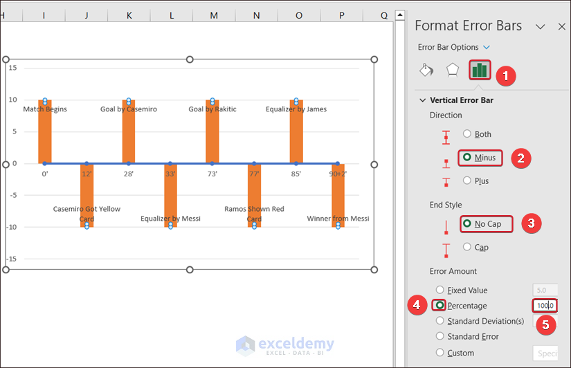
- Set the error bars direction to Minus in Vertical Error Bar.
- Set the End Style to No Cap and the Percentage to 100%.
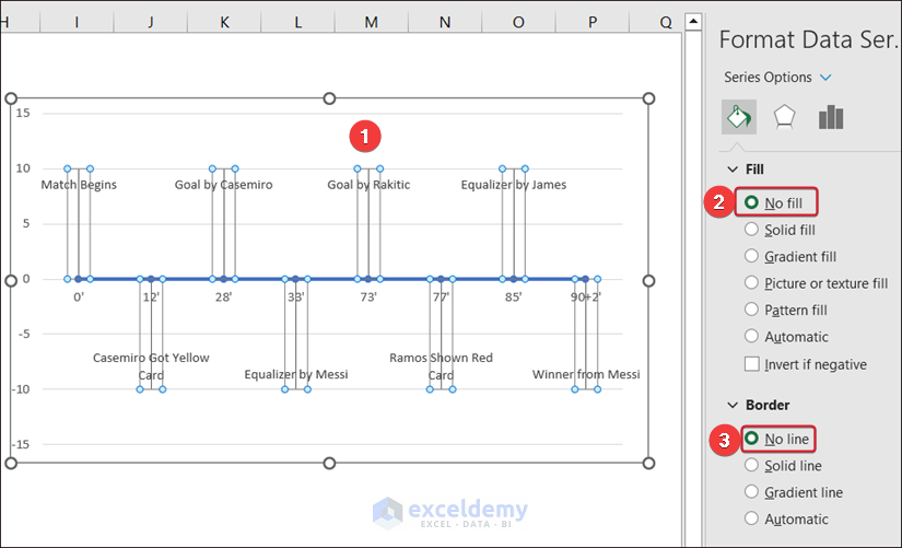
- Select the columns and choose No fill in Fill and No line in Border.
- Finalize your chart by editing it.
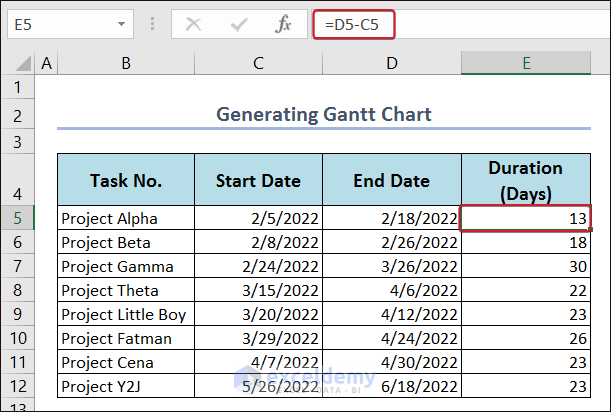
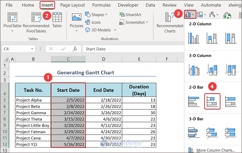
Example 11 – Gantt Chart
Modify the Stacked Bar chart.
- Create a dataset.
- Select C4:C12 (the Start Date column), and go to Insert.
- Choose Insert Column or Bar Chart in Charts.
- Select Stacked Bar in 2-D Bar.
- Right-click the chart and click Select Data.
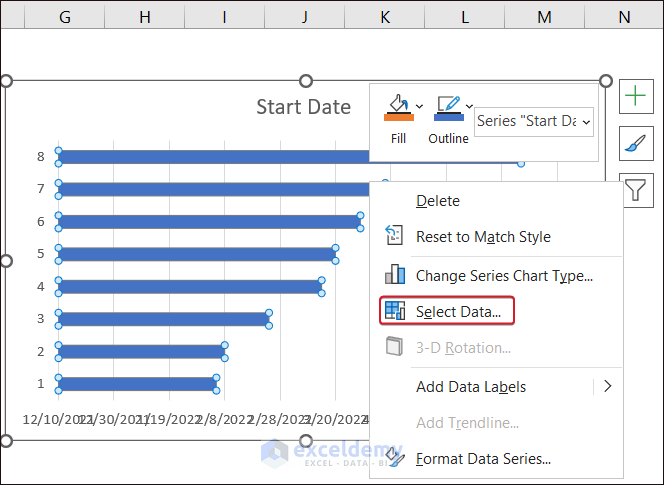
- In Select Data Source, click Add.
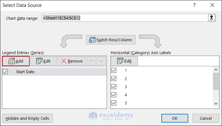
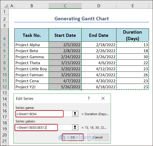
- In Series name, enter E4.
- Select E5:E12 in Series values.
- Click OK.
- Click Edit.
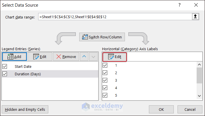
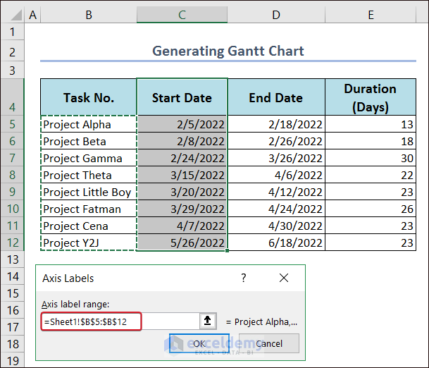
- Select B5:B12 in Axis Labels and click OK.
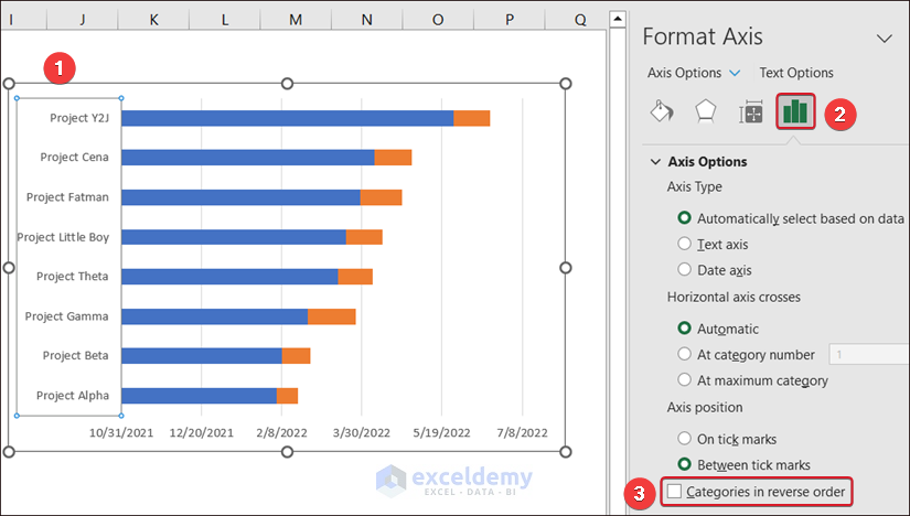
- Click the axis.
- In Format Axis, check Categories in reverse order.
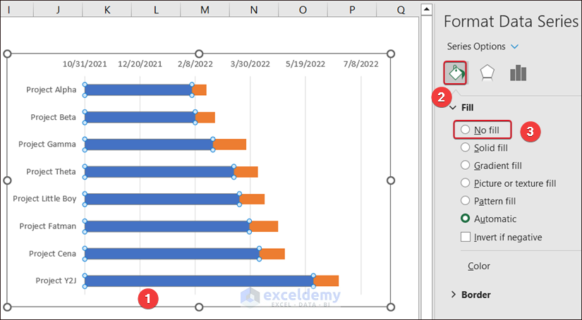
- Select all blue bars by double-clicking them.
- In Format Data Series, choose No fill in Fill & Line.
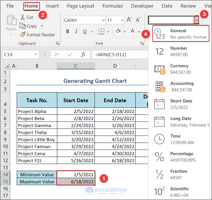
- Find the earliest task date in Minimum Value and the latest date in Maximum Value.
- Select the cells and turn them into General format.
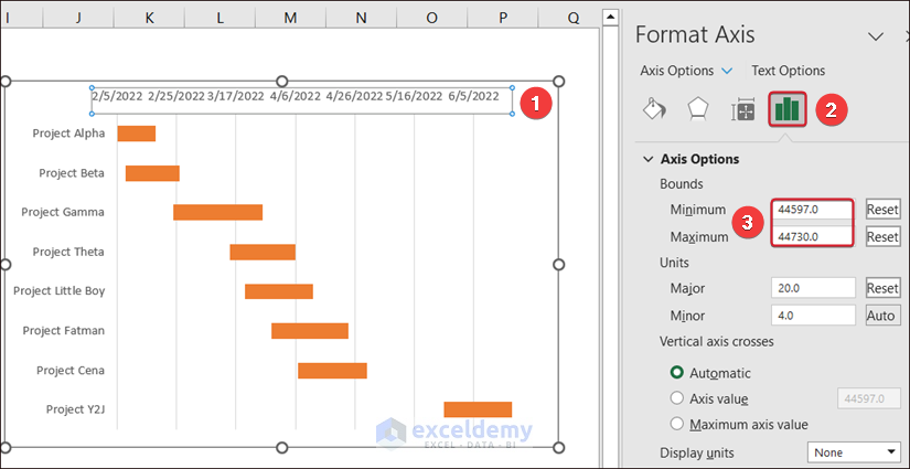
- To adjust the label values, double-click the horizontal axis label.
- In Format Axis, enter the Minimum and Maximum values manually in Axis Options.
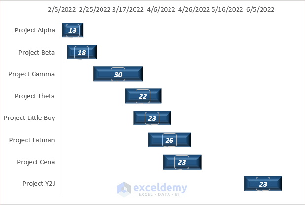
- Customize your Gantt Chart.
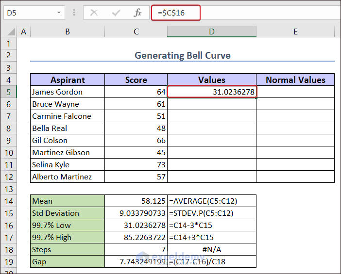
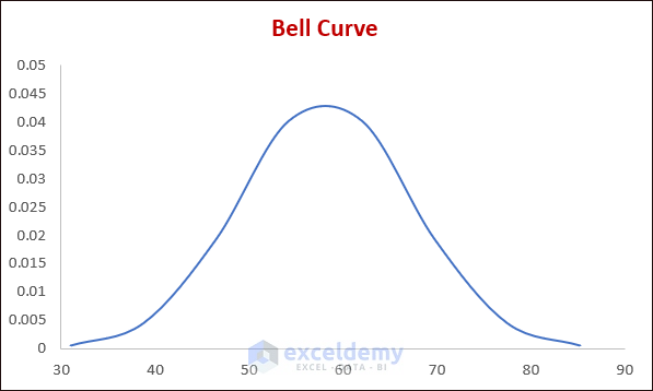
Example 12 – Bell Curve
- Calculate the Mean, Std Deviation, 7% Low, 99.7% High, and Gap using the following formulas with the values from Score.
Formula to calculate the Mean:
=AVERAGE(C5:C12)Formula to calculate the Std Deviation:
=STDEV.P(C5:C12)Formula to calculate the 99.7% Low:
=C14-3*C15Formula to calculate the 99.7% High:
=C14+3*C15Formula to calculate the Gap:
=(C17-C16)/C18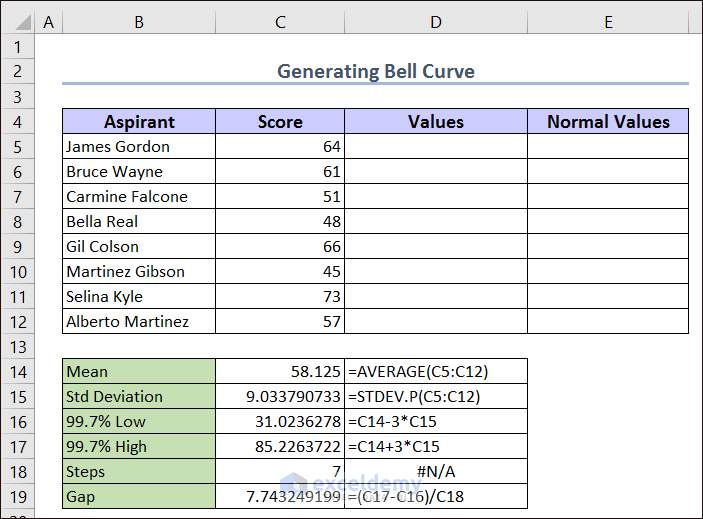
The first value is C16.
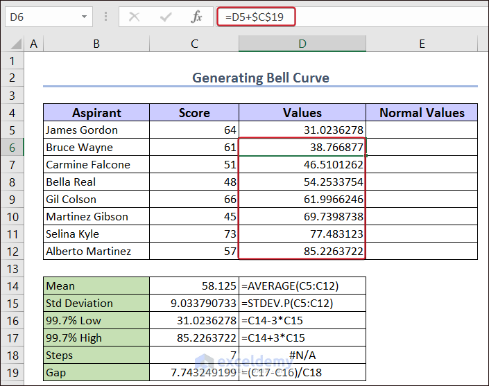
- Select the D6:D12 and enter this formula.
=D5+$C$19The interval value is used to get the other values using this formula.
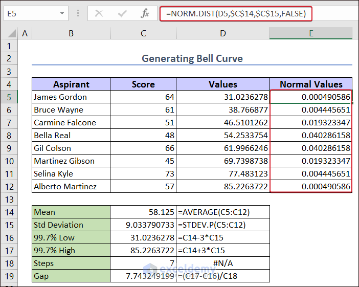
- Select E5:E12 and use this formula.
=NORM.DIST(D5,$C$14,$C$15,FALSE)The formula returns the normal distribution for the given mean and standard deviation. We have set these values in the code. The Cumulative was set to FALSE to get the “probability density function”.
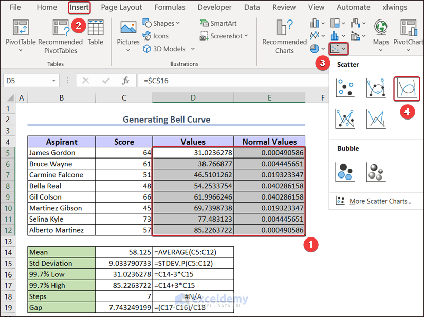
- Select D5:E12.
- Go to the Insert tab >>> Insert Scatter (X,Y) or Bubble Chart >>> select Scatter with Smooth Lines.
This will be the basic Bell Curve.
- Double-click the horizontal axis.
- In Format Axis, set the Bounds:
Minimum: 30.
Maximum: 90.
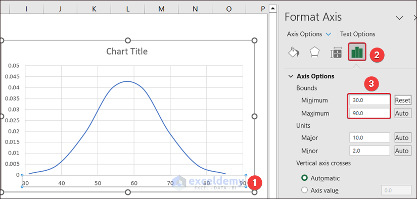
- Customize your chart.
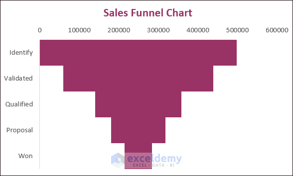
Example 13 – Sales Funnel Chart
- Create a Helper Column.
- Use the following formula:
=(LARGE($D$4:$D$9,1)-D6)/2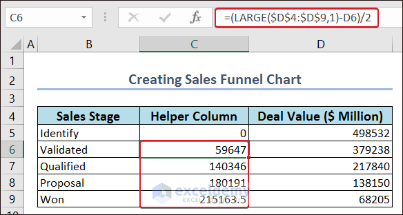
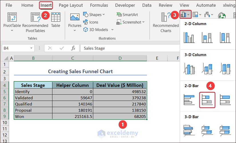
- Select the entire dataset and go to the Menu Bar.
- Click Insert >>> Insert Column or Bar Chart >>> Stacked Bar.
- Double-click the vertical axis and select Categories in reverse order in Axis Options.
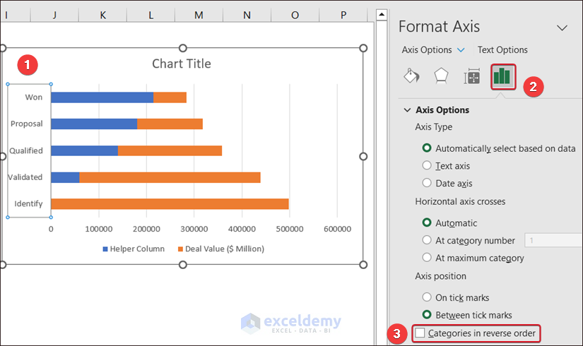
- Select the helper data in the chart.
- In Fill & Line, choose Solid fill and make transparency to 100%.
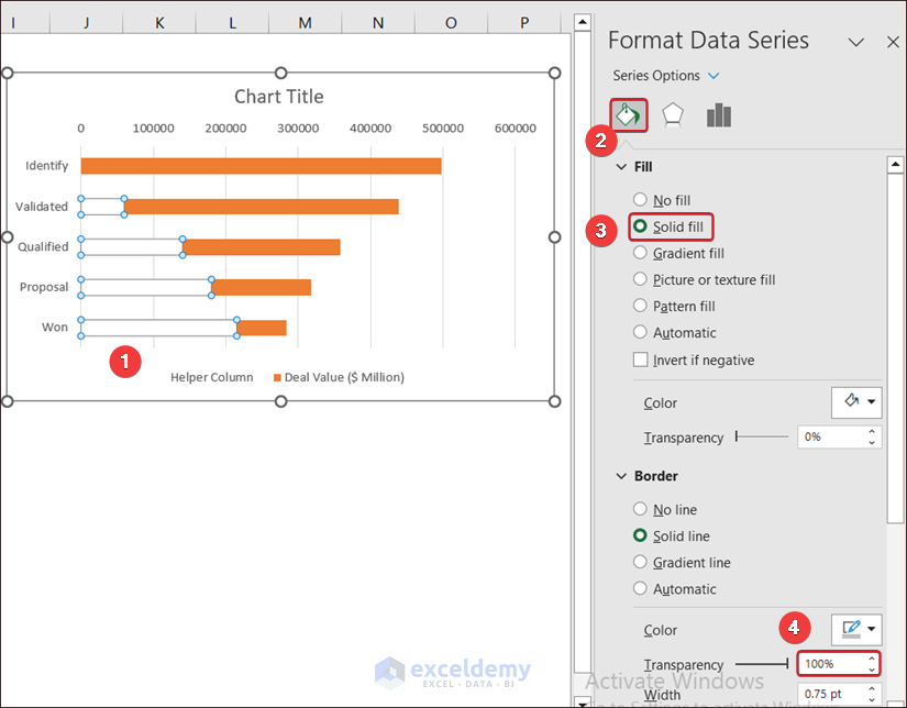
- In Axis Options, set the Gap Width to 0%.
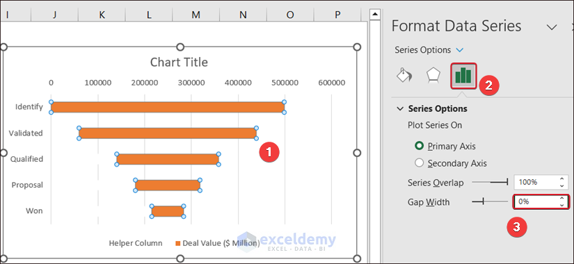
- Customize the chart.
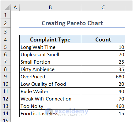
Example 14 – Pareto Chart
Consider the following dataset:
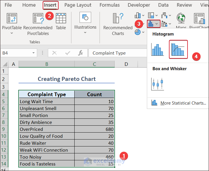
- Select the entire dataset and go to the Insert tab.
- Select Insert Static Chart and choose Pareto in Histogram.
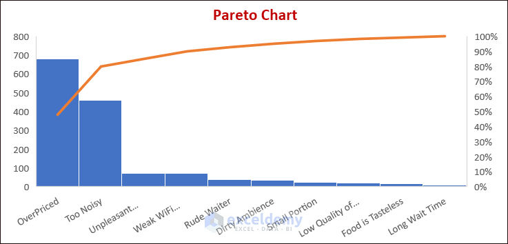
This is the output.
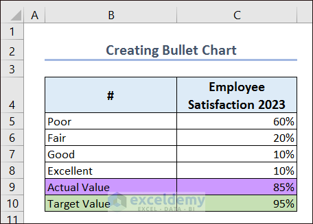
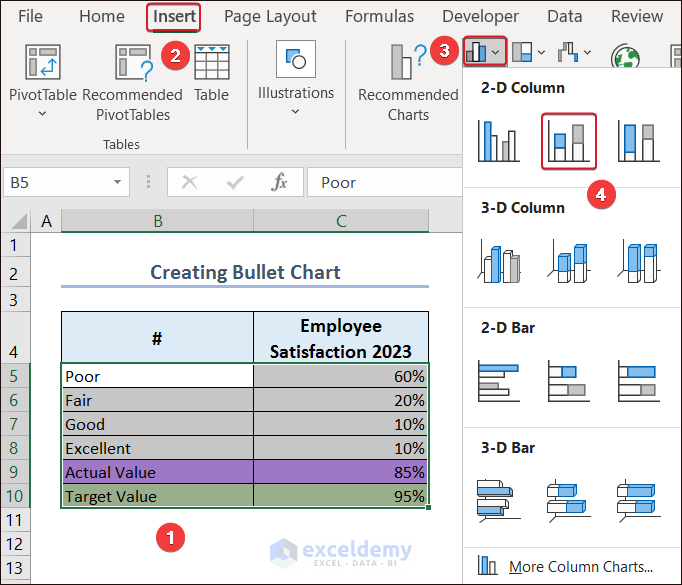
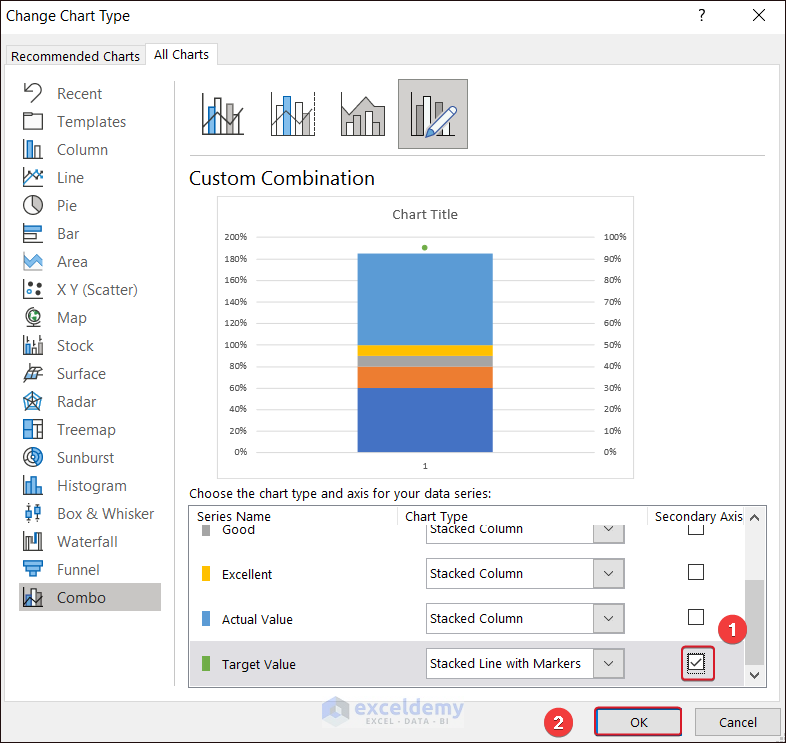
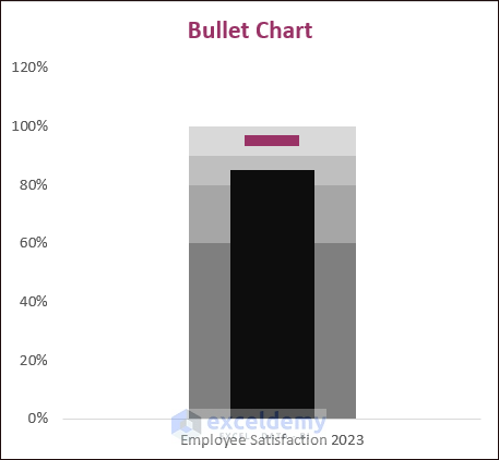
Example 15 – Bullet Chart
- Create a dataset with quantitative bands, and actual and target values.
- Select the entire dataset and go to Insert.
- In Insert Column or Bar Chart, click Stacked Column.
- Select the chart and click Switch Row/Column in Chart Design.
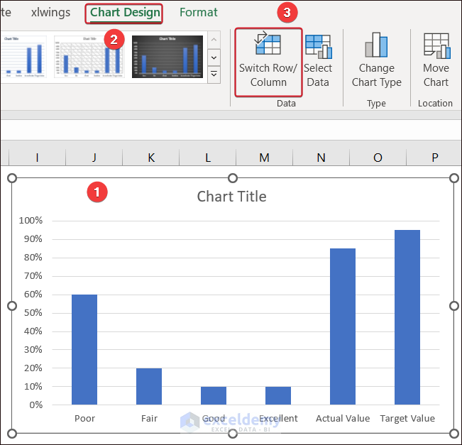
- Right-click and hold the cursor. Select Change Series Chart Type…
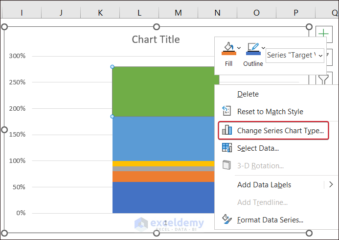
- Change the Chart Type of the Target Value to Stacked Line with Markers.
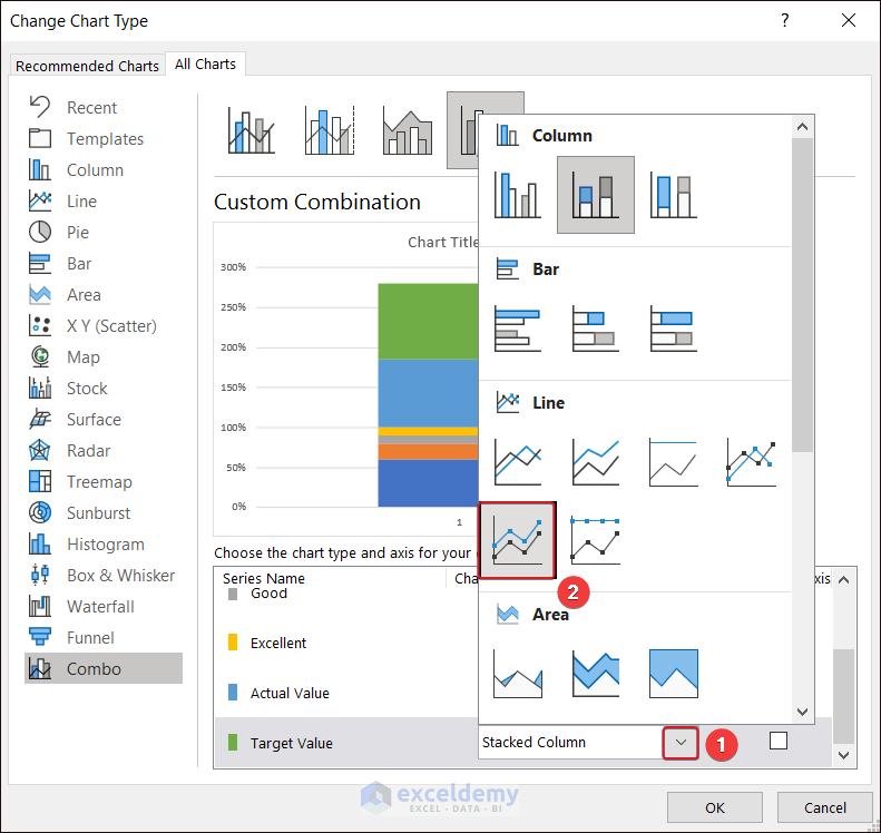
- Check Secondary Axis and click OK.
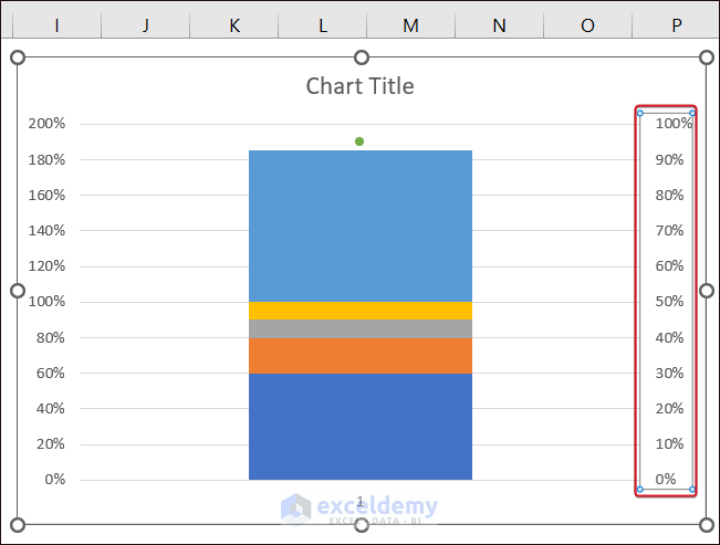
- Select the secondary axis and delete it.
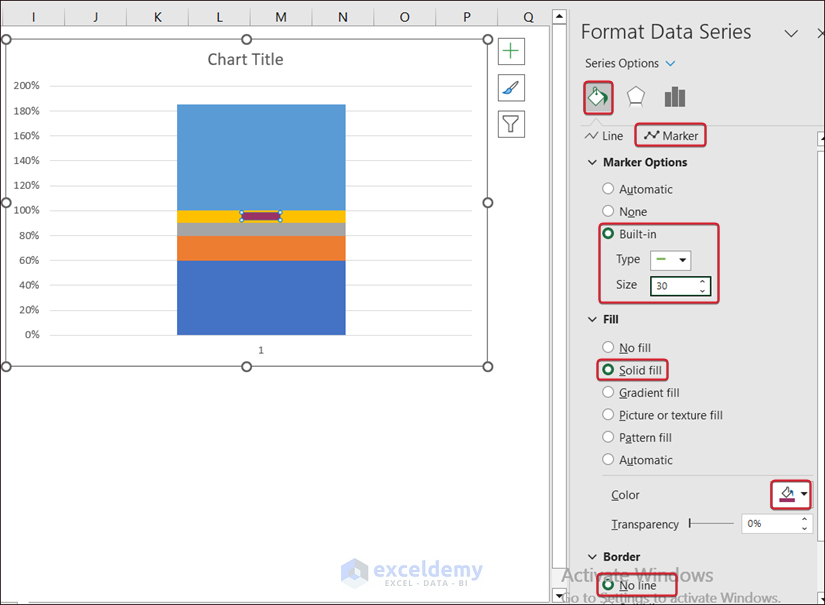
- Select the marker and change its format.
- Go to Fill & Line >>> Marker.
- In Marker Options, select Built-in, set Type to Dash, and Size to 30.
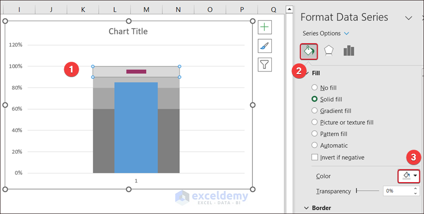
- In Fill, select Solid fill, and choose a color.
- In Border, select No line.
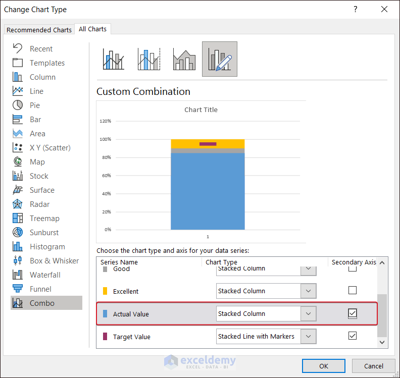
- Go to Change Series Chart Type… and set the Actual Value to Secondary Axis.
- Select the Actual Value column and set the Gap Width to 400%.
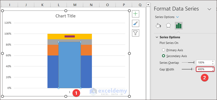
- Select the bands one by one and change their color in Fill.
The bullet chart is displayed.
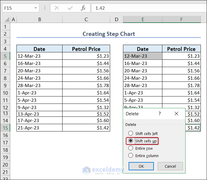
Example 16 – Step Chart
- Create a dataset.

- Copy the entire dataset to a new location (E4).
- Select E5 and F15 and right-click.
- Click Delete.
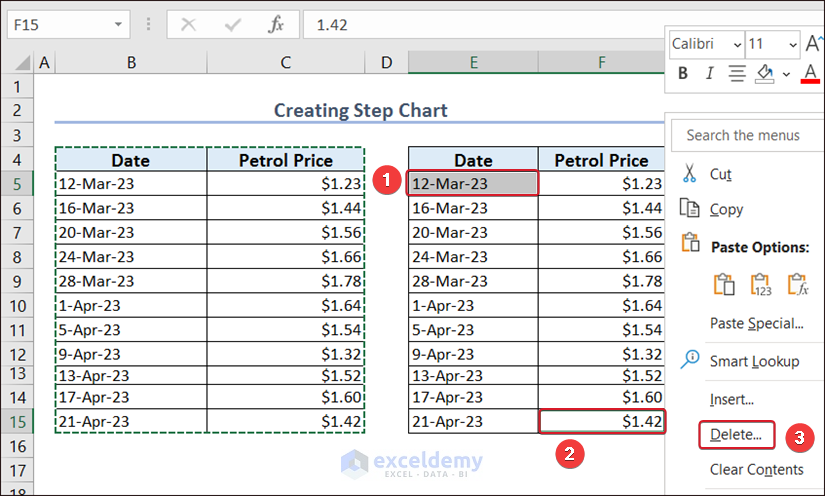
- Select Shift cells up and click OK.
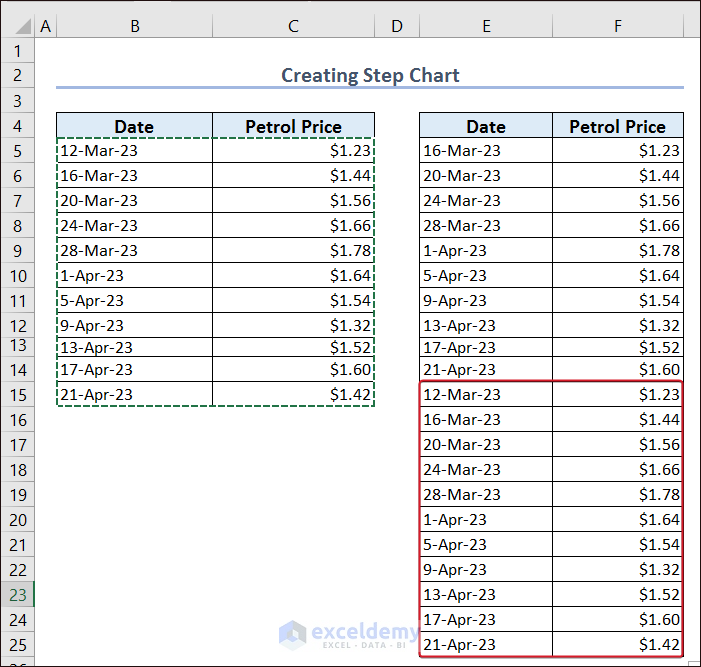
- Copy B5:C15 and paste it into E15.
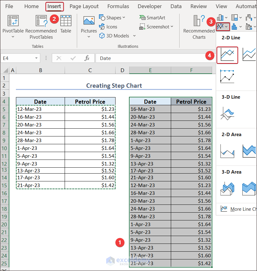
- Select E4:F25 and go to Insert.
- In Insert Line or Area Chart, select Line.
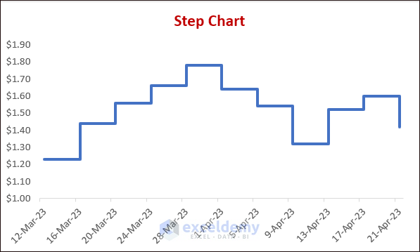
- Customize your Step Chart.
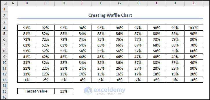
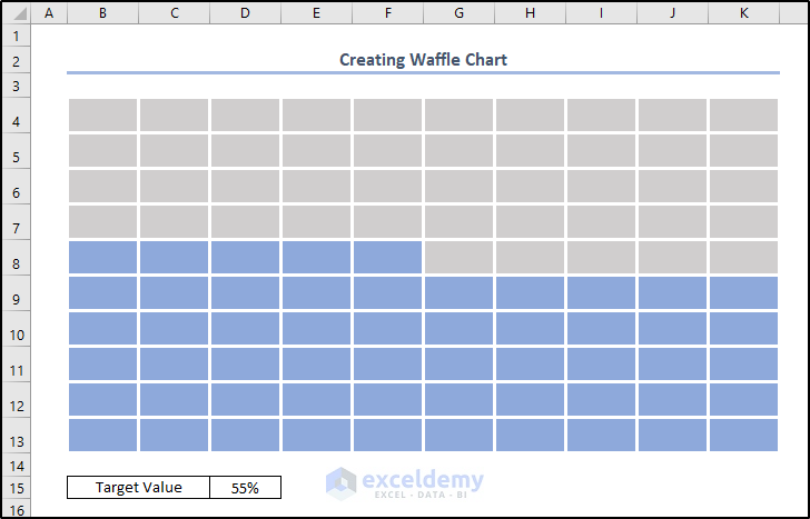
Example 17. Waffle Chart
- Create a dataset as shown below.
- Select B4:K13 and click Conditional Formatting in the Home tab.
- Select New Rule.
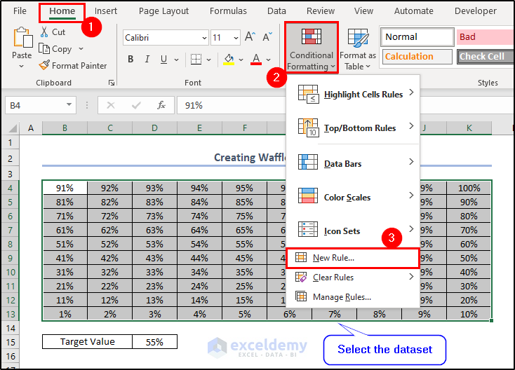
- In New Formatting Rule, select Format only cells that contain in Select a Rule Type.
- In Cell Value, select less than or equal to and D15.
- Choose a fill option in Format.
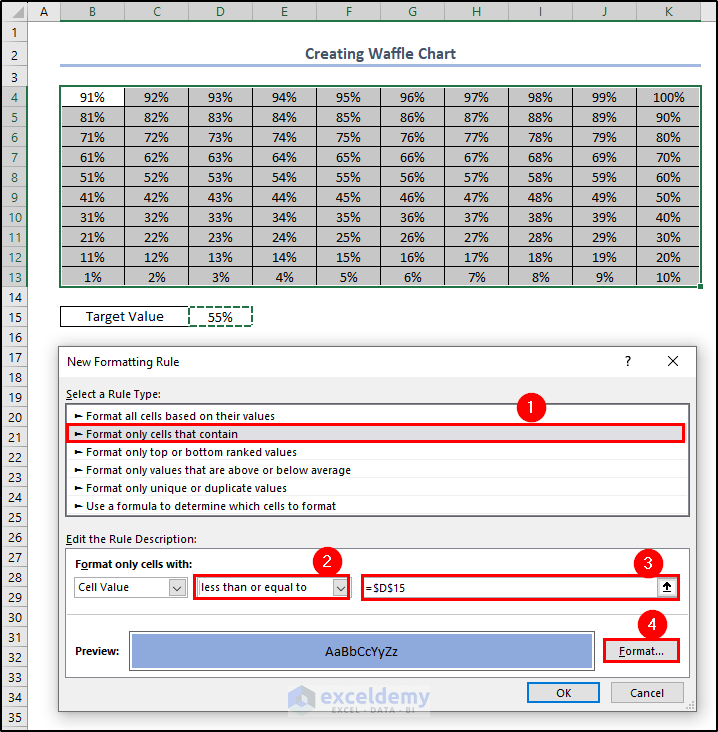
- Click OK.
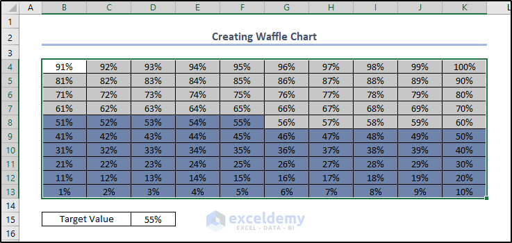
- Repeat the procedure for the same range, but with values greater than the value of D15. A gray fill was selected, here.
- Select the range and press Ctrl+1.
- In Number, select Custom format and enter ;;; in Type.
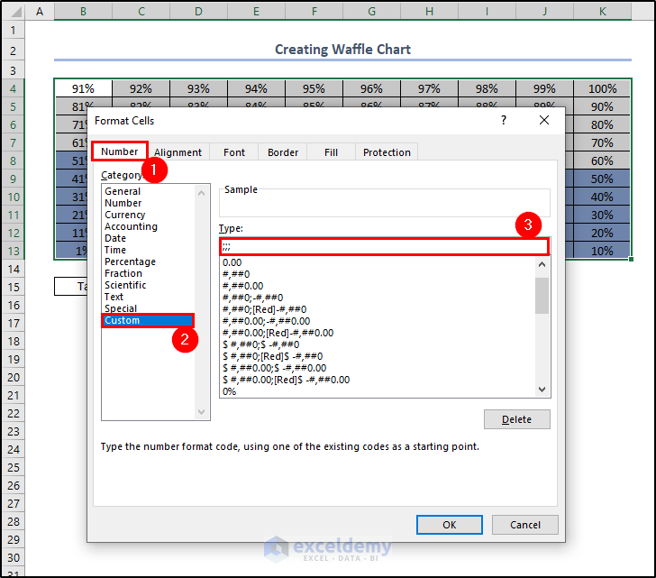
- Go to the Border tab, select a thick border and White as the color of the border. Make sure both Outline and Inside are selected.
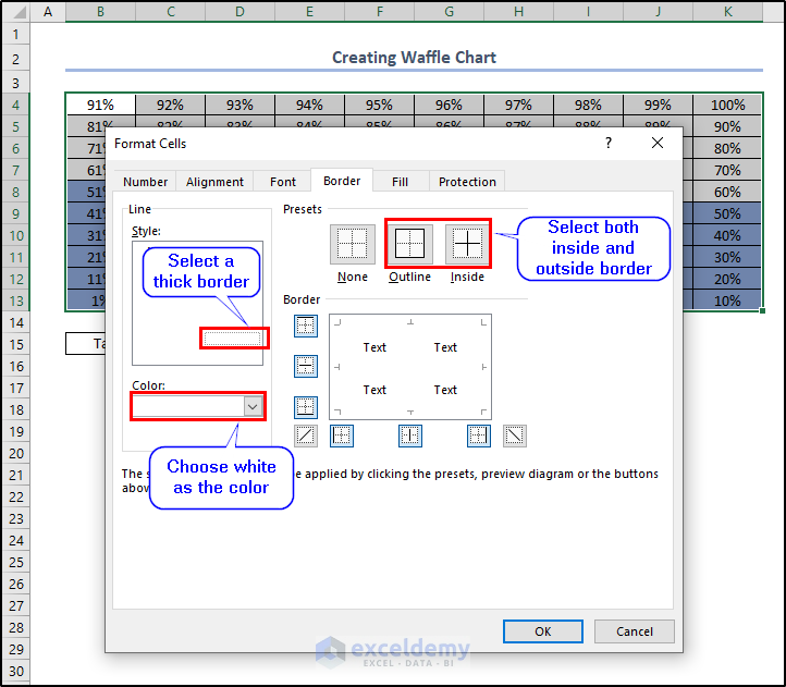
- Click OK.
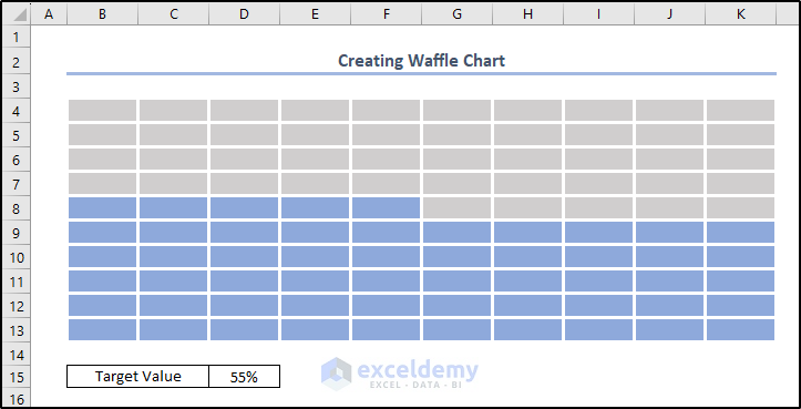
- Resize the cells.
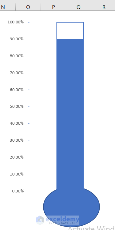
Example 18 – Thermometer Chart
- Create a dataset with total profit and targeted profit.
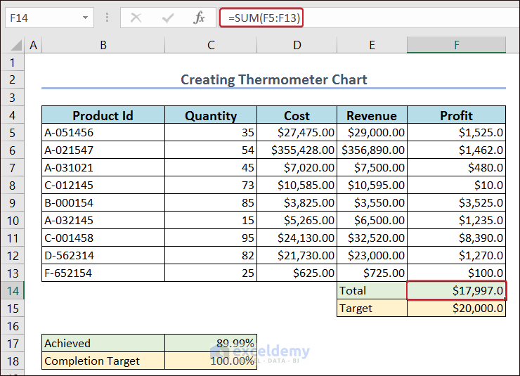
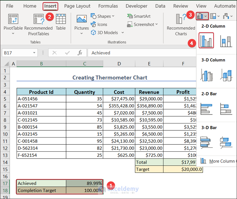
- Select B17:C18 and go to Insert.
- Click Clustered Column in 2D Chart.
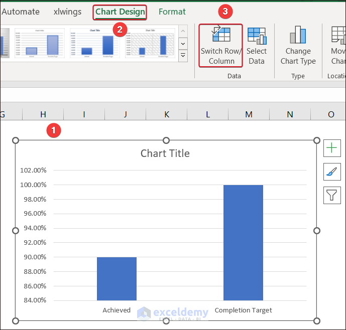
- Select any of the data columns, and in Chart Design, click Switch Row/Column.
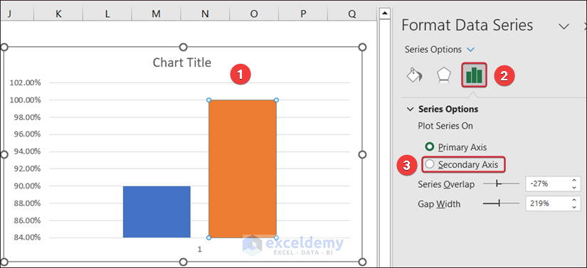
- Select the chart column and click Secondary Axis in Series Options.
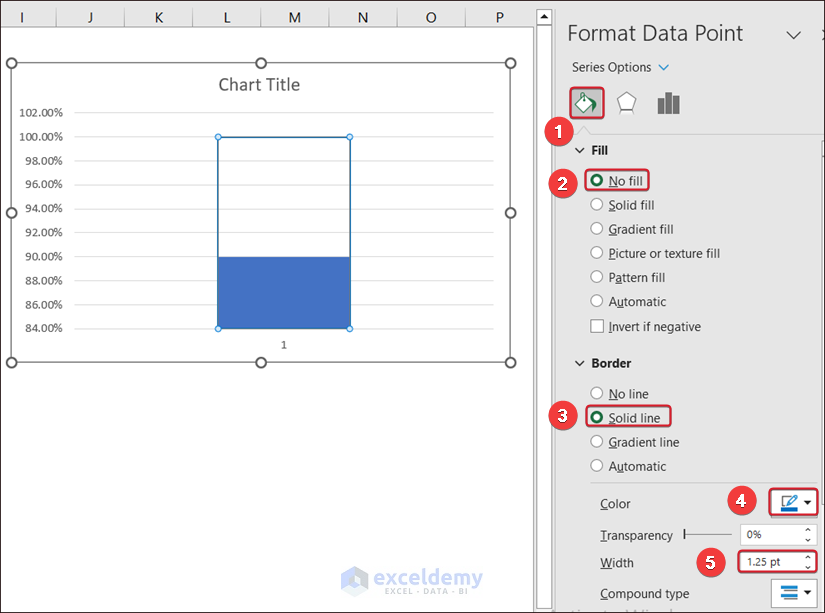
- Go to Fill and Line.
- In Fill, select No fill.
- In Border, click Solid line.
- Make sure the color of the border matches the column color.
- Set the Width to 1.25 pt.
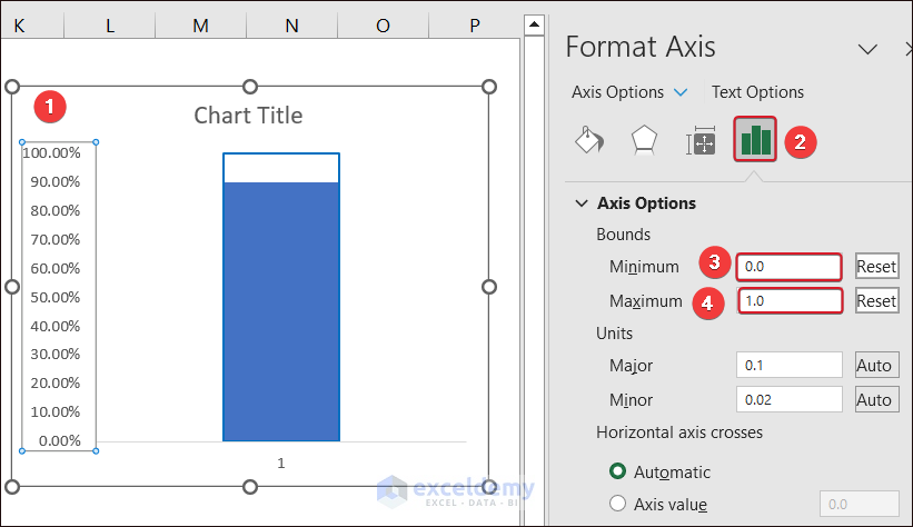
- Enter the Minimum bound as 0 and press enter.
- Enter 0 in the Maximum bound and press Enter.
- Go to the Insert tab to add a bulb shape below the chart.
- Click Shapes and choose oval shape.
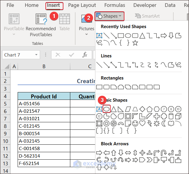
- Place the oval shape at the bottom of the Chart.
This is the output.
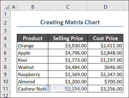
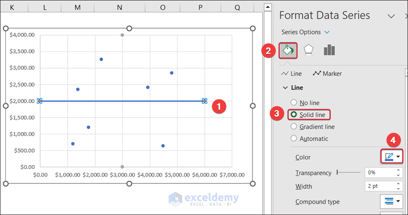
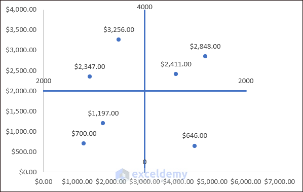
Example 19 – Matrix Chart
- Create a 4-Quadrant Matrix chart (it can only comprise 2 sets of values). Use selling prices and cost prices in the dataset below.
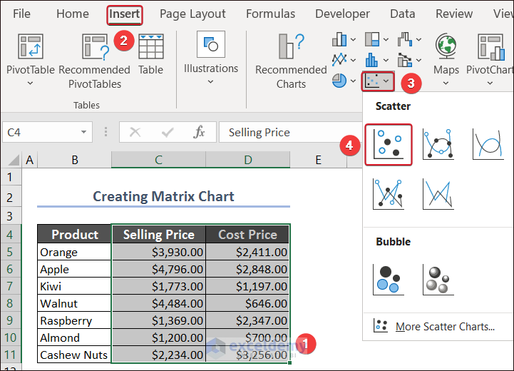
- Select C4:D8 and go to Insert>> Charts >> Insert Scatter (X, Y) or Bubble Chart >> Scatter.
.
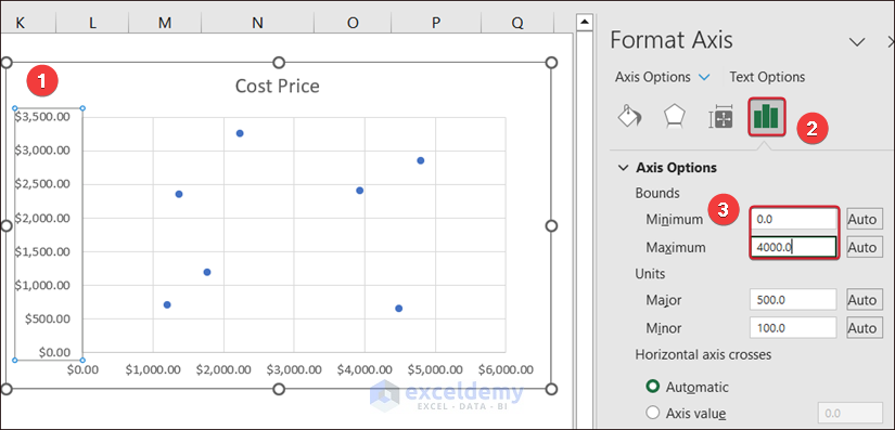
- Double-click the axis to set the upper bound and lower bound limits of the X-axis and Y-axis.
- Go to the Axis Options Tab >> expand Axis Options >> set the limit of the Minimum bound as 0.0 and the Maximum bound as 4000.0.
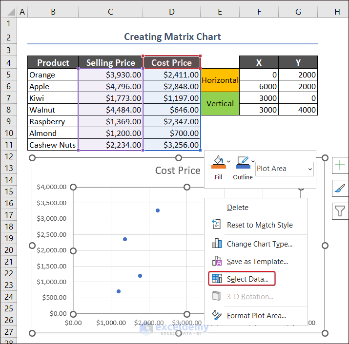
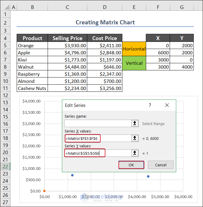
- Add an additional data range to add the 2 lines (there are 4 quadrants here).
- In Horizontal, add the following values in the X and Y coordinates.
X → 0 (minimum bound of X-axis) and 6000 (maximum bound of X-axis)
Y → 2000 (average of the minimum and maximum values of the Y-axis → (0+4000)/2 → 2000)
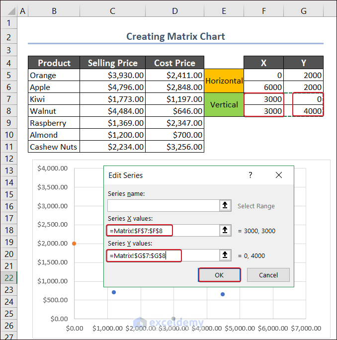
- In Vertical, add the following values in the X and Y coordinates.
X → 3000 (average of the minimum and maximum values of the X-axis → (0+6000)/2 → 3000)
Y → 0 (minimum bound of Y-axis) and 4000 (maximum bound of Y-axis)

- Select the graph and right-click.
- Choose Select Data.
- In the Select Data Source wizard, click Add.
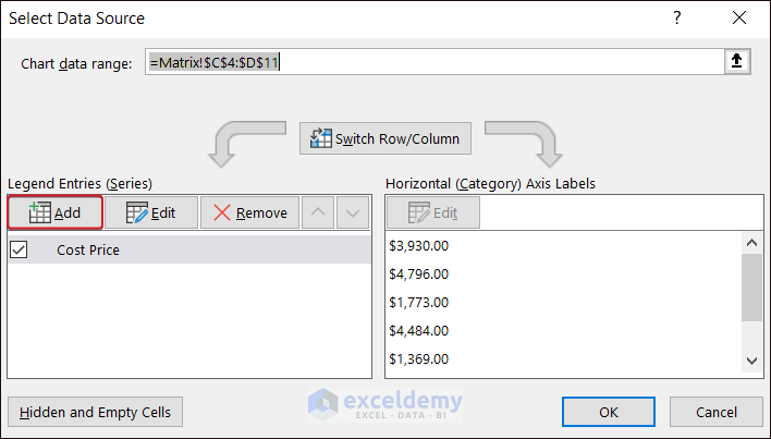
- For Series X values, select the X coordinates of the horizontal part of the Quadrant sheet.
- For Series Y values, select the Y coordinates of the horizontal part.
- Click OK.
- Add another series for the vertical line.
There will be four points.
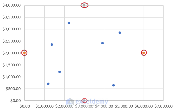
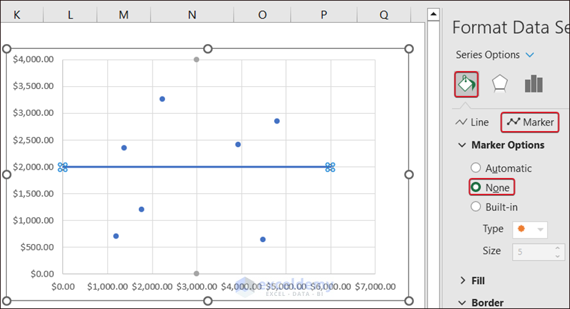
- Select the horizontal point and go to Fill & Line.
- In Line click Solid line.
- Choose a color.
- To hide the points, go to Fill & Line tab and select Marker Options.
- Click None.
- Create a line with the vertical points and remove the gridlines to have a complete matrix chart.
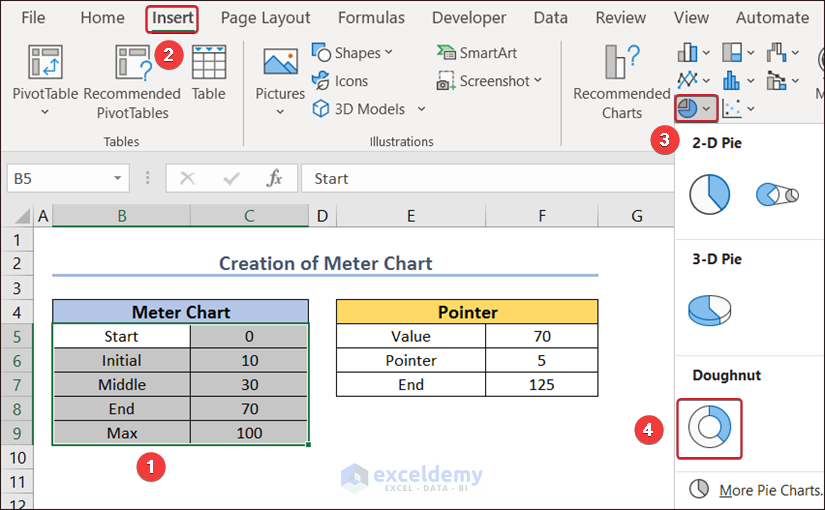
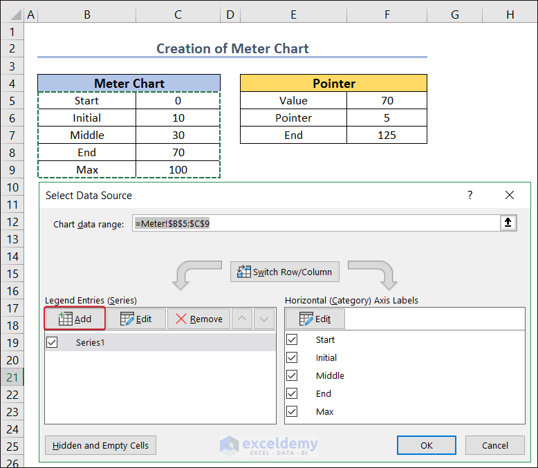
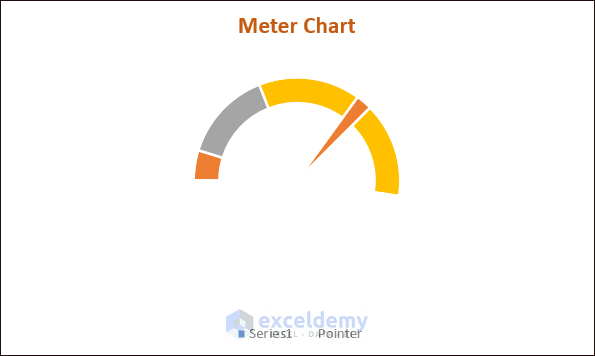
Example 20 – Meter Chart In Excel
- Create a dataset with information on vehicle speed. To calculate the end value of the pointer, use a simple mathematical formula:
=200-F5-F6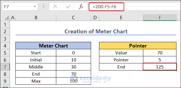
- Select B5:C9.
- Go to:
Insert → Charts → Pie Chart → Doughnut
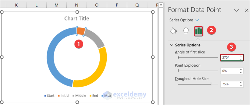
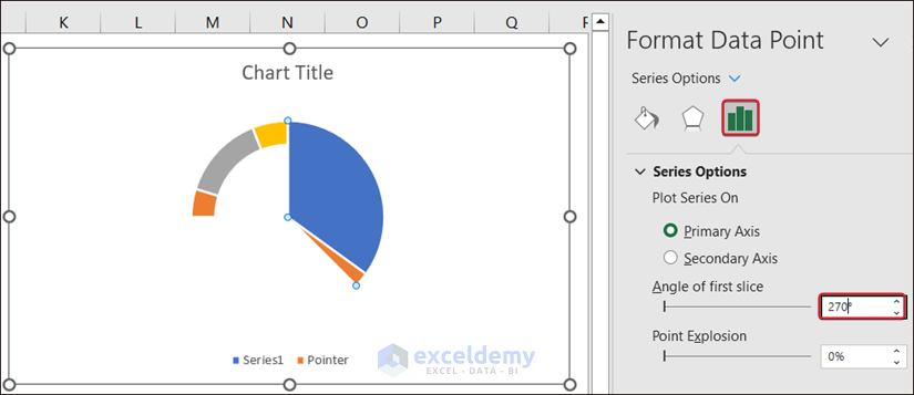
- Double-click a small portion of the chart.
- In Format Data Series, enter 270 degrees in the Angle of first slice in Series Options.
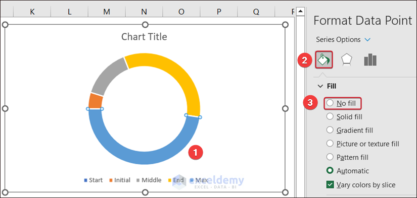
- Select the bigger portion of the Doughnut chart, and check No fill in Fill.
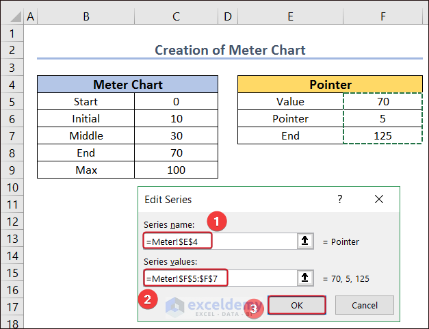
- Create a pointer. Place your cursor on the chart and right-click.
- In the new window, select Select Data.
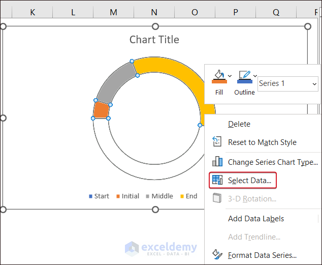
- In Select Data Source, select Add.
- In Edit Series, enter =Meter!$E$4 in Series name.
- Enter =Meter!$F$5:$F$7 in Series values.
- Click OK.
- Change the type of chart. Place the cursor on the chart and right-click.
- Select Change Series Chart Type.
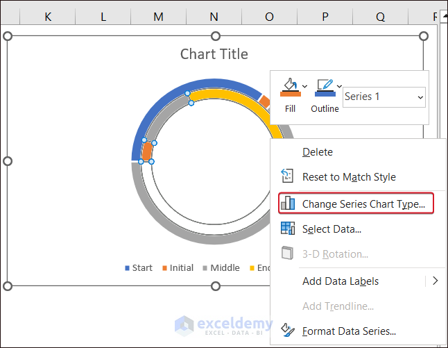
- In Change Chart Type, select Pie chart in the pointer and click OK.
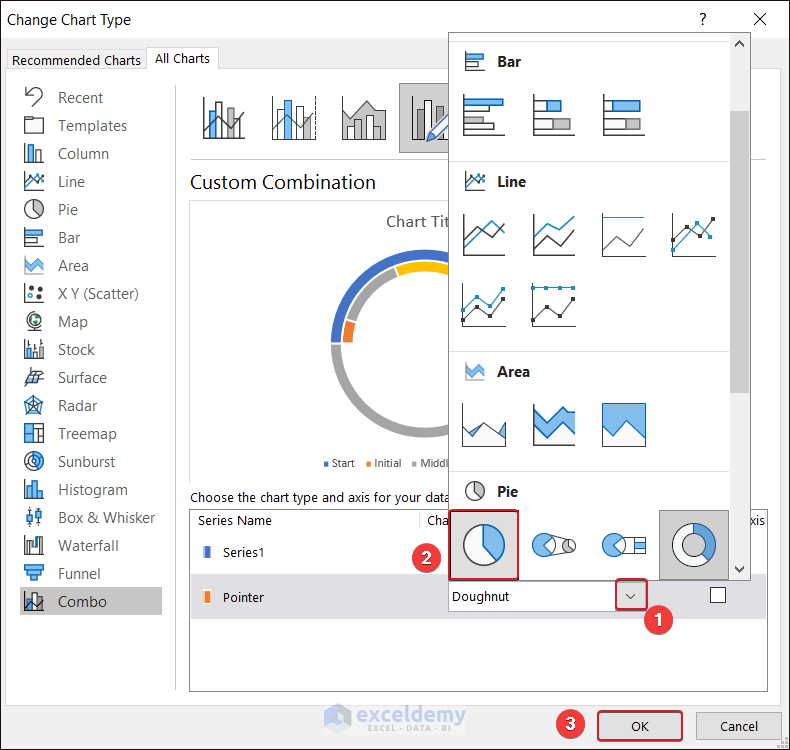
- Select the biggest portion of the Pie chart, and check No fill in Fill.
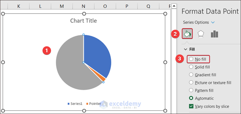
- Enter 270 degrees in the Angle of first slice in Series Options.
- Remove the other bigger portion of the chart, selecting No fill to display the Meter Chart.
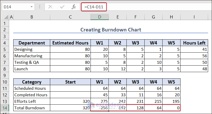
Example 21 – Burndown Chart In Excel
Calculate the total number of hours in 5 weeks and subtract it from the total estimated hours to find the remaining hours.
- Use the following formula in I5 and AutoFill the rest cells in column I:
=C5-(SUM(D5:H5))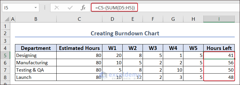
- To calculate both Total Burndown and Efforts Left in the Start section of the second table, enter the formula in C14 and C15:
=SUM(C5:C8)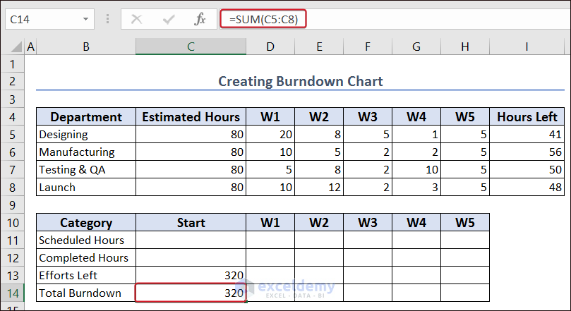
- Add the Estimated Hours and divide them by the total number of weeks to get the resulting hours. Enter the formula in D11 and AutoFillthe column:
=SUM(C5:C8)/5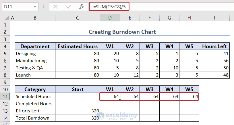
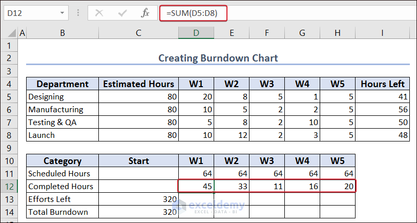
- To count the completed hours each week, enter:
=SUM(D5:D8)- AutoFill the rest of the rows.
- To display efforts left per week, enter:
=C13-C12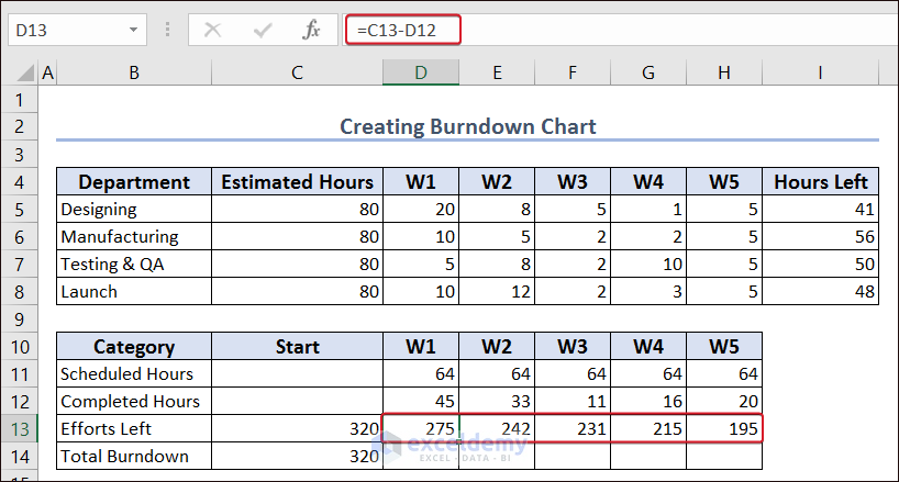
- To calculate the total burndown for each week separately, use:
=C14-D11- AutoFill the rest of the range.
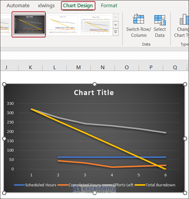
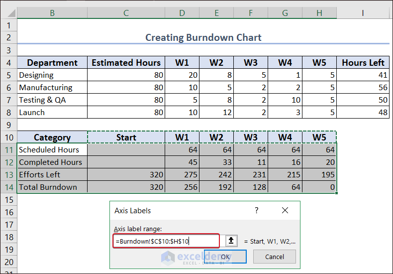
- To create a line chart, go to Table-2 and select B11:H14.
- In Insert, choose Charts.
- Click Insert Line and Area Chart and choose Line Chart.

- Change the chart design in Chart Design.
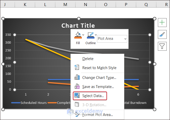
- Right-click keeping the cursor on the chart, and select Select Data… .
- Click Edit in Select Data Source.
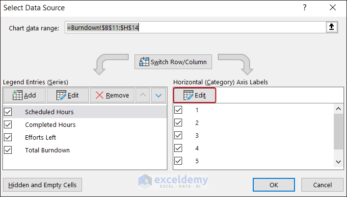
- In Axis Labels, select $C$10:$H$10 and click OK.
- To insert the Scheduled Hours and Completed Hours columns to Clustered Column, select a chart line and right-click.
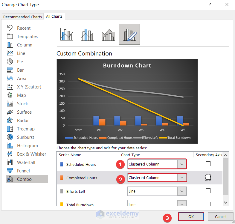
- Select Change Series Chart Type….
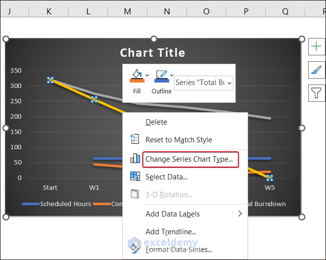
- Select Clustered Column in Chart Type for Scheduled Hours and Completed Hours and click OK.
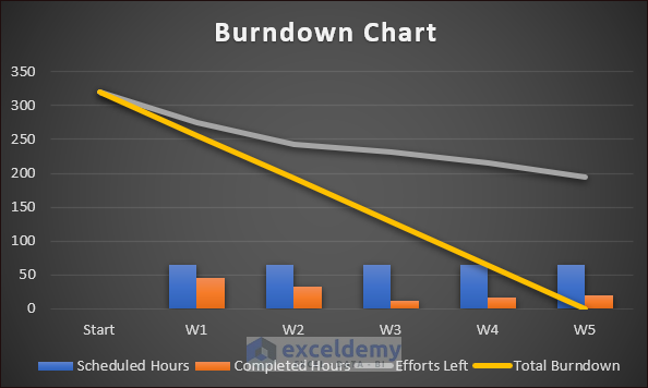
This is the Burndown Chart.
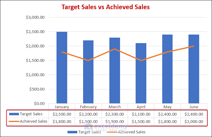
Example 22 – Excel Chart With Data Table
- A chart with Target Sales vs Achieved Sales was already created.
- To add a data table to that chart, select it.
- Click Chart Elements and check Data Table.
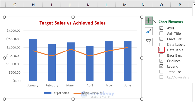
This is the output.
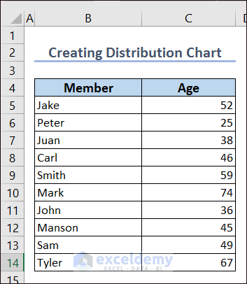
Example 23 – Distribution Chart
- The dataset shows the names of club Members and their Ages.
- Add a column for the bins, here, Age Bracket 1.
- The Age value starts at 25, so set the starting value of the bin to 20. Choose a Bin Size of 10.
- Enter the expression below in E8 and AutoFill the column.
=E7+$G$4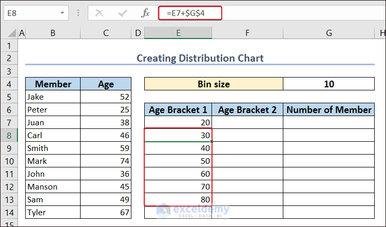
- Calculate the first value in Age Bracket 2 with the following formula
="<="&E7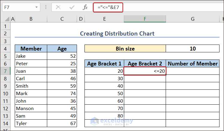
- Use the following formula in F7 and AutoFill the column.
=E7+1&"-"&E8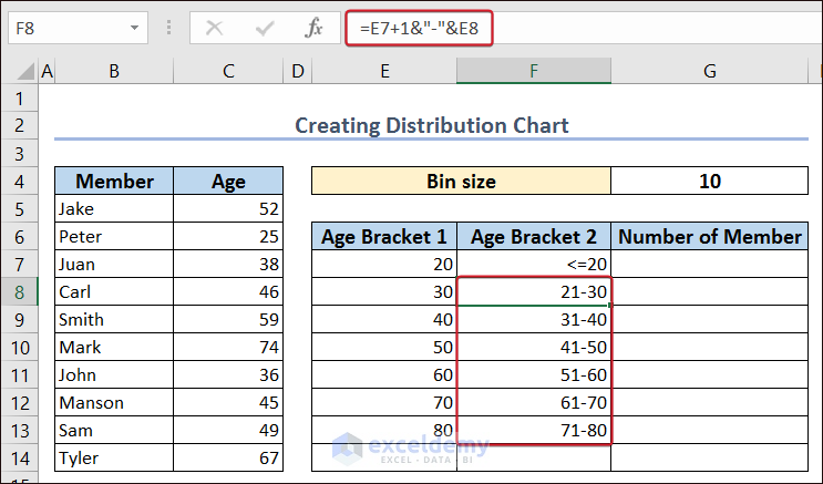
- Enter the following formula in F14.
=">="&E13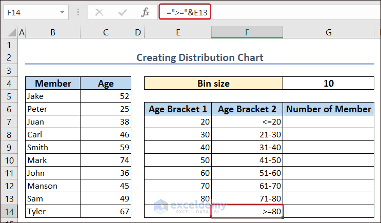
- Add the frequency column with the header Number of Member and enter this formula.
=FREQUENCY(C5:C14,E7:E13)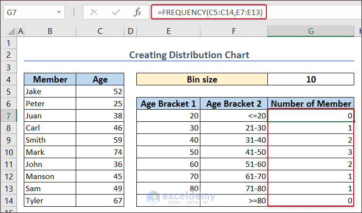
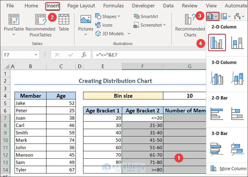
- Select the Age Bracket 2 and the Number of Member columns.
- Go to Insert >>> Insert Column or Bar Chart >>> Clustered Column.
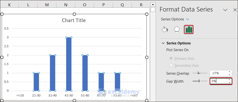
- Double-click any of the bars to open the Format Data Series window.
- Set the Gap Width to 0%.
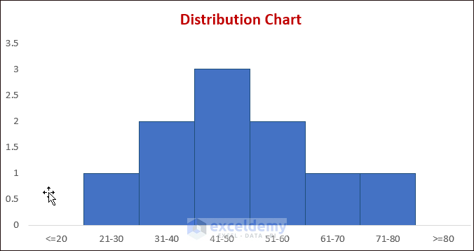
This is the distribution chart.
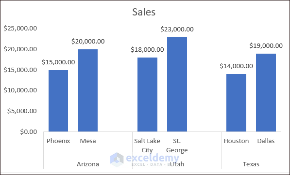
Example 24 – Comparison Chart In Excel
- Create a dataset by merging the same states and adding a blank row.
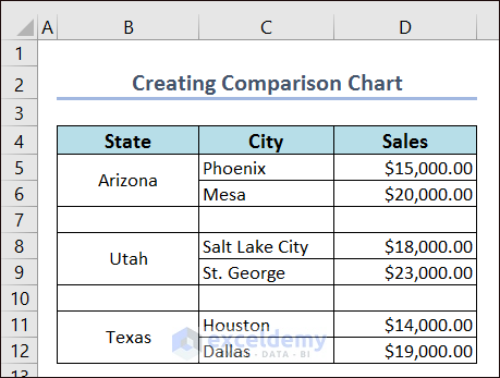
- Select the whole dataset.
- Go to the Insert tab >> Insert Column or Bar Chart >> Clustered 2-D Column.
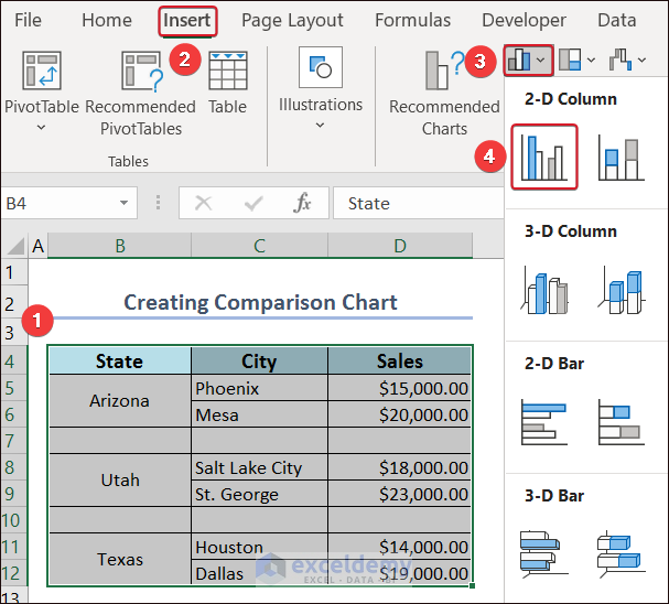
- Remove the gridlines and add data labels.
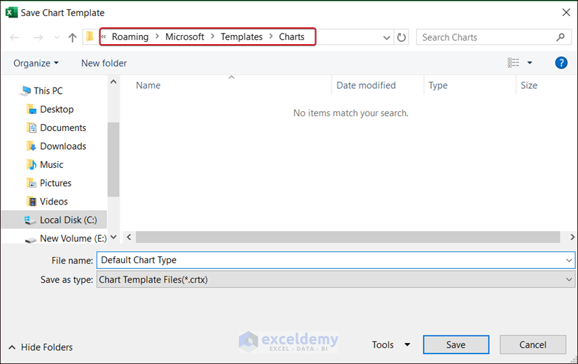
How to Save a Chart Template in Excel
- Select a chart and right-click.
- Click Save as Template…
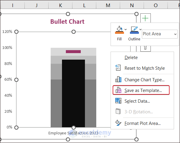
- Save it on your computer.
Things to Remember
- The Pareto analysis only looks at past data. So, it’s important to keep updating data.
Frequently Asked Questions
Q1. Why is text placement used in the Milestone chart?
Text Placement is often used in the Milestone chart to have the equal length of columns on both sides of the main axis.
Q2. How to use a customized template for a chart?
After creating a chart, right-click it and select Change Chart Type. In Templates, you will be able to use the customized templates.
Q3. What is the Difference Between a Histogram and a Pareto Chart?
A Pareto chart is like a histogram, but instead of showing the bins in order of size, they are arranged from the most frequent to the least frequent.
<< Go Back to Excel Charts | Learn Excel
Get FREE Advanced Excel Exercises with Solutions!

The positive percentage error bars on your Dynamic Column Chart with Slicers are done incorrectly. They should start even with the preceding green bars, but they start higher than that, at the top of the (hidden) orange bars. You should use the Variance column (E5:E10) as the values for the negative error bars and zero for the positive error bars.
Dear Jon Peltier
Thanks for your invaluable feedback and suggestions! You are correct about the positive percentage error bars being inserted incorrectly. Based on your suggestions, we have updated the article section.
Regards
ExcelDemy
Is there way to create a single bar chart horizontal with two values Active an Inactive or 1 and 0 which is displayed with different color and x axis it time value ?
So the bar graph shows Active an Inactive status depending on time flow.
Hello JM Kim,
Here, created a single bar chart horizontal with two values Active an Inactive or 1 and 0 which is displayed with different color and x axis it time value.
Download the Excel File: Single Horizontal Bar Chart Showing Active Inactive Status.xlsx
Regards
ExcelDemy