Download Practice Workbook
What Is Burndown Chart in Excel?
A burndown chart is used to monitor the amount of work accomplished over time. It is frequently used in agile or iterative software development strategies like Scrum. Although a burndown chart is not created in Excel by default, you can build one using Excel’s graphing features.
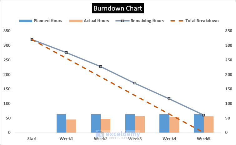
In a burndown chart, the horizontal axis indicates time, often in iterations or sprints, while the vertical axis shows the amount of work still to be done. The chart begins with the entire estimated work for the project and plots the remaining work at regular intervals to demonstrate progress.
Step 1 – Organizing the Dataset
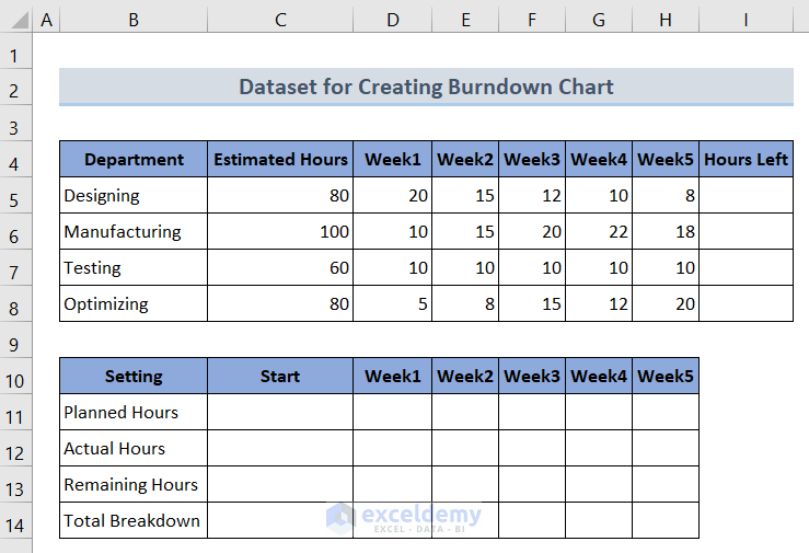
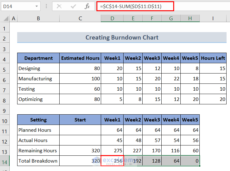
We have a sample dataset consisting of 5 weeks of scheduled hours for a company. The dataset includes two tables. The first table displays the actual data that was gathered throughout the course of the five weeks, while the second table serves as the framework for the graph.
Click the image for a detailed view.
In the Setting column, the Planned Hours row illustrates the weekly time allotment to departments, the Actual Hours row shows the amount of time spent finishing particular project components. The Remaining Hours row shows how many hours are left to accomplish the full project, and the Total Breakdown shows how much time is left to complete the project by the deadline.
Step 2 – Preparing Sprint Timeline for Given Dataset
To create the burndown chart, we need to calculate the totals of the elements in the Setting column using the SUM function.
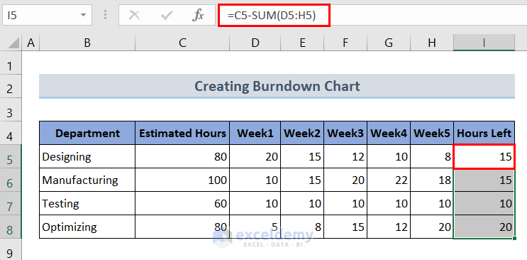
- Hours Left: Calculate the total number of hours over 5 weeks and subtract it from the total estimated hours. In cell I5, enter the formula:
=C5-(SUM(D5:H5))- Drag the Fill Handle icon to apply the formula for the remaining departments.
You can click the image for a detailed view.
- Calculate the total hours left to complete the project. For this, enter the following formula in cell C13.
=SUM(C5:C8)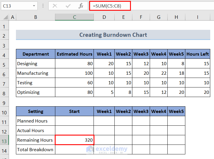
Click the image for a detailed view.
- In cell C14, enter the same formula as cell C13 to calculate the total estimated hours.
=SUM(C5:C8)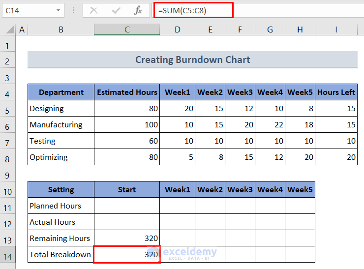
You can click the image for a detailed view.
- To calculate the Planned Hours for each week, add up the initial estimates for each task and divide the sum by the number of weeks. In cell D11, enter the formula below:
=SUM($C$5:$C$8)/5- Drag the Fill Handle to copy the formula across cells E11:H11.
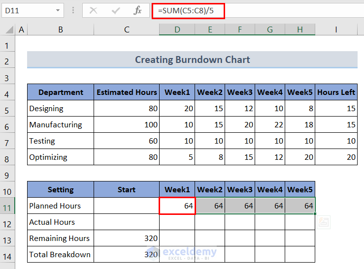
Click the image for a detailed view.
- To calculate the Actual Hours for each week, sum up the completed hours for each week. Enter the following formula in cell D12:
=SUM(D5:D8)- Drag the Fill Handle tool rightward to copy the formula to the remaining cells E12:H12.
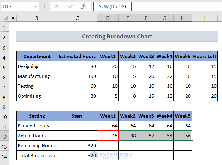
You can click the image for a detailed view.
- To determine the Remaining Hours, subtract the actual hours from the total estimated hours. For this, enter the following formula in cell D13:
=$C$13-SUM($D$12:D$12)- To copy the formula to the remaining cells E13:H13, drag the Fill Handle tool rightward.
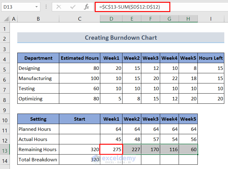
Click the image for a detailed view.
- To calculate the Total Breakdown, which represents the ideal trend of hours needed each week, enter the formula below in cell D14:
=$C$14-SUM($D$11:D$11)- Drag this formula across cells E14:H14 using the Fill Handle tool.
Click the image for a detailed view.
Step 3 – Creating a Line Chart
- Select all the data in the second table (cells B11:H14).
- Go to the Insert tab.
- Click on the Insert Line or Area Chart icon and choose Line Chart.
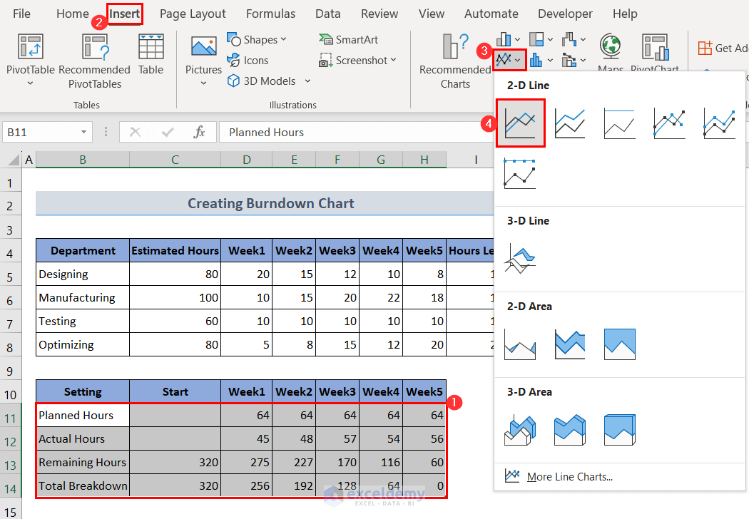
You can click the image for a detailed view.
Step 4 – Changing Horizontal Axis Labels
- A line chart will appear on the worksheet.
- We will set up a timeline on the horizontal axis. For this, click on the horizontal axis labels and right-click on it. Go to the Select Data option.
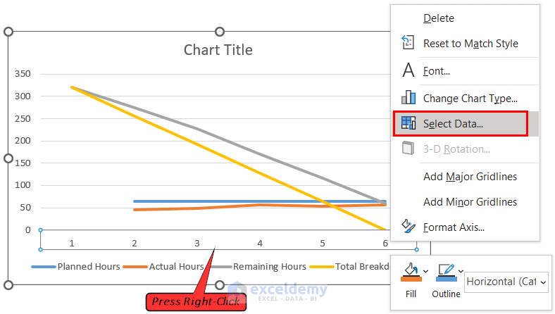
Click the image for a detailed view.
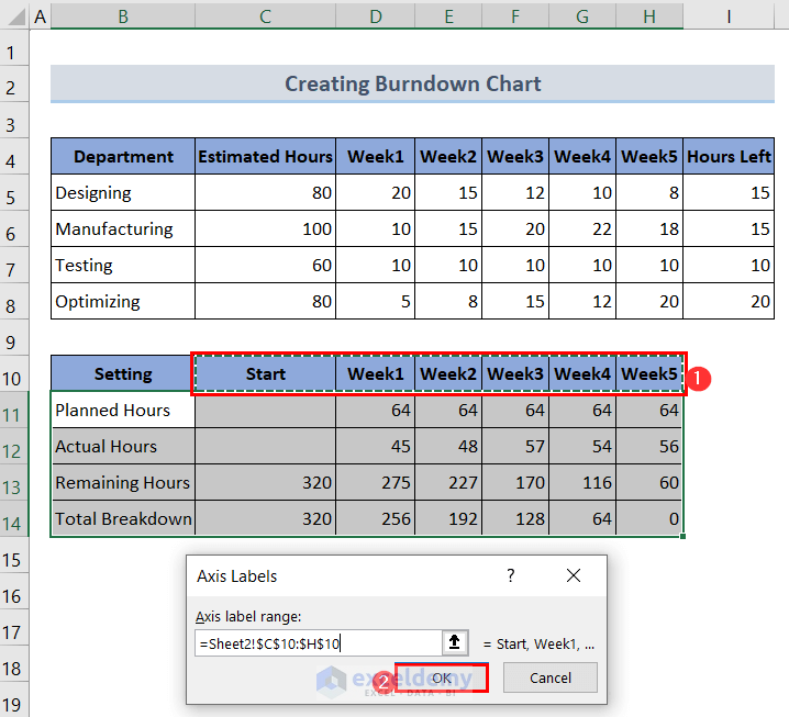
- It will open a dialog box titled Select Data Source. In the Select Data Source menu, click on the Edit button under Horizontal (Category) Axis Labels.
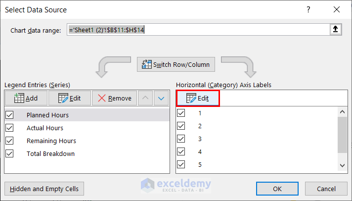
- In the Axis Labels dialog box, select the range $C$10:$H$10 and click OK.
Step 5 – Altering Default Chart Type
- To transform the planned and actual hours data series into a clustered column chart, right-click on either the Planned Hours or Actual Hours line on the chart and select Change Series Chart Type.
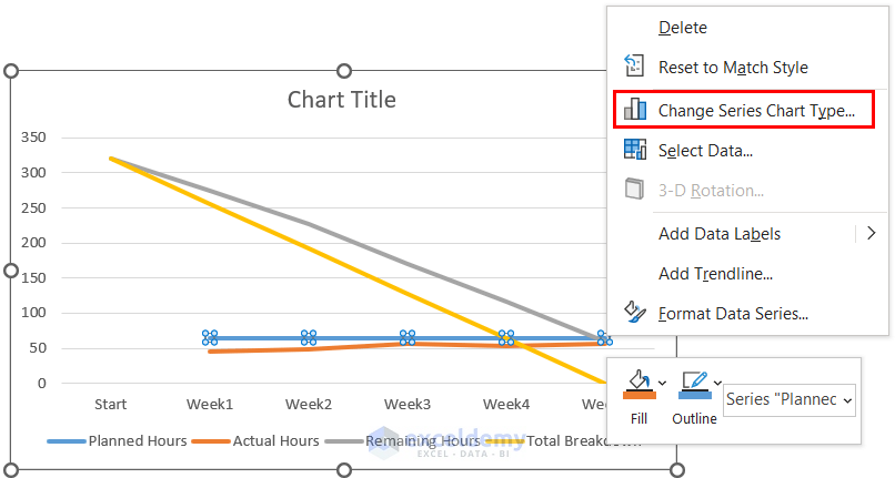
Click the image for a detailed view.
- In the Combo tab, change the Chart Type to Clustered Column for both series. Check the Secondary Axis box and click OK.
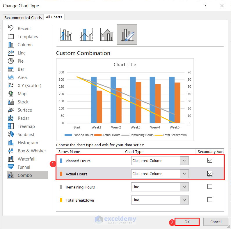
You can click the image for a detailed view.
Step 6 – Modifying Scale of Secondary Axis
- To reduce the size of the clustered columns, right-click on the secondary axis labels and go to Format Axis.
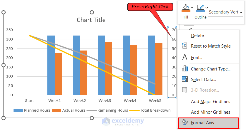
Click the image for a detailed view.
- In the Axis Options group, under Bounds, set the Maximum value to 350.
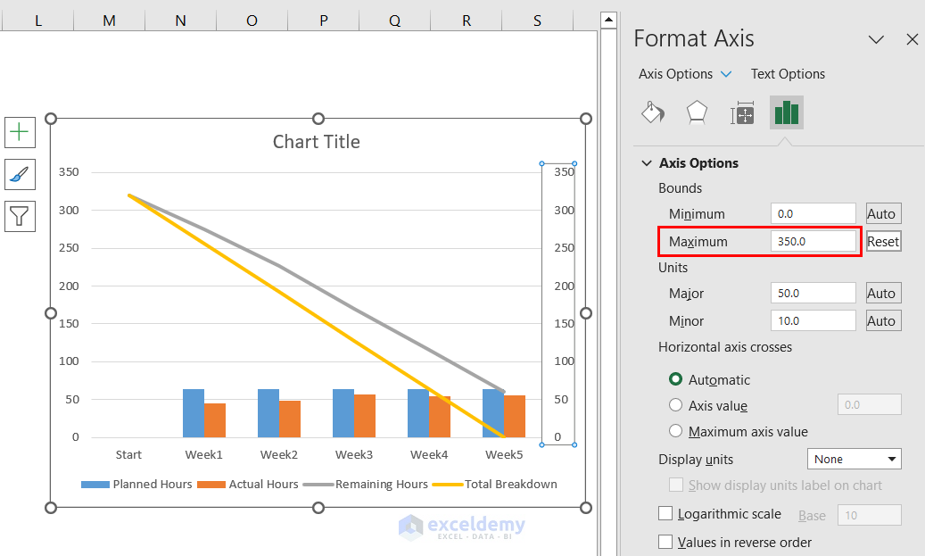
Click the image for a detailed view.
Step 7 – Customizing Burndown Chart
- To customize the solid line representing the Total Breakdown, right-click on it and select Format Data Series.
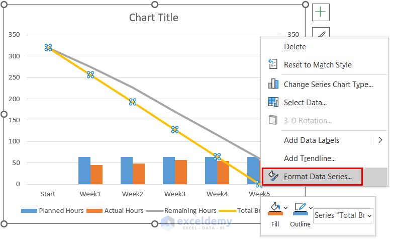
You can click the image for a detailed view.
- In the Format Data Series task pane, go to the Fill & Line Choose dark orange for the Line Color and select Dash for the Dash type.
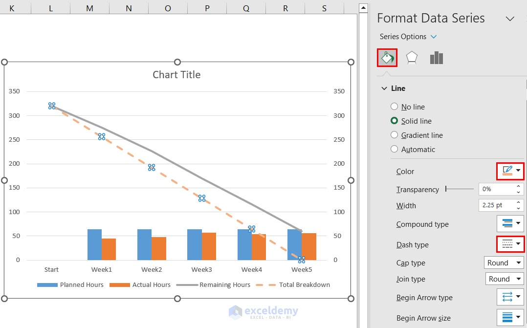
Click the image for a detailed view.
- Format the line representing the remaining effort by selecting the series, right-clicking on it, and selecting Format Data Series.
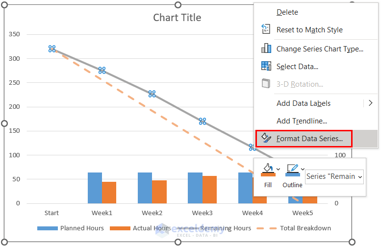
Click the image for a detailed view.
- In the Format Data Series task pane, go to the Fill & Line tab, and click on the Marker icon to customize the marker type and size.
- Under Marker Options, choose Built-in and customize the marker type and size. Choose a color for the marker type.
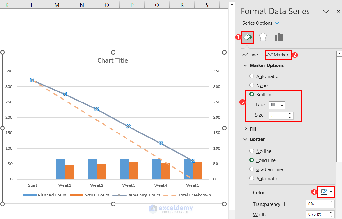
You can click the image for a detailed view.
- We will get our desired burndown chart.
Click the image for a detailed view.
Read More: How to Create a Burndown Chart in Excel
Frequently Asked Questions
1. What are the limitations of the burndown chart?
Burndown charts do not update automatically, so it will not reflect the latest progress unless you update it yourself. Manually entering data can be time-consuming and prone to errors.
2. What can I use instead of a burndown chart?
A burnup chart may be used to track and illustrate the progress of a project instead of a burndown chart. The burnup chart functions as the opposite of the burndown chart. It displays the total amount of work finished over time. It gives a precise view of the whole task scope and the percentage of it that has been completed.
3. What is the Gantt chart vs. the Burndown chart?
A Gantt chart shows tasks and dependencies on a timeline. A burndown chart displays the quantity of work that remains as time passes. Gantt charts focus on scheduling, whereas burndown charts show progress.
Burndown Chart in Excel: Knowledge Hub
- How to Create Sprint Burndown Chart in Excel
- How to Create Budget Burndown Chart in Excel
- How to Create a Burn-up Chart in Excel
<< Go Back to Excel Charts | Learn Excel
Get FREE Advanced Excel Exercises with Solutions!
