What Is a Gantt Chart?
A Gantt Chart is a visual representation of tasks over time, allowing us to track progress and manage project timelines.
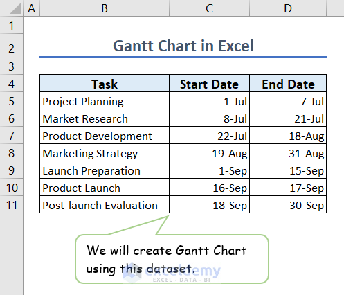
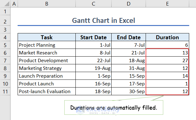
Dataset Overview
We’ll use the following dataset containing the task names, start and end dates of each task to create and customize the Gantt Chart.
Step 1 – Data Preparation
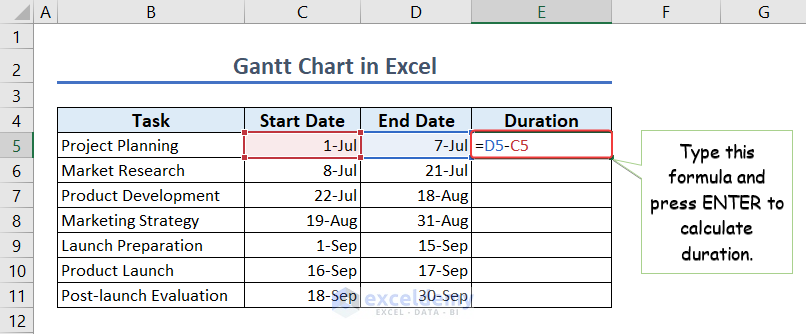
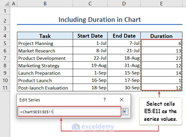
- Calculate the duration of each task by subtracting the start date (Column C) from the end date (Column D).
- In cell E5, enter the formula:
=D5-C5- Press ENTER.
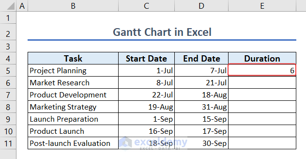
- We will get the duration of the task.
- Autofill this formula for all tasks by double-clicking the AutoFill icon in cell E5.
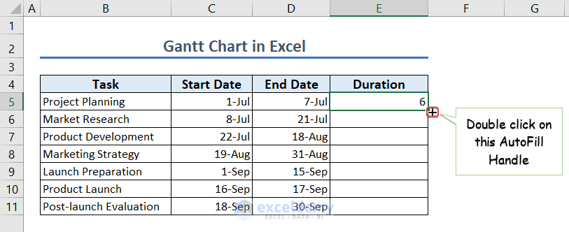
- The duration of all tasks will automatically be calculated.
Step 2 – Inserting a Stacked Bar Chart
- Select cells C4:C11 (the start dates).
- Go to the Insert tab and choose Stacked Bar Chart.
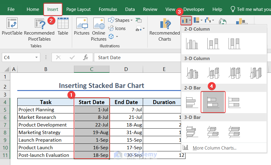
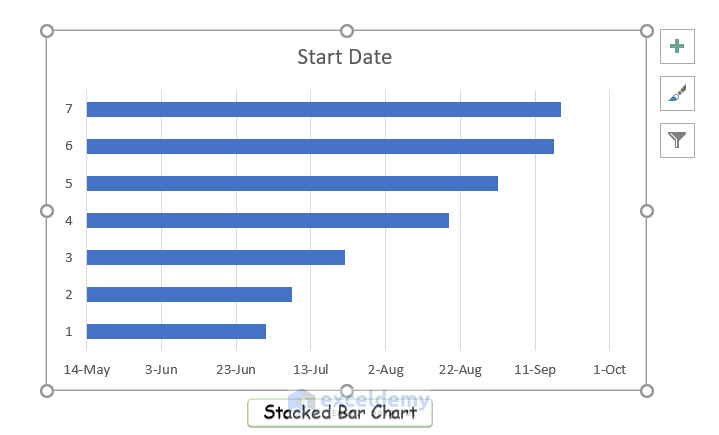
- This will create a Stacked Bar Chart representing the start dates.
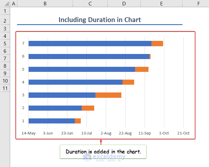
Step 3 – Adding Duration to the Chart
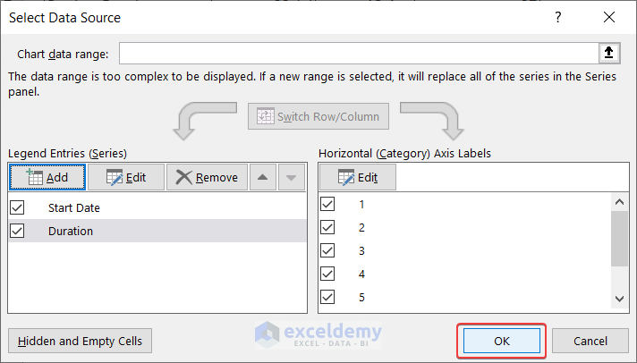
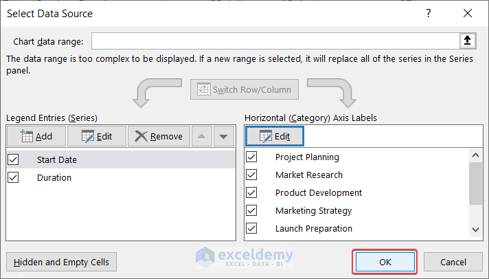
- Right-click on the chart area and choose Select Data.
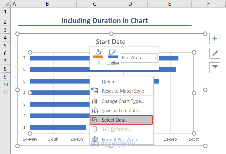
- Click Add and enter Duration as the series name.
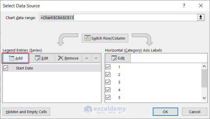
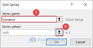
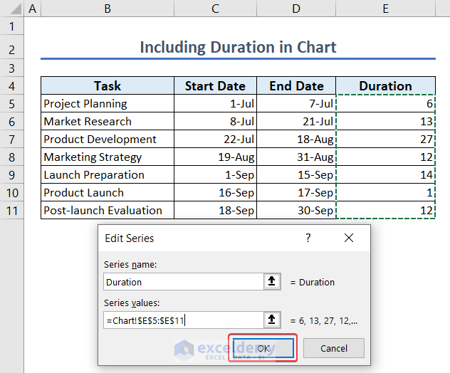
- Select cells E5:E11 as the series values and click OK.
- The Edit Series window will reappear.
- Click OK.
- Click OK on the Select Data Source window.
- The duration will be added to the chart.
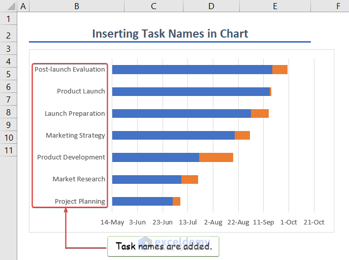
Step 4 – Inserting Task Names
- Right-click on the chart area and choose Select Data.
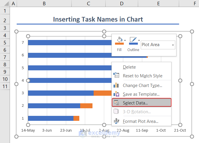
- Select the Start Date series and click Edit.
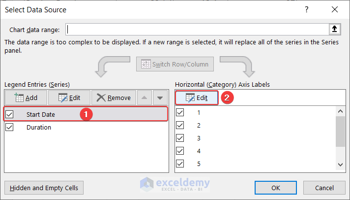
- Set the axis label range to cells B5:B11 (the task names) and click OK.
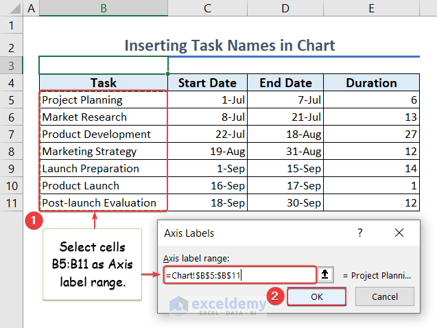
- The task names are added to the chart.
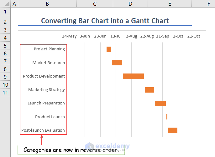
Step 5 – Converting to a Gantt Chart
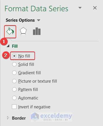
- Right-click on a blue bar in the chart and select Format Data Series.
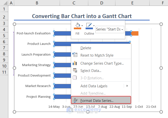
- In the Fill & Line options, choose No fill to hide the blue bars.
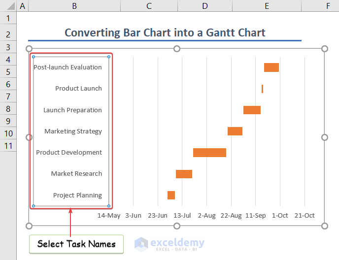
- Rearrange the task names in reverse order by selecting them and adjusting the axis options.
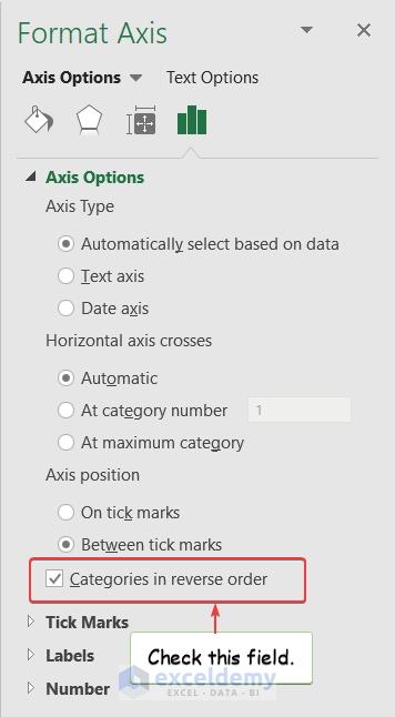
- In the axis options, select Categories in reverse order.
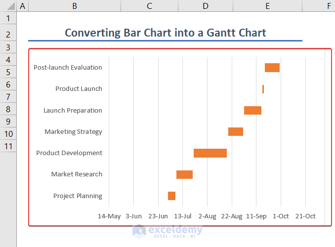
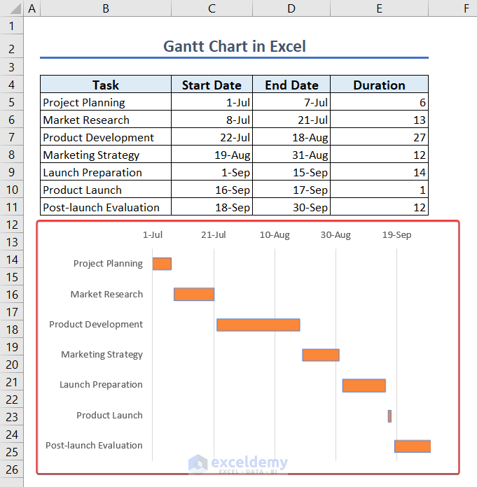
- Below is our Gannt Chart.
Step 6 – Modifying the Gantt Chart
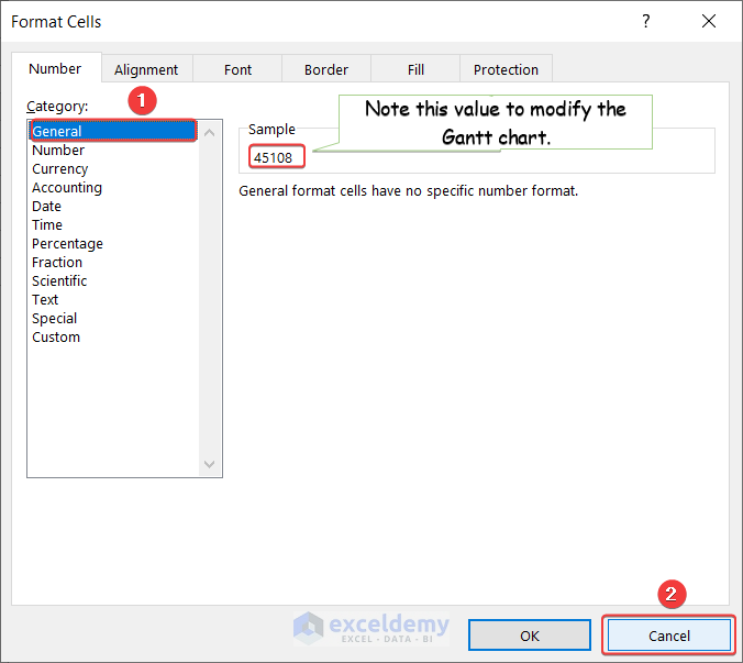
- Click on the first date (cell C5) and go to More Number Formats.
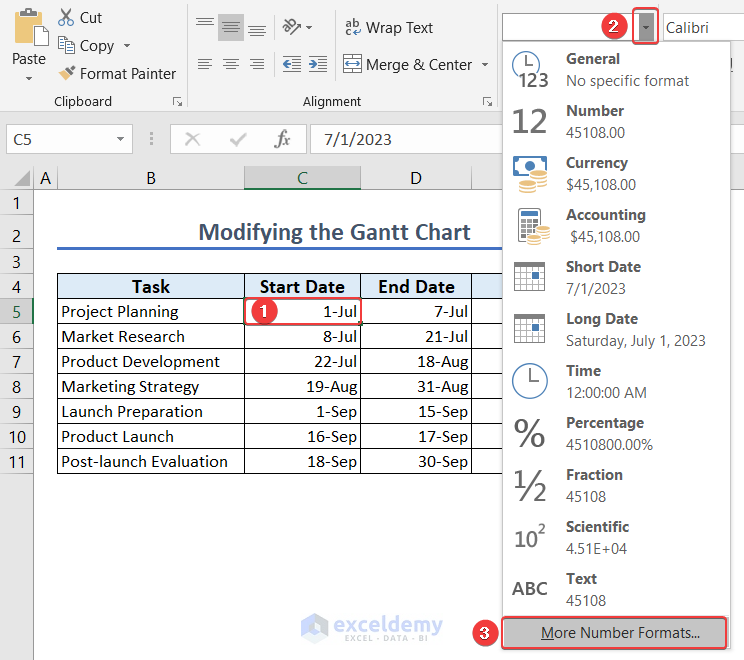
- Select the General category to view the numeric value (e.g., 45108) representing the date.
- Repeat this for the last date (cell D11, value 45199).
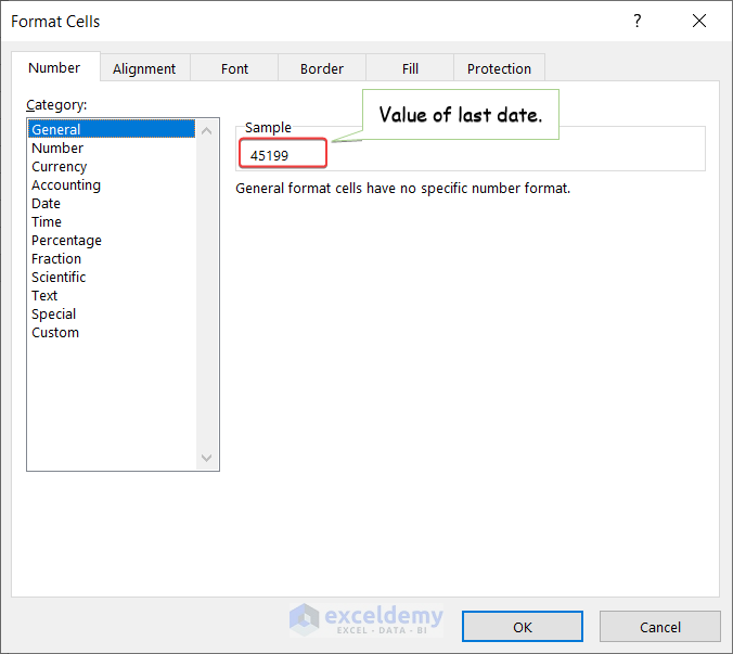
- Modify the axis options with these values to adjust the date display.
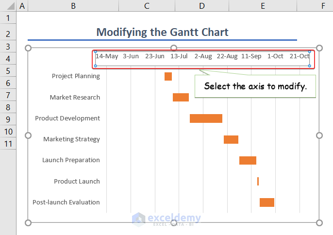
- In the Axis Options, type the noted values (45108 & 45199).
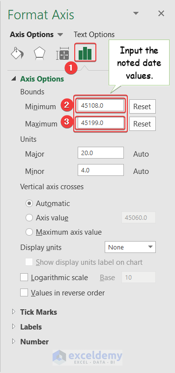
- And there you have it—a customized Gantt Chart!
Read More: How to Make a Gantt Chart in Excel
Pros and Cons of Creating a Gantt Chart in Excel
- Advantages:
- Centralized project information.
- Easy project timeline tracking.
- Disadvantage:
- Older Excel versions lack full Gantt chart support. Consider using a newer version.
- Gantt charts are offline-based, limiting online collaboration.
Things to Remember
While working on the Gantt chart, you should keep the following in mind:
- Sequence tasks logically in your dataset.
- Keep date formats clear and understandable.
- Customize the chart to suit your needs.
Download Practice Workbook
You can download the practice workbook from here:
Frequently Asked Questions
1. How do I create a Gantt chart in Excel?
By following the steps as set out in this tutorial.
2. Is there an Excel Gantt chart template?
- Unfortunately, there’s no built-in Excel Gantt chart template.
- However, you can use the Excel file from this article as a starting point or create your own customized template.
Gantt Chart Excel: Knowledge Hub
<< Go Back to Excel Charts | Learn Excel
Get FREE Advanced Excel Exercises with Solutions!

Nicely done!
Hello David Snipes,
Thanks for your appreciation and feedback. Glad to hear that you liked our article.
Keep exploring Excel with ExcelDemy!
Regards,
ExcelDemy