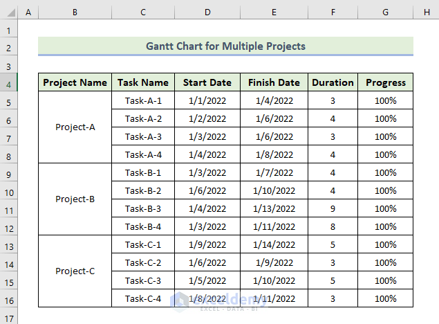
Step 1 – Prepare Your Dataset
In the following image, we can see the basic outlines of the dataset.
- Project Name: Enter the name of each project.
- Task Name: List the different tasks for each project.
- Start Date: Record the start date for each task.
- Finish Date: Note the end date for each task.
- Duration: Calculate the duration by subtracting the start date from the finish date.
- Progress: Indicate the progress status for each task.
Step 2 – Create a Stacked Bar Chart
- Select the range of cells containing your data (e.g., D4:D16).
- Go to the Insert tab and click the drop-down arrow under Column or Bar Chart in the Charts group.
- Choose Stacked Bar Chart.
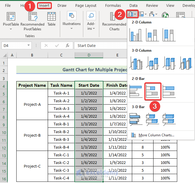
- Adjust the chart width as needed.

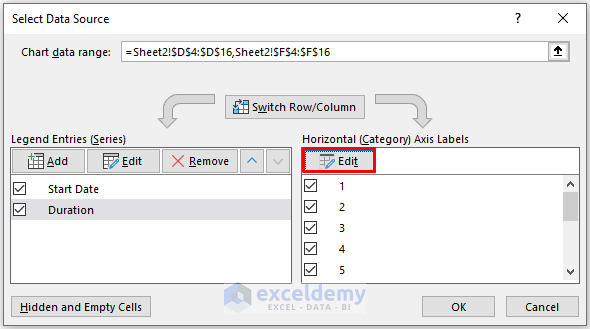
- Right-click on the chart and choose Select Data.
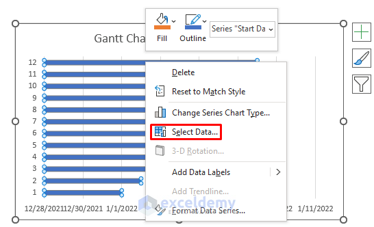
- Click Add to add other data series (X-axis and Y-axis).
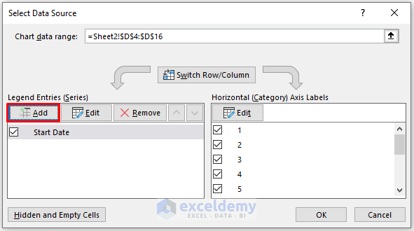
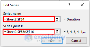
- In the Edit Series window, enter the new data series column name and select values.
- Click OK.
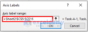
- Click on Edit from the Horizontal (Category) Axis Labels.
- Edit the Horizontal (Category) Axis Labels to use the Task Name column data.
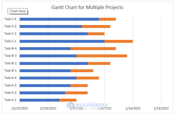
- As a result, you will get the following chart.
Step 3 – Reversing Category Axis Order
- Double-click on the Category Axis (Vertical Axis).
- In the Format Axis task pane, go to the Axis Options tab.
- Select Categories in reverse order.
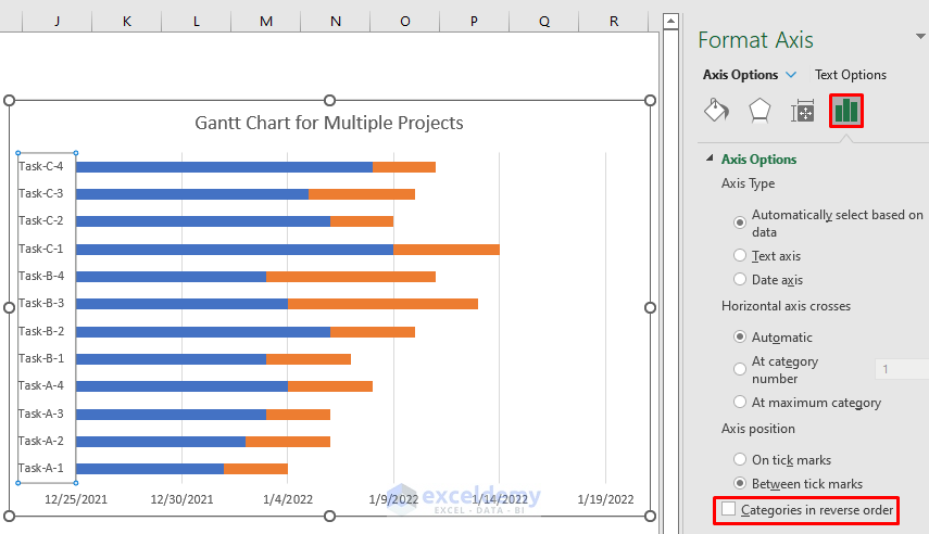
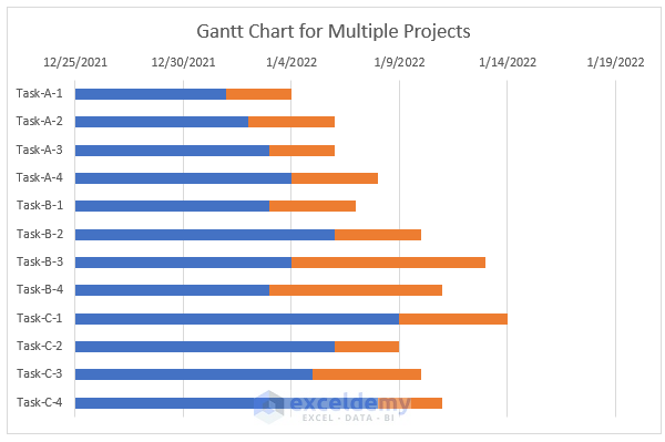
- You will get the following chart.
Step 4 – Adjust Label Position on the Horizontal Axis
- Click the Category Axis again in the Format Axis task pane.
- Under the Axis Options tab, choose High for the Label Position.
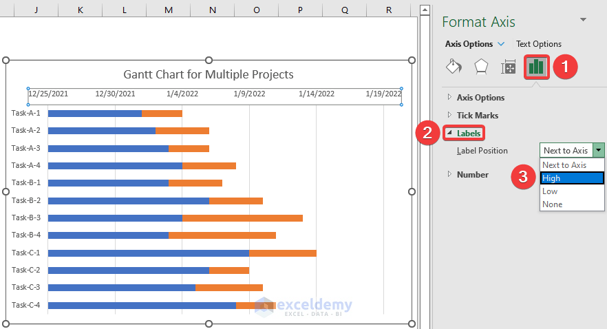
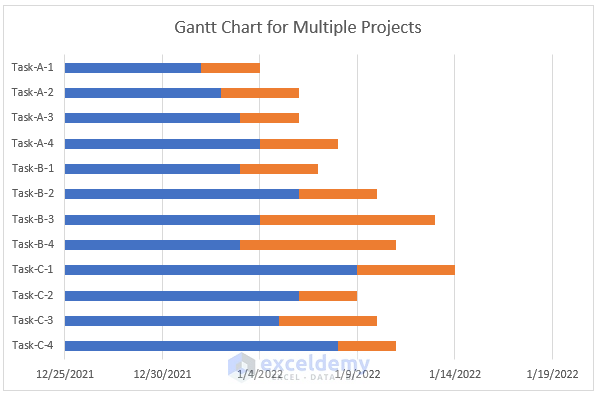
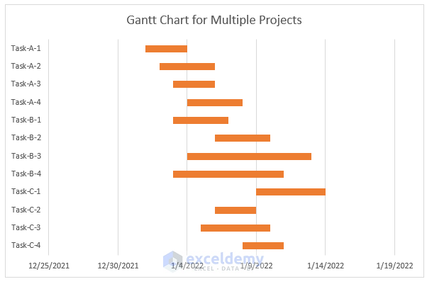
- Your Gantt chart will now display the tasks in the desired order.
- To remove fill color from the bars, select the blue bars, go to the Format Data Series task pane, and in the Fill & Line tab, choose No Fill.
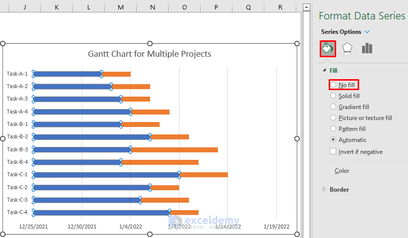
- Here, we already have a Gantt chart.
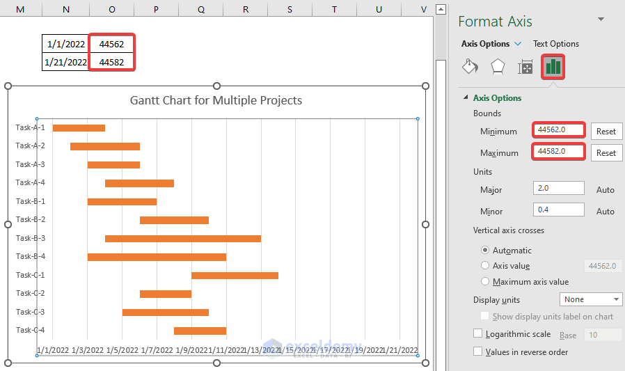
Step 5 – Adjusting the Horizontal Axis
- Minimum Value: Double-click on the horizontal axis to open the Format Axis task pane.
- In the Axis Options, set the minimum value to represent the start date of your first task (e.g., 01/01/2022). The default value (e.g., 44562) corresponds to that date.
- Maximum Value: The maximum value is automatically set, but you can adjust it (e.g., change it to 44582).
- Major Units: Set the major units (e.g., 2) for better readability.
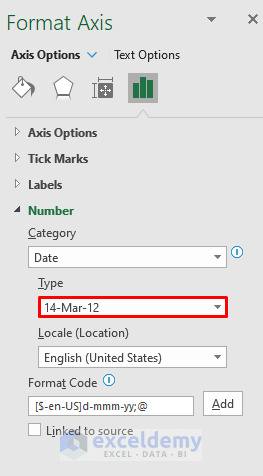
- To format the date display, click on the Number option and choose your desired date format.
- You will get the following Gantt chart.
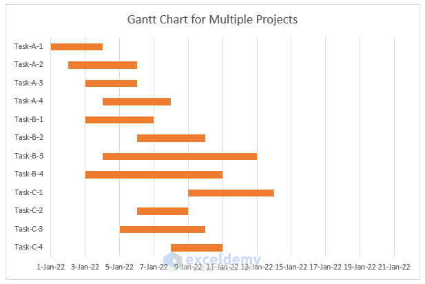
Step 6 – Formatting the Gantt Chart
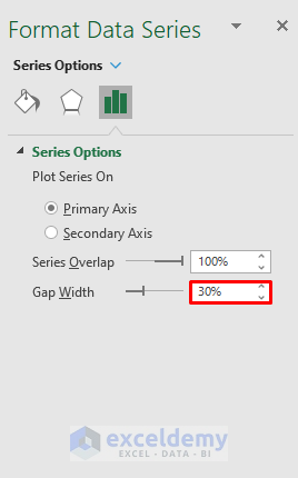
- Select any of the red bars from the Duration data series.
- Click the Format Data Series task pane.
- Under Series Options, adjust the Gap Width value (e.g., 30%) to decrease the gap between bars.
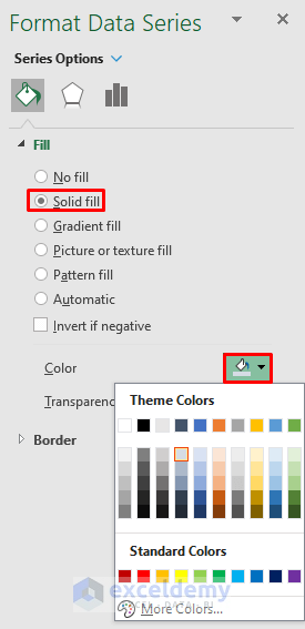
- In the Format Data Series, choose Solid Fill under Fill & Line, and select your preferred color for the data series.
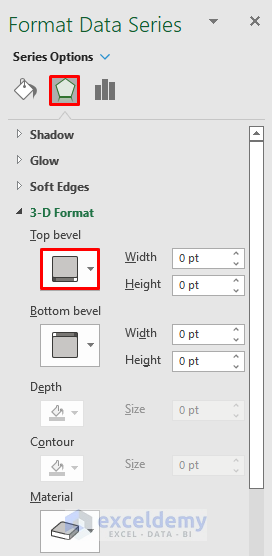
- From the Format Data Series, select 3-D Format, and choose an angle type (e.g., bevel) from the Top Bevel dropdown.
- If you want to display data labels, click the Chart Elements icon (top-right corner) and select Data Labels.
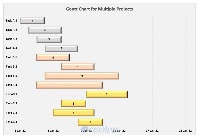
- Customize the Chart Title (e.g., Gantt Chart for Multiple Projects) and adjust its size.
- Optionally, show horizontal grid lines and experiment with background colors and dashed grid lines.
- Your Gantt chart will look polished and ready for use.
Download Practice Workbook
You can download the practice workbook from here:
Related Articles
- Excel Gantt Chart with Conditional Formatting
- How to Create Excel Gantt Chart with Multiple Start and End Dates
- How to Add Milestones to Gantt Chart in Excel
- How to Show Dependencies in Excel Gantt Chart
<< Go Back to Gantt Chart Excel | Excel Charts | Learn Excel
Get FREE Advanced Excel Exercises with Solutions!

How do I change the colour of the fill based on the project? The way this is set up it only lets me change the colour for all at once?
Hello JORDAN,
Greetings. You can easily change the color of the fill based on the project by following the steps below.
First, double-click on the particular task of the specific project in the Gantt chart. Therefore, the Format Data Point window will appear. Next, in the Format Data Point, you have to select Fill & Line and then choose Solid Fill. Then, you have to enter your required color for the data point. You have to follow the same procedure for the other tasks in the specific project. You can alter the fill’s color in accordance with the project in this way.
The steps listed below must be followed if you want to instantly change the Gantt chart’s color.
First, click on the task of any project in the Gantt chart. Therefore, the Format Data Series window will appear. Next, in the Format Data Series, you have to select Fill & Line and then choose Solid Fill. Then, you have to enter your required color for the Data series. Based on the color you enter, this process will create a similar color for the entire Gantt chart.
Hi,
This is exactly what I was looking for. Thank you very much for your article, it’s very helpful.
Dear Raf,
You are most welcome.
Regards
ExcelDemy
Hi,
how could I use this approach to generate something like a projects’ milestones summary graph?
F.e. let’s say Y axis values are names of projects (similar to your tasks), X axis is a timeline (=dates, same as in the above example) and multiple milestones marks are shown in one line of Gant chart per project (= gate 1, gate 2, gate 3 …). So not really a Gant chart as such, but a summary graph.
Ideally I would like this to be a pivot chart that can change depending on slicers filtering the source data.
I’m happy to provide more explanation if need be, just let me know if you can help.
Hi VLAD,
Thanks for your comment. You can checkout this article: How to Add Milestones to Gantt Chart in Excel.
Hope you find this helpful.
Regards,
Rafiul Hasan
Team ExcelDemy