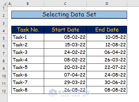
Step 1 – Selecting the Dataset
- Select the dataset.
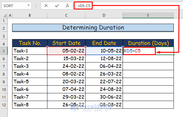
Step 2 – Determining the Duration of Each Task
- To determine the duration of Task 1 in E5, use the following formula.
=D5-C5
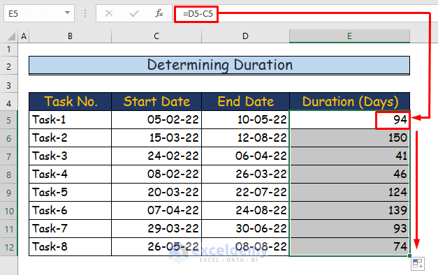
- Press Enter to see the ouput: 94 days.
- Drag down the Fill Handle to see the result in the rest of the cells.
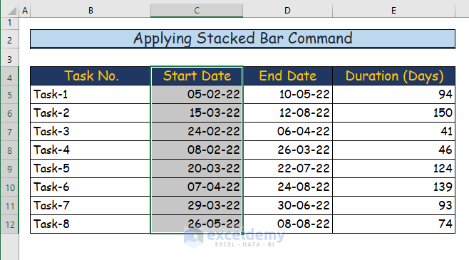
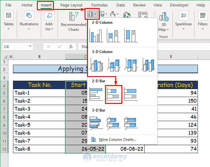
Step 3 – Applying the Stacked Bar Command
- Select C4:C12 (the Start Date column).
- Go to the Insert tab.
- Choose Insert Column or Bar Chart in Charts.
- Choose Stacked Bar in 2-D Bar.
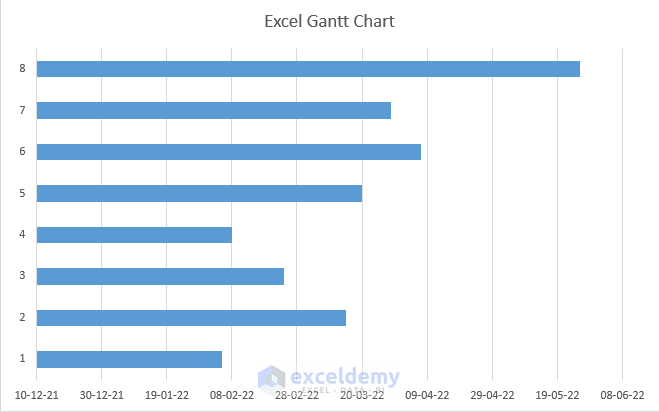
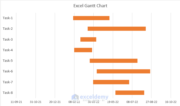
You will see the following chart.
- Name the chart: “Excel Gantt Chart”.
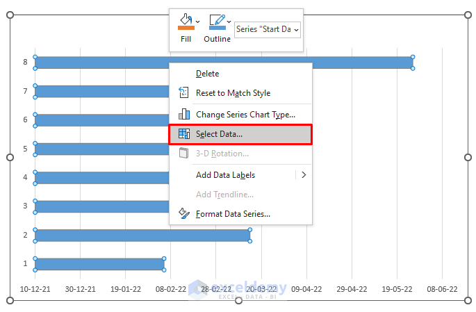
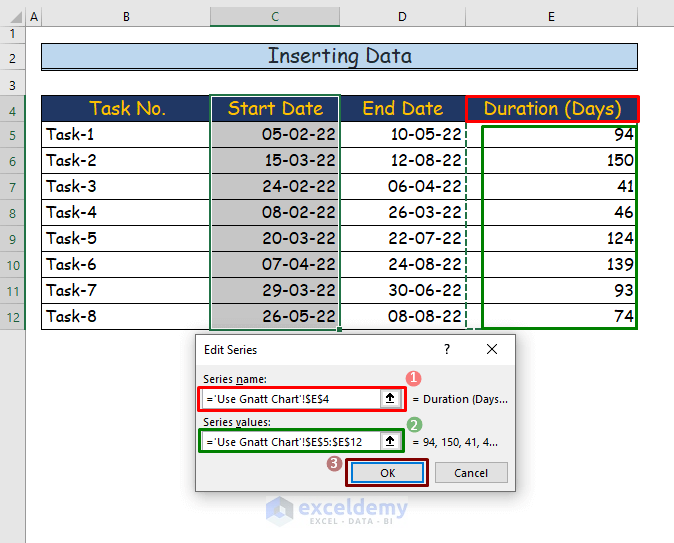
Step 4 -Entering Data into the Stacked Bar Chart
- Right-click the chart and click Select Data.
- In Select Data Source, click Add.
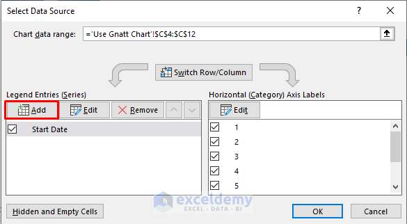
- In “Edit Series”, enter E4 in “Series name”.
- Enter E5: E12 in “Series values”.
- Click OK.
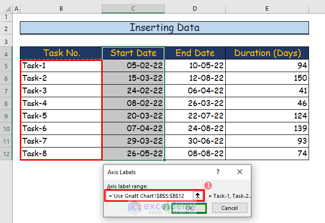
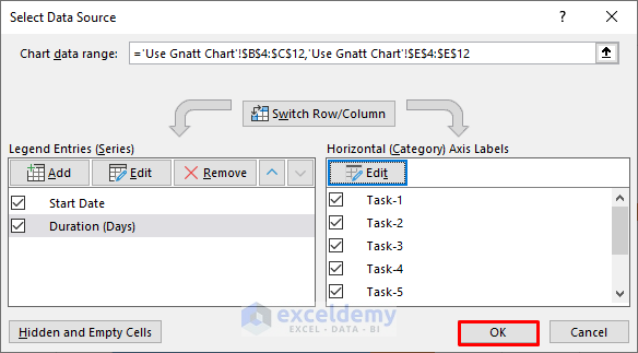
- Click Edit.
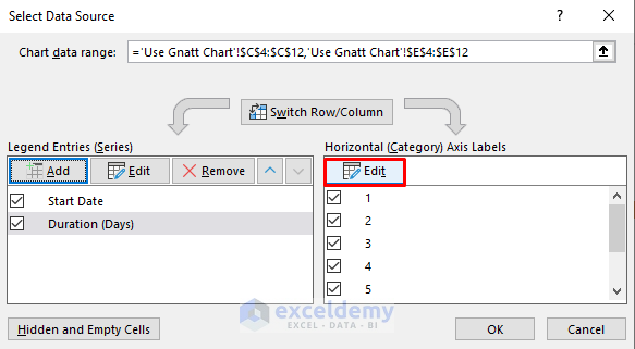
- Select B5:B12 as Axis label range in Axis Labels.
- Click OK.
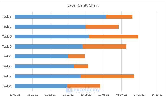
- In the Select Data Source dialog box, click OK.
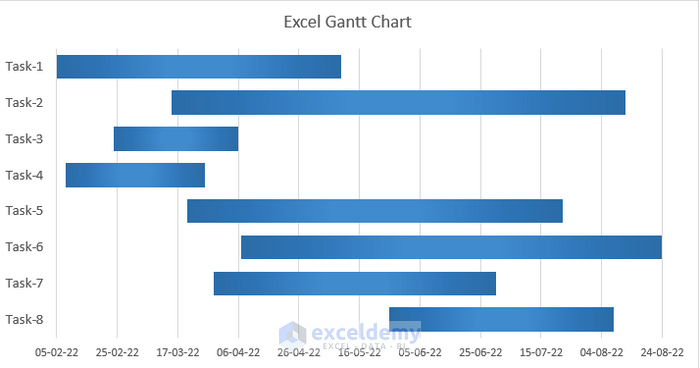
The Gantt chart is displayed.
Step 5 – Arranging Categories in Reverse Order
The task sequences are in reverse order:
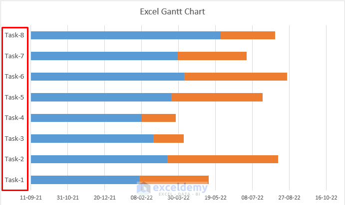
To rearrange the sequence:
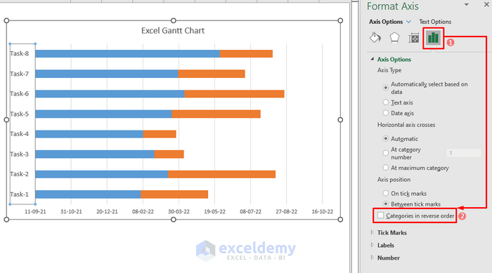
- Double-click the axis.
- in Format Axis, choose Axis Option.
- Check Categories in reverse order.
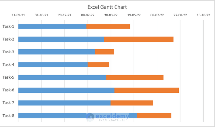
This is the output.
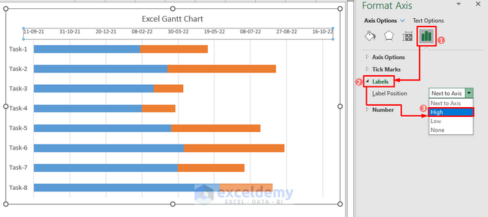
Step 6 – Positioning the Horizontal Axis Label
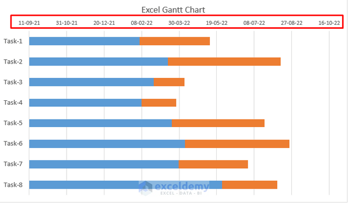
To position the labels in their previous location:
- Double-click the axis label.
- In Format Axis, go to Labels in Axis Options.
- Choose Label Position as High.
This is the output.
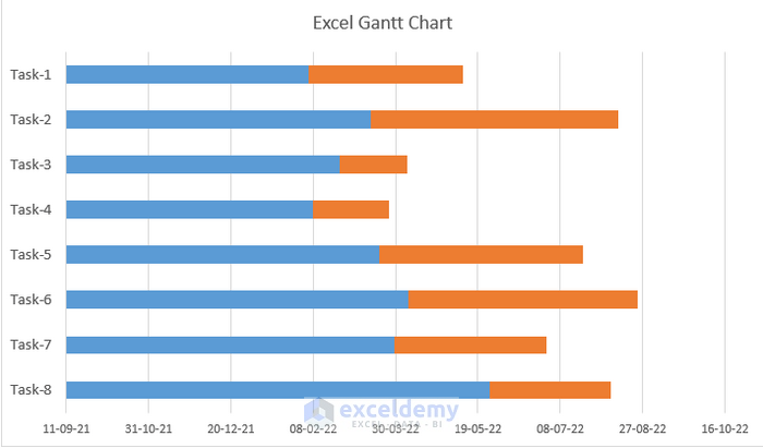
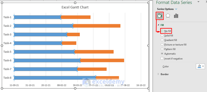
Step 7 – Eliminating the Start Date in the Stacked Chart
- Double-click a blue bar.
- In Format Data Series, choose No fill in Fill & Line.
This is the output.
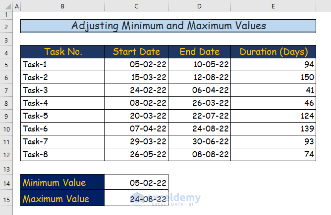
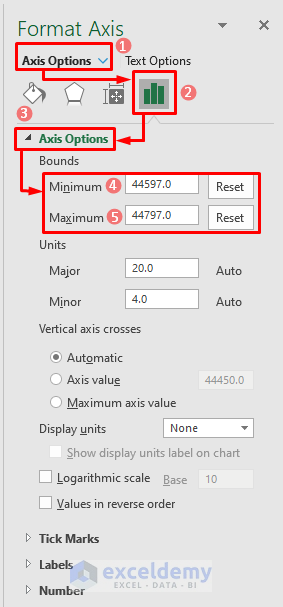
Step 8 – Adjusting the Minimum and Maximum Values in the Horizontal Axis
- Select two cells: C14 and C15 and name them Minimum Value and Maximum Value.
- Find the earliest and the latest date of a task and add the dates.
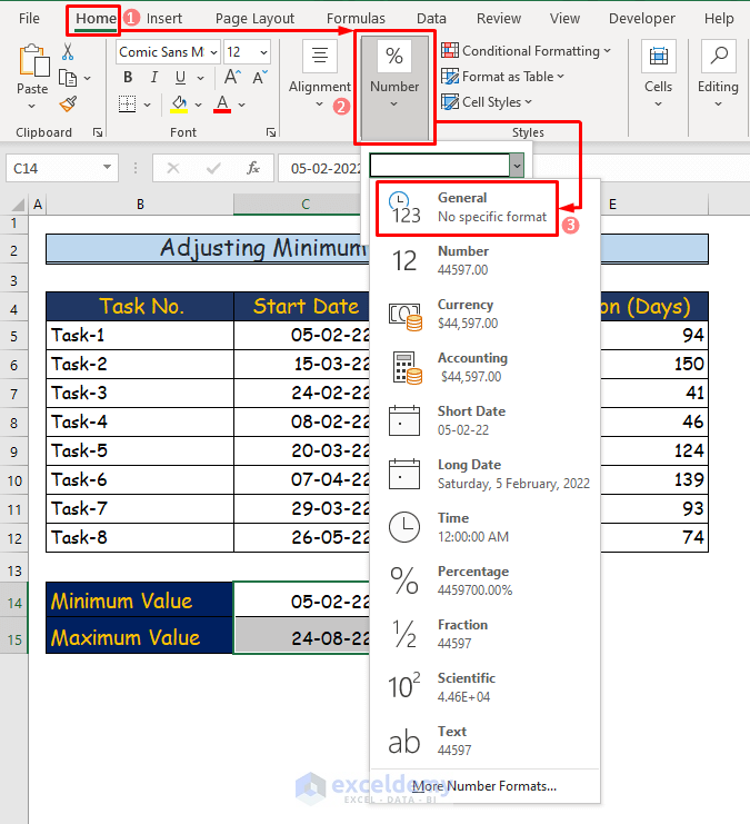
- Go to the Home tab and choose General in Number.
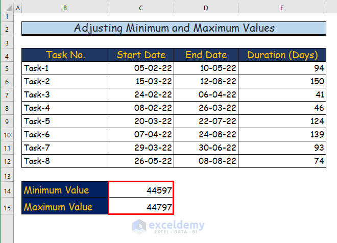
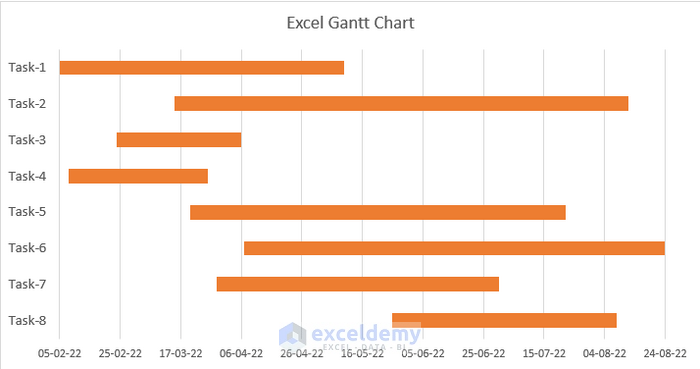
This is the output.
- To adjust the label values in the chart, double-click the horizontal axis label.
- In Format Axis, enter the Minimum and Maximum values manually in Axis Options.
This is the output.
Customizing the Gantt Chart
1. Changing the Gap Width of the Gantt Chart
Step 1:
- Double-click the red bars.
- In Format Data Series, change the Gap Width in Series Options.
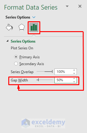
Step 2:
Here, the percentage was decreased.
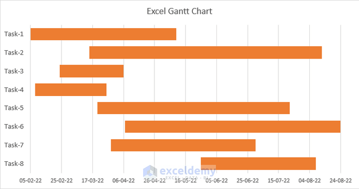
This is the output.
2. Altering Colors and Styles
Step 1:
- Double-click any bar in the chart.
- Go to Fill & Line in Format Data Series.
- Choose Gradient fill in Fill.
- Choose a shade in Preset gradients.
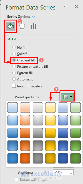
This is the output.
3. Adding Data Labels to the Gantt Chart
Step 1:
- Click the chart and select Chart Elements.
- Select Data Labels.
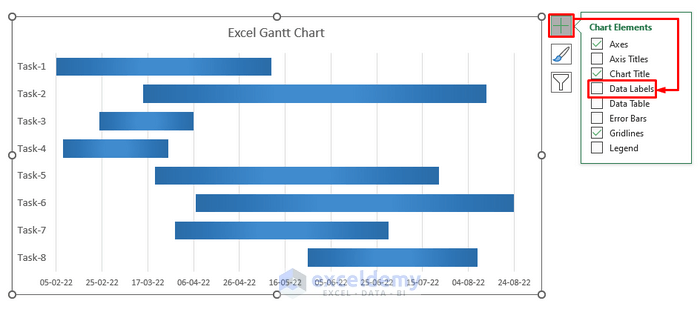
Data labels will be displayed.
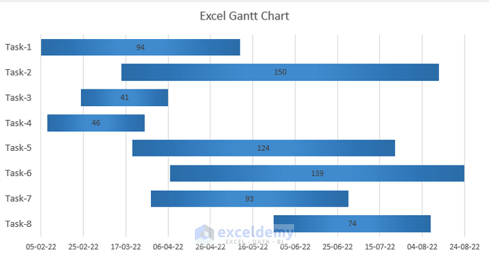
Step 2:
- To customize the data labels, click them.
- In Format Data Labels, choose Fill & Line.
- Select Solid Fill in Fill.
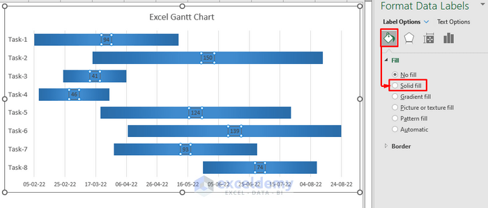
This is the output.

Download Practice Workbook
Related Articles
- How to Create Gantt Chart for Multiple Projects in Excel
- Excel Gantt Chart with Conditional Formatting
- How to Create Excel Gantt Chart with Multiple Start and End Dates
- How to Add Milestones to Gantt Chart in Excel
- How to Show Dependencies in Excel Gantt Chart
<< Go Back to Gantt Chart Excel | Excel Charts | Learn Excel
Get FREE Advanced Excel Exercises with Solutions!
