In this article, we will uncover 7 Excel chart types you probably didn’t know existed.
In this article, we will show how to visualize geographic data using Excel Maps.
In this article, we’ll use a practical example to demonstrate how to create a combination chart and customize visual elements to make your data stand ...
In this article, we'll show how to create clustered and stacked bar charts to visualize complex data in Excel.
What Is a Heatmap? A heat map visually represents data using colors in a two-dimensional or geographic area. Each data point corresponds to a ...
This is an overview: Download Practice Workbook Download the Excel file here. Creating Network Diagram.xlsx What is Network ...
This is an overview. Download Practice Workbook Download the Excel file and practice. Creating Flowchart.xlsx What Is a ...
This is an overview. Download Excel Workbook Data for Chart.xlsx How to Add a Chart in Excel The sample dataset contains ...
This is an overview: Download Practice Workbook Download the practice workbook. Trendline in Excel.xlsx How to Add a ...
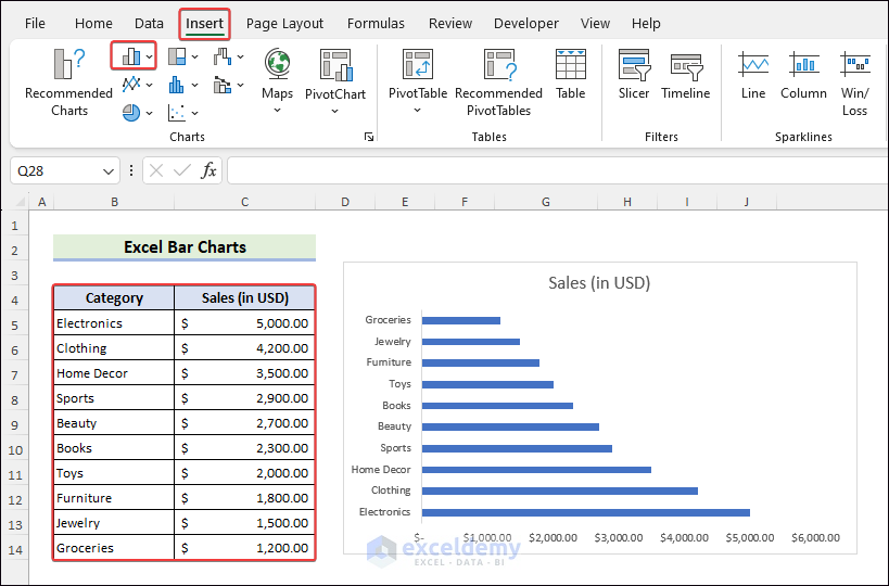
This tutorial will provide an ultimate guide on Excel Bar Chart topics: You will learn to insert a bar chart using features, shortcuts and VBA. ...
We'll use the following sales information dataset when creating a scatter plot and describing what you can do with it. Download the ...
In this Excel tutorial, you will learn how to -Create a thermometer chart/goal thermometer -Create a twin thermometer chart We have ...
This is an overview: Download Practice Workbook Data Bars.xlsx How to Insert Data Bars in Excel? Select data ...
Dot Plot in Excel: Knowledge Hub How to Make a Dot Plot in Excel << Go Back To Excel Charts | Learn Excel
Excel Chart Not Working: Knowledge Hub Excel Plotting Row Number Instead of Value Excel Graph Not Showing All Dates Excel Chart Disappears ...
Advanced Excel Exercises with Solutions PDF