What Is a Heatmap?
- A heat map visually represents data using colors in a two-dimensional or geographic area.
- Each data point corresponds to a color based on its value.
- Colors range from cool (e.g., blue or green) to warm (e.g., red or orange), reflecting data magnitude.
1. Creating a Static Heat Map
1.1 Creating a Heat Map with Default Color Scale
- Select your dataset.
- Go to the Home tab and choose Conditional Formatting.
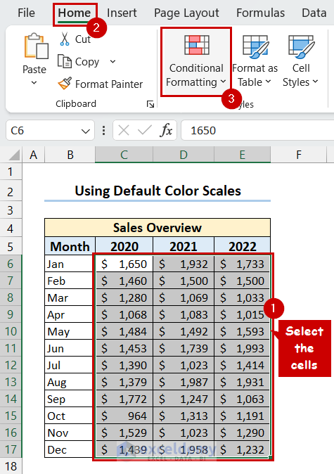
- Select Color Scales and pick your preferred scale.
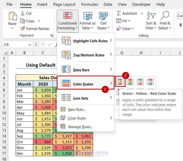
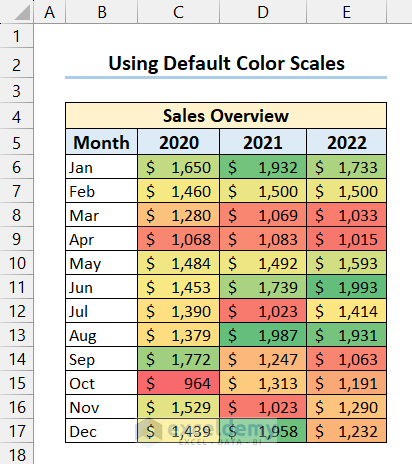
- You will see that you have got your desired heat map.
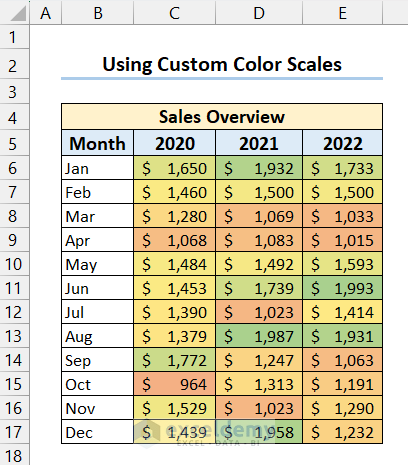
1.2 Creating a Heat Map with Custom Color Scale
- Follow the previous method.
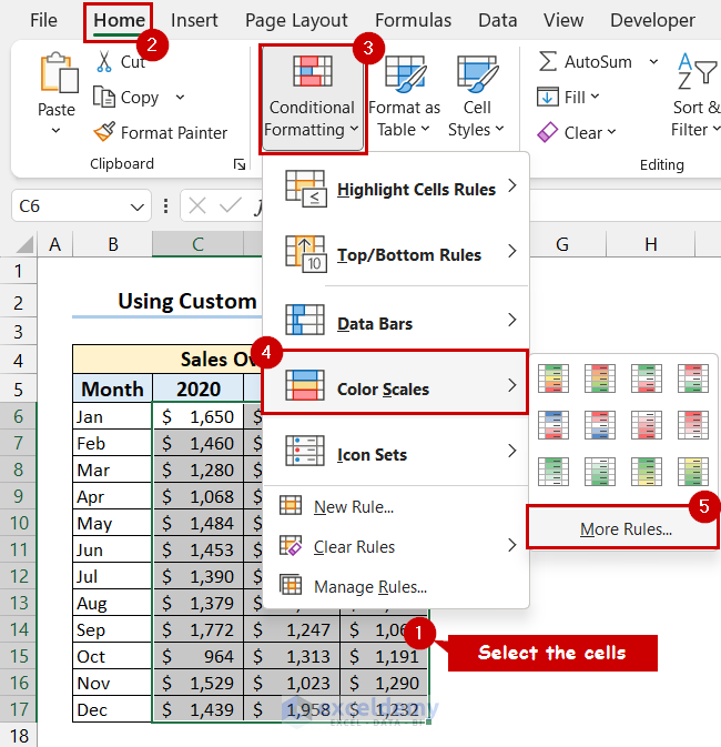
- In the New Formatting Rule dialog, choose Format all cells based on their values.
- Select 3-Color Scale and set colors for minimum and maximum values.
- Press OK.
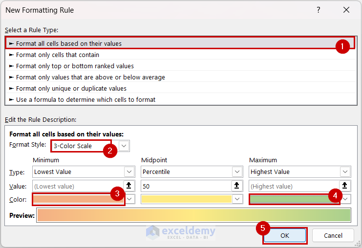
- You will get the heat map with your selected color scale.
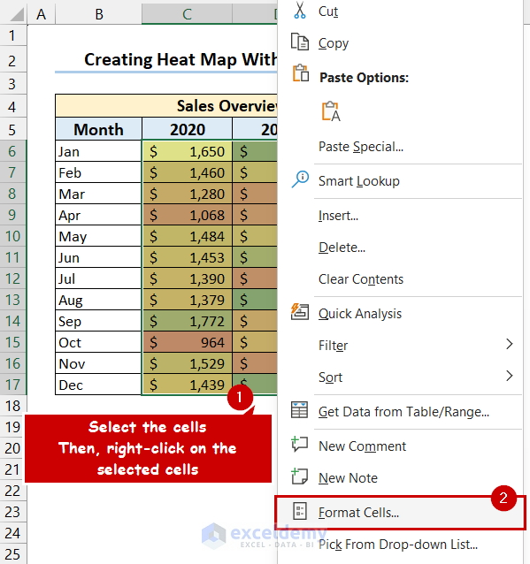
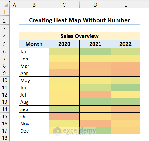
1.3 Creating a Heat Map Without Numbers
- Create a heat map as before.
- Right-click on the selected cells, choose Format Cells, and select Custom format.
- Press OK.
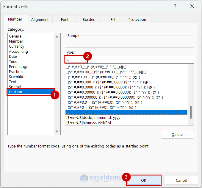
- You will get the heat map without numbers.
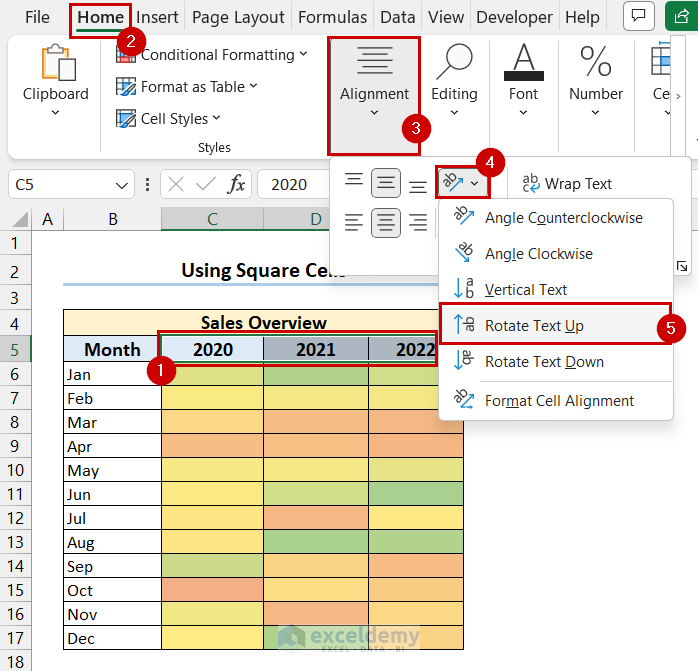
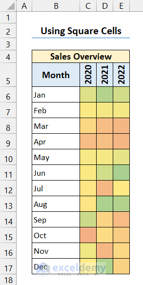
1.4 Creating a Heat Map with Square Cells
- Insert a heat map following the previous method.
- Select the Headers.
- Go to the Home tab and select Alignment.
- Go to select Orientation and select Rotate Text Up.
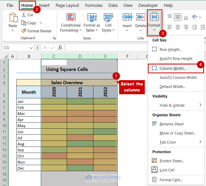
- Select the columns of the heat map.
- Go to the Home tab and select Format.
- From the Cell Size drop-down list, select Column Width.
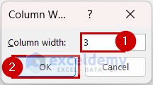
- Adjust column width to 3.
- Select the rows of the heat map and go to the Home tab.
- Select the Cells group, click on Format and select Row Height.
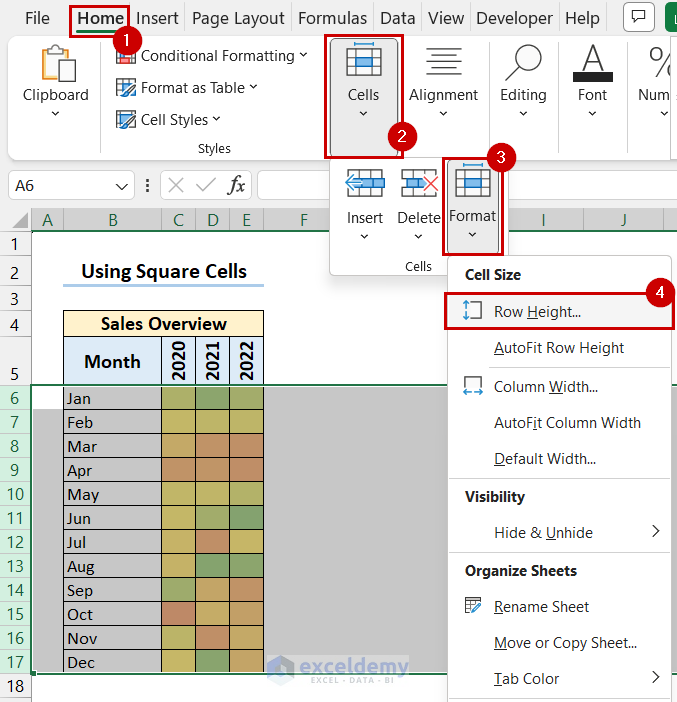
- Adjust the Row height to 19.5.
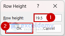
- Press OK.
- You will get your heat map with square cells.
Read More: How to Make a Heatmap in Excel
2. Creating a Dynamic Heat Map
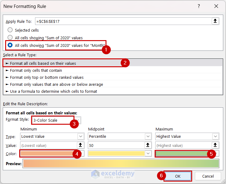
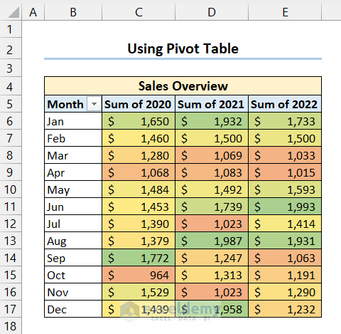
2.1 Create a Dynamic Heat Map using a Pivot Table
- Select the data from the Pivot Table.
- Go to the Home tab and select Conditional Formatting.
- Select Color Scales from the drop-down list and click on More Rules.
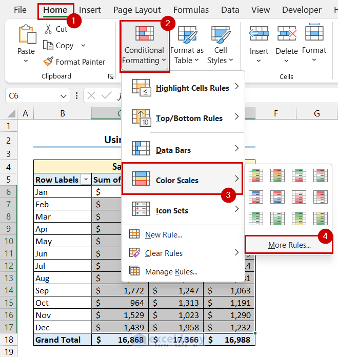
- In the New Formatting Rule dialog box, select the 3rd option from Apply Rule To. Under Select a Rule Type, select Format all cells based on their value.
- Select the 3-Color Scale option under Edit the Rule Description and select colors for Minimum and Maximum value.
- Press OK.
- You will get your dynamic heat map.
- Add new data to the Pivot Table, and it will automatically update the heat map.
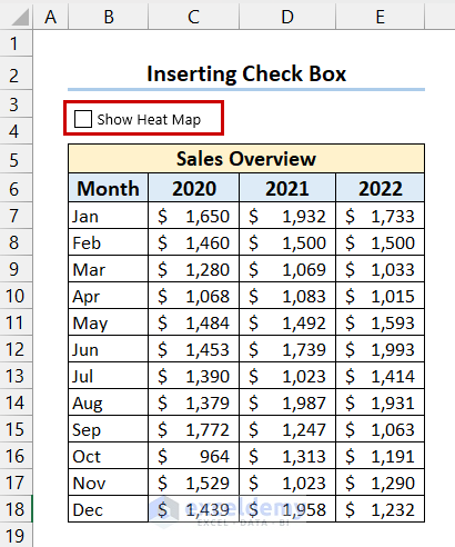
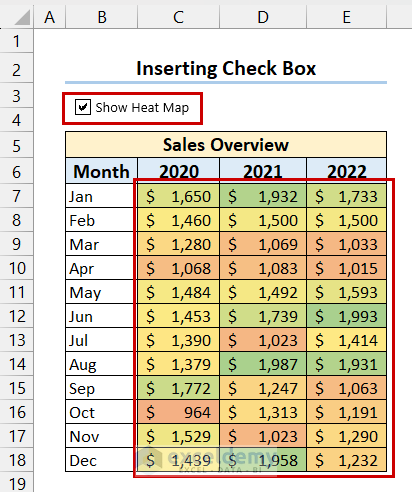
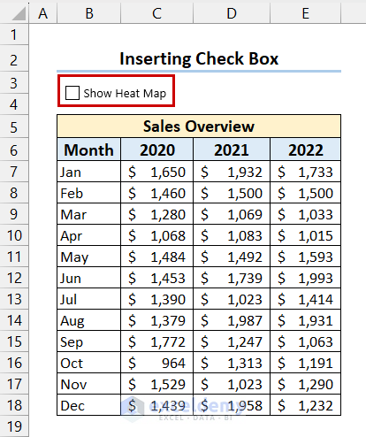
2.2 Creating a Dynamic Heat Map with Check Box
- Go to the Developer tab and select Insert.
- Select Check Box from Form Control.
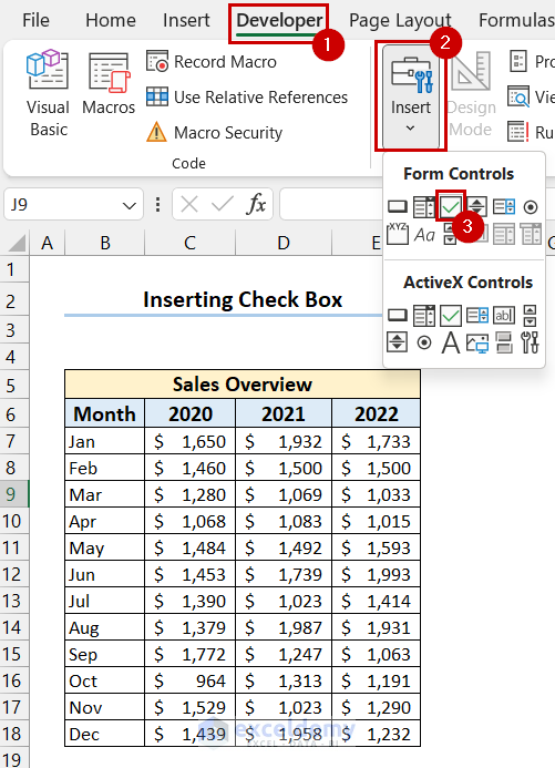
- Click and drag your mouse cursor where you want the Check Box.
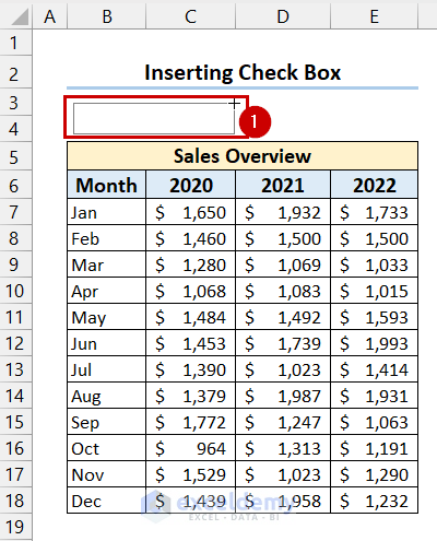
- We have inserted the Check Box and changed the text.
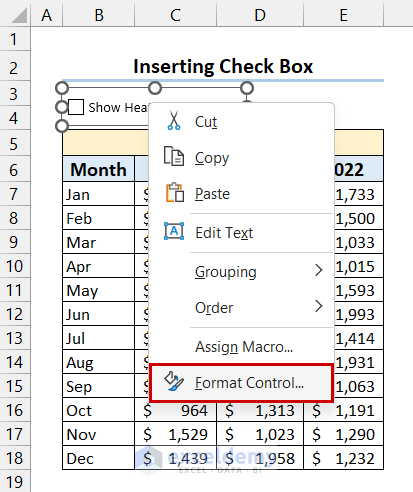
- Right-click on the Check Box and select Format Control.
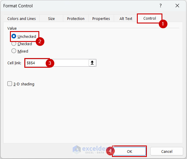
- In the Format Control dialog box select the Control tab.
- Choose Unchecked and select a cell for Cell Link.
- Click on OK.
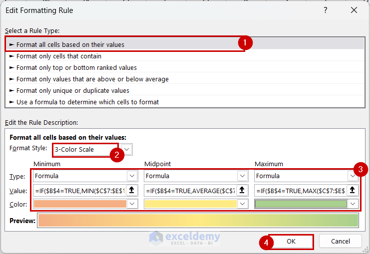
- Open the Edit Formatting Rule dialog box for the dataset and select Format cells based on their values.
- Choose the 3-Color Scale as Format Style.
- For Minimum select Formula as Type and enter the following formula as Value:
=IF($B$4=TRUE,MIN(C7:E18),FALSE)- For Midpoint select Formula as Type and insert the following formula as Value:
=IF($B$4=TRUE,AVERAGE(C7:E18),FALSE)- For Maximum select Formula as Type and enter the following formula as Value.
=IF($B$4=TRUE,MAX($C$7:$E$18),FALSE)- Select colors for Minimum, Midpoint, and Maximum >> press OK.
- If you check the Check Box you will be able to see the heat map.
- If you uncheck the Check Box, the heat map will disappear.
2.2 Creating a Dynamic Heat Map Without Numbers
- Select the dynamic heat map with Check Box.
- Go to the Home tab and select Conditional Formatting.
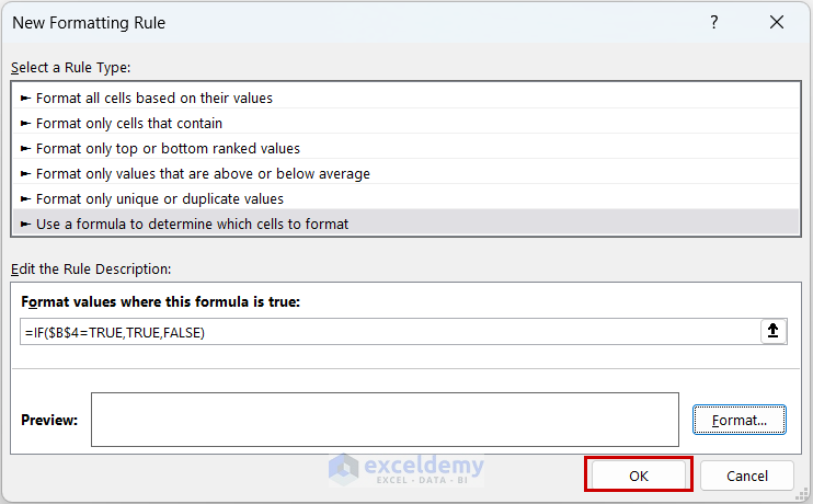
- Choose New Rule.
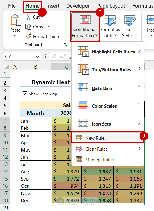
- The New Formatting Rule dialog box will appear.
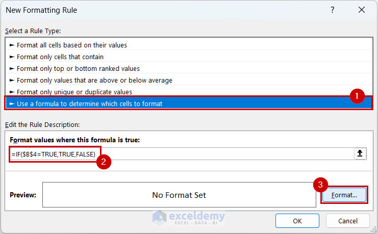
- Select Use a formula to determine which cells to format and enter the following formula:
=IF($B$4=TRUE,TRUE,FALSE)- Select Format.
- The Format Cells dialog box will appear.
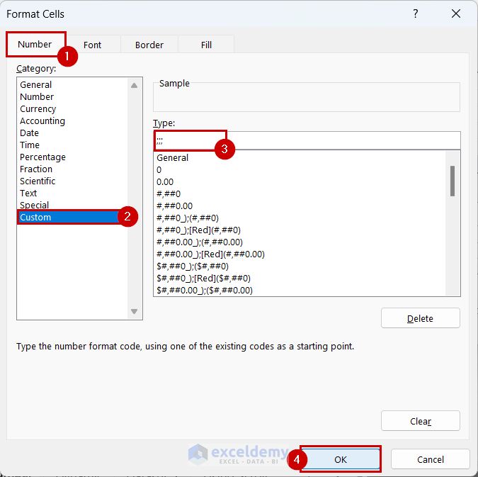
- Go to the Number tab, select Custom and insert “;;;” as format Type.
- Press OK.
- Select OK.
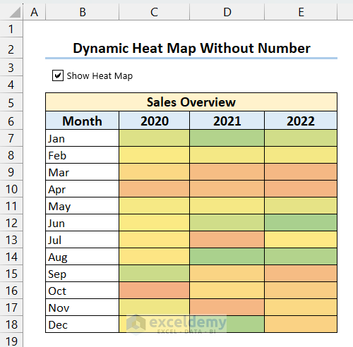
- You will be able to see the heat map without numbers if you check the Check Box.
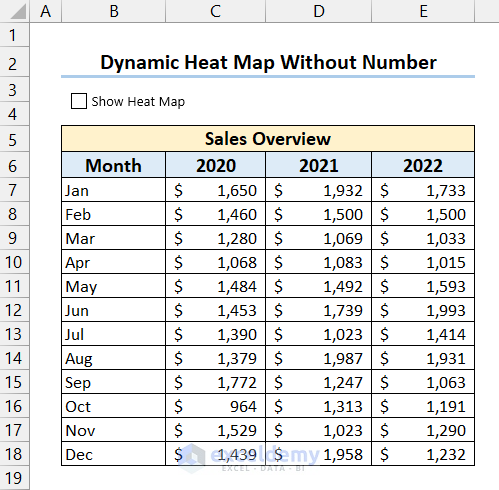
- If you uncheck the Check Box the heat map will disappear, and you will get the dataset.
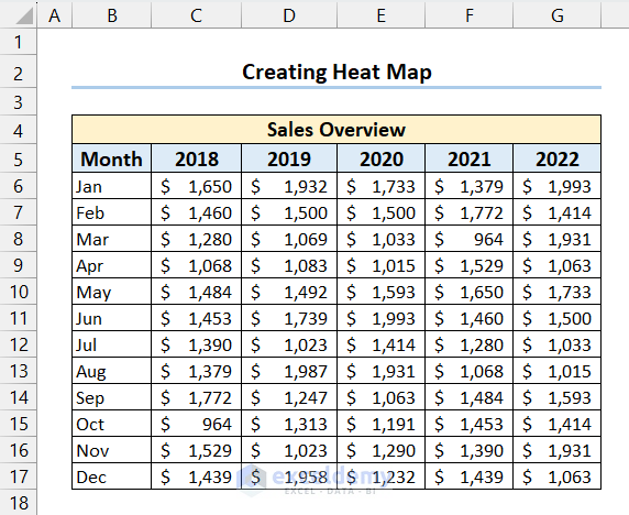
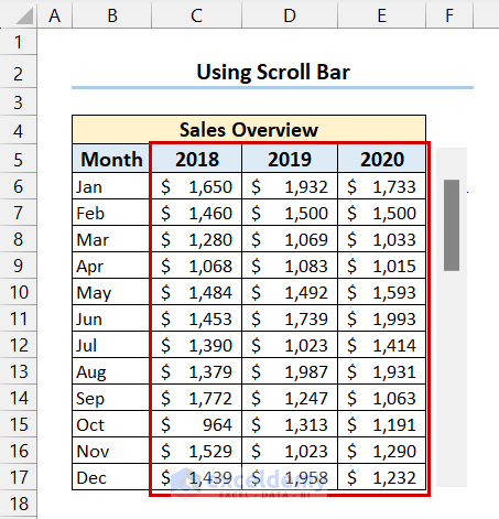
2.3 Using the Scroll Bar in a Heat Map
- We will use the following dataset for this example. We will use the Scroll bar to show sales data for 3 years at a time.
- Go to the Developer tab, select Insert and choose Scroll Bar from Form Control.
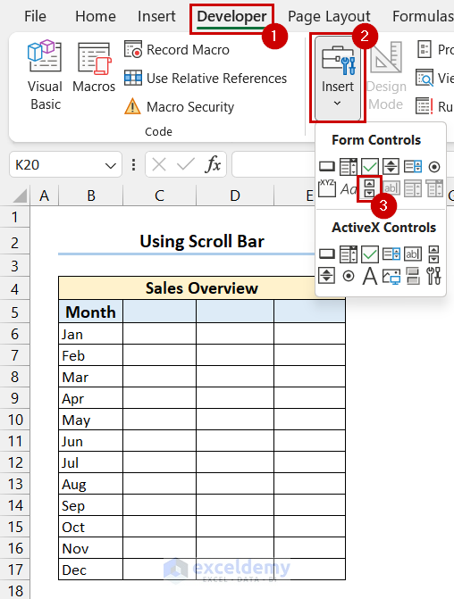
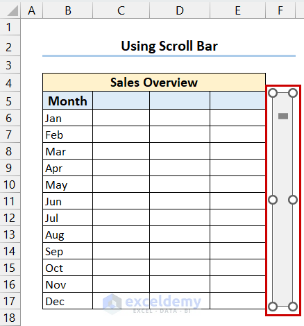
- Insert the Scroll Bar at your desired position.
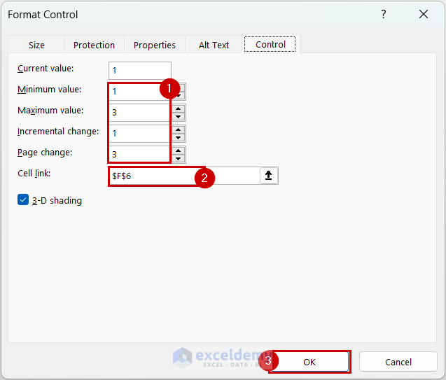
- Right-click on the Scroll Bar >> select Format Control.
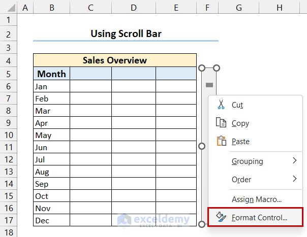
- In the Format Control dialog box, go to the Control tab.
- Select Minimum value, Maximum value, Incremental change, Page change and select a cell for Cell link.
- Press OK.
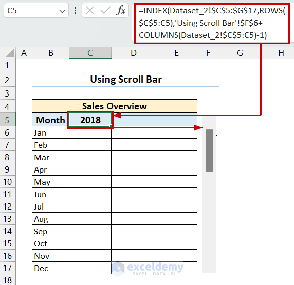
- Select the first cell of the heat map and enter the following formula:
=INDEX(Dataset_2!$C$5:$G$17,ROWS($C$5:C5),'Using Scroll Bar'!$F$6+COLUMNS(Dataset_2!$C$5:C5)-1)- Press Enter and drag the Fill Handle to the right to copy the formula.
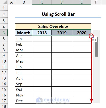
- Right-click and drag the Fill Handle down to copy the formula to the other cells.
- Select Fill without Formatting.
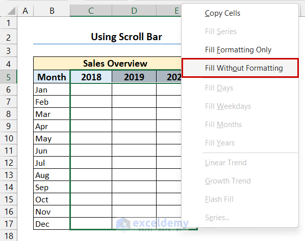
- We have the data from the dataset.
- Insert a heat map following the previous methods.
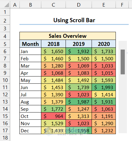
- You can get a heat map for different years by simply clicking the scroll bar.

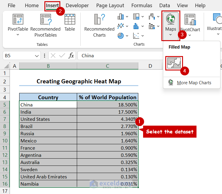
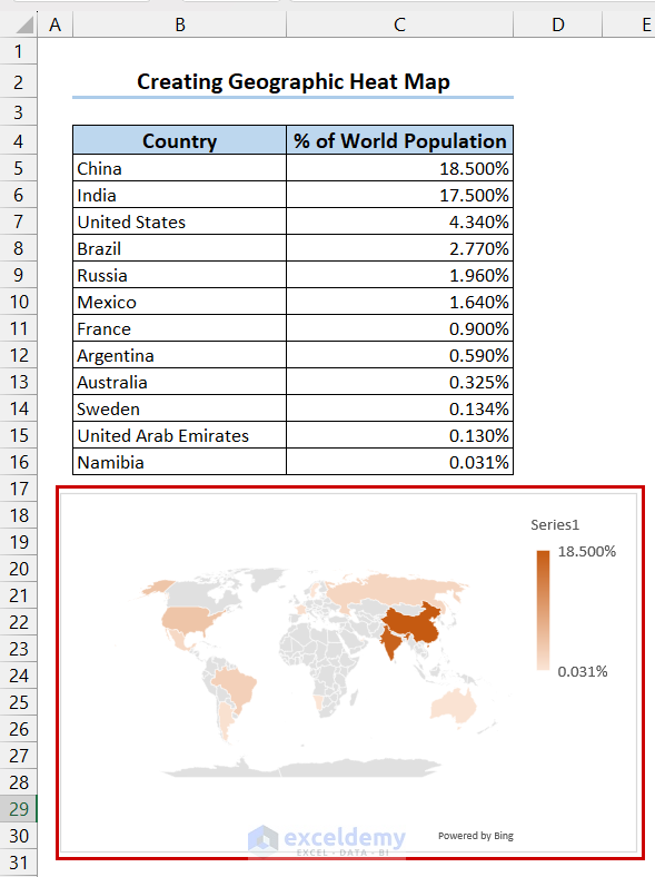
3. Creating a Geographic Heat Map
- Select the dataset and go to the Insert tab.
- Select Maps and choose Filled Map.
- We have inserted the geographic heat map and changed the color.
Read More: How to Make Geographic Heat Map in Excel
Download Practice Workbook
You can download the practice workbook from here:
Frequently Asked Questions
- What is a Heat Map Used For?
- A heat map serves various purposes, including:
- Data analysis
- Statistics
- Finance
- User experience design
- A heat map serves various purposes, including:
- Is a Heat Map in Excel a Chart?
- Yes, a heat map in Excel is a two-dimensional chart where values are represented using colors for improved visualization.
- Is a Heat Map in Excel Used for Numerical Data?
- Absolutely! Heat maps depict relationships between different values, and they work exclusively with numerical data.
Heatmap in Excel: Knowledge Hub
<< Go Back to Data Visualisation in Excel | Learn Excel

