Download Excel Workbook of Heat Map
Method 1 – Make a Heatmap with Conditional Formatting
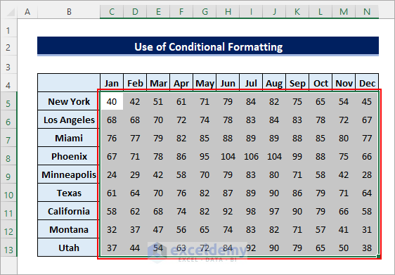
Steps:
- Select the entire dataset excluding the labels as shown in the following image.
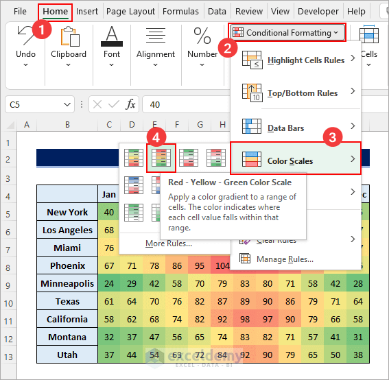
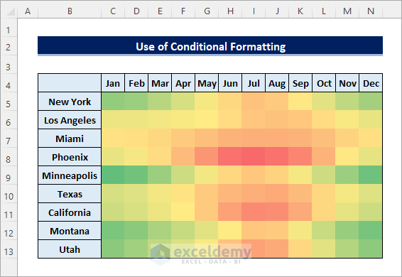
- Go to Home >> Conditional Formatting >> Color Scales >> Red – Yellow – Green Color Scale.
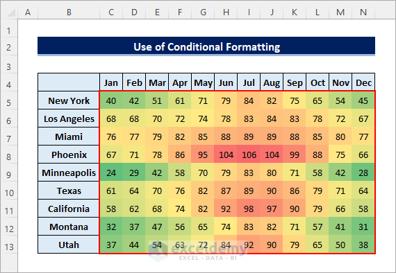
- The following heatmap will be created.
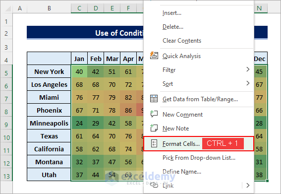
- Select the entire heatmap, right-click on it, and select Format Cells.
- Select the Custom category from the Number tab, enter three semicolons (;;;) in the Type field and click OK.
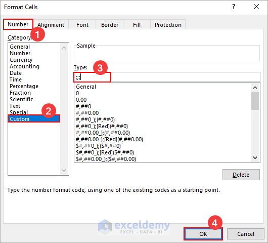
- It will make a heatmap without numbers as shown below.
Read More: How to Create a Zip Code Heat Map in Excel (with Useful Steps)
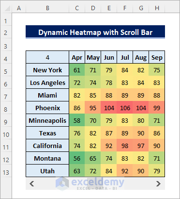
Method 2 – Make a Dynamic Heatmap with Scroll Bar
Steps:
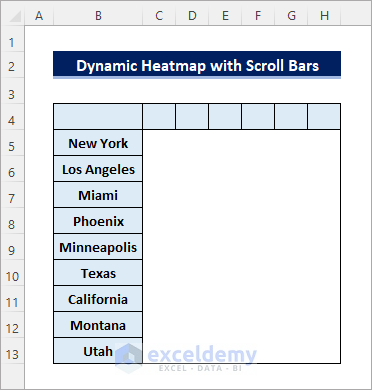
- Copy the city names (from the dataset) to a new sheet and format the area where you want the data to be visible as shown below.
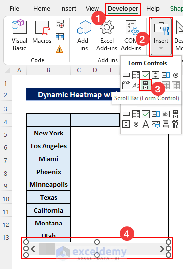
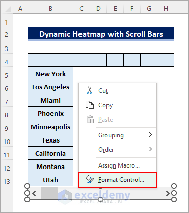
- Go to Developer >> Insert >> Scroll Bar (Form Control) and drag the cursor to place it anywhere you like.
- Right-click on the scroll bar and select Format Control.
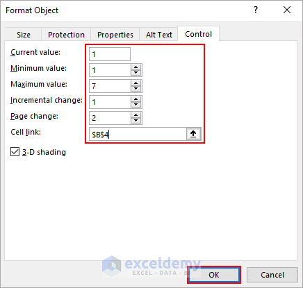
- Set the Minimum value to 1, Maximum value to 7, Incremental change to 1, Page Change to 2, enter a cell reference for the Cell link, and click OK.
- Enter the following formula in cell C4 and drag it to the last cell of the visible area (H13). Change any formatting if required. (The dataset is in Sheet1)
=INDEX(Sheet1!$C$4:$N$13,ROW()-3,$B$4+COLUMNS($C$4:C4)-1)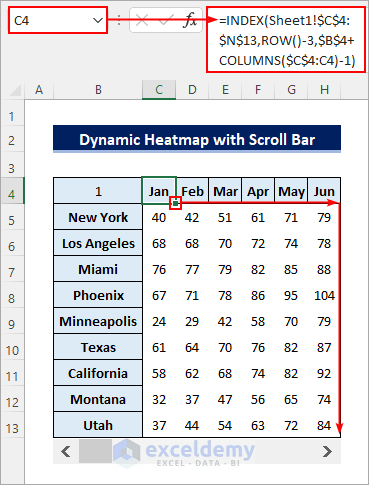
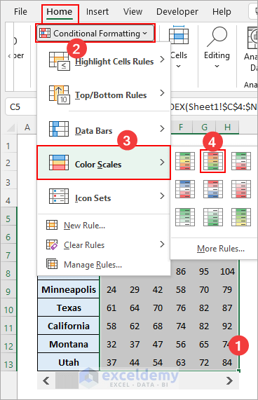
- Select the visible values and apply the Conditional Formatting Color Scales.
- You can use the scroll bar to show the part of the dataset as required.
How to Make a Geographic Heatmap in Excel
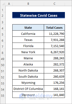
Assume you have the following dataset containing the state-wise total Covid-19 cases in the USA.
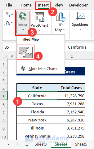
To create a geographic heat map using this data in excel:
Steps:
- Click anywhere in the data or select it entirely. Go to Insert >> Maps >> Filled Map.
- The following geographic map will be created.
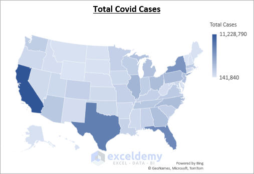
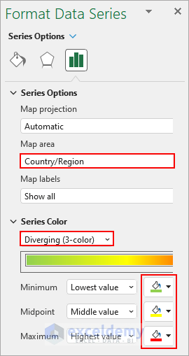
- Right-click on the data points and select Format Data Series.
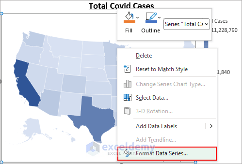
- Set the Series Color to Diverging (3-color) and change the color sets as required.
- It will create the following geographical heat map in excel.

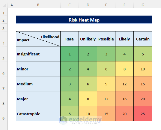
How to Create a Risk Heatmap in Excel
Steps:
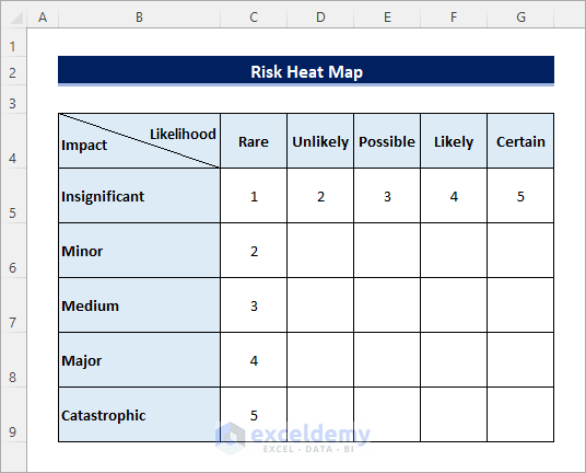
- Create a table specifying the impact and likelihood labels as shown below.
- Enter the following formula in cell D6 and drag the Fill Handle icon to fill the entire table.
=$C6*D$5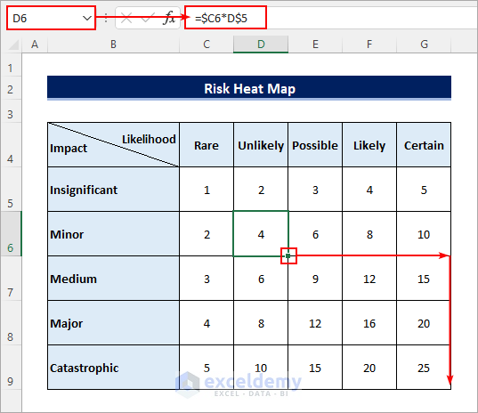
- Apply conditional formatting color scales to the values in the table.
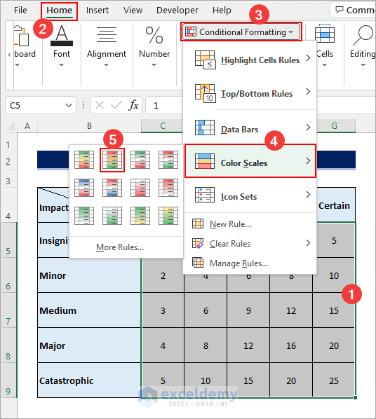
- It will create the following risk heat map in excel.
<< Go Back to Heatmap in Excel | Data Visualisation in Excel | Learn Excel
Get FREE Advanced Excel Exercises with Solutions!

Hi,, please give me a tip on how to create an amazing payroll format based on 15days payroll period,, Thanks…
Hello HERMAN,
Thanks for your feedback. You can follow the articles given below to create a payroll format based on 15 days. The steps and format will be pretty same, hope it will help you.
https://www.exceldemy.com/daily-wages-sheet-format-in-excel/#Step_1_Calculate_Total_Daily_Working_Time_in_Daily_Wages_Sheet_Format_in_Excel
https://www.exceldemy.com/calculate-hours-and-minutes-for-payroll-in-excel/
City heatmap ?
Is it possible to create Heatmap based on Cities ? (Not State, Country)
But based on cities?
Definitely possible. You just need to follow the following procedures to do so.
After selecting the entire dataset, go to the Insert tab. Followingly, click on Filled Map from the Maps option and you will have your desired output.