Method 1 – Using Built-in Maps Chart to Make Geographic Heat Map in Excel
Case 1.1 Creating Heat Map of States
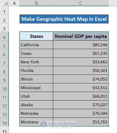
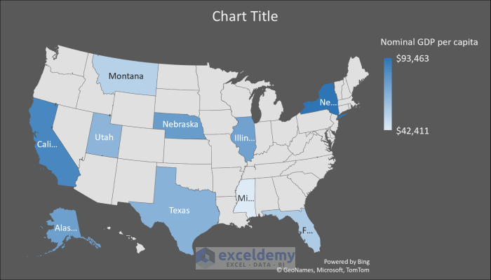
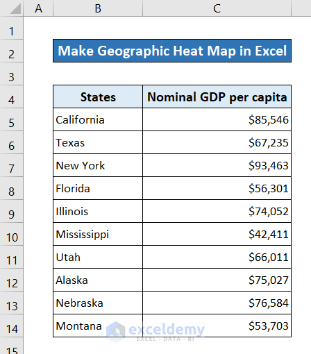
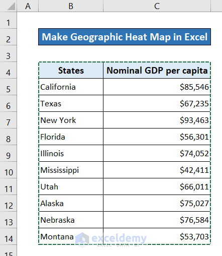
For a demonstration of the heat map of states, we’re using the following dataset. It contains nominal GDP per capita for different states in the U.S. Let’s see how we can visualize the comparison of GDP by using a heat map.

Steps:
- Select the dataset you want to make a heat map from.
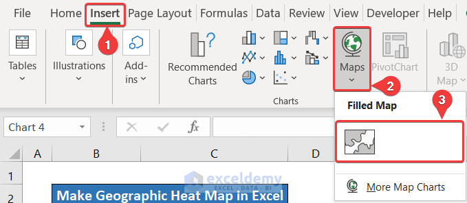
- Go to the Insert tab in your ribbon.
- From the Charts group, click on Maps.
- Select the Filled Map Icon.

- A heat map will appear.
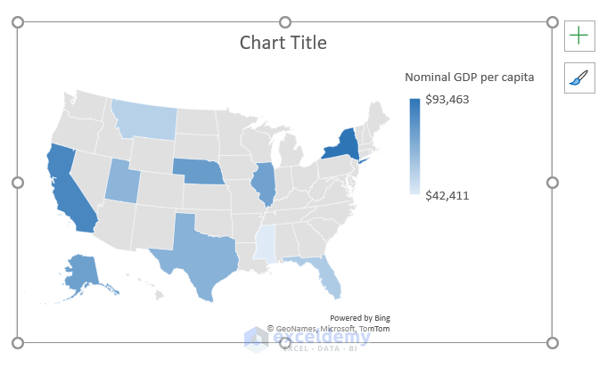
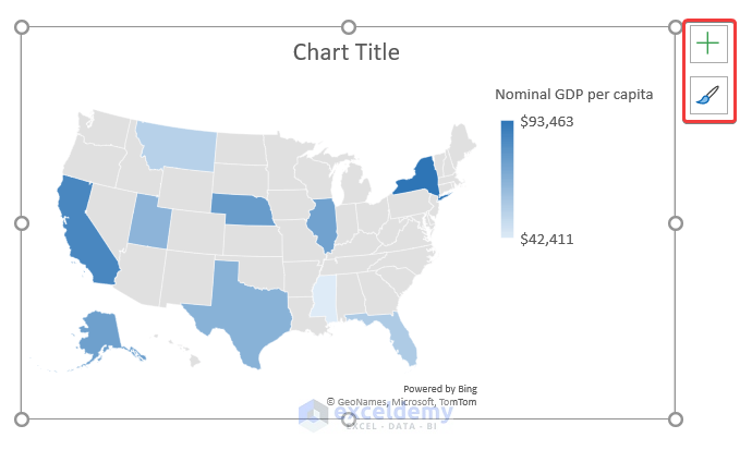
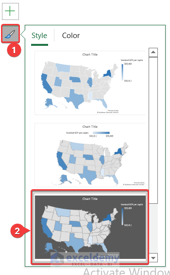
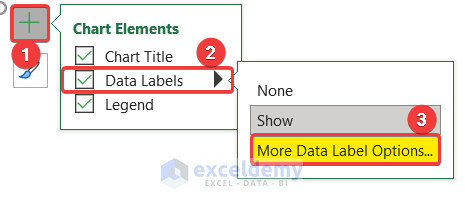
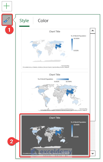
- You can modify this chart to your liking from the Chart Elements and Chart Styles button that appear on the top corner once you select the chart.
- We have selected Style 3 from the Chart Styles.
- We also selected data labels to show country names by selecting Data Labels from Chart Elements and then selecting More Data Label Options. Then I selected Category Name.
- This way, you will have the geographic heat map made for visualization in Excel.
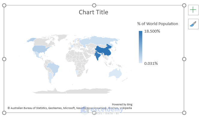
Case 1.2 Creating Heat Map of Countries
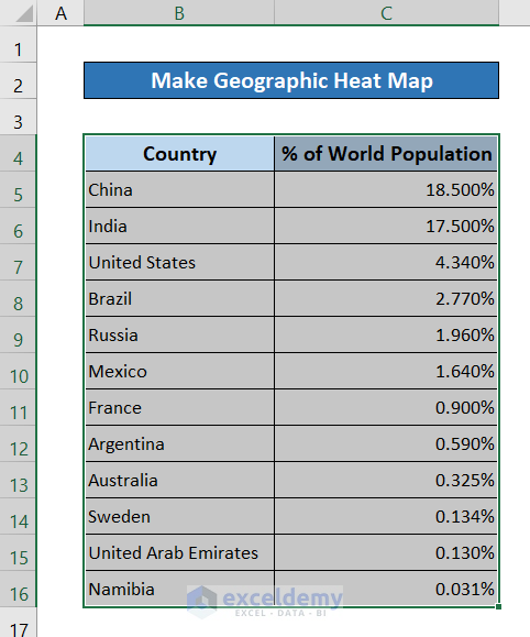
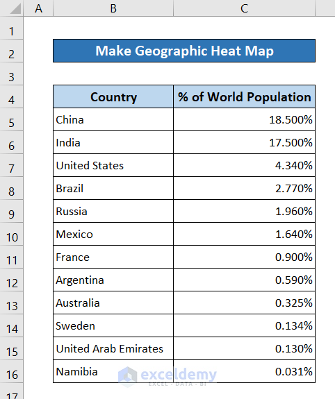
Let’s use the following dataset containing information country population in terms of percentage of the global population.

Steps:
- Select the dataset.
- Go to the Insert tab from your ribbon.
- From the Charts group, select Maps.
- Choose the Filled Map Icon.
- Excel will automatically put in the world map since country names were used in the dataset.
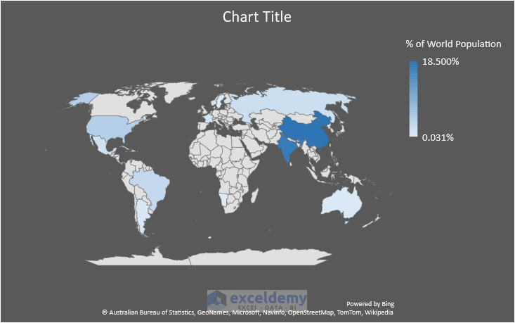
- You can tweak the modification options for better visualization of your heat map. We have selected Style 3 from Chart Styles.
- Now the geographic heat map will look something like this.
Read More: How to Make a Heatmap in Excel
Method 2 – Applying Add-ins to Make Geographic Heat Map in Excel
Steps:
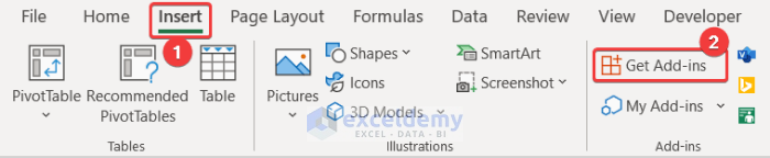
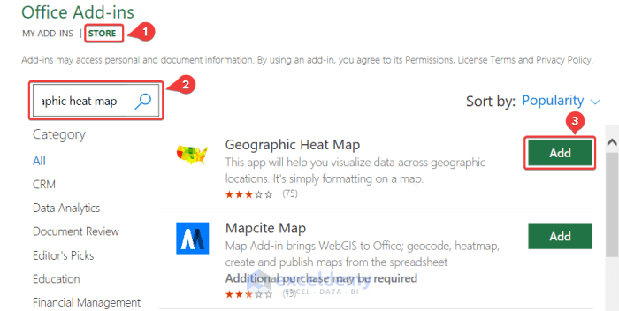
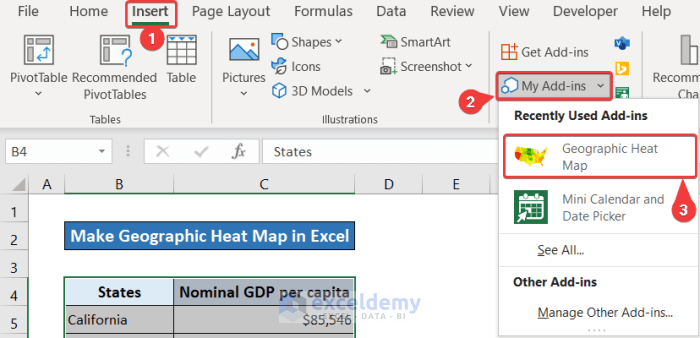
- Go to the Insert tab in your ribbon.
- Select Get Add-ins from the Add-ins group.
- In the Office Add-ins box that appeared, select the Store tab.
- In the search box, type geographic heat map.
- Click on Add next to the Geographic Heat Map add-in result.
Follow the sub-sections below for your desired heat map areas.
Case 2.1 Making Heat Map of States
Let’s use the same state dataset as before.
Steps:
- Go to the Insert tab in your ribbon.
- From the Add-ins group, select the down arrow on My Add-ins.
- Select Geographic Heat Map from the list.

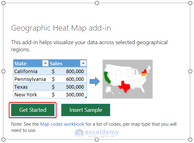
- An object box will appear for the add-in. Select Get Started in it.

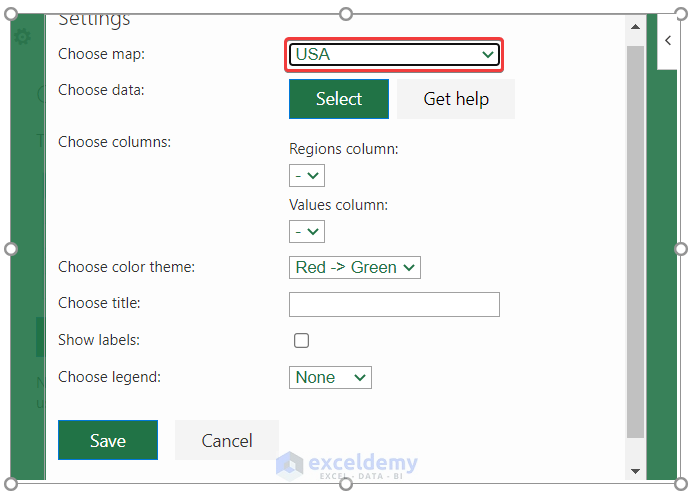
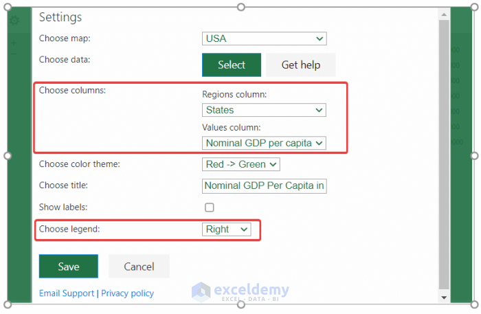
- In the Choose map field, select USA (since that’s the sample dataset).
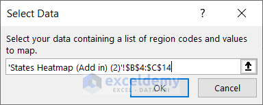
- Click on Select beside Choose data.
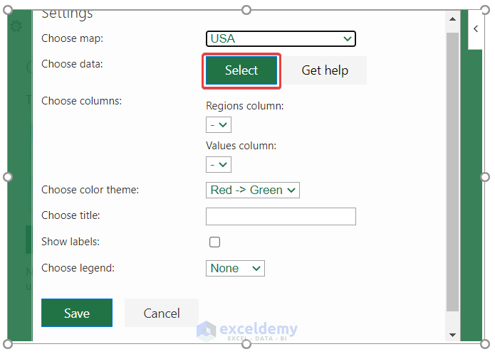
- Select the dataset from your spreadsheet.
- Click on OK on the Select Data dialog box.
- Make sure the Regions column and Values column are properly selected.
- For a better display, we chose the legend to appear on the right.
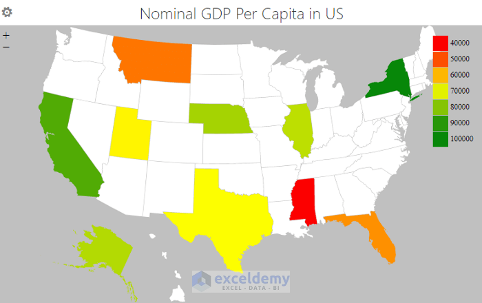
- Click on Save. You will receive a geographic heatmap in your spreadsheet.
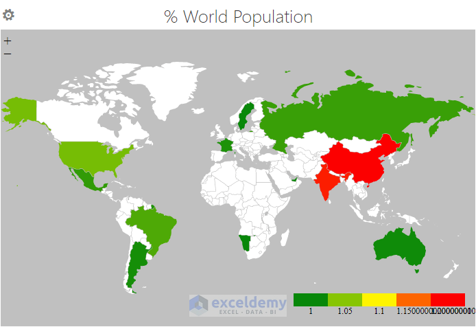
Case 2.2 Making Heat Map of Countries
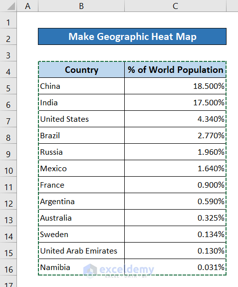
Let’s use the previously mentioned global population dataset.
Steps:
- Go to the Insert tab on your ribbon.
- From the Add-ins group, select My Add-ins.
- In the drop-down list, select Geographic Heat Map.
- An object box will appear. Select Get Started from it.
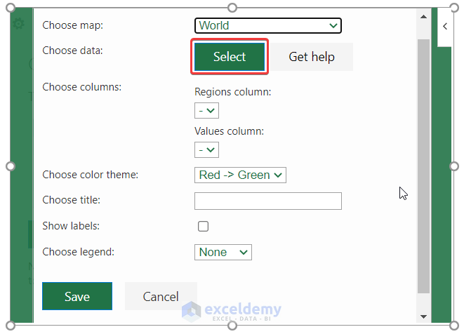
- Select World in the Choose map field.
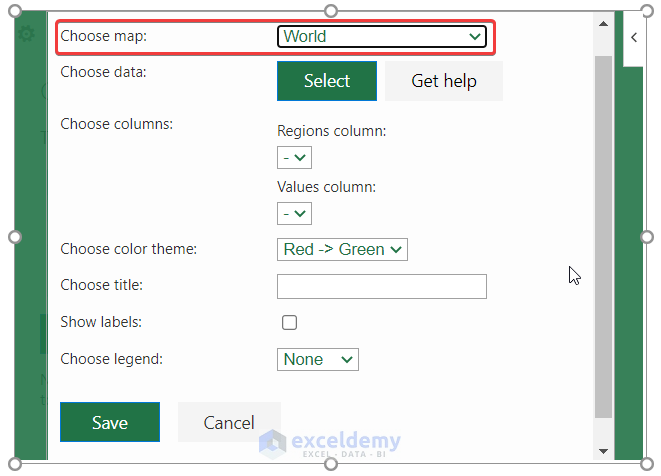
- Click on Select in the Choose data field.
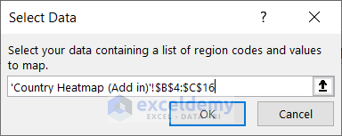
- Select the data from your spreadsheet.
- Click on Ok in the Select Data dialog box.
- Ensure the Regions column and Values column are selected properly.
- For a better presentation, we selected the color theme from Green to Red and kept the legend at the bottom.
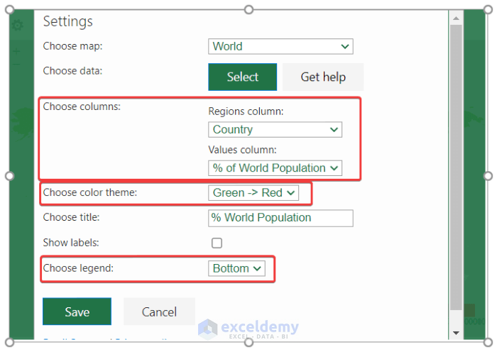
- Click on Save. You will get a geographic heat map of the world in your Excel spreadsheet.
Download Practice Workbook
You can download the workbook used for the demonstration below.
Related Articles
<< Go Back to Heatmap in Excel | Data Visualisation in Excel | Learn Excel
Get FREE Advanced Excel Exercises with Solutions!
