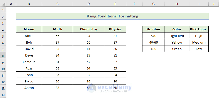
Method 1 – Applying Conditional Formatting to Create a Risk Heat Map in Excel
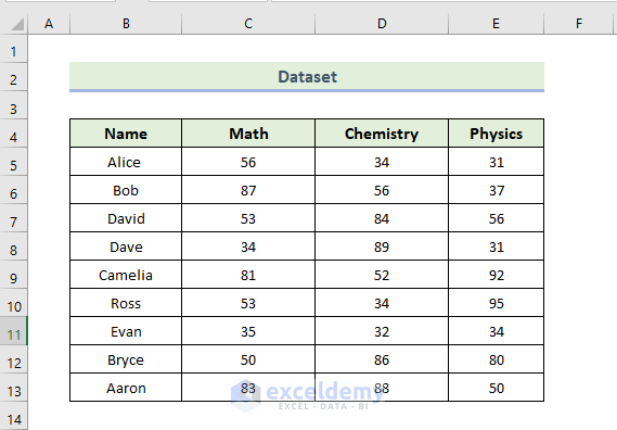
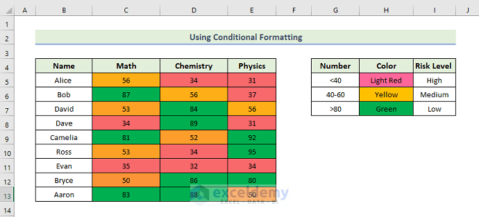
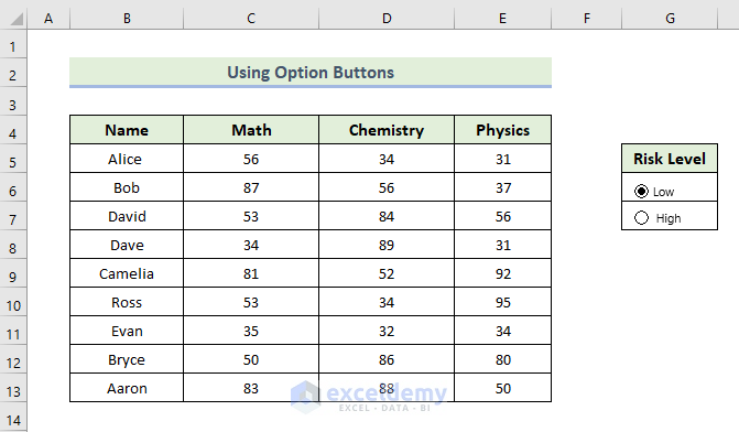
We have a dataset showing math, chemistry, and physics scores. We are going to identify the risk level of every student’s score.
We consider a mark less than 40 as poor and denote it as a high-risk level. If the obtained mark falls between 40 and 60, we will consider it a medium-risk level, and if the mark falls between 80 and 100, we will consider it a low-risk level.
Steps:
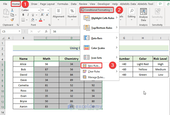
- Select the range of the cells C5:E13.
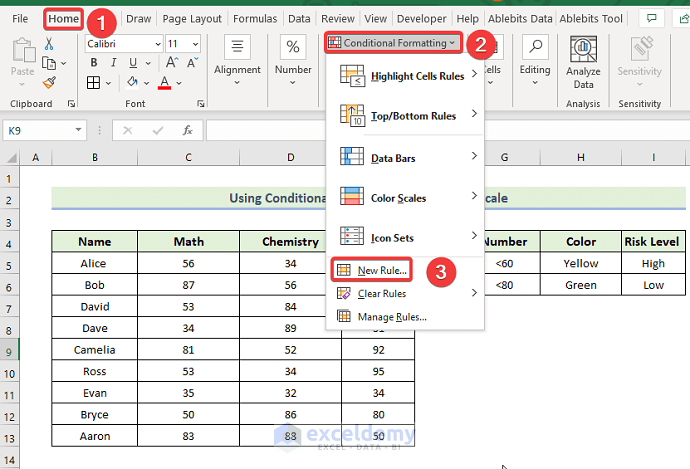
- Go to the Home tab, select Conditional Formatting, and select the New Rule option.
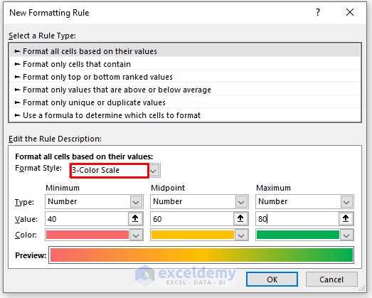
- When the New Formatting Rule dialog box appears, select the Format all cells based on their values option.
- Select the 3-Color Scale in the Format Style box.
- Enter the numbers 40, 60, and 80 in the Value boxes, respectively, and select your desired colors from the Color dropdowns.
- Press OK.
- Here’s the result.
Read More: How to Make a Heatmap in Excel
Method 2 – Using Conditional Formatting with a 2-Color Scale Rule
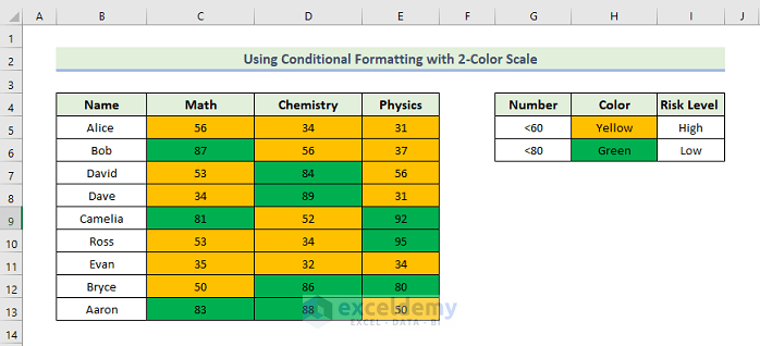
We’ll consider a mark less than 60 as poor and denote it as high-risk. As long as the mark falls between 80 and 100, we will consider it low-risk.
Steps:
- Select the range of the cells C5:E13.
- Go to the Home tab, select Conditional Formatting, and select the New Rule option.
- When the New Formatting Rule dialog box appears, select the Format all cells based on their values option.
- Select 2-Color Scale in the Format Style box.
- Enter the numbers 60 and 80 in the Value boxes and select your desired colors from the Color options.
- Press OK.

- Here’s the result.
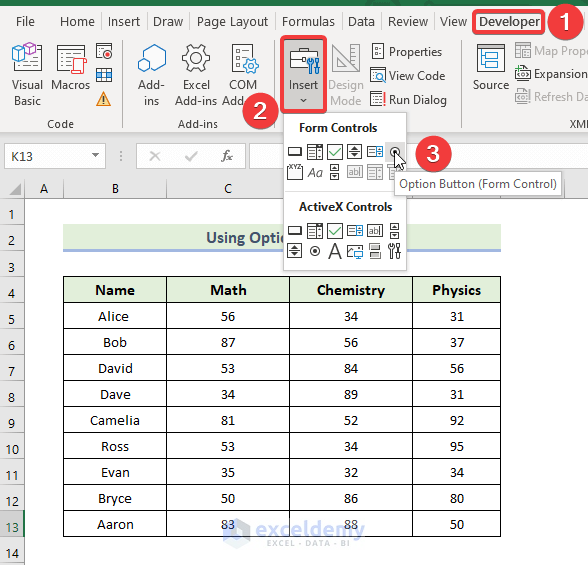
Method 3 – Creating a Risk Heat Map Using Form Controls
We’ll consider the top 10 marks low-risk and the bottom 10 high-risk.
Steps:
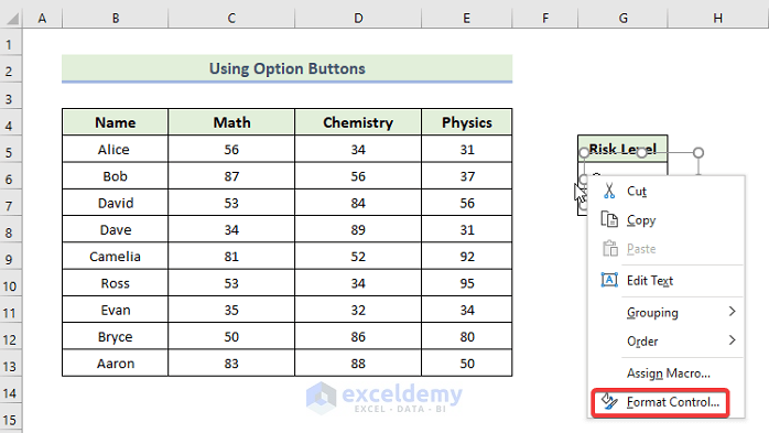
- Go to the Developer tab, select Insert, and choose the Option Button.
- Repeat to get another option button and change the names of the two options to Low and High.
- Put the mouse cursor on the Low button, right-click on it, and select the Format Control box.
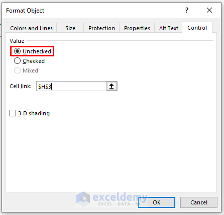
- When the Format Object dialog box appears, click on Checked and press $H$3 in the Cell Link.
- Repeat with the High button.
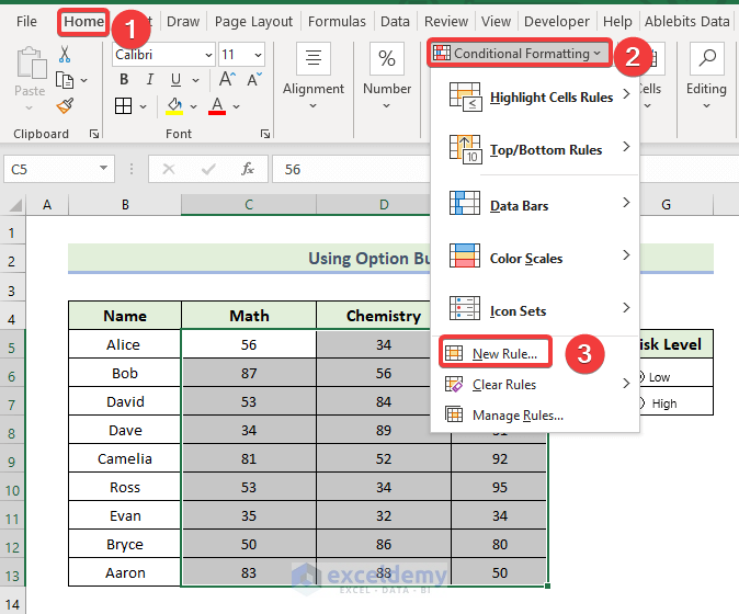
- Select the range of the cells C5:E13.
- Go to the Home tab, select Conditional Formatting, and select the New Rule option.
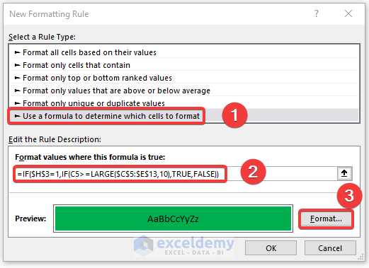
- When the New Formatting Rule dialog box appears, select Use a Formula to determine which cells to Format option.
- Insert the following code in Format values where this formula is true box.
=IF($H$3=1,IF(C5>=LARGE($C$5:$E$13,10),TRUE,FALSE))
$H$3=1 indicates the Low button. The LARGE function returns the n-the largest value from the dataset. Using the IF function, we will get only the value that is above 80.
- Select your desired color from the Format option.
- Press OK.
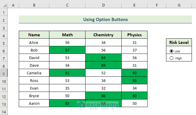
- You will get the following output where the values above 80 are highlighted in green.
- Open Conditional Formatting New Rule again for the range.
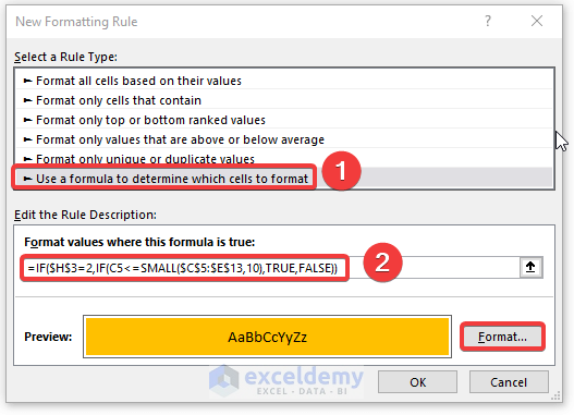
- Select the Use a Formula to determine which cells to Format option.
- Use the following code in the Format values where this formula is true box.
=IF($H$3=2,IF(C5<=SMALL($C$5:$E$13,10),TRUE,FALSE))
$H$3=2 indicates the Low button. The SMALL function returns the n-the smallest value from the dataset. Using the IF function, we will get only the value that is less than 56.
- Select your desired color from the Format option.
- Click on OK.
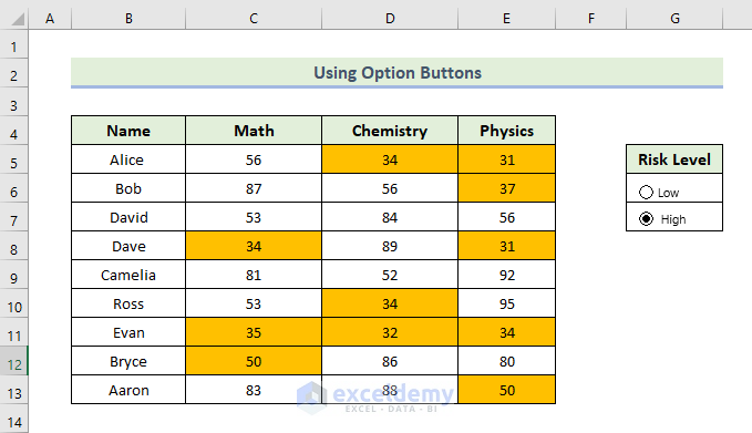
- You will get the following output where the values below 56 are highlighted in yellow.
Download the Practice Workbook
Download this practice workbook to exercise while you are reading this article.
Related Articles
<< Go Back to Heatmap in Excel | Data Visualisation in Excel | Learn Excel
Get FREE Advanced Excel Exercises with Solutions!
