Example 1 – Column Chart
The sample dataset showcases 3 people’s leisure activities.
To create a chart:
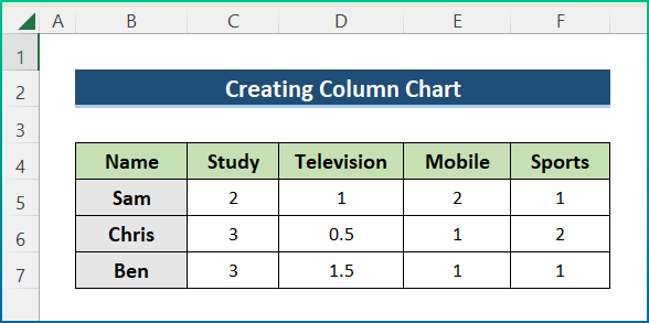
Steps:
- Select the entire dataset.
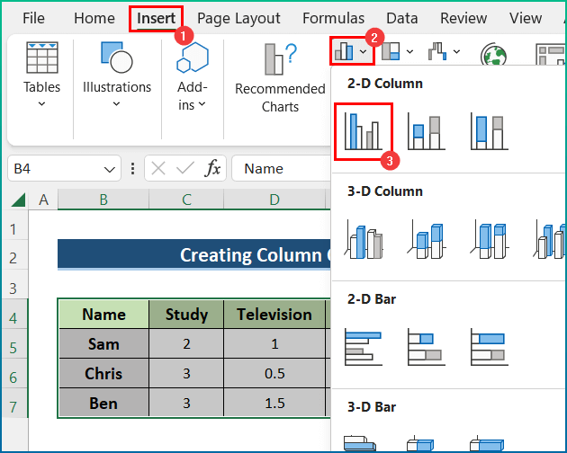
- Go to the Insert tab, and select Charts.
- Choose Column Chart.
- Select the first option in the 2-D Column.
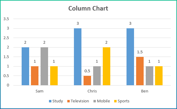
- A column chart will be displayed. (The chart was formatted)
Example 2 – Bar Chart
Create a bar chart in Excel.
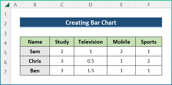
Steps:
- Select a cell in the dataset.
- Go to the Insert tab, and select Charts.
- Choose Bar Chart.
- Select the first option in the 2-D Bar.
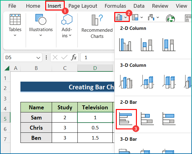
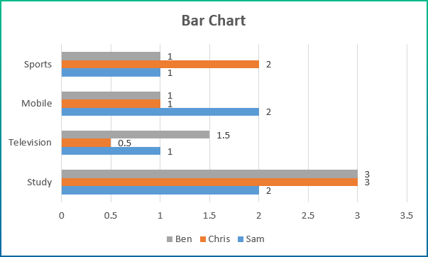
- A bar chart is displayed. (The chart was formatted)
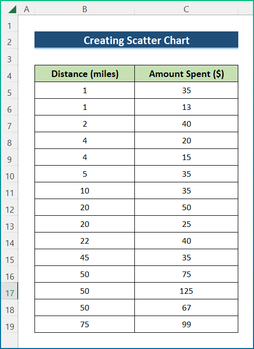
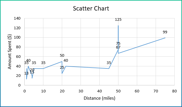
Example 3 – Scatter Chart
A store owner wants to run a survey to find out whether customers live far or near the shop.
Steps:
- Select a cell in the dataset.
- Go to the Insert tab, and select Charts.
- In Charts, click Scatter (X, Y).
- Choose Scatter with Smooth Lines and Markers.
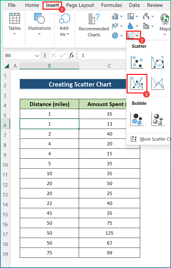
- A scatter chart is displayed. (The chart was formatted)
Example 4 – Pie Chart
The dataset Showcases the Number of Students over 6 Months in a particular subject.
Create a pie chart.
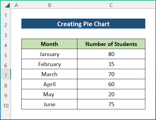
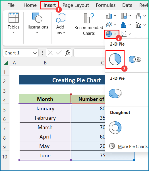
Steps:
- Select the data range. Here, B4:C11.
- Go to the Insert tab.
- Select Insert Pie or Doughnut Chart in Charts.
- Select a type of pie chart. Here, 2-D Pie.
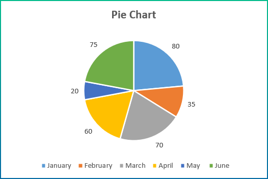
- A pie chart is displayed. (The chart was formatted)
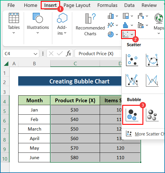
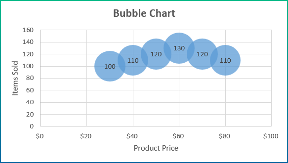
Example 5 – Bubble Chart
Create the bubble chart for the following dataset.
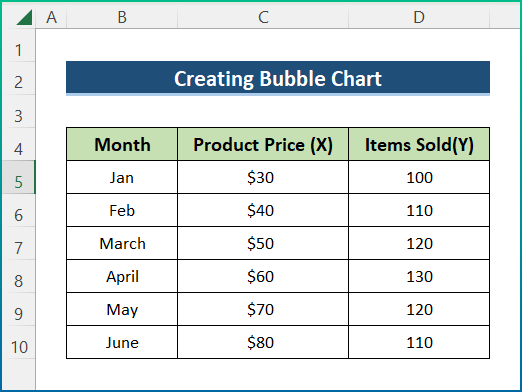
Steps:
- Select C4:D10.
- Click the Insert tab and go to Scatter.
- Choose Bubble.
- The chart is displayed. (The chart was formatted)
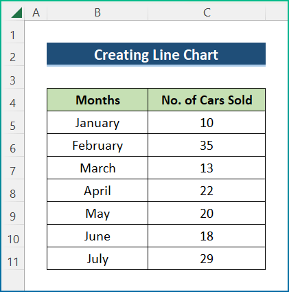
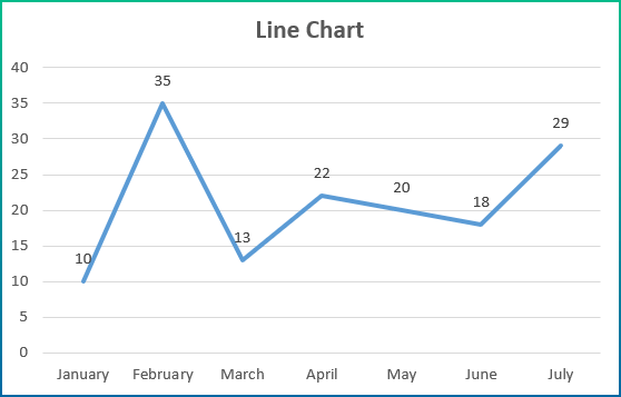
Example 6 – Line Chart
The sample dataset contains the No. of Cars Sold per Month. Create a line chart:
Steps:
- Select a cell in the dataset.
- Go to the Insert tab and select Charts.
- Choose 2-D Line Chart.
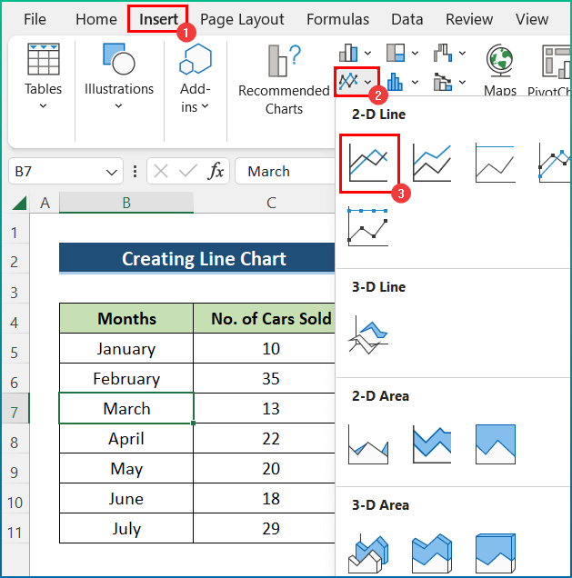
- The line chart is displayed. (The chart was formatted)
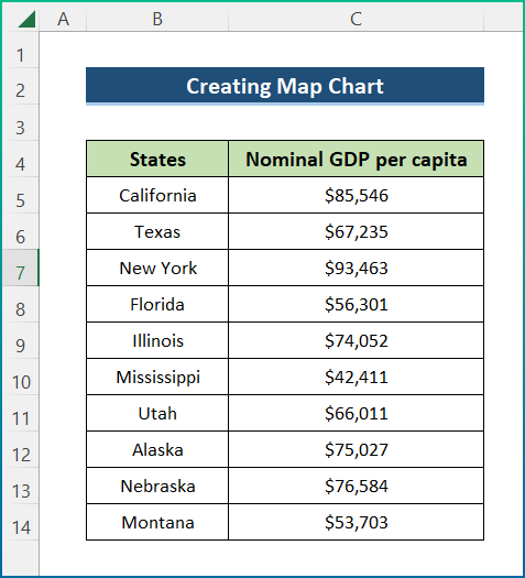
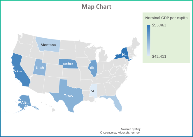
Example 7 – Map Chart
The dataset contains Nominal GDP per Capita for different States in the US. Create a map chart.
Steps:
- Select the entire dataset.
- Go to the Insert tab.
- In Charts, click Maps.
- Select Filled Map.
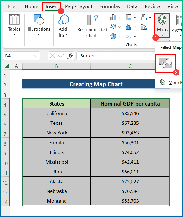
- A map chart will be displayed. (The chart was formatted)
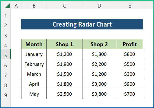
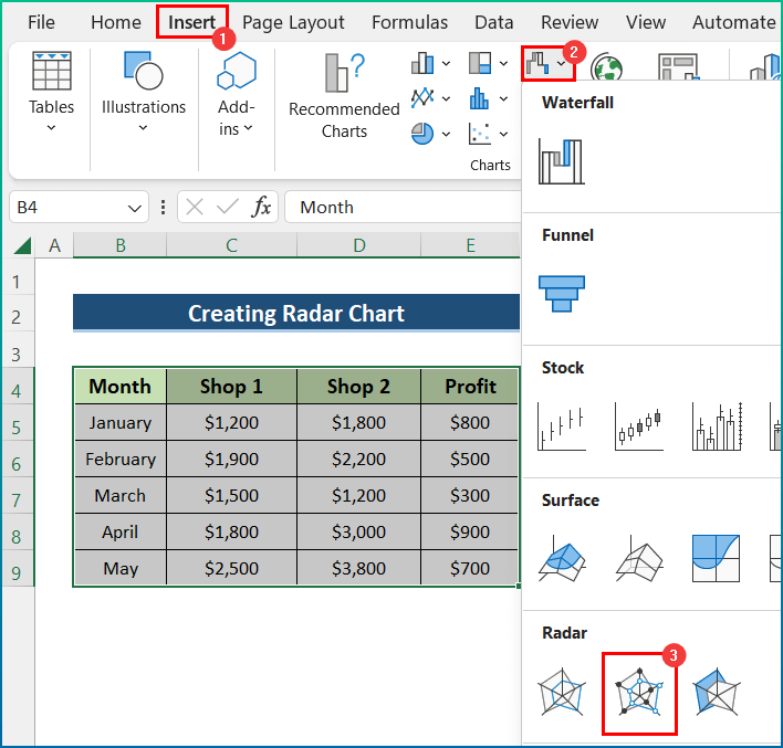
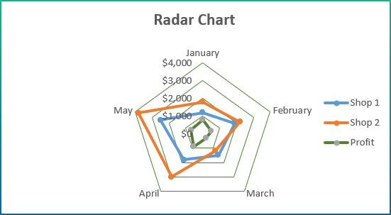
Example 8 – Radar Chart
The sample dataset showcases Month, Shop 1, Shop 2, and Profit columns. Create a Radar chart in Excel.
Steps:
- Select the entire data table.
- Go to the Insert tab.
- In Radar, select Radar with Markers.
- The Radar chart with markers is displayed. (The chart was formatted)
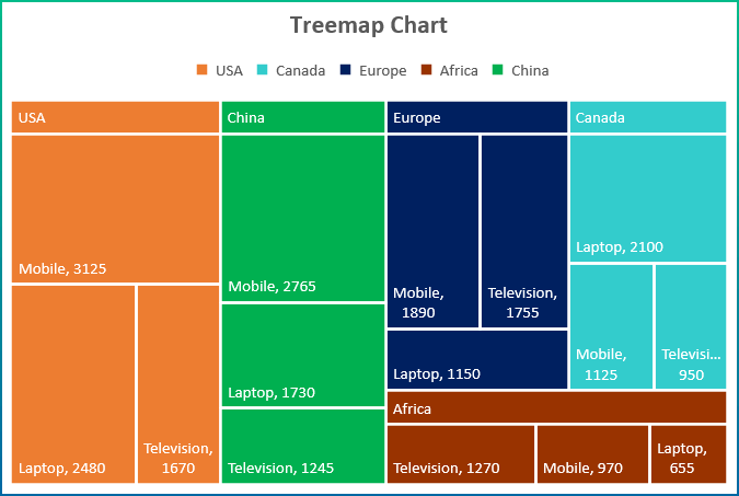
Example 9 – Treemap Chart
Create a Treemap Chart to show the sales value of various products:
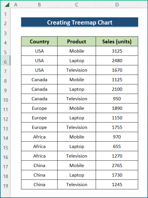
Steps:
- Select the dataset.
- Go to the Insert tab and select Insert Treemap Chart.
- Click Treemap Chart.
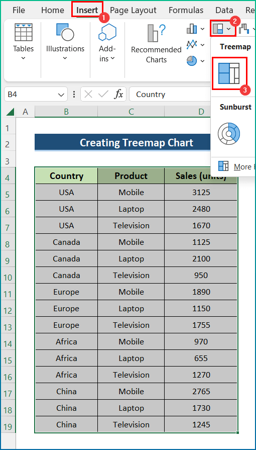
- The Treemap Chart will be displayed. (The chart was formatted)
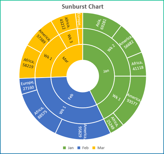
Example 10 – Sunburst Chart
Create a Sunburst Chart for Employee percentages.
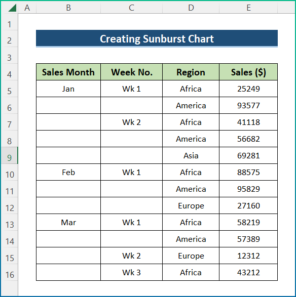
Steps:
- Select the dataset.
- Go to the Insert tab and select Insert Hierarchy Chart.
- Click Sunburst Chart.
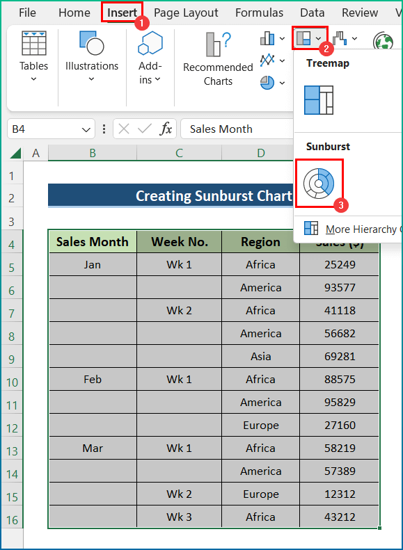
- The sunburst chart is displayed. (The chart was formatted)
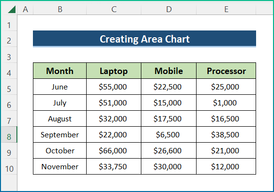
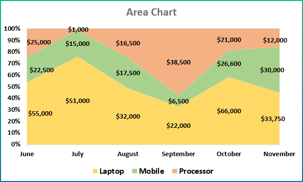
Example 11 – Area Chart
This is the sample dataset. Create an Area Chart.
Steps:
- Select a cell in the dataset.
- Go to the Insert tab and choose Charts.
- Select 2-D Area Chart.
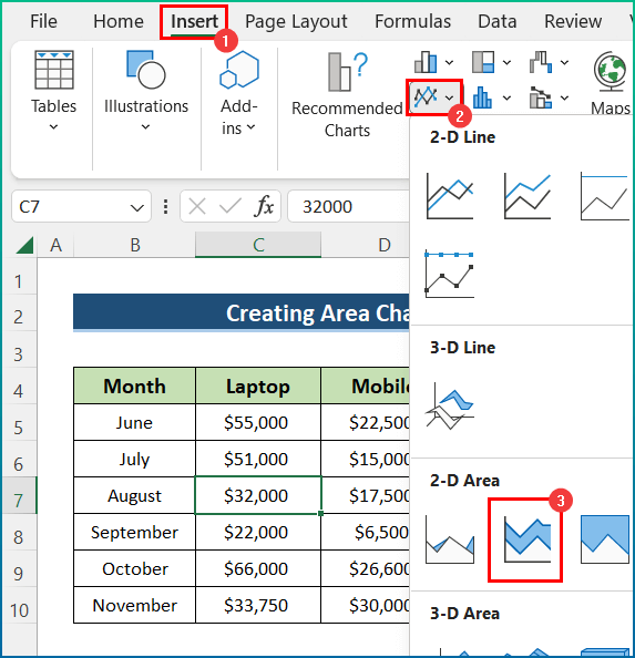
- The area chart is displayed. (The chart was formatted)
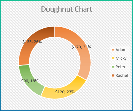
Example 12 – Doughnut Chart
The dataset contains sales information. Create the chart.
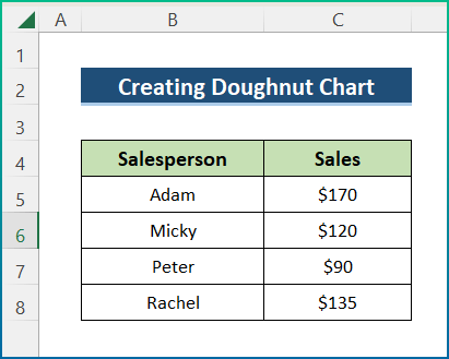
Steps:
- Select the dataset.
- Go to the Insert tab.
- In Charts, select Doughnut Chart.
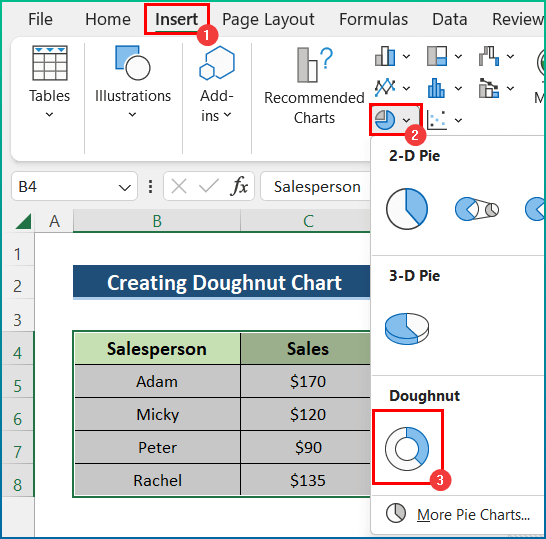
- The doughnut chart is displayed. (The chart was formatted)
Download Practice Workbook
Download the workbook.
<< Go Back to Data Visualisation in Excel | Learn Excel
Get FREE Advanced Excel Exercises with Solutions!
