Microsoft Excel has a powerful graphing feature that can add visual depth and even make it easy to understand the most boring datasets. Now, what if you want to represent data with three variables? In this regard, the Bubble Chart provides a simple yet effective way to represent this data. Creating Bubble Charts with Labels in Excel is quite an easy task. However, this article shows 3 Excel bubble chart examples. In addition, we’ll also demonstrate how to create a bubble chart sized according to a value.
What Is a Bubble Chart?
A Bubble Chart represents the data in a three-dimensional visualization. In simple terms, the bubble chart indicates the first two variables in the x and y coordinates, while it depicts the third variable as the size of the bubble.
When to Use Bubble Charts?
The bubble chart is similar to a scatter plot. They show connections between some numeric variables. The marker size is the main difference maker of the two. The size is usually the indicator of the third variable. So, it is very advantageous to use bubble charts for this three-way comparison.
There could be other situations to use bubble clusters too. For example,
- To visualize data clusters’ distribution and relationship.
- While presenting hierarchical data.
- Or merely for adding a more engaging visual element.
3 Suitable Excel Bubble Chart Examples for Visualizing Data
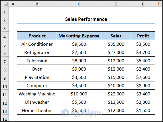
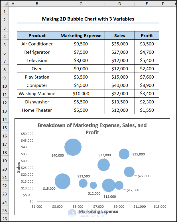
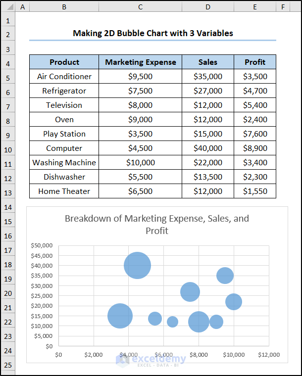
Considering the Sales Performance dataset shown in the B4:E13 range, which shows the Product names, the Marketing Expenses, the Sales figure, and the Profit in USD. Here, we want to create a bubble chart with the Marketing Expense and the Sales figure on the x and y axes, while the Profit value will be indicated by the bubble size. So, let’s have a glance at each example with easy and simple illustrations.
Here, we’ve used Excel 365. You may use any other version according to your convenience.
Example-1: Making a 2D Bubble Chart with 3 Variables
Let’s begin by inserting a simple 2-dimensional bubble chart using the dataset mentioned above. Hence, just follow these steps.
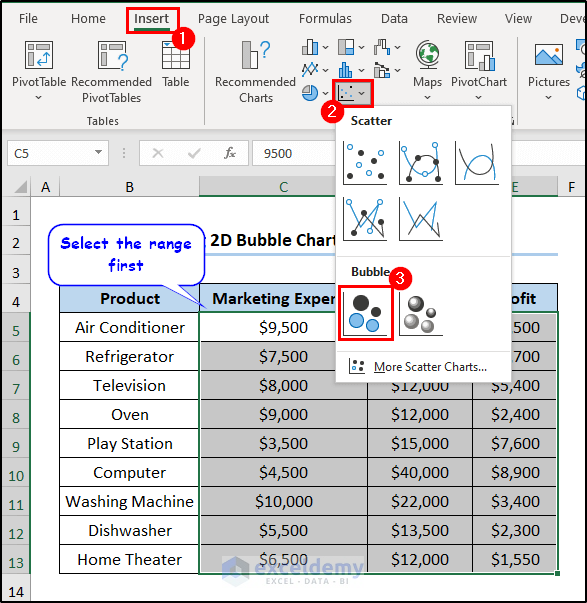
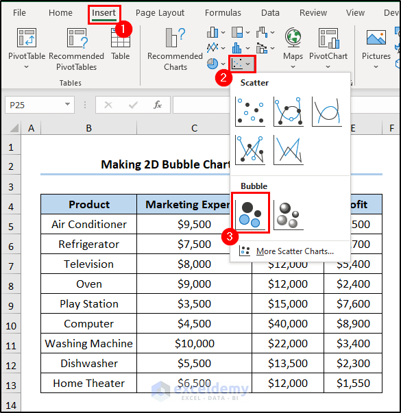
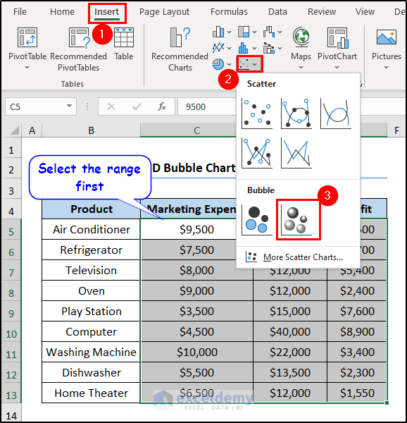
- Select the range which you want to plot in the bubble chart first. We are selecting the range C5:E13.
- Now go to the Insert tab and choose Insert Scatter (X, Y) or Bubble Chart from the Charts group.
- Then select Bubble from the drop-down menu.
- As a result, the bubble chart will appear on the spreadsheet.
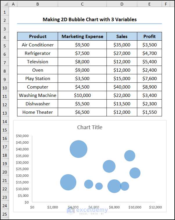
- After some modifications, the chart looks like this.
Alternative Way to Insert Chart Bubble in Excel
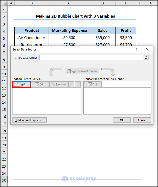
Instead of choosing the range, you can manually insert them later too. Follow these steps for that.
- Go to the Insert tab and select Insert Scatter (X, Y) or Bubble Chart from the Charts group first.
- For not selecting the range, an empty chart will appear. Click on it.
- You will see the Chart Design tab appearing on your ribbon.
- Select Select Data from the Data group of this tab.

- As a result, the Select Data Source wizard will appear. Click on the Add button in it.
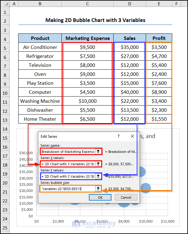
- In the Series name, we inserted “Breakdown of Marketing Expense, Sales, and Profit”. We have chosen the ranges C5:C13 and D5:D13 as Series X and Y values. As for the Series bubble size, we selected the range E5:E13.
- After clicking OK in both boxes, we will get a bubble chart like below.
- With some modifications, we can get the same look as previously.
Read More: How to Create a 3D Bubble Chart in Excel
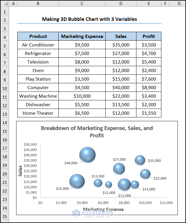
Example-2: Inserting a 3D Bubble Chart with 3 Variables
Excel also enables us to make a 3-dimensional bubble chart and the process is quite similar to the previous example. So, let’s see it in action.
- First, select the range which you want to plot in the bubble chart first. We are selecting the range C5:E13.
- Now go to the Insert tab and choose Insert Scatter (X, Y) or Bubble Chart from the Charts option.
- Then select 3-D Bubble from the drop-down menu.
- As a result, a chart will appear on top of the spreadsheet.
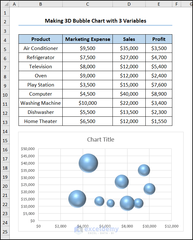
- After some modifications, the chart looks like below.
Read More: How to Create a Bubble Matrix in Excel
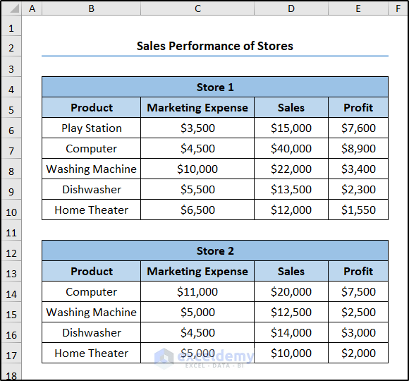
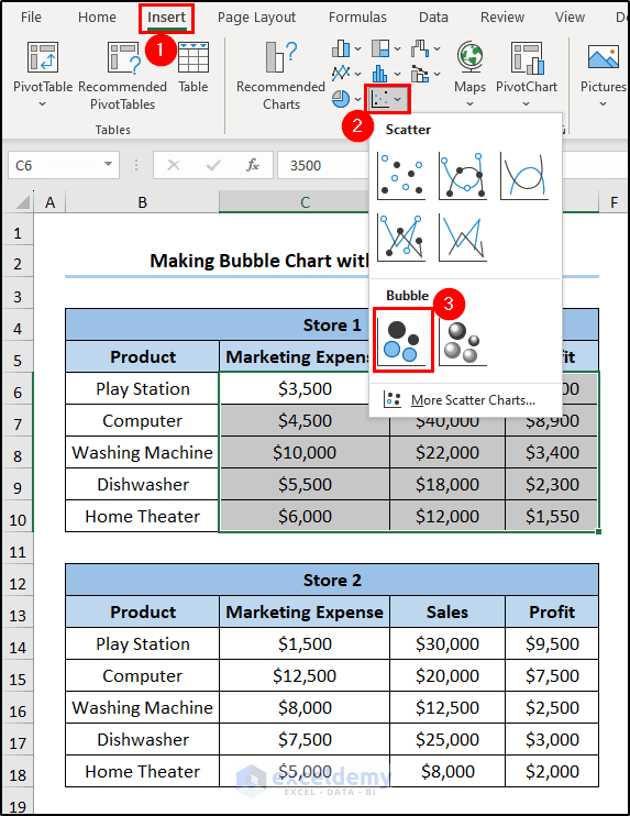
Example-3: Creating a Bubble Chart with Multiple Series
What if you want to insert a bubble chart with two series? Well, you’re in luck because our next example provides the answer to this question. Therefore, just follow along.
Assume a dataset showing the sales performance of two stores in the ranges B6:E10 and B14:E17. The datasets show the name of the products, the marketing expense, the sales value, and the profit earned in the USD of two stores.
- First, select the range C6:E10 and select Insert Scatter (X, Y) or Bubble Chart from the Charts group of the Insert tab.
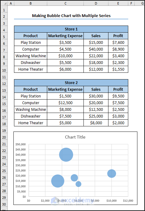
- This will create a bubble chart of the first dataset on the spreadsheet.
- Now click on the chart and select Select Data from the Chart Design You can find it in the Data group of that tab.
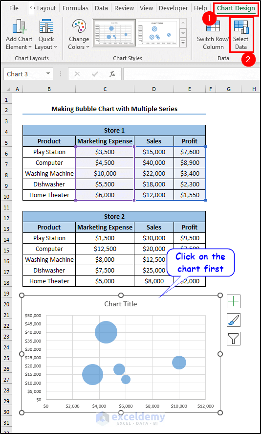
- Now select Add in the Select Data Source box.
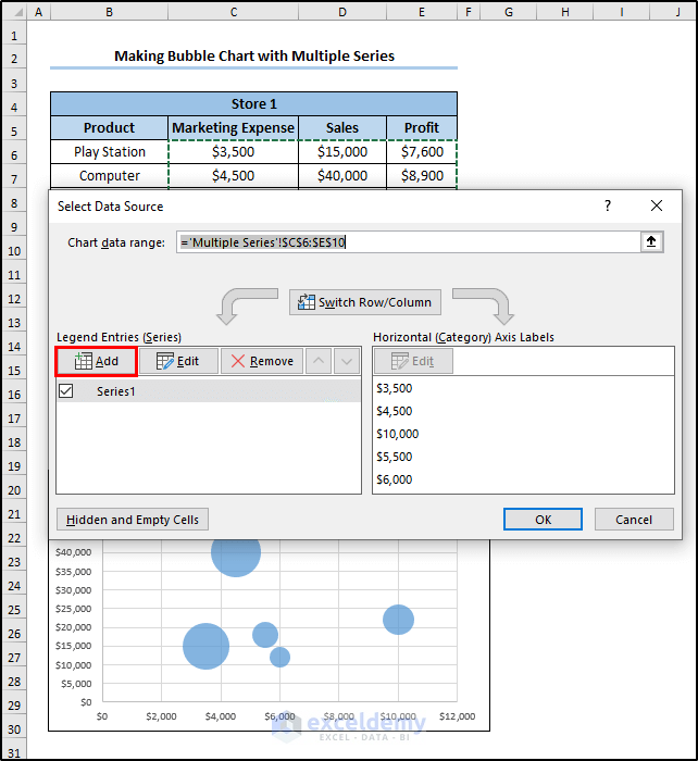
- Then similar to example 1, we have selected the particulars in this wizard for store 2.
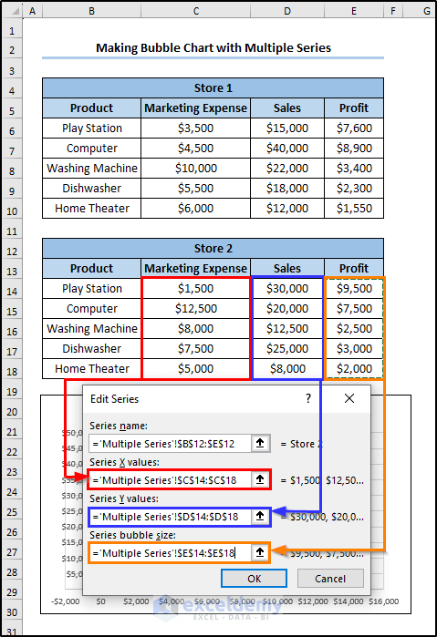
- After clicking on OK in both boxes, the bubble chart consisting of two datasets will emerge.
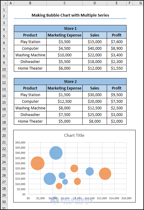
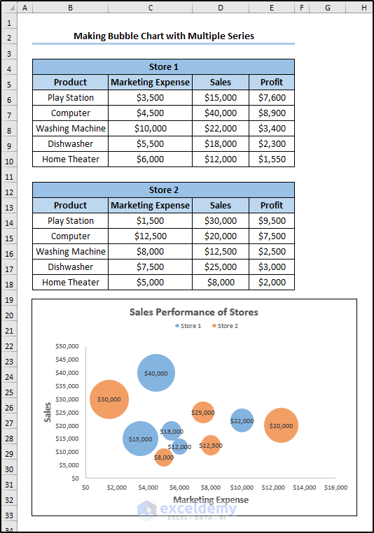
- With some modifications, it will look like this.
Read More: How to Create a Bubble Chart in Excel with Labels
Formatting a Bubble Chart in Excel
We discussed Excel bubble chart examples. The point of creating a bubble chart is the visual representation. By default, Excel may give you some files depending on the version you are using. You may not always want the output like that. Luckily, Excel also offers various formatting options for all types of charts. Bubble charts are no exception. So we are discussing some of the basic formatting options available in Excel.
Adding/Removing Axis Title
- Click on the chart first. The Chart Design tab will appear on the ribbon.
- Select Add Chart Element from the Chart Layouts group there and select Axis Title from the drop-down.
- There are two options there- Primary Horizontal and Primary Vertical. If you have them on the chart, selecting them will remove them. Otherwise, it will add them to the bubble chart.

Adding Colors to Bubble Chart
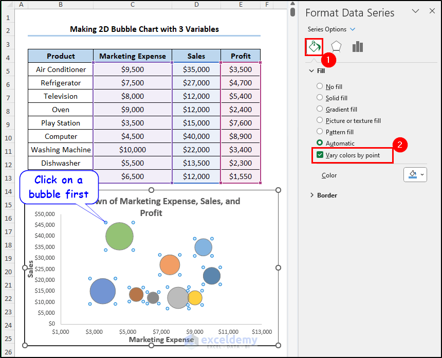
- To add colors, click on a bubble first. The Format Data Series wizard will open on the right of the spreadsheet.
- Select the Fill & Line tab and you can select the type and color of the fill of the bubbles.
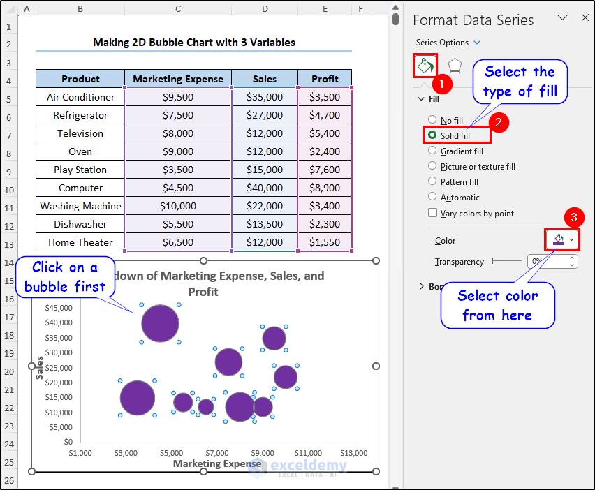
- If you want different colors for each of the bubbles, you can select the Vary colors by point option available under Fill.
Adding Data Labels
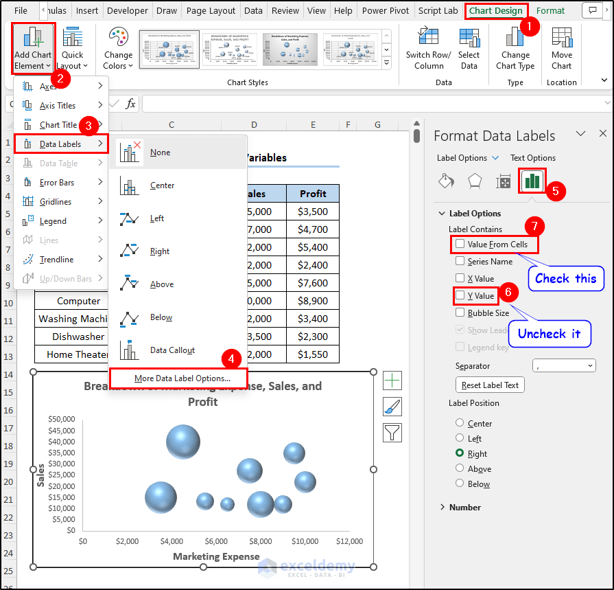
- Click on the chart and go to the Chart Design Select Add Chart Element from there.
- Then select Data Labels from the drop-down. From the list beside it, select More Data Label Options.
- As a result, the Format Data Labels wizard will open up. First, uncheck the Y Value option under the Label Options. Then check the Value From Cells.
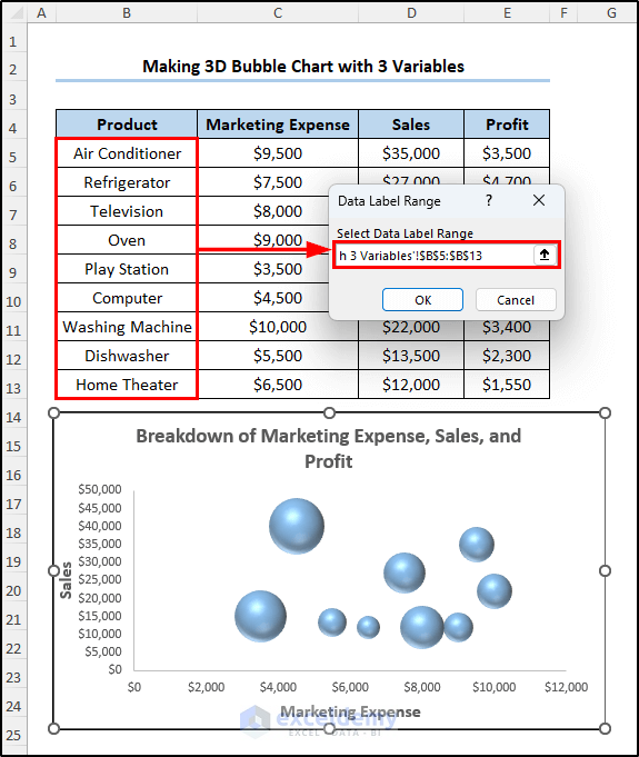
- In the Data Label Range box that will pop up next, select the range you want the label to be from. For example, we have selected the range B5:B13.
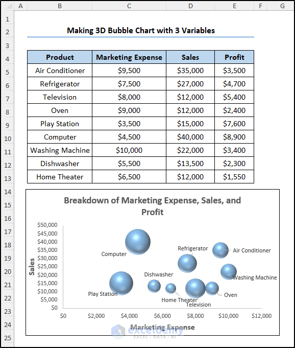
- After clicking on OK, we will get the labels like this.
Best Practices While Working with Excel Bubble Chart
The purpose of working with bubble charts is to represent the data. There are some common messes while working with them. We should care to avoid them while using a bubble chart
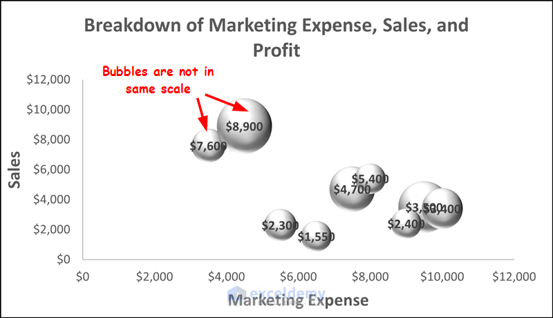
- Make sure the bubbles are on the same scale. The third column of the selection is always the size of the dataset. For example, we have used the second column of the second example to represent the size and the $8900 value bubble is almost twice of the $7600 value in the figure.
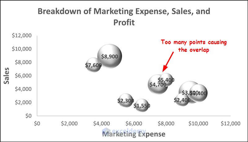
- Try to have a limited number of points for the bubble chart to plot. For instance, we can already see an overlap occurring in the previous point. It doesn’t occur particularly from any errors but from too many data points. So try to limit them while plotting bubble charts.
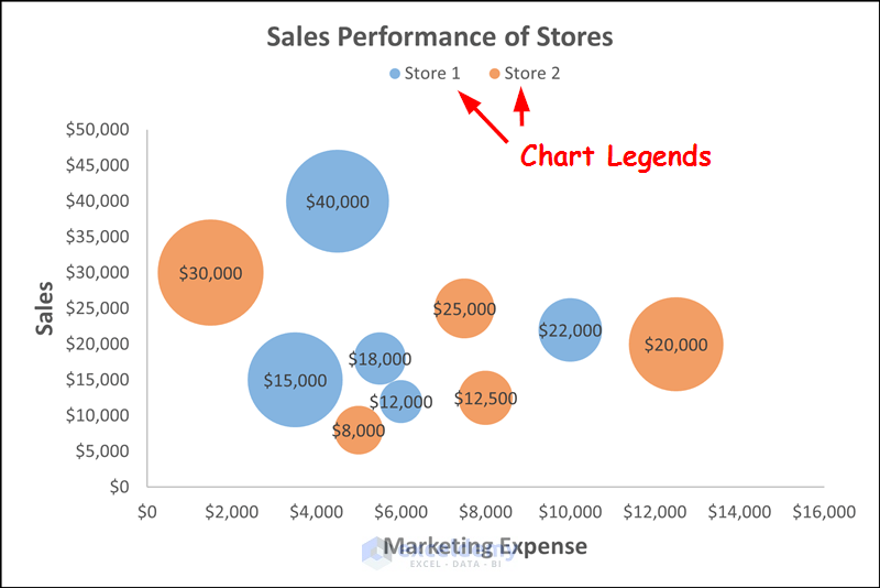
- When you have more than one dataset, it is very beneficial to have chart legends. For example, we had one in our third example. That indicates some bubbles are from sales of the first store and some are from the second store.
- If you have a negative value in the dataset, Excel won’t plot them in the bubble chart. This is simply because the bubble charts usually represent the area of the third column. And a negative value simply can’t represent any area. So try to avoid plotting bubble charts if you want to represent the visualization of data with negative values.
Advantages and Disadvantages of Bubble Chart in Excel
Like any other chart, a bubble chart can also have its advantages and disadvantages.
Advantages of bubble charts include-
- Applicable for 3-dimensional datasets.
- Can highlight patterns and correlations.
- Visually pleasing, and thus can be more engaging to viewers.
- Supports hierarchical structures because spotting the biggest and smallest values can be easier with areas.
- Can be used for multiple datasets.
However, it comes with some disadvantages also-
- For inexperienced users, it can be difficult to understand.
- The data points are limited. We can’t use more than three variables.
- Precise comparison of two areas can be difficult as there are no direct scales involved for areas.
- It doesn’t have any standardized format or guidelines like other chart types. So it can be inconsistent.
Things to Remember
- The third column of the selection determines the size of the bubble chart unless you change them manually.
- The first two columns are the X and Y axis of the chart.
- Don’t choose too many variables as they can overlap and result in unclear charts.
Frequently Asked Questions
- What is a bubble chart used for?
Bubble charts can be used for various purposes. Such as relationship analysis, proportional data comparison, cluster analysis, hierarchical data representation, and multivariate data visualization.
- Which data type is a bubble chart suitable for?
A bubble chart is suitable for datasets with 3 numeric columns. The first two columns are the X and Y axis of the chart while the third one is the area of circles. The data type of all three has to be numeric in value.
- Can I change the size or color of the bubbles in a bubble chart?
You can easily change the color by double-clicking on any of the circles and using the Format Data Series wizard on the right of the spreadsheet.
However, the size of them will always be dependent on the values of the third column of the selection. Unless the value of them changes, the size of the bubbles in the chart won’t change.
Download Practice Workbook
You can download the workbook used for the demonstration of this article from the link below.
Conclusion
That concludes our discussion on the Excel bubble chart examples. We have included three different scenarios of using a bubble chart- 2-D, 3-D, and creating one with multiple datasets. Hopefully, the idea was easy to grasp and you can plot your bubble charts easily now. I hope you found the article helpful and informative.
If you have any questions or suggestions on Excel bubble chart examples, let us know in the comments below.
Related Articles
- How to Create 4 Quadrant Bubble Chart in Excel
- How to Create a Project Portfolio Bubble Chart in Excel
<< Go Back To Bubble Chart in Excel | Excel Charts | Learn Excel
Get FREE Advanced Excel Exercises with Solutions!
