The Bubble Chart is a type of scatter plot chart that replaces data points with bubbles. It has horizontal and vertical axis like the scatter plot chart and also has an additional dimension of data that represents the size of the bubble. It is really useful to represent your dataset of 3 variables in a single plot. In this article, we will learn how to create Bubble Chart in Excel in 2 suitable ways.
How to Create Bubble Chart in Excel: 2 Suitable Examples
We can create 2D and 3D bubble charts in Excel with single or multiple series of data. In this article, we will learn how to create Bubble Chart in Excel with 2D and 3D bubble charts. Also, we will learn how to create a bubble chart with multiple series of data.
1. Create 2D Bubble Chart in Excel
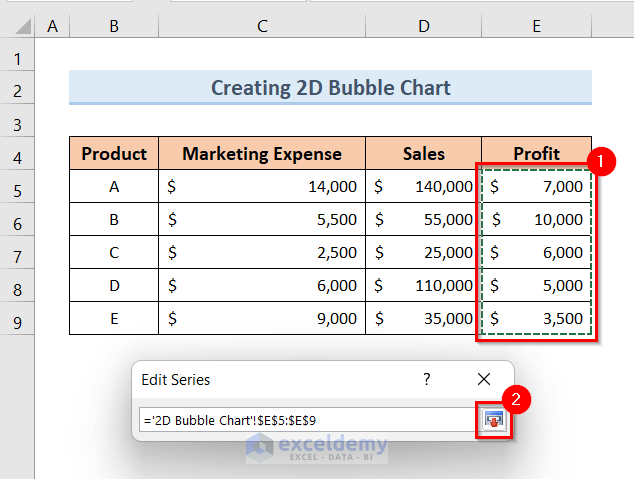
In order to create a 2D bubble chart in Excel, we will need a dataset like the below one. The dataset contains Marketing Expenses, Sales, and Profit of 5 products of a shop. We will create a 2D bubble chart keeping Marketing Expense as the horizontal axis, Sales as the vertical axis, and Profit as the size of the bubble.

Steps:
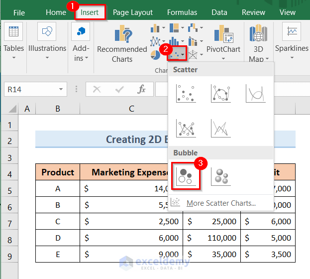
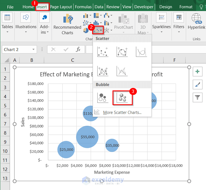
- First, click on the Insert tab.
- Next, click on the Insert Scatter (X, Y) or Bubble Chart drop-down option.
- After that, choose the Bubble option like the image below.
- As a result, it will open an empty plot.
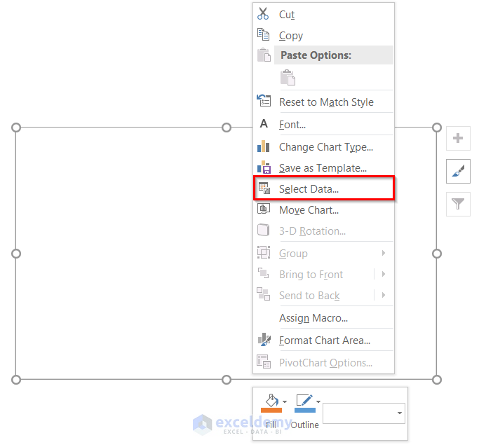
- Subsequently, right-click on the empty plot.
- Now, click on the Select Data Source option from the pop-up window.
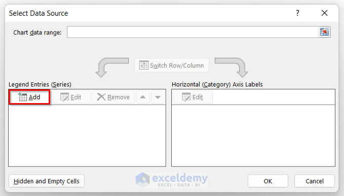
- After that, the Select Data Source window will pop up.
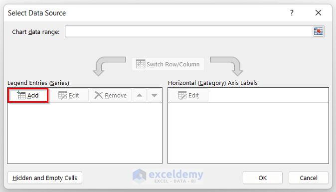
- Now, click on the Add option like the image below.
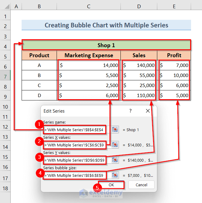
- Next, type Effect of Marketing Expense on Sales and Profit in the Series name field.
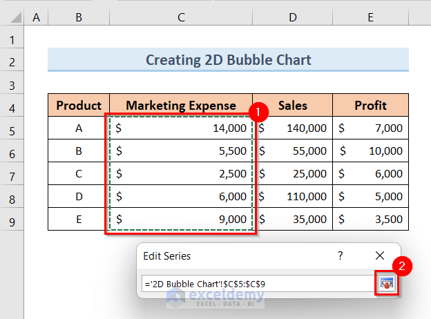
- After that, click on the Select Range in the Series X values field.
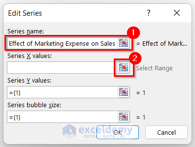
- Subsequently, select the cells ($C$5:$C$9) from Marketing Expense and complete the range.
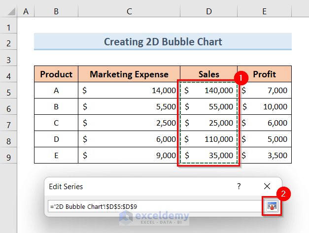
- After that, click on the Select Range in the Series Y values option like the image below.
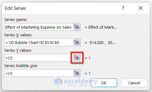
- Furthermore, select the cells ($D$5:$D$9) from Sales and complete the range.
- Then, click on the Select Range in the Series bubble size option like the below one.
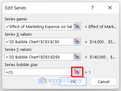
- Afterward, select the cells ($E$5:$E$9) from Profit and complete the range.
- After selecting the X, Y, and bubble size values, click OK.

- As a result, you will see a 2D bubble chart like below.

- After that, in order to modify the chart, select the chart.
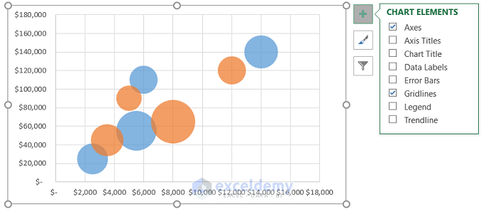
- Next, click on the ‘+’ sign.

- As a result, it will open the Chart Element window.
- Then, select the Axis Title and Data Labels options like the image below.

- Finally, change the axis titles as you want and your 2D bubble chart is ready.

Hope, you’ve now got a clear idea of how to create bubble chart in Excel with the help of this 2D chart.
Read More: How to Create 4 Quadrant Bubble Chart in Excel
2. Insert 3D Bubble Chart in Excel
In order to insert a 3D bubble chart in Excel, you need to follow the above-described steps. Once your 2D bubble chart is ready, you can create a 3D bubble chart from the 2D chart. To make a 3D bubble chart, follow the steps below.

Steps:
- First, select the 2D bubble chart.
- Next, click on the Insert tab.
- Then, click on the Insert Scatter (X, Y) or Bubble Chart drop-down option.
- After that, choose the 3-D Bubble option like the image below.
- As a result, you will see a 3D bubble chart like the below one.

Read More: How to Create a Bubble Matrix in Excel
How to Create Bubble Chart in Excel with Multiple Series
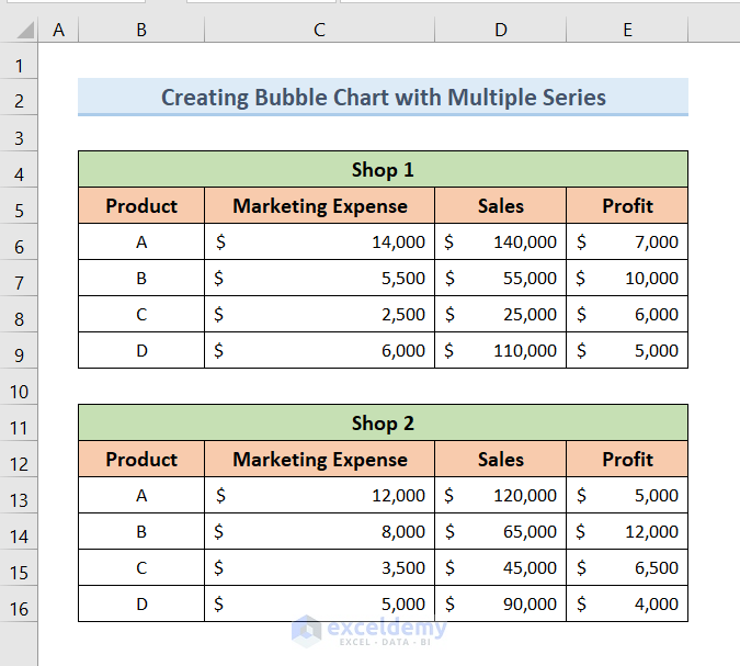
We can also create a bubble chart with multiple series of data. Here is an example of how to create a bubble chart in Excel with multiple series of data. We have 2 series of data of 2 shops having Marketing Expense, Sales and Profit of 4 products. Now we will create a bubble chart from these 2 series of data.
Steps:
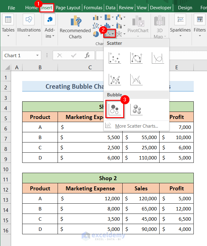
- First, click on the Insert tab.
- Next, click on the Insert Scatter (X, Y) or Bubble Chart drop-down option.
- Afterward, choose the Bubble option like the image below.
- As a result, it will open an empty plot.
- After that, right-click on the empty plot.
- Now, click on the Select Data option from the pop-up window.

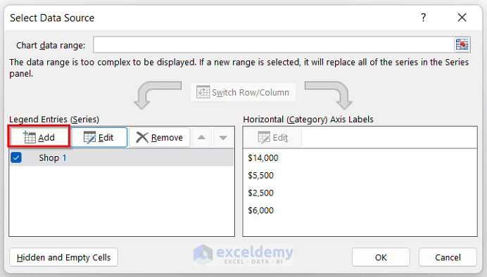
- Hence, the above action will open a new window named Select Data Source.
- Now, click on the Add option like the image below.
- Next, select the Series name, Series X values, Series Y values, and Series Bubble size in the same way as the 2D bubble chart method for Shop 1 dataset.
- Then, click OK.
- Next, click on the Add option again.
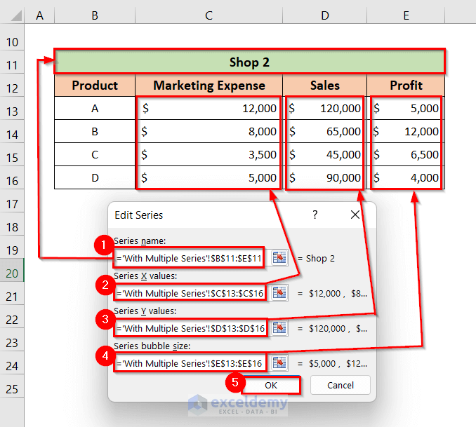
- Furthermore, select the Series name, Series X values, Series Y values, and Series Bubble size in the same way as the 2D bubble chart method for Shop 2 dataset.
- Hence, click OK.
- As a result, the Select Data Source window will pop up.
- Then, click OK.

- As a result, you will see a 2D bubble chart with 2 series of data each having a different color.

- After that, in order to modify the chart, select the chart.
- Next, click on the ‘+’ sign.

- As a result, it will open the Chart Element window.
- Then, select the Axis Title, Data Labels, and Legend options like the image below.

- Finally, change the axis titles as you want and your bubble chart with multiple series of data is ready.

Read More: How to Create a Bubble Chart in Excel with Labels
Things to Remember
- If you want to represent your dataset of 3 variables in a single plot, then a bubble chart is the best option for you.
- In order to insert a 3D bubble chart, you need to create a 2D bubble chart first.
- After creating the bubble chart (2D or 3D), you can modify the chart in your own way.
- A 3D bubble chart with multiple series of data can also be created from a 2D bubble chart with multiple series of data.
You can download the Excel workbook from here.
Conclusion
Hence, follow the above-described methods. Thus, you can easily learn how to create bubble chart in Excel. Hope this will be helpful. Don’t forget to drop your comments, suggestions, or queries in the comment section below.
Related Articles
<< Go Back To Bubble Chart in Excel | Excel Charts | Learn Excel
Get FREE Advanced Excel Exercises with Solutions!
