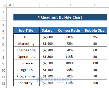
Step 1 – Prepare the Dataset
- We set some job titles and their corresponding salaries. We’ll use the salary as the X-axis.
- We find out the compa ratio of that salary paid by the company. Compa Ratio is the short form of compensation ratio. This ratio demonstrates the salary of the employee compared to the market salary. Compa ratio allows the employees to know about their position. It denotes whether employees get competitive salaries or below the average market salary. In our bubble chart, we’ll use the compa ratio as the Y-axis.
- We set some bubble sizes.
Read More: Excel Bubble Chart Examples
Step 2 – Create the Bubble Chart
- Select the range of cells B4 to E12.
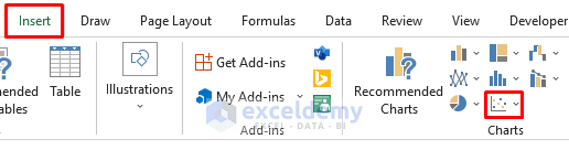
- Go to the Insert tab in the ribbon,
- From the Charts group, select Insert Scatter or Bubble Chart option.
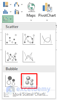
- You’ll get two different bubble chart options.
- Select any of them. We chose the second one.
- Here’s the resulting stock chart.
- Right-click on the bubble chart.
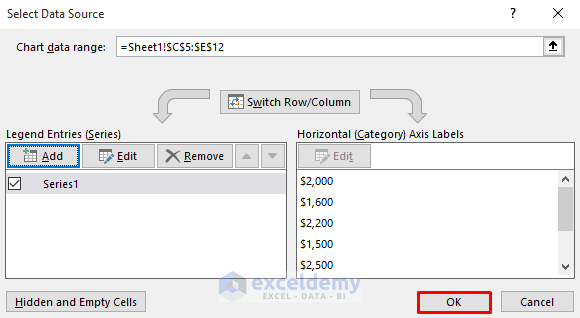
- Select the Select Data option.
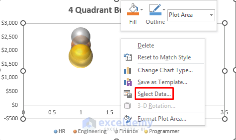
- This will open the Select Data Source dialog box.
- In the Legend Entries (Series), remove all the series one after another by clicking the Remove option.
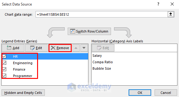
- It will make the Legend Entries(Series) section blank.
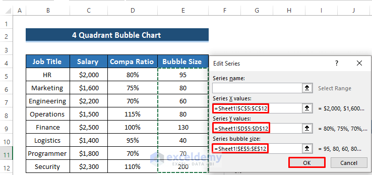
- Click on Add to create new series.
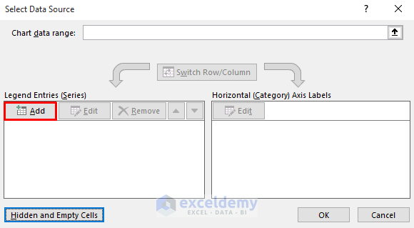
- The Edit Series dialog box will appear.
- In the Series X values section, select the Salary column range of cells C5 to C12.
- In the Series Y values section, select the Compa Ratio column range of cells D5 to D12.
- In the Series bubble size section, select the Bubble Size column range of cells E5 to E12.
- Click on OK.
- In the Select Data Source dialog box, click on OK to apply this series.
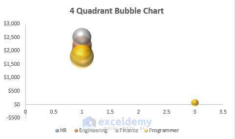
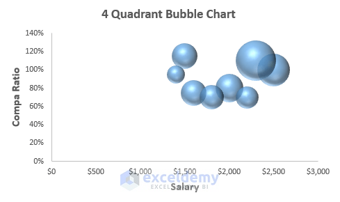
- Here’s the result.
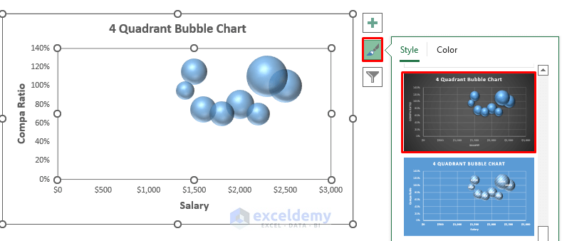
- If you want to edit the Chart Style, click on the Brush icon on the right side of the chart. Select any type of chart style.
- We need additional modifications.
Read More: How to Create a 3D Bubble Chart in Excel
Step 3 – Convert the Bubble Chart to a 4-Quadrant Bubble Chart
- Double-click on the X-axis to open the Format Axis dialog box.
- In the Axis Options section, set the minimum and maximum value that covers the dataset.
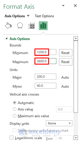
- This will change the X-axis to a new highest and lowest value.
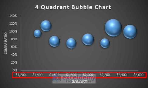
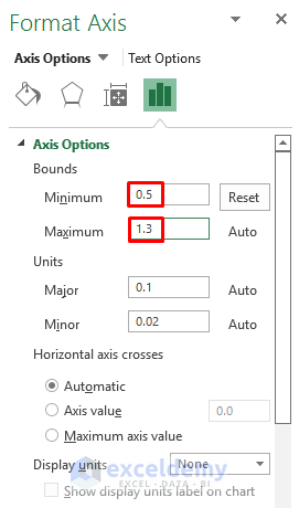
- Double-click on the Y-axis to open the Format Axis dialog box.
- In the Axis Options section, set the minimum and maximum value to cover the dataset.
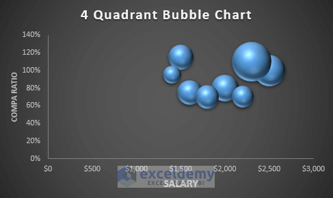
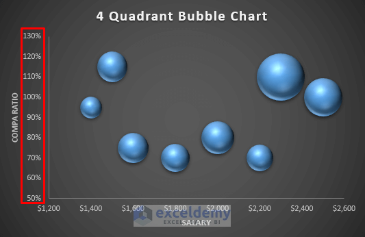
- We get the following result with a better view.
- Right-click on any of the bubbles. It will open up a Context Menu dialog box.
- Select Add Data Labels.
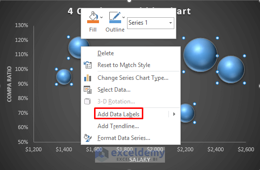
- This will show the compa ratio value in each bubble.
- We want to show the specific job title for the corresponding salary and compa ratio.
- Right-click on any of the bubbles.
- From the Context Menu, select Format Data Labels.
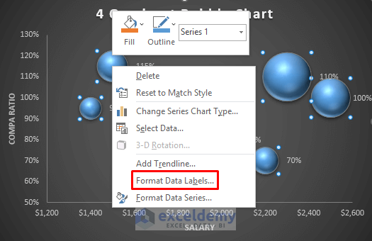
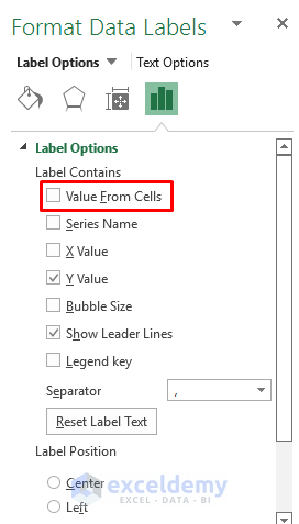
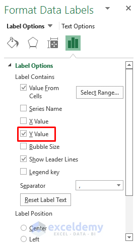
- In the Label Options section, check the Value From Cells option.
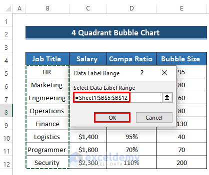
- The Data Label Range dialog box will occur.
- Select the range of cells B5 to B12.
- Click on OK.
- Uncheck the Y Value from Label Options. It will remove the compa ratio from the bubbles.
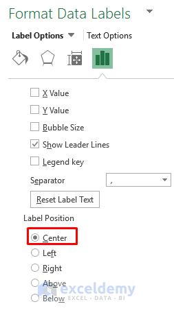
- In the Label Position section, set the label position as Center. That means the label will appear at the center of the bubble.
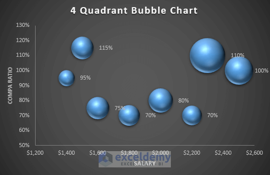
- Here are the new labels.

- To make a 4 quadrant bubble chart, we need to add a new X-axis and Y-axis.
- We need the middle value of the X-axis and Y-axis. The average salary is $1900 and the average compa ratio is 90%.
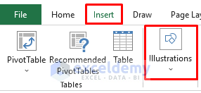
- Go to the Insert tab in the ribbon,
- Select the Illustrations drop-down option.
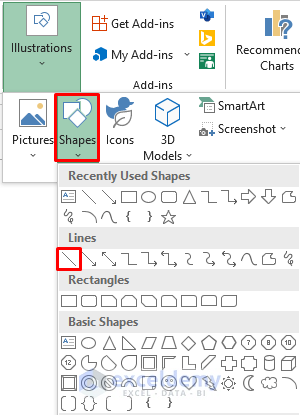
- Select the Shapes drop-down option.
- Select a line.
- The mouse cursor will convert into a plus.
- Draw two lines from the middle values of the X-axis and Y-axis.

- You’ll get the following result.

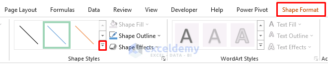
- If you want to change the Shape Style, select the line you created.
- It will open up Shape Format in the ribbon.
- Go to the Shape Format in the ribbon.
- Select the small arrow from the Shape Style group.
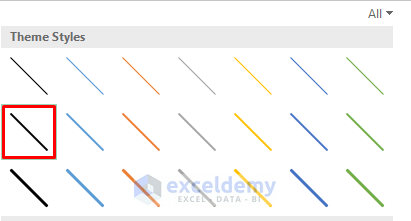
- It will show several Theme Styles. Select any of them.
- We will get our desired 4 quadrant bubble chart in Excel.

Read More: How to Create a Bubble Chart in Excel with Labels
Interpretation of a 4-Quadrant Bubble Chart
- The first section appears when a certain job or job holder has a higher salary and compa ratio. That denotes the most favorable condition for any employee. In our dataset, Security and Finance appear in this section.

- In the next section, we have a case where the compa ratio is high but the salary is low. The job’s overall salary structure is poor compared to other jobs. For such kinds of employees, the company can provide some bonuses to make them motivated.

- In the third section, we have a condition when the salary is high but the compa ratio is low. It can create a negative impact on the employees here because they might believe they can make even more in another company.

- In our last section, we find a condition when both salary and compa ratio is low. This is the most unfavorable condition.

Things to Remember
- We can’t create the quadrant dividers automatically but need to draw them using a line shape. You can use the average formula to determine their values.
Download the Practice Workbook
Related Articles
<< Go Back To Bubble Chart in Excel | Excel Charts | Learn Excel
Get FREE Advanced Excel Exercises with Solutions!
