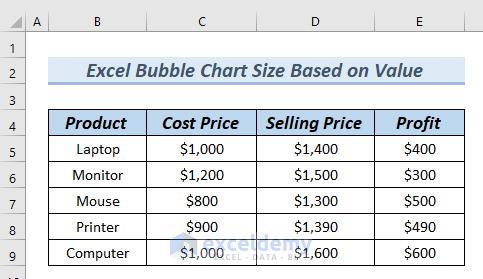
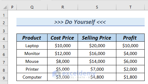
The following table contains the Product, Cost Price, Selling Price, and Profit columns. We will create an Excel Bubble chart and adjust the bubble size based on value.
Method 1 – Using the Context Menu Bar to Adjust the Bubble Chart Size Based on Value
Step 1 – Inserting the Bubble Chart
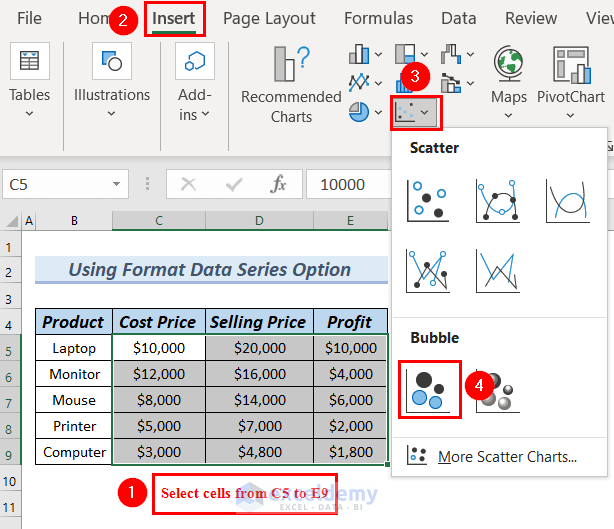
- Select the cells from C5 to E9.
- Go to the Insert tab.
- From Insert Scatter (X, Y) or Bubble Chart, select a Bubble chart.
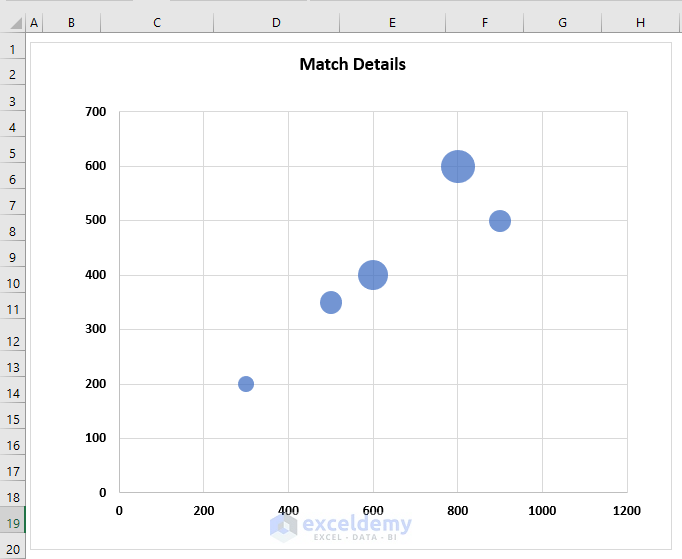
- You will see the Bubble chart.
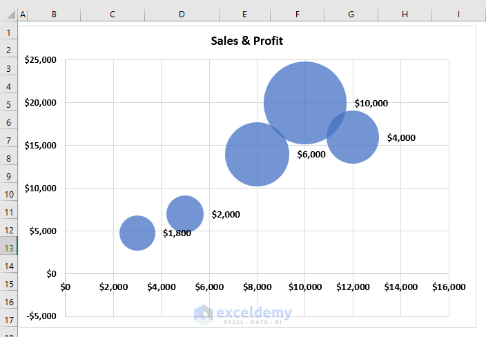
- Click on the Chart Title to edit the Chart Title.
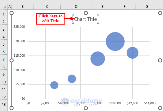
- You can see the Bubble chart with a Chart Title.
Step 2 – Using the Format Data Series Option
- Right-click on the bubbles in the Bubble chart.
- Select the Format Data Series option from the Context Menu.
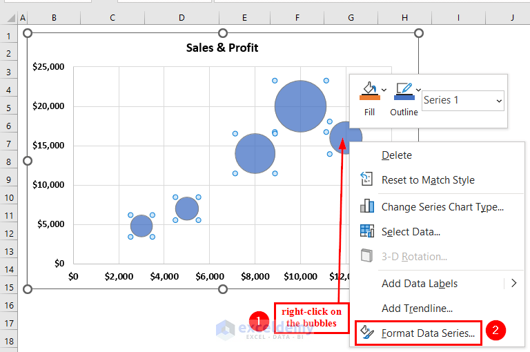
- A Format Data Series dialog box will appear on the right side of the Excel sheet.
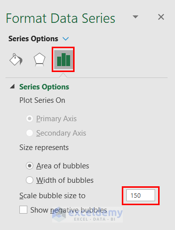
- From Series Options, set the Scale bubble size to 150.
- You can set the Scale bubble size to any size.
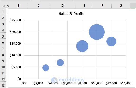
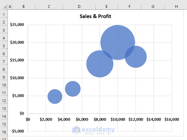
- The bubble size of the Bubble chart has increased.
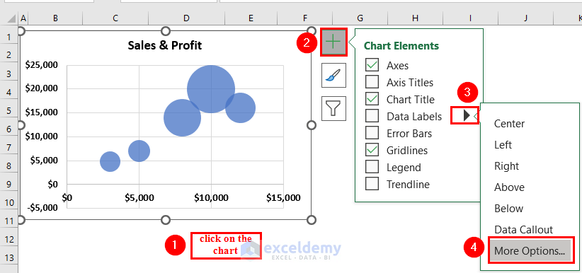
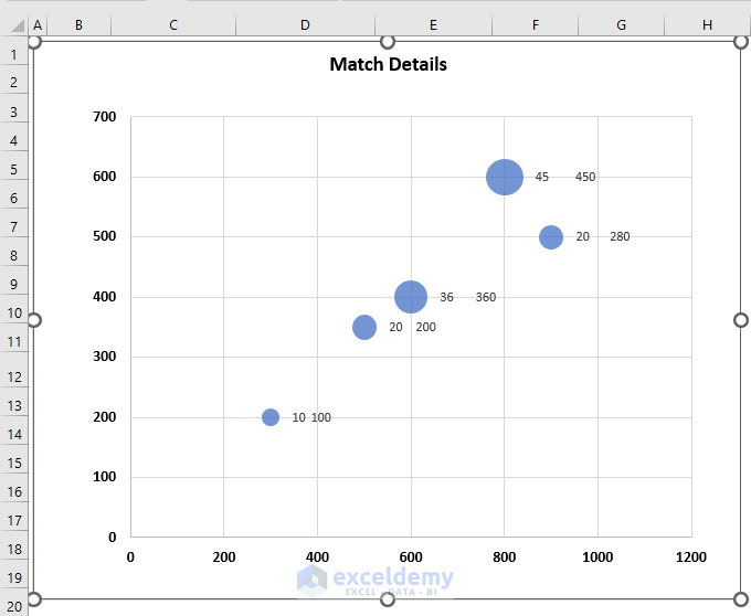
Step 3 – Adding Data Labels to the Bubble Chart
- Click on the Bubble chart.
- From Chart Elements, click on the right arrow for Data Labels.
- Select More Options.
- A Format Data Labels dialog box will appear on the right side of the Excel sheet.
- Go to Label Options.
- From Label Options, unmark Y Values and mark Bubble Size.
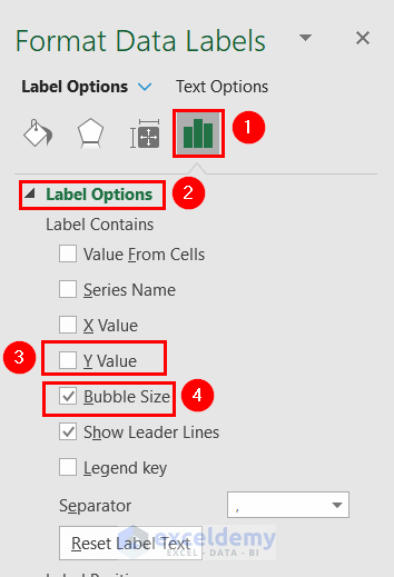
- You can see the Bubble chart with Bubble Size from the Label options.
Read More: How to Color Excel Bubble Chart Based on Value
Method 2 – Use the Paste Special Feature to Adjust the Bubble Chart Size Based on Value
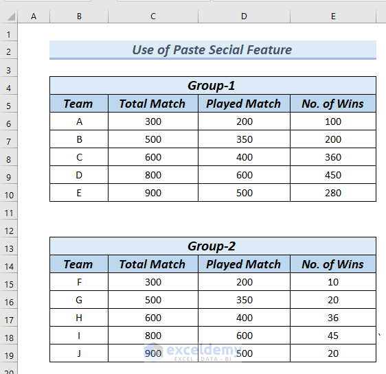
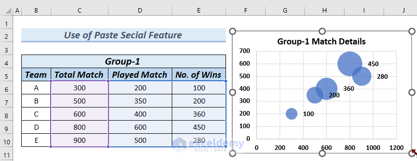
We have two tables of Group-1 and Group-2. The Total Match and Played Match columns in both groups are the same. However, the No. of Wins column is different for both groups. We will create a Bubble chart for both groups.
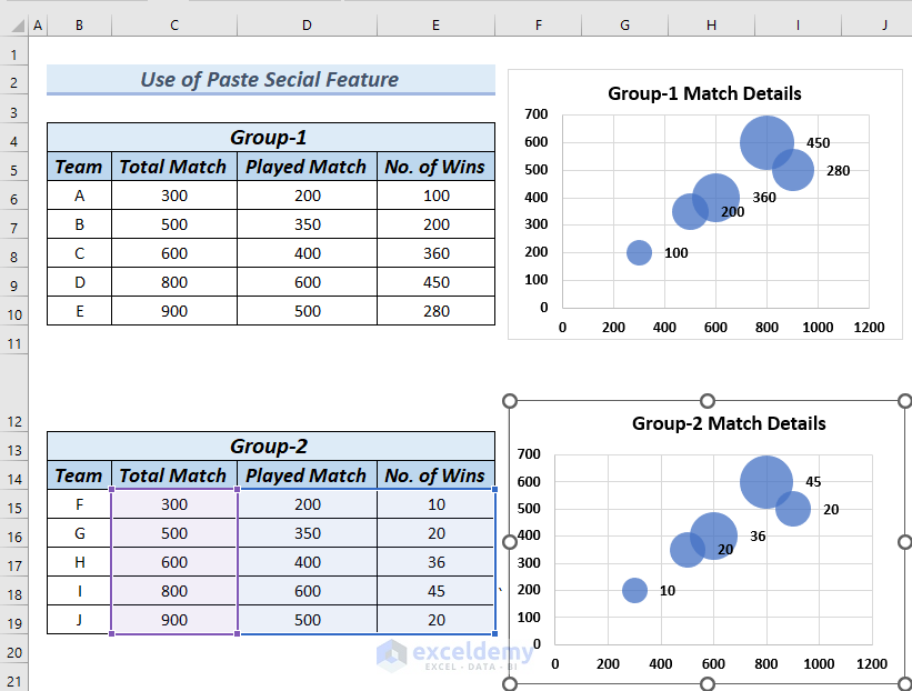
The Bubble charts of these two groups are the same.
Steps:
- Insert a Bubble chart for Group-1 by following Step 1 of Method 1.
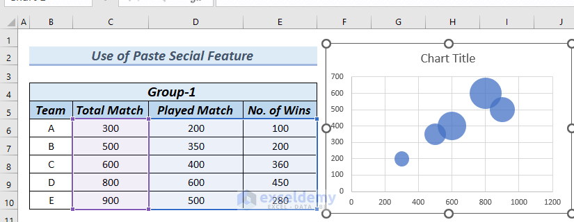
- Edit the Chart Title and follow Step 3 of Method 1 to add Bubble Size from the Label options, which is the No. of Wins, to the Bubble chart.
- Insert a Bubble chart for Group-2 by following Step 1 of Method 1.
- Edit the Chart Title and follow Step 3 of Method 1 to add Bubble Size from the Label options, which is the No. of Wins, to the Bubble chart.
- You can see a Bubble chart of Group-2 with Bubble Size from the Label options
- The two charts look identical.
- Remove the charts.
- Insert a Bubble chart for Group-1 by following Step 1 of Method 1.
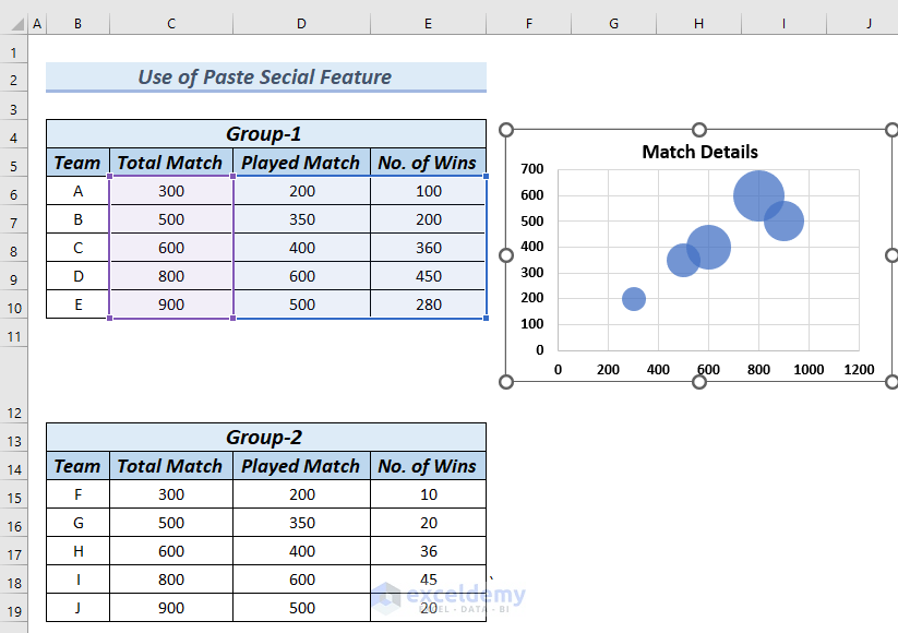
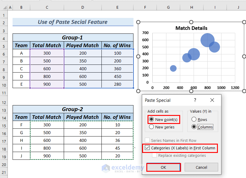
- Select the cells of Group-2 from C15:E19 and copy these cells by pressing Ctrl + C. You can also select these cells and right-click and then select Copy from the Context Menu.
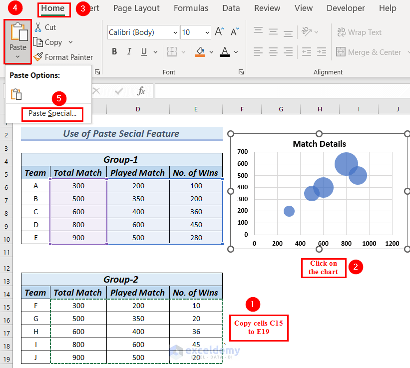
- Click on the Bubble chart.
- Go to the Home tab.
- From the Paste option, select Paste Special.
- A Paste Special dialog box will appear.
- Make sure that New Points are marked under Add cells as option.
- Make sure Categories (X Labels) in first column is also marked.
- Click OK.
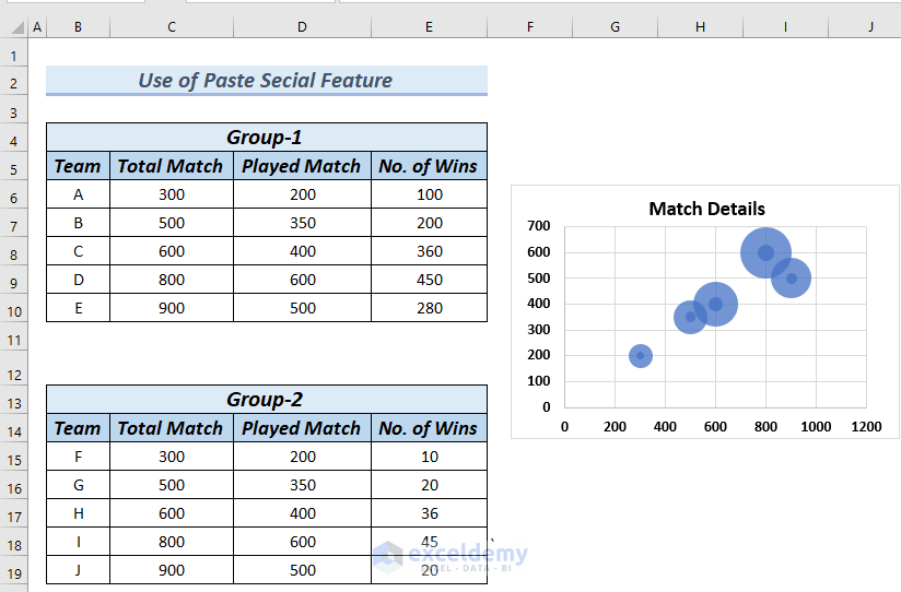
- In the Bubble chart, inside the Group-1 bubbles, the Group-2 bubbles have been created. You can see the size of the Group-2 bubbles is smaller than Group-1 bubbles.
We will hide the larger bubbles of Group-1, so that the Bubble chart only shows smaller bubbles of Group-2.
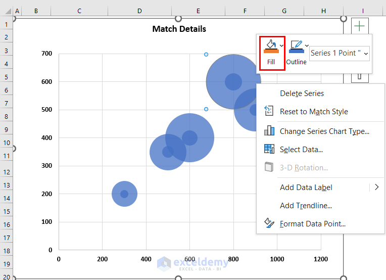
- Select the bubbles on the Bubble chart.
- Click on a single large bubble.
- Right-click on the selected single bubble.
- Click on Fill from the Context Menu.
- Select No Fill from the Fill option.
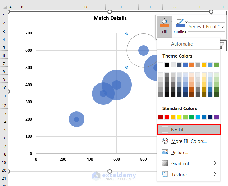
- Repeat the following procedure for other large bubbles to hide all the large bubbles.
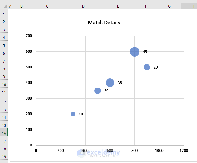
- Here’s the Bubble chart that now only shows the smaller bubbles for Group-2.
We will add Bubble size from the Label option to the Bubble chart. As the Bubble chart now shows the bubble of Group-2, we will keep the Bubble size of Group-2 and delete the Bubble size of Group-1.
- Add Bubble size to the Bubble chart by following the Step 3 of Method 1.
- There are two Bubble sizes. One is for Group-1, and another is for Group-2. We will delete the Bubble size of Group-1.
- Select the Bubble size of the chart.
- Click on the Bubble size you want to delete. We clicked on the value 450 which is a Bubble size value for Group-1.
- Press the Delete button.
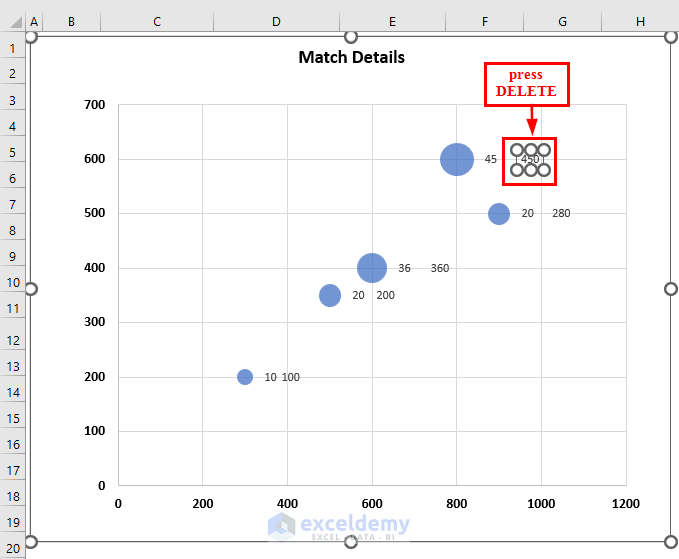
- Repeat to delete all the values of Bubble size for Group-1.
- We have created a Bubble chart size based on value.
Read More: How to Create Bubble Chart for Categorical Data in Excel
Practice Section
You can download the Excel file to practice the explained methods.
Things to Remember
- While inserting a Bubble chart, make sure the heading of the data is not selected. Otherwise, the chart might not show an accurate result.
- As the Bubble chart overlaps bubbles, it is sometimes difficult to read the values of the bubbles. Therefore, it is not convenient to insert a Bubble chart with a huge number of data entries.
- Do not add colors that make the Bubble chart messy and unattractive.
Download the Practice Workbook
Related Articles
- Create Bubble Chart in Excel with Multiple Series
- How to Create Bubble Chart with 2 Variables in Excel
- How to Create Bubble Chart in Excel with 3 Variables
<< Go Back To Bubble Chart in Excel | Excel Charts | Learn Excel
Get FREE Advanced Excel Exercises with Solutions!
