This tutorial will demonstrate how to create Bubble Chart with 2 Variables in Excel. A bubble chart is very useful in interpreting charts. You can use it to display the relationships between different variables. Bubble Charts are best for representing data with more than 2 variables.
What Is Bubble Chart?
The Bubble Chart is a tool for three-dimensional data visualization. With the Bubble Chart, you may plot the third variable in addition to the standard two variables (x and y). The first two variables are represented by coordinates, whereas the third is by the bubble’s size.
Why Do We Use Bubble Chart with 2 Variables in Excel?
The common uses of the chart are:
- Bubble Charts are best for displaying data with more than 2 variables.
- The significant advantage is you don’t have to use any other chart to communicate complex data with more variables.
- You can use this chart to interpret the relationship between major key data.
- You can use this chart for controlling process quality with a corrective approach.
Create Bubble Chart with 2 Variables in Excel: Step-by-Step Procedures
We’ll use a sample dataset overview as an example in Excel to understand easily. If you follow the steps correctly, you should learn how to create Bubble Chart with 2 Variables in Excel. The steps are as follows.
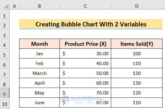
Step 1: Arranging Dataset
In this case, our goal is to arrange a dataset for creating a bubble chart with 2 variables in excel. For instance, we have a dataset of people with their Month in Column B, Product Price(X) in Column C, and Items Sold(Y) in Column D. We’ll use a sample dataset overview as an example in Excel to understand easily.
Read More: How to Create Bubble Chart in Excel with 3 Variables
Step 2: Creating Bubble Chart
Now, our target is to create a bubble chart in Excel. We can do this by following the below steps.
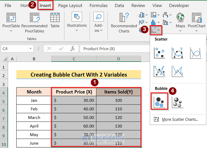
- First, select the desired data table. Then, click the Insert tab and go to the Insert Scatter option, and select the Bubble option.
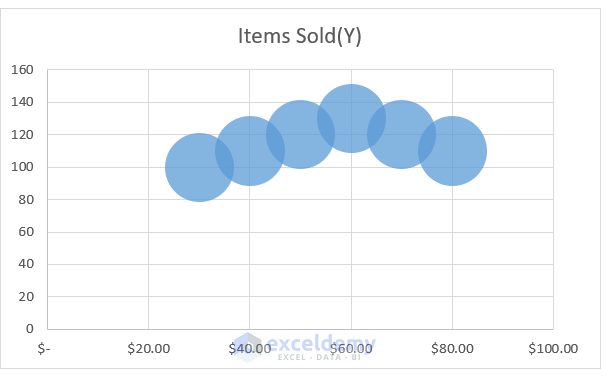
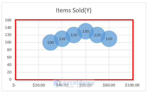
- Then, the following result will come on the display screen.
Read More: How to Create Bubble Chart for Categorical Data in Excel
Step 3: Adding Labels
After creating the bubble chart, we have to add labels on the axis so that it represents the data without confusion. We can do this by following the below steps.
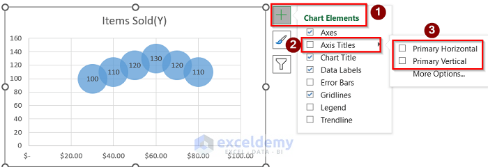
- To begin with, go to the Bubble Chart > Chart Elements > Data Labels options.
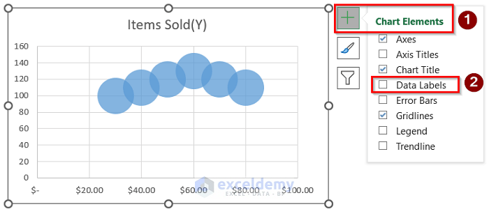
- In addition, the following result will come on the display screen.
- Furthermore, go to the Bubble Chart > Chart Elements > Axis Titles > Primary Horizontal and Primary Vertical options.
- Afterward, you will get the below result.

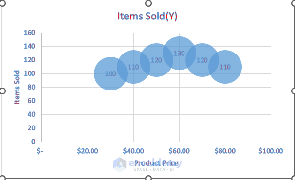
- Finally, name the axes properly and you will get the below result.

Read More: Excel Bubble Chart Size Based on Value
Step 4: Formatting Bubble Chart
Next, we can also make proper changes in the bubble chart by following the below steps.
- Firstly, select the newly inserted bubble chart.
- Secondly, right-click on the bubble chart and select the Format Chart Area option.

- Thirdly, on the right side of your window, you will see the Format Chart Area. Make the changes accordingly to get the desired result.

- Lastly, you will get the below result.
How to Create Bubble Chart in Excel with Multiple Series
In this case, we want to create a bubble chart with multiple series in Excel. We can do this by following the below steps.
Steps:
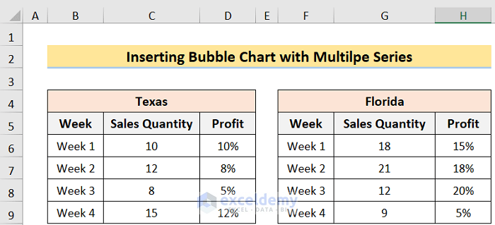
- First, arrange a dataset like the below image.
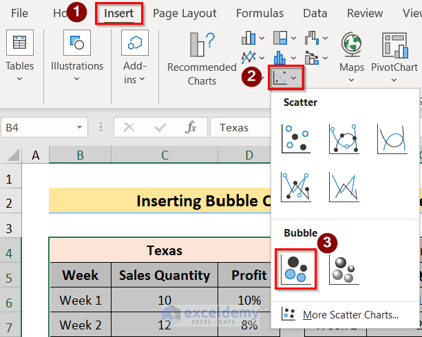
- Second, select desired data range. Then, click the Insert tab and go to the Insert Scatter option, and select the Bubble option.
- Third, you will get the below result.

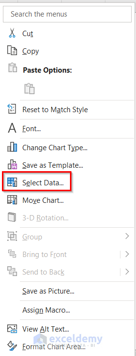
- Fourth, right-click on the data chart and go to the Select Data option.
- Fifth, in the Select Data Source dialog box, go to the Add option and press OK.

- Sixth, then in the Edit Series dialog box, select the desired ranges for the first series and press OK.
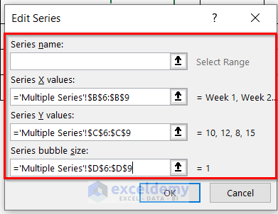
- Seventh, again do the same for another series and press OK.

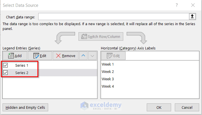
- Eighth, you will get the two series options in the Select Data Source box like the below image. Then, press OK.
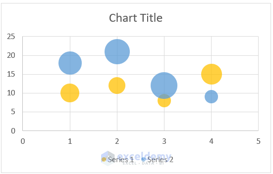
- Ninth, you will get the below result.
- Tenth, go to the Bubble Chart > Chart Elements > Data Labels options.

- Last, you will get the below result.

Things to Remember
- Before creating the bubble chart, make sure to have a clear idea about the dataset. If the bubble chart doesn’t work properly, try to use the Scatter Plot.
- Adding labels is a kind of a must in using any chart. Otherwise, the data will create confusion.
- Formatting should only be used if any necessary change must be made.
Download Practice Workbook
You can download the practice workbook from here.
Conclusion
Henceforth, follow the above-described methods. Hopefully, these methods will help you to learn how to create Bubble Chart with 2 Variables in Excel. We will be glad to know if you can execute the task in any other way. Please feel free to add comments, suggestions, or questions in the section below if you have any confusion or face any problems. We will try our best to solve the problem or work with your suggestions.
Related Articles
<< Go Back To Bubble Chart in Excel | Excel Charts | Learn Excel
Get FREE Advanced Excel Exercises with Solutions!
