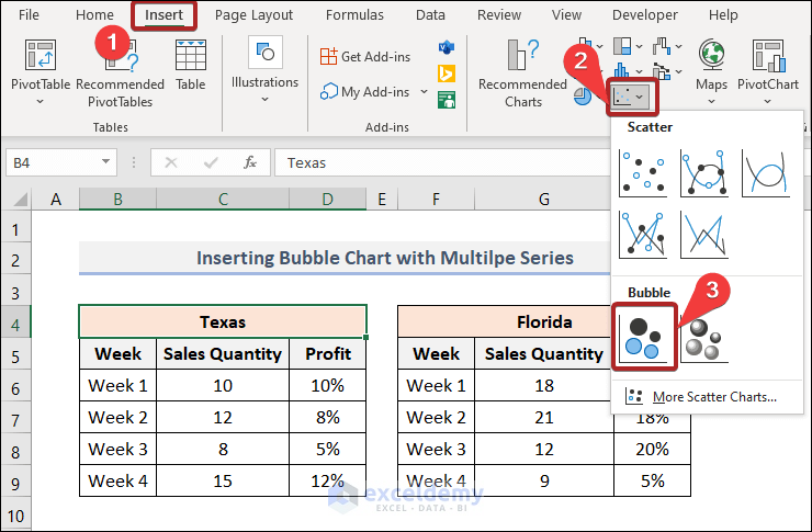
Method 1 – Insert Bubble Chart with Multiple Series in Excel
- Select any cell.
- Go to the Insert tab.
- Select Insert Scatter (X, Y) or Bubble Chart > Bubble.
It inserts a Bubble Chart in our worksheet.

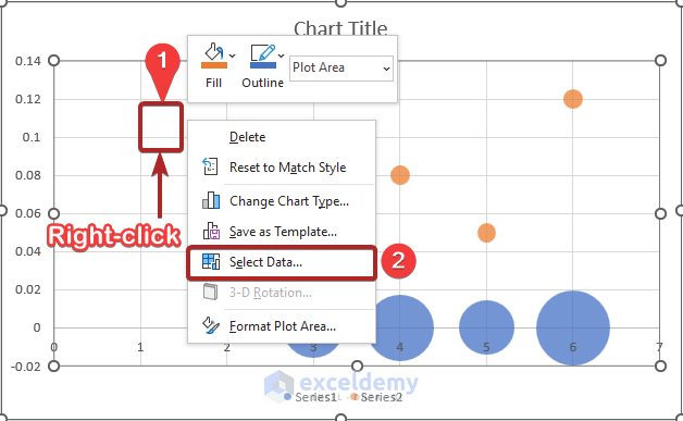
The chart looks like this because we haven’t selected any relevant data. Input significant data into this chart.
- Right-click anywhere on the chart.
- Select the Select Data option.
- The Select Data Source dialog box opens.
- Click on Series 1.
- Select the Remove button.
- Remove Series 2.
- Click OK.
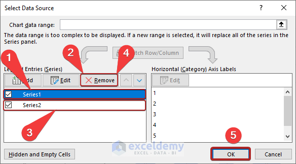
The chart is entirely blank now. We deleted all data from it.

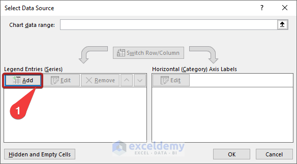
Method 2 – Add Multiple Series to the Chart
- Open the Select Data Source dialog box just like before.
- Click Add in the Legend Entries (Series) section.
- It opens the Edit Series dialog box.
- Select the relevant cells for the text boxes as in the image below.
- Click OK.
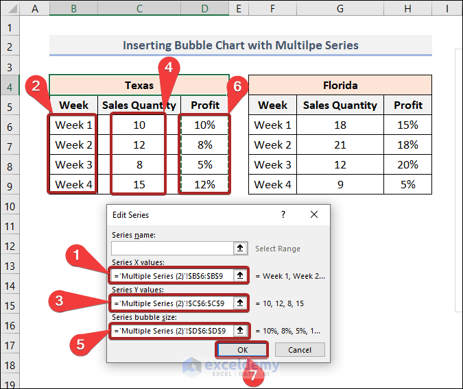
- We added Series 1 to our Bubble Chart. The weeks are also in the Horizontal (Category) Axis Labels.
- Click the Add button to add our 2nd series.
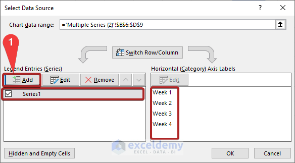
- Add the 2nd series in the Legend Entries (Series) section.
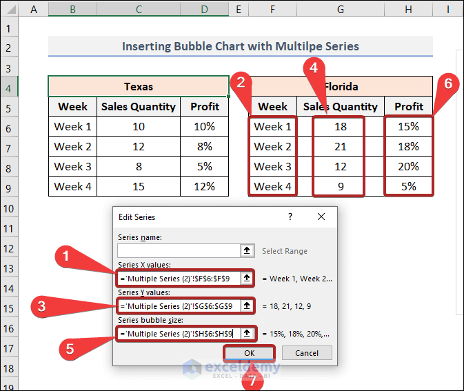
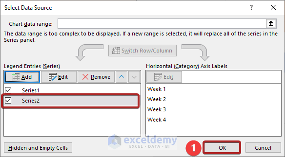
- Ae also added Series 2.
- Click OK.
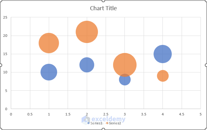
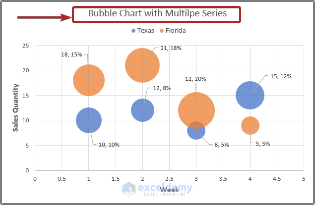
The Bubble Chart looks like the one below.
Method 3 – Edit Multiple Series Labels
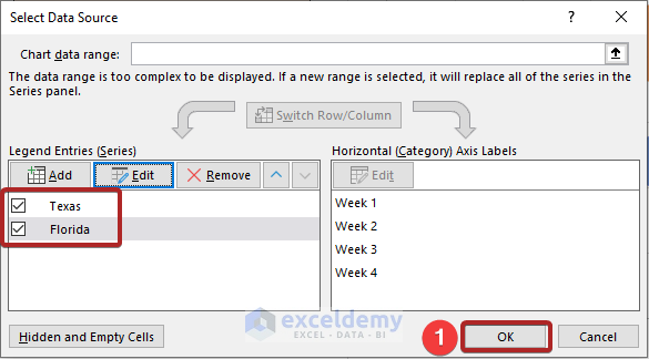
- Open the Select Data Source dialog box like before.
- Select Series 1 from the list.
- Click on the Edit button.
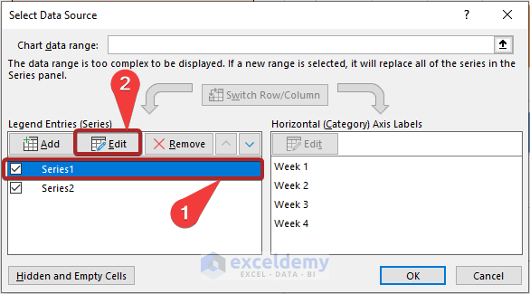
- It opens the Edit Series dialog box again.
- Click on the Series Name box.
- Select cell B4 as a cell reference.
- Click OK.
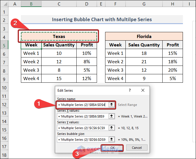
- Edit the Series Name of Series 2 also.
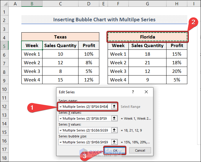
- Through our previous actions, we successfully changed the series names. We changed them in Legend Entries (Series) from Series 1 and Series 2 to Texas and Florida, the names of the two states.
- Click OK.
The Bar Chart just looks like the one below.
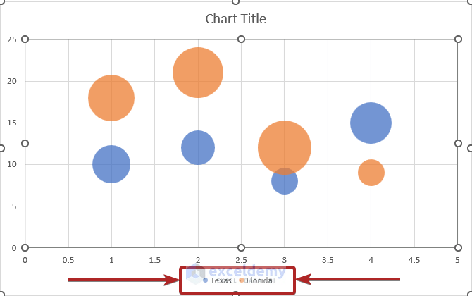
The series names in the chart above have also changed. Before, they were Series 1 and Series 2.
Method 4 – Add Legend to the Bubble Chart
- Go to the Chart Design tab.
- Select Add Chart Element from the ribbon.
- From the drop-down list, select Legend > Top.
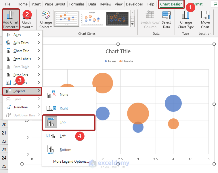
The chart Legend will be visible at the top, below the Chart Title. We can notice that in the image above.
Method 5 – Add Axis Title to Bubble Chart with Multiple Series in Excel
Adding Axis Title in a chart is also important. An Axis Title links specific data categories to the visual information. We’ll add this title to the chart.
- Go to the Chart Design tab.
- Select Add Chart Element from the ribbon.
- From the drop-down list, select Axis Titles > Primary Horizontal.
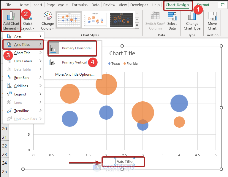
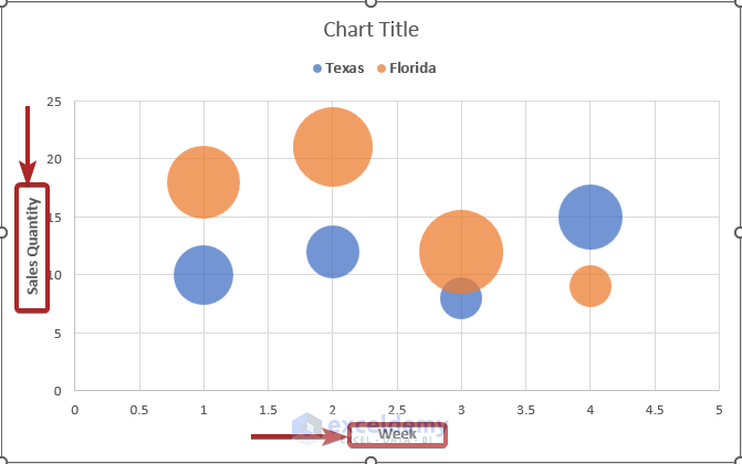
The Axis Title of the X-axis is visible in the image above.
- Add the Primary Vertical type Axis Title in the chart also.
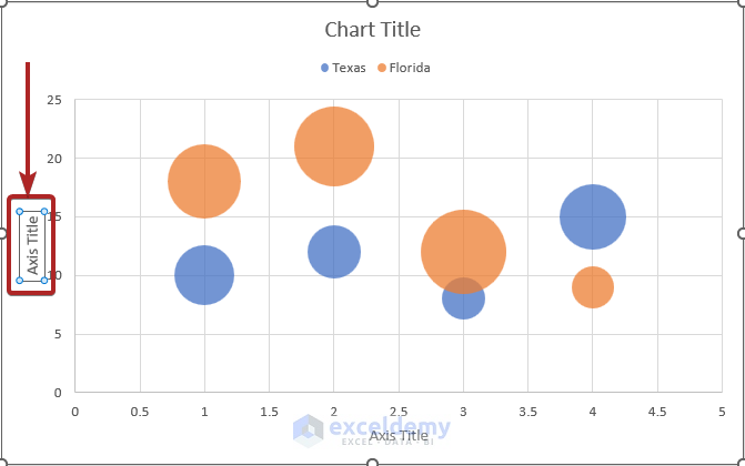
- Click on those titles.
- Edit them and give suitable titles related to the dataset.
Method 6 – Add Data Labels
Data labels help a chart’s viewers better understand its contents by providing information on a data series or its data points. Add the Data Labels to the chart.
- Go to the Chart Design tab.
- Select Add Chart Element from the ribbon.
- From the drop-down list, select Data Labels > More Data Label Options.
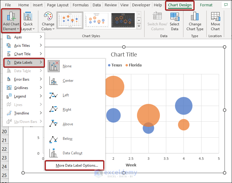
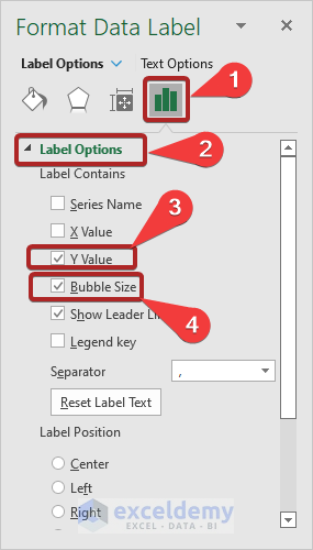
- It opens the Format Data Label task pane.
- Click on the Label Options icon.
- Expand the Label options menu.
- Check the boxes of Y Value and Bubble Size.
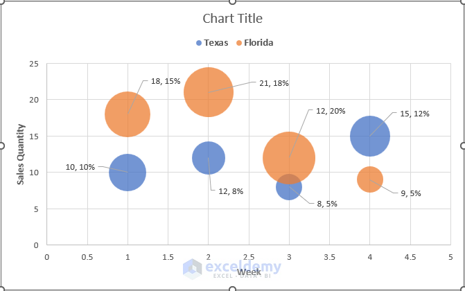
The Bubble Chart looks like the one below.
Method 7 – Add Chart Title
- Go to the Chart Design tab.
- Select Add Chart Element from the ribbon.
- From the drop-down list, select Chart Title > Above Chart.
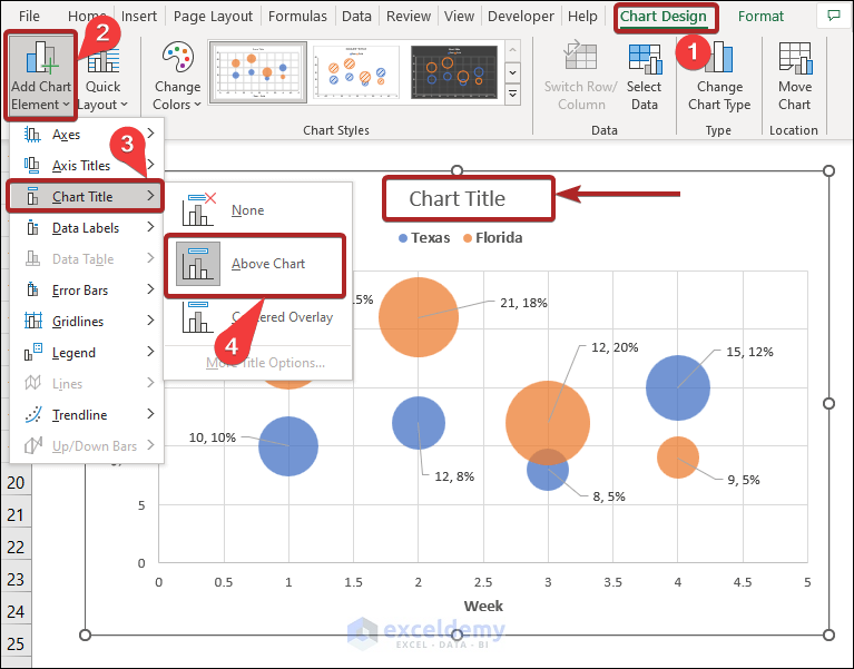
- Edit the title and give a suitable title according to our relevant dataset.
Concentrate on the sales of Florida from the chart. You can notice that the Sales Quantity of Week 2 is the highest, represented by the 2nd orange circle from the left; the Profit percentage is lower than in Week 3. Understand it by seeing the size of the circle for Week 2 and Week 3. The circle of Week 3 is bigger. You understand from the chart that though Week 2 has more Sales Quantity, Week 3 has more Profit percentage.
Things to Remember
- To use the Bubble Chart, we must arrange the data immediately.
- We must stay away from ornate colors that occasionally appear unattractive.
- We can alter the backdrop color of the chart to give it a good, polished appearance.
- We shouldn’t add too many data points to a Bubble Chart as it gets messy then.
Download Practice Workbook
Related Articles
<< Go Back To Bubble Chart in Excel | Excel Charts | Learn Excel

