Suppose you have created a chart in a spreadsheet on the basis of some gathered data. But when you create a chart in an Excel sheet, both the horizontal and the vertical axis don’t have titles. In this article, I will show you how to add a title to an axis of a chart in an Excel Spreadsheet.
How to Add Axis Titles in Excel: 2 Quick Methods
In this section, you’ll find 2 easy methods for adding title to an axis of a chart in an Excel workbook using Excel built-in features. Let’s check them now!
1. Add Axis Titles by ‘Add Chart Element’ Option
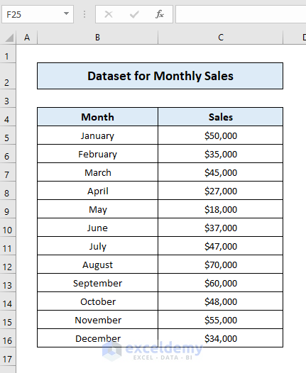
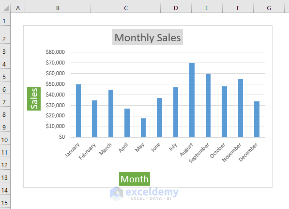
Let’s say, we have got a dataset of monthly sales of a shop over a year.
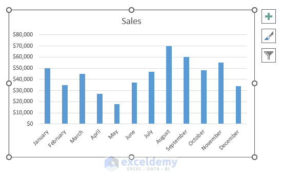
We have made a chart describing the sales of the shop over the mentioned year.
Here, for simplicity we’ve created a column chart, feel free to proceed with your chart.
 To add axis titles by using this method, just follow the steps below:
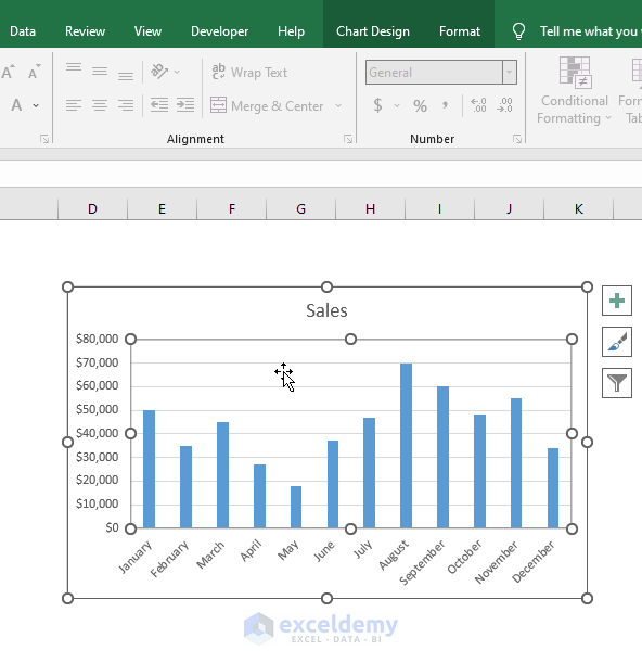
- At first, click on the chart area and two new tabs will appear on the ribbon:
i) Chart Design Tab
ii) Format Tab
- Go to the Chart Design tab > click Add Chart Element > Axis Titles.
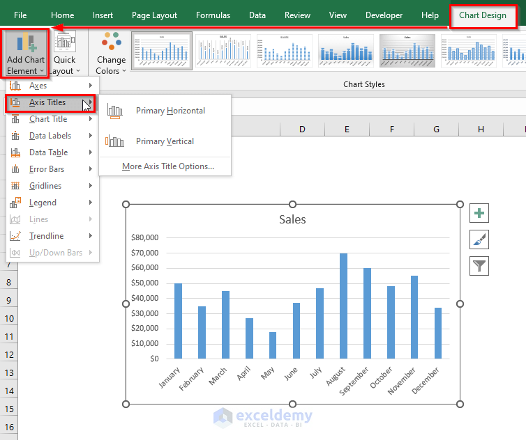
- Select Primary Horizontal to add a label to the horizontal axis.

- Select Primary Vertical to add a label to the vertical axis.
 See! It’s too easy to add axis labels.
Add Titles to the Labels:
- Just double click on the Axis Title and type the title as you want.

Change Font Size:
- You can change the font size if you don’t like it. For this, just double click on the title and select the font size.

Format Axis Title:
- For this, just click the right mouse button and use the quick formatting option.

- You can format the text just the way you like.
So these are the steps you can follow for adding titles to the axis of your chart in Excel.
Read More: How to Change Axis Titles in Excel
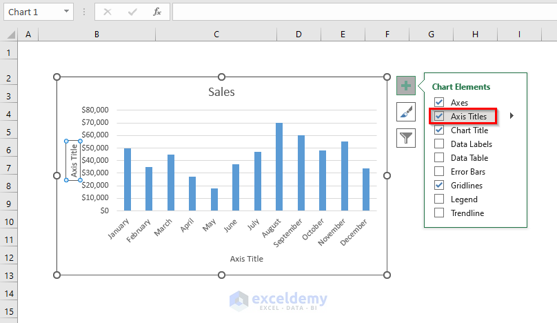
2. Use Chart Elements Button to Add Axis Titles
We will now use the Chart Elements button for adding axis titles to the chart created by our previous data.
For this, just follow the steps below:
- First, click on the chart area and then click on the “+” sign at the right side of the top. A menu bar will appear.

- Mark the Axis Titles and then horizontal and vertical axis will appear in your chart.
Now let’s make your axis title Dynamic. For this:
- Click the axis title you want to change. Go to the Formula bar, type “=” and just refer to the cell which you want as the title of the selected axis.

- Press ENTER and your axis title will be changed. If you change the text of the referred cell, the axis title will change also according to the cell.

- Repeat the same process to change the title of the other axis.

- By right-clicking on the axis title, a menu bar will appear. You can change Style, Fill, Outline of the axis title from here.

- You can change the title the way you want. You can follow the format options to change the font

See! It’s too easy to add titles to the axis of a chart and make them dynamic with referred cells just by following some quick steps in Excel.
Read More: How to Change Axis Labels in Excel
Download Practice Workbook
Conclusion
In this article, we have learned how to add titles to the axis of an Excel chart. I hope from now on, you can quickly add axis titles to your chart in Excel when you need them. If you have any queries helpful regarding this article, please don’t forget to leave a comment below. Have a great day!
Related Articles
<< Go Back To Label Axis in Excel | Excel Chart Elements | Excel Charts | Learn Excel
Get FREE Advanced Excel Exercises with Solutions!
