Labelling axes in Excel charts provides clarity by identifying the data on each axis, giving context to the presented information, improving readability and enhancing understanding of the charts.
In this Excel tutorial, we will discuss how to:
– Add an axis title label to an Excel chart.
– Change an axis title label.
– Change an axis value label.
– Remove an axis title label.
We used Microsoft 365 to create this article. However, the methods and techniques used are applicable to Office 2013 and subsequent versions.
Download Practice Workbook
What is an Axis Label in Excel?
There are 2 components to a Label on an Axis in an Excel chart:
- Axis Label Value.
- Axis Label Title.
Axis Label Value means adding descriptive text to the horizontal (x) and vertical (y) axes of a chart or graph.
Labeling the horizontal axis (x-axis) typically involves adding text that represents the categories or data points being displayed. For example, if you’re creating a bar chart to show sales data for different months, the x-axis labels would be the names of the months (January, February, etc.).
Labeling the vertical axis (y-axis) usually involves adding text that indicates the values or measurements. In the case of the sales data mentioned above, the y-axis labels would show the monetary values of sales (e.g., $0, $100, $200, etc.).
Axis Label Title means labeling just the title of the axes of the chart.
How to Add an Axis Label Title in an Excel Chart
There are two methods:
- Using the Chart Element button.
- Using the Add Chart Element option.
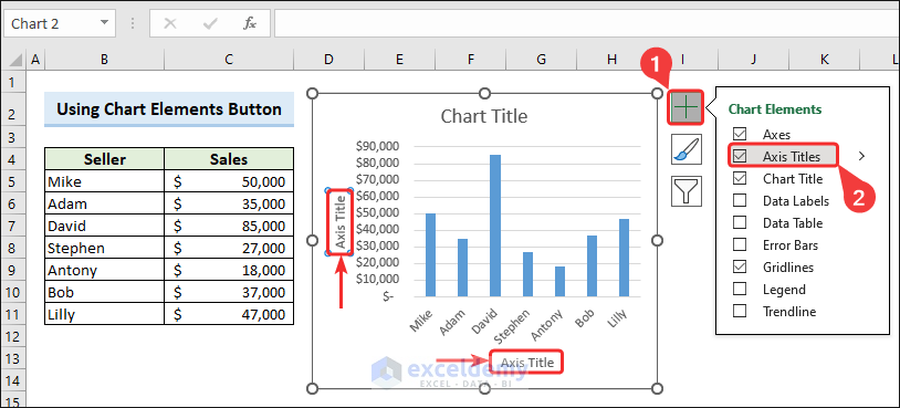
Method 1 – Using Chart Elements Button
Steps:
- Click on the chart.
- Click on the plus icon in the top-right corner to open Chart Elements.
- Put a checkmark on the Axis Titles option.
This will add titles to the chart axes.
Click here to see the full image
Method 2 – Using the Add Chart Element Feature
As soon as you create a chart, Excel shows the Chart Design tab in the ribbon. This tab provides an Add Chart Element option from which you can add an axis title label.
Steps:
- Click on the chart area to make the Chart Design tab visible.
- Go to the Chart Design tab.
- Click the dropdown of the Add Chart Element feature.
- Click Add Titles.
- Select Primary Horizontal.
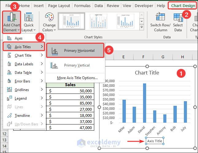
This will insert a title for horizontal axis.
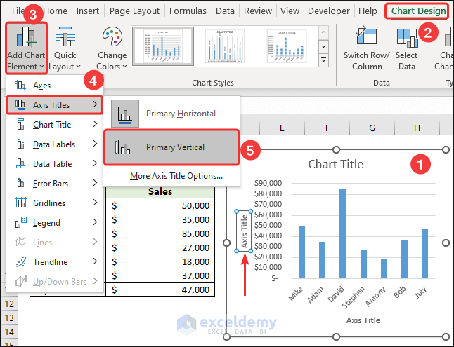
- Select the Primary Vertical option to insert a title for the vertical axis.
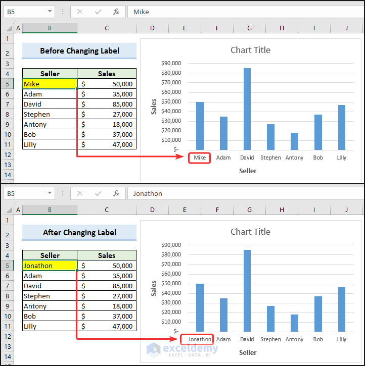
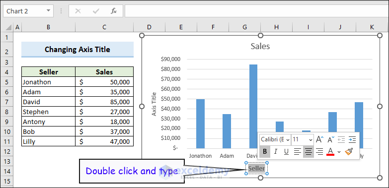
How to Change an Axis Title Label in an Excel Chart
- Double-click on the axis title and type the new title.
Click here to see the full image
We can also format the axis title (change the font, make it bold and so on).
How to Change an Axis Value Label in an Excel Chart
We can change the axis value label in two ways.
- Changing the original source data.
- Using the Select Data option without changing the source data.
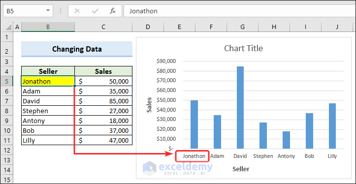
Example 1 – Changing the Source Data
The axis value label represents individual data points or categories along the axis.
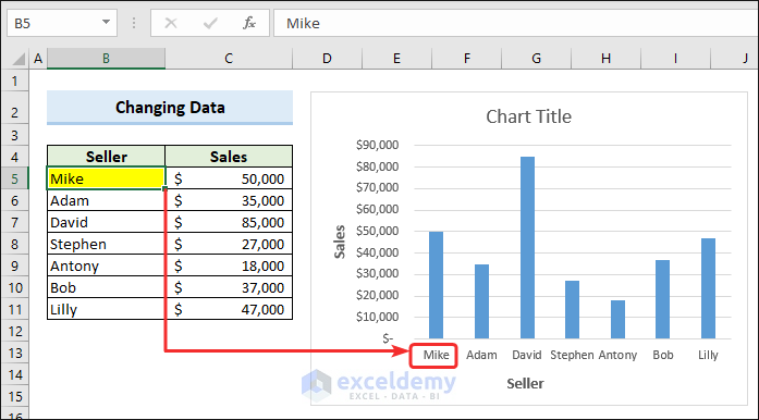
Change the source data and the corresponding label of the axis value changes automatically.
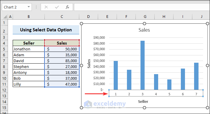
Example 2 – Using Select Data Option
We can use the Select Data option to change the Axis value by modifying the Axis label range.
Steps:
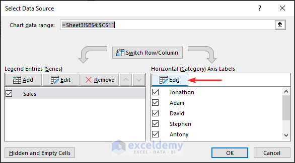
- Right-click on the axis label.
- Choose the Select Data option from the context menu.
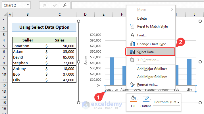
The Select Data Source dialog box will appear.
- Click Edit on the Horizontal (Category) Axis Labels.
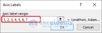
- In the Axis Labels dialog box, enter the new Axis label range to show as labels, separated by commas.
- Click OK.
- Close the Select Data Source dialog box by clicking OK.
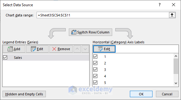
The label entries change accordingly.
Read More: Change Axis Titles
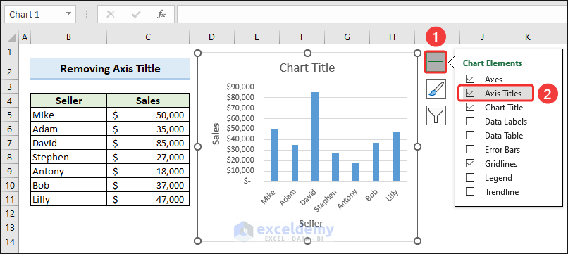
How to Remove an Axis Title Label from an Excel Chart
We can remove the Axis Title Label in an Excel chart by using the Chart Elements button.
Steps:
- Click the Chart Elements button.
- Uncheck the Axis Titles option.
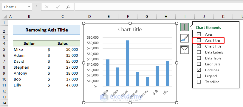
Click here to see the full image
Both horizontal and vertical axis titles are removed.
Click here to see the full image
Things to Remember
- Ensure that the axis labels are clear, descriptive, concise and meaningful.
- If the axis involves units (such as currency, percentages, or time), include the appropriate unit symbol or abbreviation to provide context to the data.
- Choose the right orientation for your labels. Horizontal labels are common for the x-axis.
- Ensure that the axis scaling is appropriate for the displayed data.
- The Add Chart Element option is available from Excel 2010 onwards.
Frequently Asked Questions
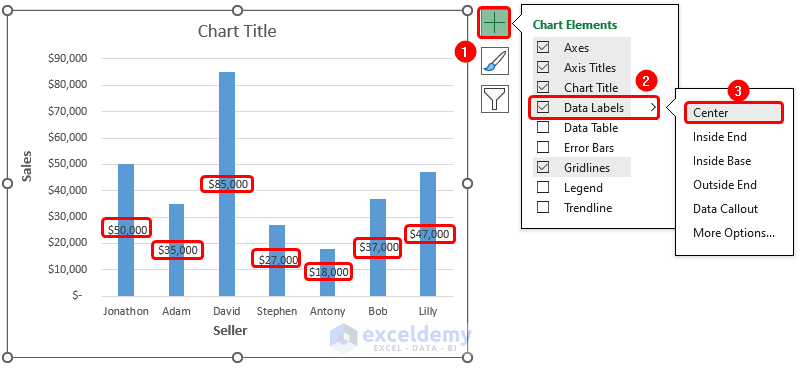
1. How do I center data labels in Excel?
- Select the chart.
- Click the Chart Elements button.
- Click on the drop-right arrow of Data Labels labels.
- Select Center to place the value of data labels in the middle position of each segment in the chart.
Click here to see the full image
2. What is axis scale?
The range and units used to represent data on a graph or chart’s axis. It determines how data points are spaced and displayed along the axis.
3. Why label the axes?
To provide context, clarity, and understanding of the data being presented. Labels help viewers quickly interpret the information by indicating what the data on each axis represents—such as categories or values. Properly labeled axes make it easier for audiences to reach informed conclusions from the visualized data.
Label Axis in Excel: Knowledge Hub
- Add X and Y Axis Labels
- Change Axis Labels in Excel
- Add Axis Titles in Excel
- Ignore Blank Axis Labels
<< Go Back To Excel Chart Elements | Excel Charts | Learn Excel
Get FREE Advanced Excel Exercises with Solutions!
