Method 1 – Change Axis Label by Changing Data
Suppose we have a dataset of the sales and profit of various salesmen for a certain period of time.

We have generated a chart from this dataset. For simplicity sake we’ve created a clustered column chart, but the same process can be applied to other chart types.

Let’s change the axis labels.
STEPS:
- Click the cell in the worksheet where you want to change the label.
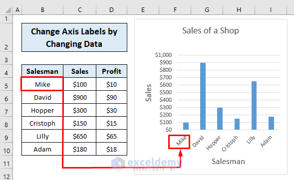
- Type the label into the cell and press ENTER.
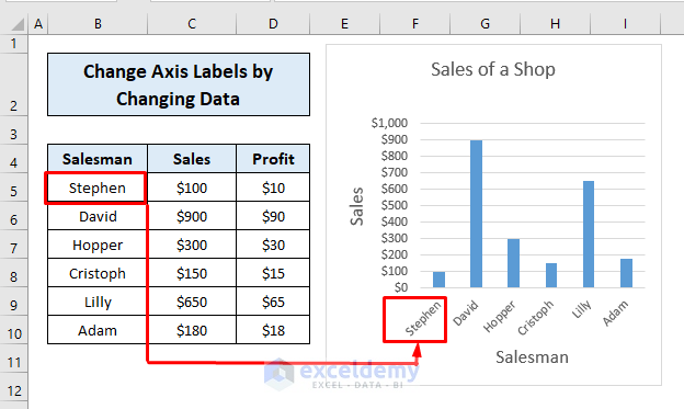
- Repeat the same for each cell and the labels on the graph will change accordingly.

Read More: How to Change Axis Titles in Excel
Method 2 – Change Axis Label Without Changing Data
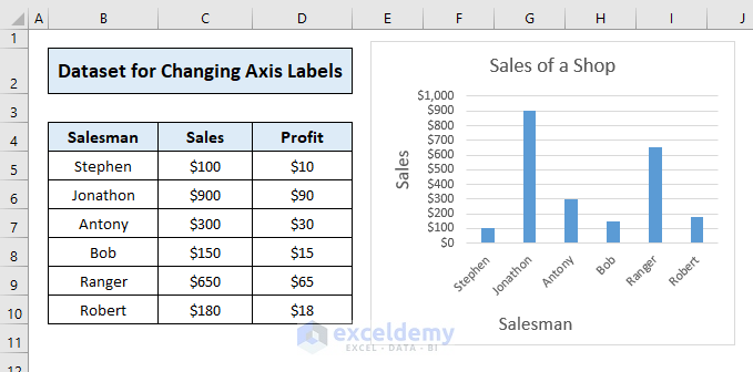
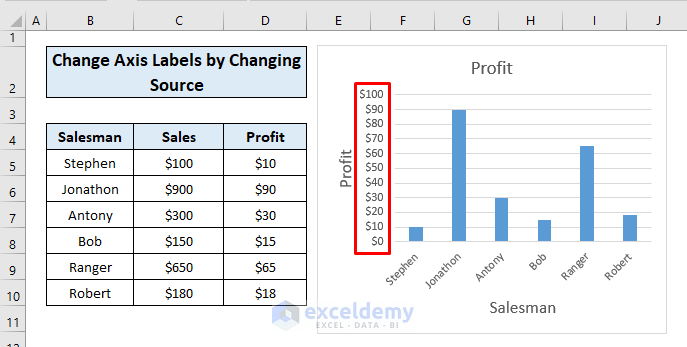
Here is our data and chart:
STEPS:
- Right-click the Category label and click Select Data.
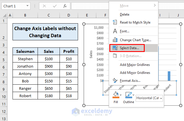
A Select Data Source dialog box opens.
- Click Edit from the Horizontal (Category) Axis Labels list.
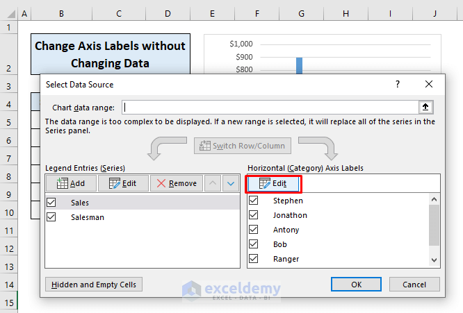
- Enter the new labels separated with commas in the Axis Labels dialog box that opens..
- Click OK.
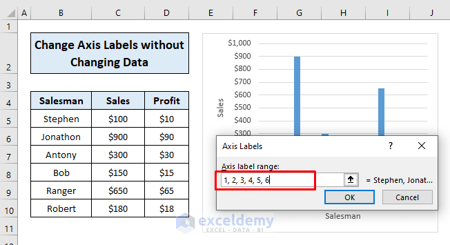
Our new labels are assigned. We’ve used numbers here, but you can use text if you prefer.
- Click OK in the dialog box.
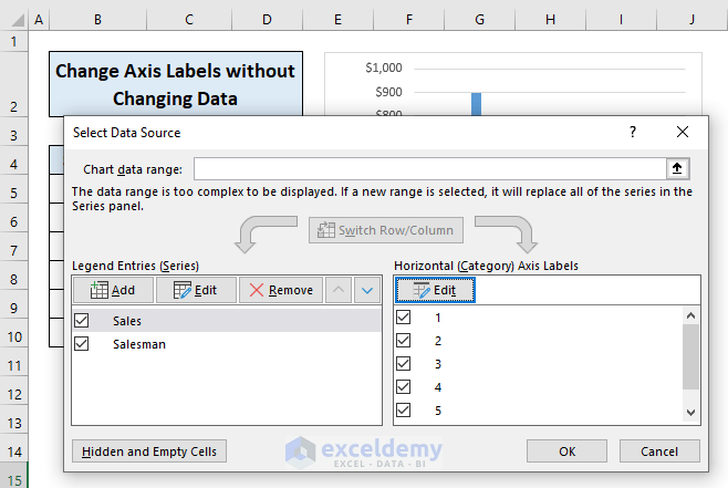
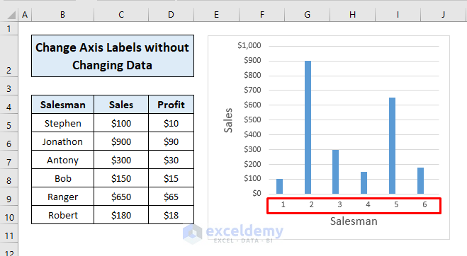
Your axis labels will be changed.
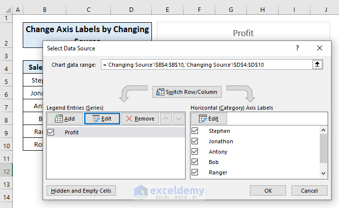
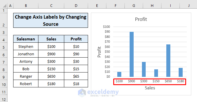
Method 3 – Change Axis Labels by Changing Source
To change the label of the vertical axis:
STEPS:
- Right-click the category label and click Select Data.
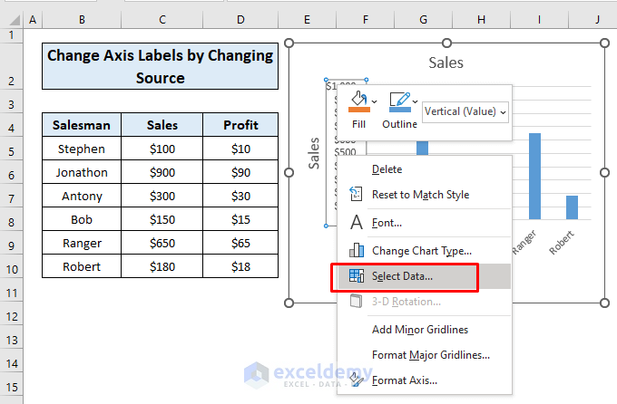
The Select Data Source dialog box opens.
- Click Edit under Legend Entries (Series).
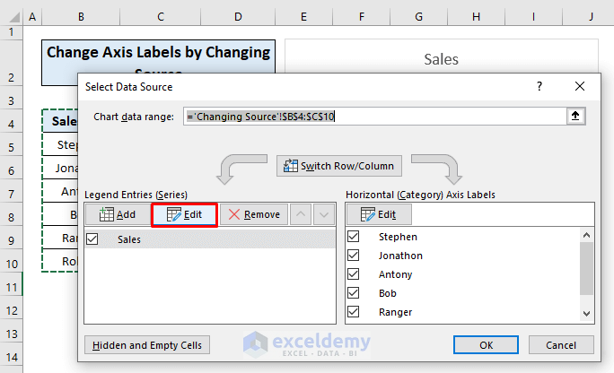
The Edit Series pop-up window will appear.
- Change the Series name to the cell you want.
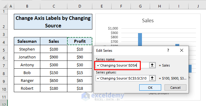
- Assign the Series values.
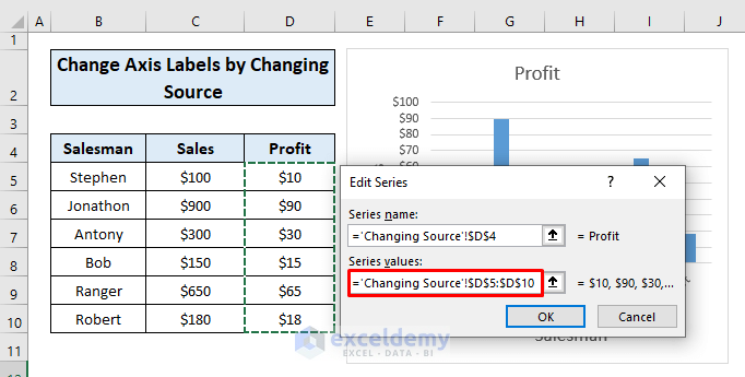
- Press OK in the dialog box.
Your axis label will be changed.
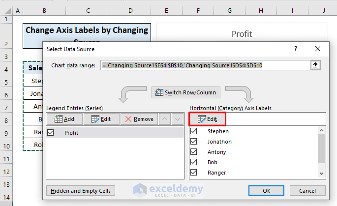
To change the label of the Horizontal axis:
STEPS:
- Right-click the category label and click Select Data.
- In the Select Data Source box that opens, click Edit from the Horizontal (Category) Axis Labels list.
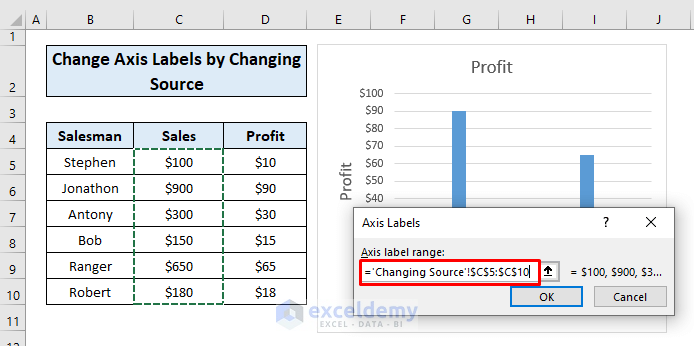
- Assign a new Axis label range.
- Click OK.
- Press OK in the dialog box.
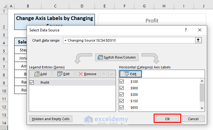
Your axis label will be changed.
Read More: How to Add X and Y Axis Labels in Excel
Download Practice Workbook
Related Articles
<< Go Back To Label Axis in Excel | Excel Chart Elements | Excel Charts | Learn Excel
Get FREE Advanced Excel Exercises with Solutions!
