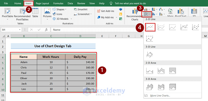
We have a dataset of people with their Work Hours in column C and Daily Pay in column D. We will add x-axis and y-axis labels.

Method 1 – Add Axis Labels by Chart Design Tab in Excel
Steps:
- We need to create a graph. Select Column B, Column C, and Column D.
- Click on the Insert tab and choose the proper line according to your wish from the Recommended Charts.
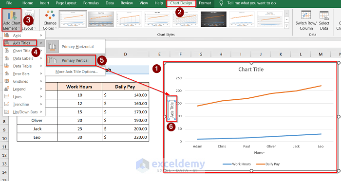
- Select the graph and click the Chart Design.
- Go to Add Chart Element and press on the Axis Titles.
- Select Primary Horizontal to label the horizontal axis.
- Select graph>Chart Design> Add Chart Element>Axis Titles>Primary Horizontal.

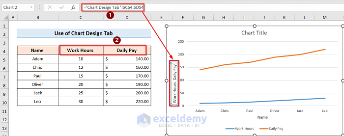
If you follow all steps properly, the Axis Title option will come under the horizontal line. To reflect the table data and set the label properly, we have to link the graph with the table.
- Select the Axis Title, go to the Formula Bar, and choose the column you want to link.
- Select Axis Title> Formula Bar> Select Column.
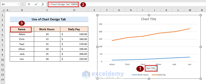
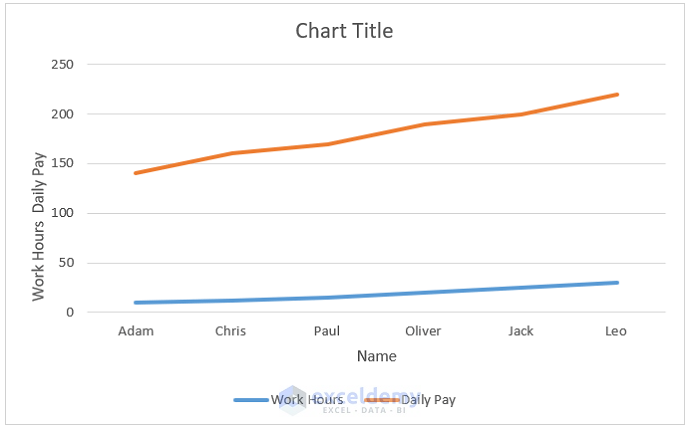
You will get the following result.
To label the vertical axis, we will follow the same steps as described before, but with a slight change.
- Select the Primary Vertical option as we are labeling the vertical axis.
- Select graph>Chart Design> Add Chart Element>Axis Titles>Primary Vertical
- We can similarly connect the graph and table as described before for the vertical axis
- (Select Axis Title> Formula Bar> Select Column).
The following result is shown below:
Read More: How to Change Axis Labels in Excel
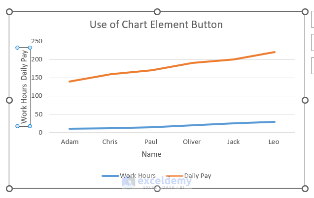
Method 2 – Use the Excel Chart Element Button to Add Axis Labels
Steps:
- Select the graph.
- Click on the Chart Elements option and press Axis Titles.
- Select both Primary Horizontal and Primary Vertical. You will see the Axis Title option under both axes.

- Link the data with the table using the same steps as method-01
- (Select Axis Title> Formula Bar> Select Column).
You will get the following result:
Things to Remember
- In the first method(Add Axis Title by Chart Design Tab), you must set both axis labels individually.
- To link the graph with the table, in the Formula Bar, you have to use ‘=’ and then select the desired column.
- These steps will only apply to two axes. If any formula or table requires more than two axes, then these steps won’t be helpful.
Download the Practice Workbook
You can download the practice workbook from here.
Related Articles
- How to Add Axis Titles in Excel
- How to Change Axis Titles in Excel
- Excel Chart: Ignore Blank Axis Labels
<< Go Back To Label Axis in Excel | Excel Chart Elements | Excel Charts | Learn Excel
Get FREE Advanced Excel Exercises with Solutions!
