Method 1 – Change Display of Chart Axes
1.1. Display or Hide Axes
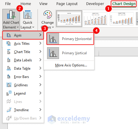
- Click the chart and select it.
- From the Chart Design tab, select Add Chart Element.
- Click Primary Horizontal from the Axes as shown.
Alternate Method:
- Select the chart.
- Click on the plus icon at the top right corner.
- Check/uncheck the mark on Primary Horizontal or Primary Vertical, or both to display or hide the axis.
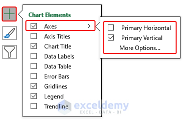
- A chart axis with Primary Horizontal and Primary Vertical axis will appear/disappear depending on your selection/deselection from the options.
1.2. Adjust Axis Tick Marks and Labels
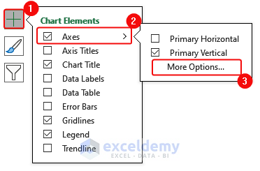
- Start with selecting the chart, click on the big plus icon at the top-right corner of the chart.
- Click More Options from Axes.
- In the Axis Options, click Tick Marks. In the Major type box, select Inside.
- Click on Labels, now select Next to Axis in the Label Position.
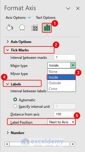
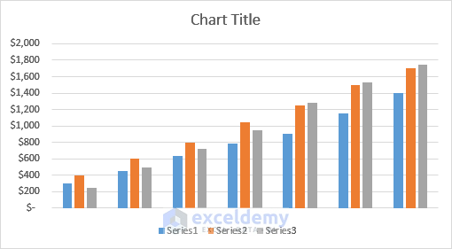
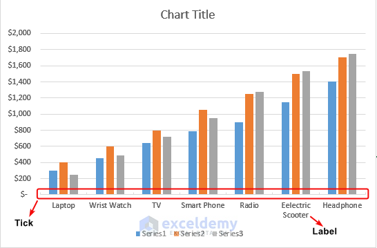
- Ticks and Labels are added as follows.
Method 2 – Format Axis Labels in a Chart
2.1. Change the Number of Categories Between Labels or Tick Marks
- Select the chart and then click on the plus icon at the top-right corner.
- Click on More Options from Axes
- From Axis Options, click Labels. Type 2 in the Specify interval unit.
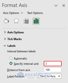
Tips:
Type 1 to display a label for every category.
or you can type 2 to display a label for every other category.
3 to display a label for every third category.
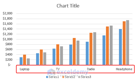
- Display a label for every other category as follows. It omitted some labels.
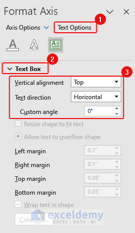
2.2. Change the Alignment and Orientation of Labels
- Click the plus icon appearing at the top-right corner after selecting the chart.
- Click on More Options from
- From Text Options, select Vertical alignment and Text direction, and Custom angle.
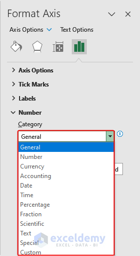
2.3. Change Text and Numbers Format in Labels
- At the top-right corner, click on the plus icon appearing after selecting the chart.
- Click More Options from the menu.
- From Axis Options, click Number; select the number types in the box.
Method 3 – Add Axis Titles
- Selecting the chart, click the plus icon appearing at the top-right corner.
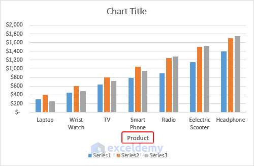
- Click Axis Titles, and check Primary Horizontal.
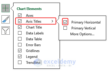
- The axis title will appear as follows.
Method 4 – Change Axis Type
- At the top-right corner, click on the plus icon appearing after selecting the chart.
- Click on More Options from
- From the Axis option, in Axis type, select Text axis.
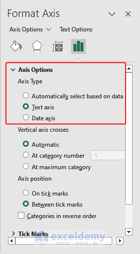
Changing the axis type in a chart adjusts how Excel shows the data:
- Text Axis: Treats numbers as text labels (e.g., names).
- Date Axis: Formats for time-based data (e.g., dates).
- Logarithmic Scale: This shows data on a logarithmic scale.
- Percentage Axis: Displays data as percentages. Choose the right axis type for accurate representation.
Method 5 – Adjust Axis Scale
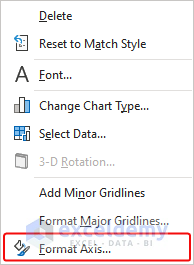
- Select the Y-axis, then right-click on the chart.
- A menu bar will appear. Click Format Axis.
- In the Axis option, type 2500 in the Maximum box, and 500 in the Major box.
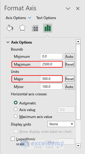
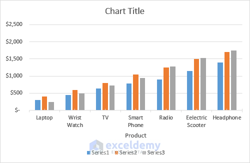
- A chart with an adjusted scale will appear as follows.
Method 6 – Swap X and Y Axes in the Chart
Swap X and Y axis,
- Click the chart and then select the Chart Design tab from the ribbon.
- Select the chart, and find the Switch Row/Column option.
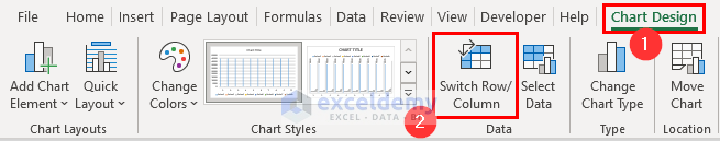
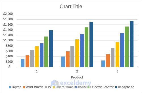
- The swapped chart will appear as follows.
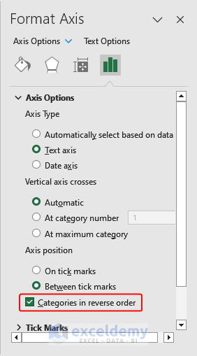
Method 7 – Flip an Excel Chart from Left to Right
To flip an Excel chart,
- Select the chart, and in the top-right corner, click the plus icon.
- Choose More Options from the Axes
- Mark on Categories in reverse order.
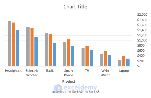
- The flipped chart will appear as follows.
Things to Remember
- Choose the right scaling for your data.
- Use clear axis labels and titles.
- Format numbers for readability.
- Adjust font size and style appropriately.
- Position the axis appropriately.
- Customize tick marks and axis lines.
- Consider axis crossings for negative values.
- Use a logarithmic scale when needed.
- Set fixed intervals for large data ranges.
- Format date and time values correctly.
- Reverse order if necessary.
- Set axis limits to focus on specific data.
Download Practice Workbook
Click here to download the Practice Workbook.
Frequently Asked Questions (FAQ)
1. How do I format a horizontal axis in Excel?
- Select the horizontal axis on your chart.
- Right-click and choose Format Axis.
- Use the Format Axis task pane on the right to customize the axis appearance.
- Adjust axis options, labels, numbers, tick marks, font, and line color.
- Preview changes and click Close to apply the formatting.
2. How do I change the axis scale in Excel?
- Select the axis (either vertical or horizontal) on your chart.
- Right-click and choose Format Axis.
- In the Format Axis task pane, go to Axis Options.
- Set the scale to Automatic for Excel to determine the best-fit scale.
- Or, choose Fixed and enter specific minimum or maximum values.
- Click Close to apply the changes to your chart.
3. How do I change the Y-axis format in Excel?
- Select the Y-axis on your chart.
- Right-click and choose Format Axis.
- In the Format Axis pane, go to Axis Options.
- Under Number, choose your desired format (General, Number, Currency, Percentage, etc.).
- Set the decimal places and use a 1000 separator if needed.
- Close the Format Axis pane to apply the changes.
Format Axis in Excel: Knowledge Hub
<< Go Back To Excel Chart Elements | Excel Charts | Learn Excel
Get FREE Advanced Excel Exercises with Solutions!
