Method 1 – Creating Helper Ranges
You need to create the following 4 helper ranges first.
These helper ranges are required to create the matrix of bubbles. Using values from these ranges for different axes will present the chart.
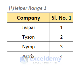
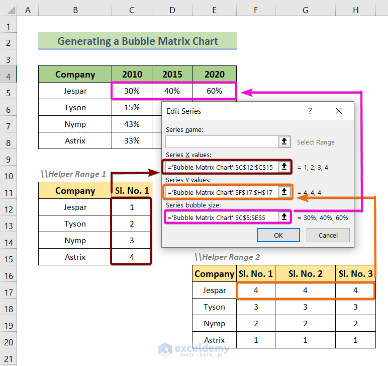
In Helper Range 1, you will have company names and their serial number.
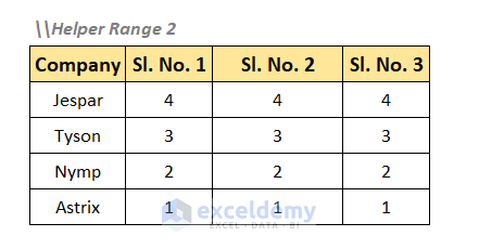
In Helper Range 2, you will insert the company names and their serial number in descending order in 3 columns.
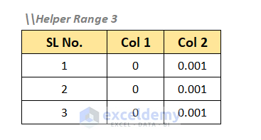
Helper Range 3 consists of a serial number followed by 0s and 0.001s.
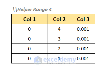
Helper Range 4 consists of 0s followed by a serial number in descending order and 0.001s.
Method 2 – Inserting a Bubble Matrix Chart
To insert a bubble matrix chart.
- Select your dataset first.
- Go to the Insert
- In the Charts group, click the Insert Scatter (X, Y) or Bubble Chart drop-down.
- In the Bubble section, choose the Bubble
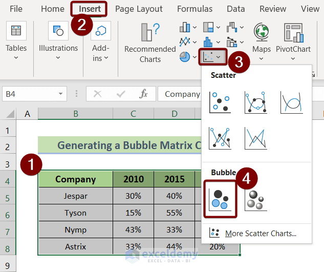
A bubble chart will be created as the following image.
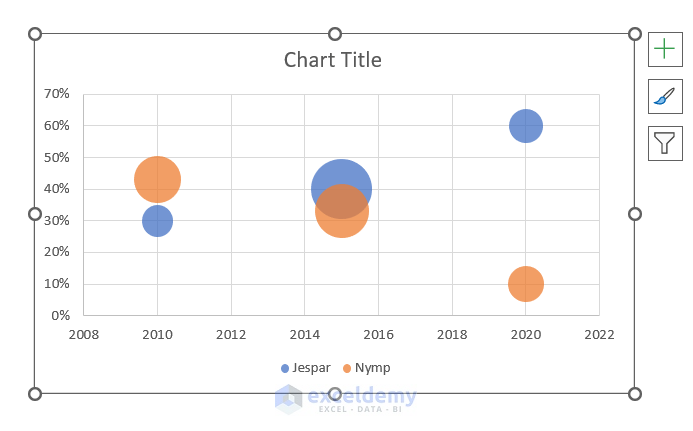
Method 3 – Removing Default Labels of Two Axes
After inserting a bubble chart, it will have some default axes that you need to remove.
To remove the default axes.
- Right-click on the axes first.
- Select Delete from the context menu.
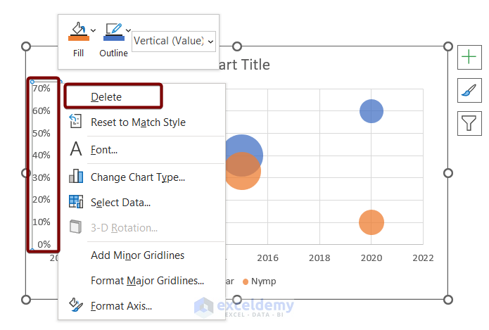
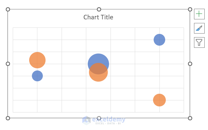
The bubble chart will look like the following image.
Method 4 – Inserting Data to Generate Bubble Matrix Chart
Generate bubbles using your dataset.
- Right-click on the bubble chart first.
- From the context menu, choose Select Data.
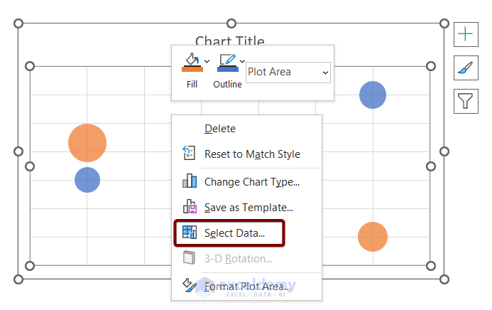
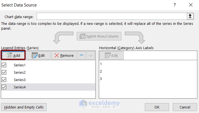
Select Data Source dialog box will appear.
- Click Add.
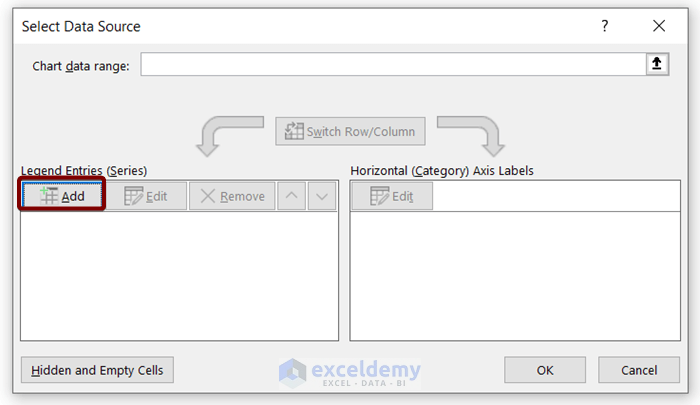
The Edit Series dialog will appear.
- Leave the ‘Series name’ box empty.
- In the ‘Series X values’ box, select the serial numbers from the Helper Range 1.
- Fill the ‘Series Y values’ box with the serial number of the company, Jespar from the Helper Range 2.
- Fill the ‘Series bubble size’ box with the profit growth rate of the company Jespar, from the main dataset.
- Click OK.
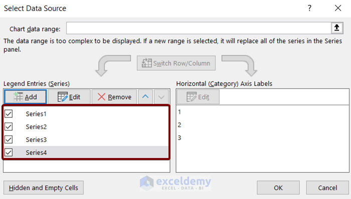
- Repeat the same process for the company Tyson, Nymp, and Astrix.
After adding all the company’s data, the Select Data Source dialog box will look like the following image.
Method 05 – Inserting Extra Two Helper Ranges for New Labels of Axes
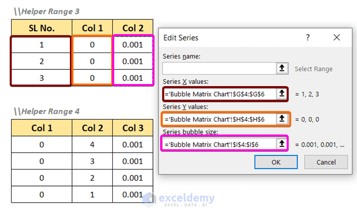
- Click on the Add button in the Select Data Range dialog box.
The Edit Series dialog box appears again.
- Leave the ‘Series name’ box empty.
- In the ‘Series X values’ box, insert the range of the SL No. column of the Helper Range 3.
- Fill the ‘Series Y values’ box with the range of the Col1 column of the Helper Range 3.
- Insert the range of the Col2 column of the Helper Range 3 in the ‘Series bubble size’
- Click OK.
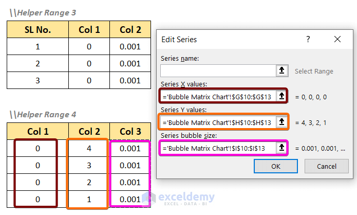
To import the data from the Helper Range 4,
- Click on the Add button in the Select Data Source dialog box.
In the Edit Series dialog box,
- Leave the ‘Series name’ box empty.
- In the ‘Series X values’ box, insert the range of the Col1 column of the Helper Range 4.
- Fill the ‘Series Y values’ box with the range of the Col2 column of the Helper Range 4.
- Insert the range of the Col3 column of the Helper Range 4 in the ‘Series bubble size’
- Click OK.
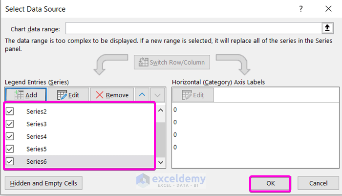
- Hit OK in the Select Data Source dialog box.
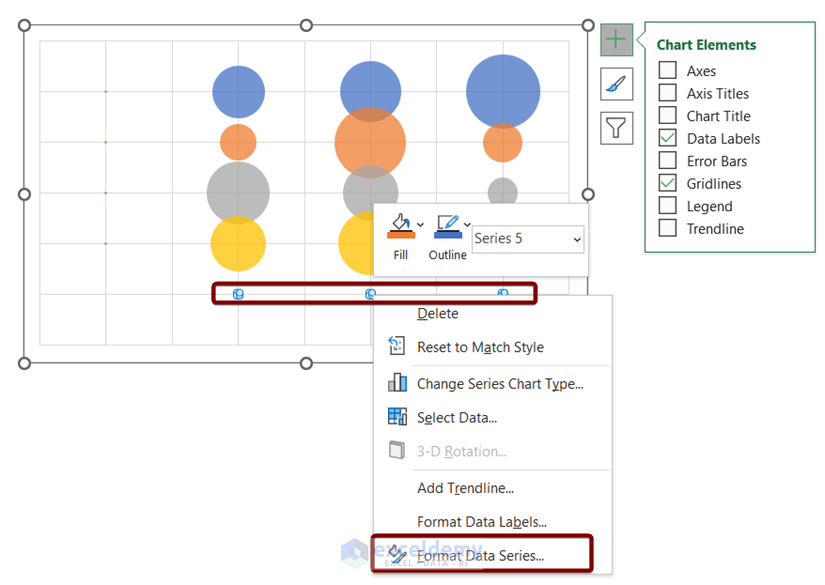
Method 6 – Adding New Axes
- Right-click on the little bubbles below the yellow bubbles.
- Select Format Data Series.
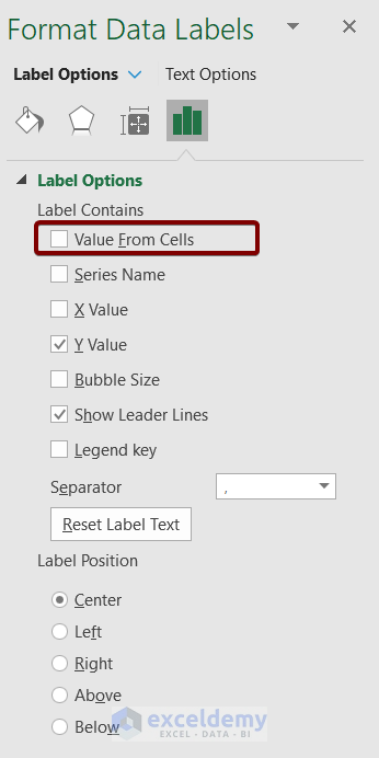
- In the Format Data Labels dialog box, check the Value From Cells
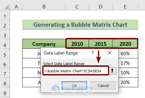
Data Label Range dialog box appears.
- Insert the range C4:E4.
- Click OK.
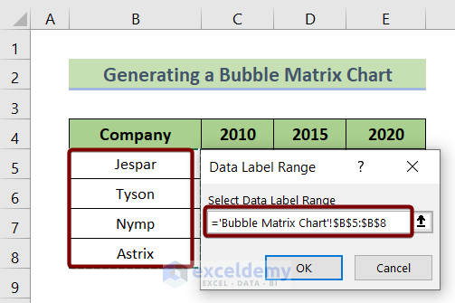
Repeat the same process to insert a vertical axis.
- This time insert the range of company names in the Data Label Range dialog box.
- Click OK.
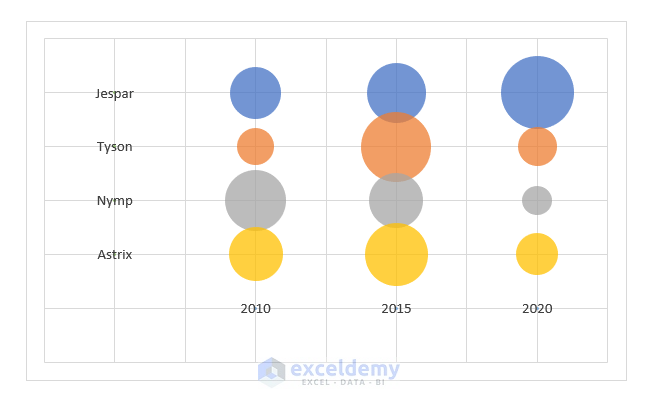
The bubble matrix chart with new axes will look like the following picture.
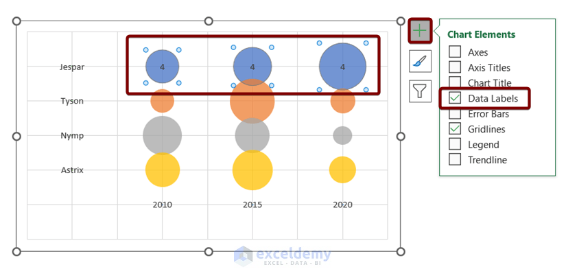
Method 7 – Adding Labels for Bubble Sizes
- Click on the bubbles of the company, Jesper.
- Click on the plus icon at the top-right corner of the bubble chart.
- Select the Data Labels command from the Chart Elements.
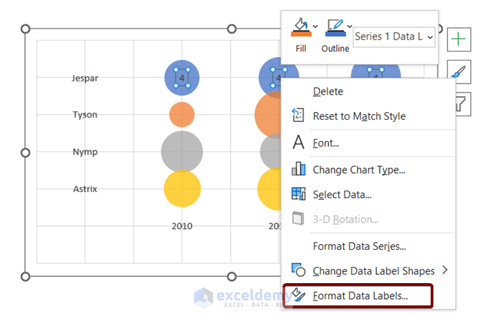
- Right-click on the numbers inside the bubbles of the company, Jesper.
- Select Format Data Labels from the context menu.
- Deselect Y Value in the Format Data Labels dialog box.
- Select the option Bubble Size in the Format Data Labels dialog box.
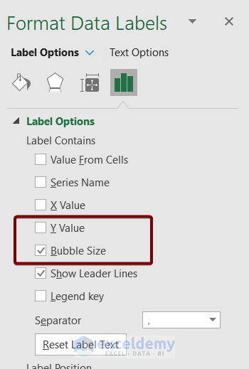
The profit growth rate of each company will be integrated inside the bubbles of the bubble matrix chart.
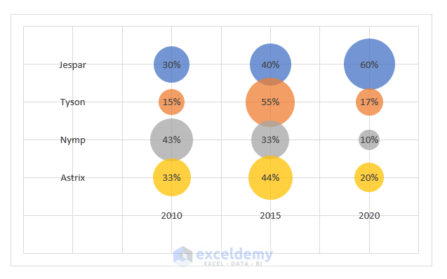
Now the final bubble matrix chart will look this:
Advantages of Bubble Matrices
- Allows for easy comparison of data.
- Helps to track changes over time.
- Helps to spot patterns and trends.
Disadvantages of Bubble Matrices
- It may be difficult to interpret if there is a lot of data.
- Can be time-consuming to create.
Related Articles
- How to Create a Bubble Chart in Excel with Labels
- Excel Bubble Chart Examples
- How to Create a Project Portfolio Bubble Chart in Excel
<< Go Back To Bubble Chart in Excel | Excel Charts | Learn Excel
Get FREE Advanced Excel Exercises with Solutions!
