Method 1 – Color Bubble Chart Using Single Series Data Values
This method of creating a bubble chart is quite simple. You can set the color of the bubbles based on value with just a few clicks.
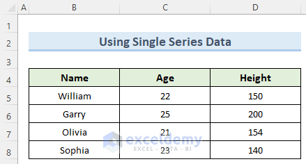
We’ll use this dataset that has the ages and heights of four students:
Steps
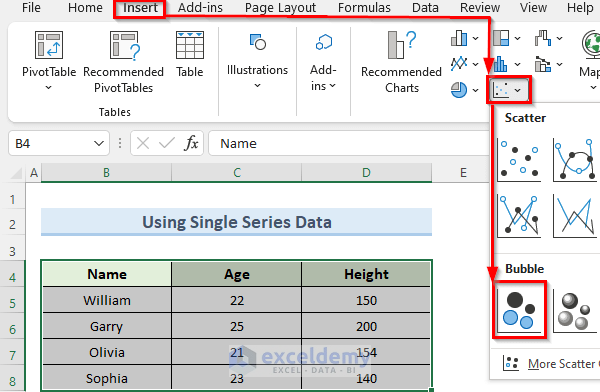
- Select your dataset by dragging and highlighting the relevant cells.
- Go to the Insert tab and click on the Insert Scatter (X, Y) or Bubble Chart dropdown.
- Choose the Bubble option from the dropdown.
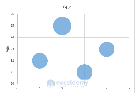
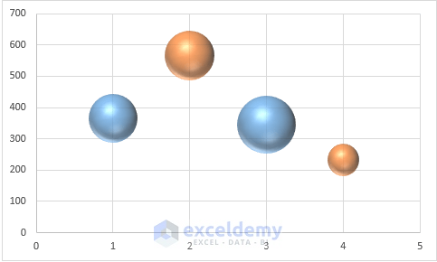
- Excel will generate a bubble chart with a single color for all bubbles.
- To change the color of individual bubbles:
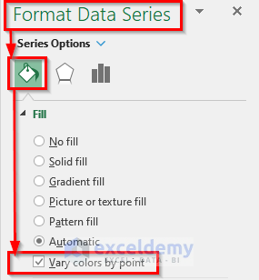
- Right-click on any bubble.
- Select Format Data Series.

- In the new window, go to Fill and Line.
- Choose Vary colors by point.
- Excel will format the bubbles with different colors based on their values.

Read More: Excel Bubble Chart Size Based on Value
Method 2 – Use Excel ISNA and NA Functions
We can utilize these two functions to retrieve values from the dataset and determine the color of the bubble chart based on those values. The ISNA function in Excel verifies whether a cell contains a #N/A error. If any of the cells contain the #N/A error, the function returns TRUE; otherwise, it returns FALSE. Similarly, the NA function returns the #N/A error.
Steps
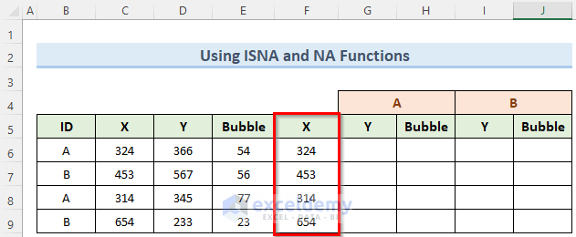
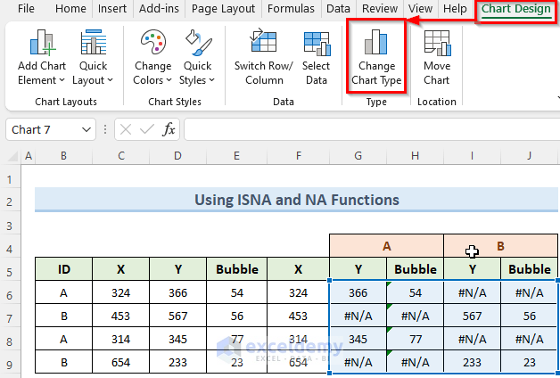
- Assume you have a dataset with two bubble categories (A and B), each with X and Y coordinates and a Bubble column denoting bubble size.
- Copy values from the first X column to the second X column.
- In cell G6, enter the formula:
- Press Enter.
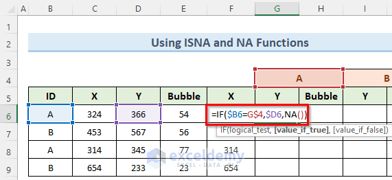
- Drag the fill handle to copy this formula down.
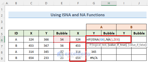
- In cell H6, enter:
- Copy this formula down as well.
- Repeat for columns I and J.
- Go to the Insert tab and select 3-D Bubble from the Insert Scatter (X, Y) or Bubble Chart dropdown.
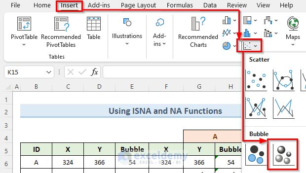
- You’ll see an empty chart box.
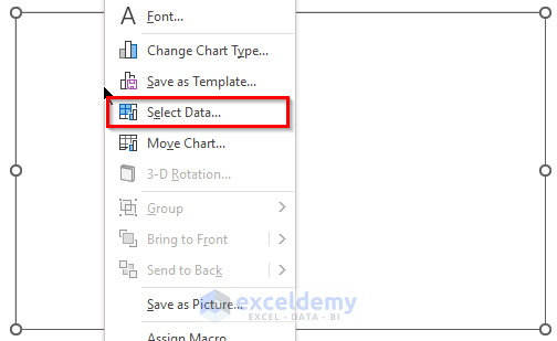
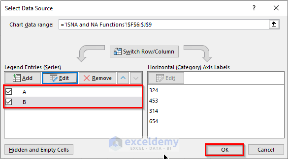
- Right-click the box, choose Select Data.
- Click Add.
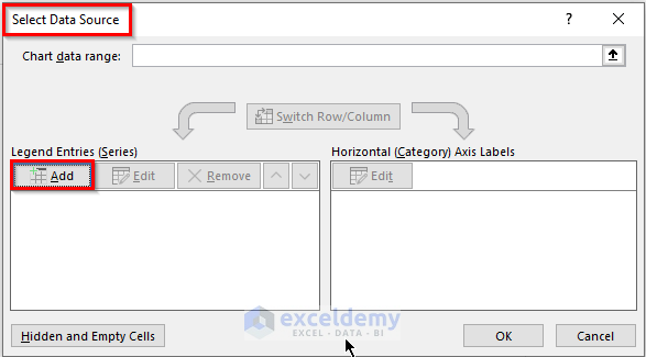
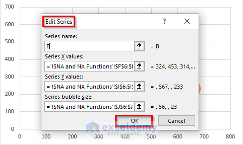
- Set the series name to A and select the appropriate cell ranges for X, Y, and bubble size.
- Repeat step for category B.
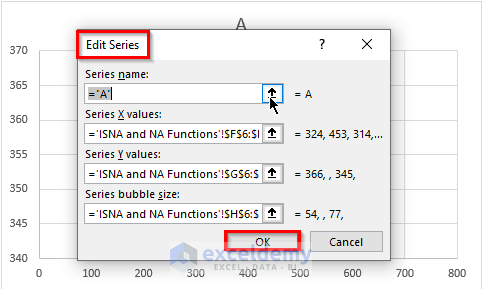
- Press OK to create the data series.
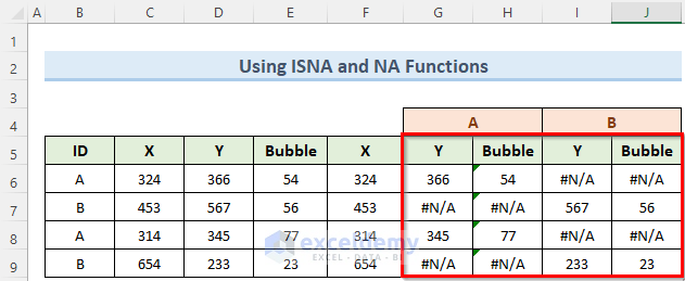
- You can see the two data series that have been created.
- Navigate to the Chart Design tab and choose Change Chart Type.
- Select X Y (Scatter) and click on 3-D Bubble.
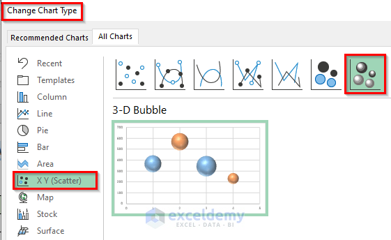
- Your bubble chart will now display different colors for each category.
Read More: How to Create Bubble Chart for Categorical Data in Excel
Download Practice Workbook
You can download the practice workbook from here:
Related Articles
- Create Bubble Chart in Excel with Multiple Series
- How to Create Bubble Chart with 2 Variables in Excel
- How to Create Bubble Chart in Excel with 3 Variables
<< Go Back To Bubble Chart in Excel | Excel Charts | Learn Excel
Get FREE Advanced Excel Exercises with Solutions!
