Typical Excel Charts depict a two-dimensional (X and Y) representation of data. Working with three-dimensions (or 3 variables) requires the insertion of a bubble chart into Excel, where the third variable is the size of the bubbles. In this article, we’ll demonstrate the step-by-step procedure to create a bubble chart in Excel with 3 variables.
First, we will prepare our dataset. Then, we will insert a Bubble Chart. Finally, we will modify the Bubble Chart with 3 variables.
Step 1 – Preparing a Dataset to Create a Bubble Chart
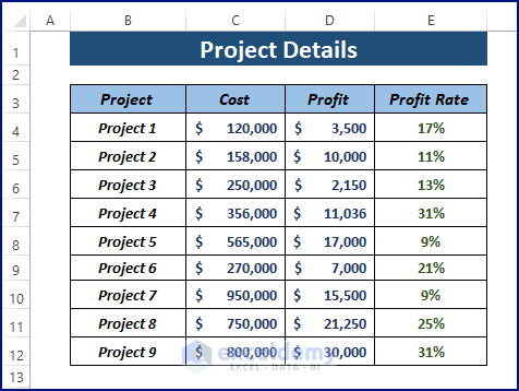
We’ll use the following dataset named Project Details containing 3 variables: Cost, Profit, and Profit Rate.
Read More: How to Create Bubble Chart with 2 Variables in Excel
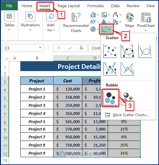
Step 2 – Inserting a Bubble Chart
Excel offers 2 types of bubble charts: 2D Bubble and 3-D Bubble. We can use either to insert a bubble chart with 3 variables.
- Go to the Insert tab and click on Insert Scatter from the Charts group.
- Choose Bubble under Bubble.
Read More: Create Bubble Chart in Excel with Multiple Series
Step 3 – Modifying the Bubble Chart
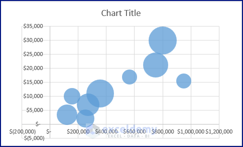
After clicking on the Bubble in the Insert Scatter options, a bubble chart is inserted into the worksheet as displayed in the below picture. However, the inserted chart needs modifications.
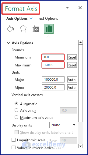
Step 3.1 – Formatting the X-Axis
- Select the X-Axis and right-click on it.
- Click on Format Axis from the context menu.
- In the Axis Options, set Minimum and Maximum X-Axis Bounds as shown in the following image.
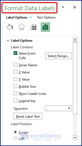
Step 3.2 – Displaying Data Labels from Cells
- Click on the Chart.
The Chart Elements (Plus Icon) pane appears.
- Tick chart elements such as Axes, Axis Titles, or Chart Title as desired.
- Click Data Labels > More Options.
The Format Data Labels dialog box appears.
- Tick Value From Cells.
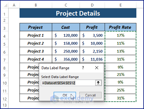
The Data Label Range dialog box opens.
- Assign the range (Profit Rate) then click OK.
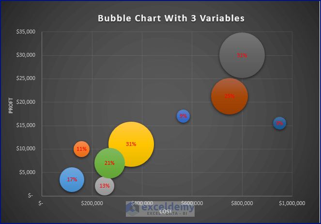
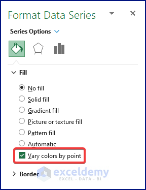
Step 3.3 – Coloring the Bubbles
- Click on any bubble to select all of them and right-click to open the context menu.
- Choose Format Data Series.
- Under the Fill option, tick Vary colors by point to multi-color the bubble.
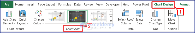
Step 3.4 – Displaying the Chart in a Particular Style
- Click on the chart and the Chart Design tab appears.
- Choose any of the Chart Designs from the Chart Styles.
The final display of the chart should look like the below image.
⧭ Notes: (i) Highlight two data columns to create a bubble chart with two variables.
(ii) For 4 variables, use individual data series and denote them using Legends.
Read More: How to Color Excel Bubble Chart Based on Value
Things to Keep in Mind
- Make sure the bubble sizes are proportional to their values. Excel usually auto-fits bubble sizes corresponding to their values, but if this is not the case, adjust the data to fit using the Square Root of the raw data.
Download Excel Workbook
Related Articles
<< Go Back To Bubble Chart in Excel | Excel Charts | Learn Excel
Get FREE Advanced Excel Exercises with Solutions!
