The article will demonstrate how to create an Excel Bubble Chart for categorical data.
A Bubble Chart is useful when working with two or more variables in an Excel sheet. It represents data in the form of bubbles of different sizes. For example, suppose you have two values, say 10 and 5. If we put them in a Bubble Chart, the bubble for the 10 value will be twice the size of the bubble for the 5 value. We can also categorize the bubbles in the chart.
Create a Bubble Chart for Categorical Data in Excel: 6 Easy Steps
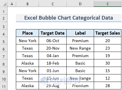
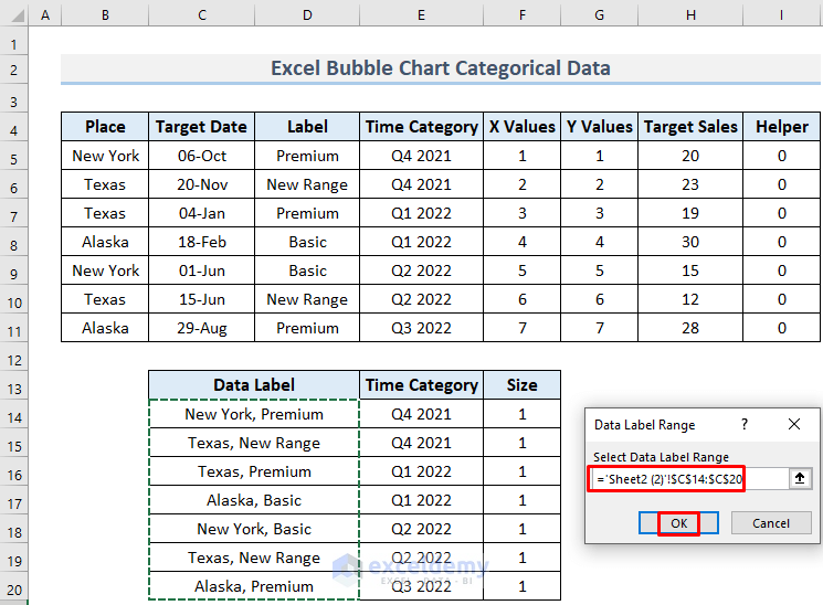
Suppose a businessman wants to sell some products in different regions of the country, and picks some dates, the quality of the product, and the target amount of product to sell on corresponding dates. The data looks like the following picture:
Let’s represent the Target Sales amounts in a Bubble Chart with categories.
Step 1 – Inserting the Necessary Parameters
First, we need to insert the necessary parameters to create the Bubble Chart.
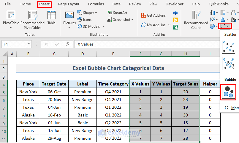
- Make some columns to insert the parameters.
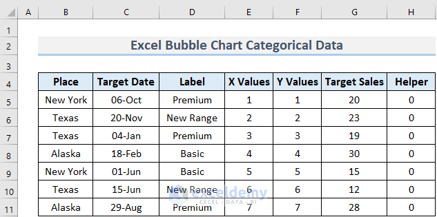
The X and Y Values refer to the position of the corresponding Bubble. For example, the bubble that represents target sales of 20 in New York on the 6th October, 2021 will be on the (1, 1) point of the chart. We can vary the values to change the location of the bubble in the chart if we want. The purpose of having the Helper column will become clear later.
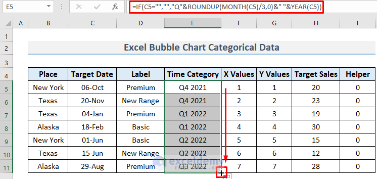
Step 2 – Creating the Time Category
Now, we will make a Time category for the Bubble Chart, where the period of a year will be divided into 4 intervals.
- Create a column to store the Time category, enter the following formula in cell E5, and press ENTER:
=IF(C5="","","Q"&ROUNDUP(MONTH(C5)/3,0)&" "&YEAR(C5))
The year and corresponding quarter of the period for the date in C5 will be returned.
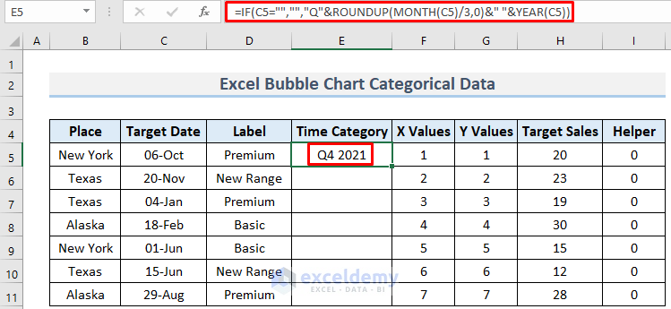
The formula uses the IF, ROUNDUP, MONTH, and YEAR functions to divide the date in C5 into its corresponding quarter and year. The MONTH and YEAR functions return the month and year of a date, so here it will return 10 for the 6th October and 2021 for the year. Dividing 10 by 3 and rounding up its decimal value will give us the quarter.
- Use the Fill Handle to Autofill the cells below.
Step 3 – Creating the Bubble Chart
Now we are ready to create the bubble chart.
- Select the range F4:H11 and go to Insert >> Scatter Chart >> Bubble Chart.
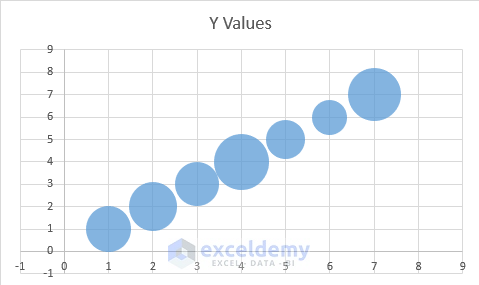
The Bubble Chart will appear.
Read More: How to Create Bubble Chart with 2 Variables in Excel
Step 4 – Formatting the Bubble Chart
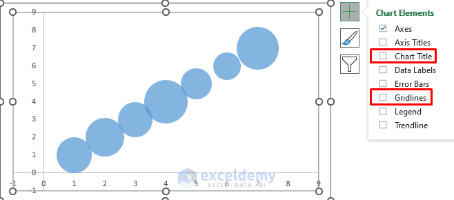
Let’s format our Bubble Chart to make it look more presentable.
- Click on the Plus icon of the chart and uncheck the Gridlines and Chart Title.
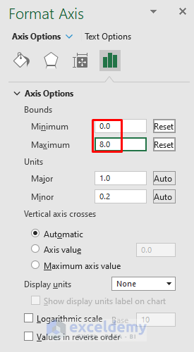
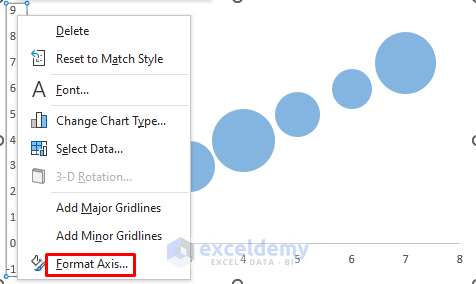
- Right-click on the Horizontal Axis and select Format Axis.
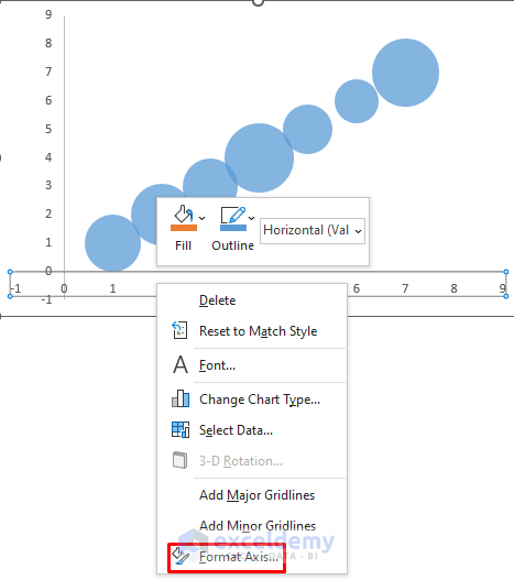
- In the Format Axis window, change the Bounds Minimum to 0 and Maximum to 8. The reason for choosing this interval is that we have 7 data entries.
Similarly, we now change the Y Axis.
- Right-click on the Y Axis and select Format Axis.
- Change the Bounds as we did previously.
We have a nice, clean Bubble Chart.

Read More: How to Create Bubble Chart in Excel with 3 Variables
Step 5 – Creating a Category for Data Labelling
Next, we’ll create a category for Data Labelling.
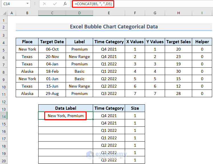
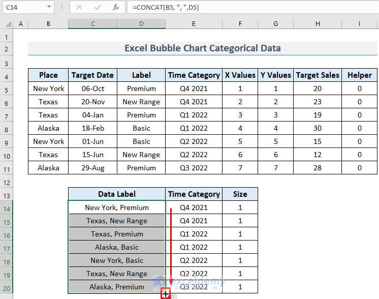
- Create a column to store the region and quality together.
- Enter the following formula in cell C14, and press ENTER:
=CONCAT(B5, ", ",D5)
The formula uses the CONCAT function to join the text in B5 and D5 with a comma.
- Copy the Time Category range and Paste as Values from cell F14 to cell F20.
There is another column for the bubble size which will be applied later.
- Use the Fill Handle to AutoFill the cells below.
Step 6 – Adding Categories in the Bubble Chart
Now we’ll insert the categories in the Bubble Chart.
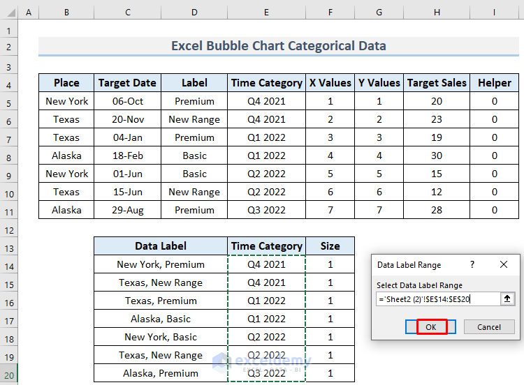
- Click on the Plus icon of the chart and select Data Labels >> More Options…
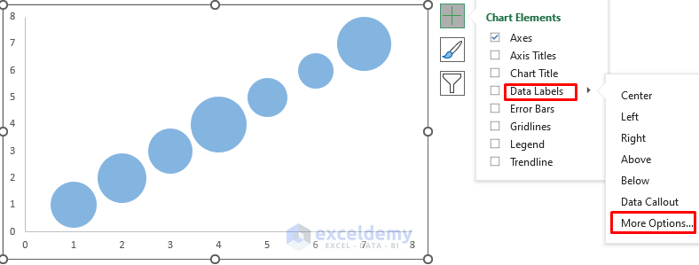
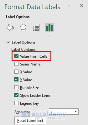
- Check the Value From Cells option from Format Data Labels.
- In the Data Label Range dialog box, select the range C14:C20.
- Click OK.
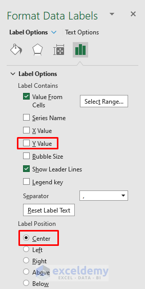
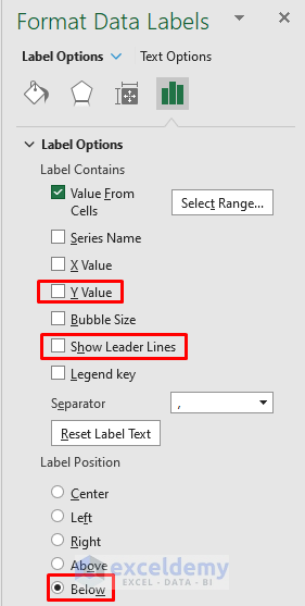
- Uncheck the Y Value from Format Data Labels.
The region and quality categories are added to the Bubble Chart.
Now we will add the Time Category to the Horizontal Axis.
- Right-click anywhere in the Plot Area and select Select Data.
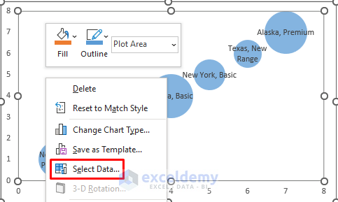
- Select Add from Select Data Source.
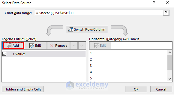
Now we fill the Edit Series dialog box with the following ranges:
- Give this series a name, for example Category 2.
- For the X values enter F5:F11.
- Since we want the Time Category on the Horizontal Axis, make a range of zeros in cells I5:I11 and select it for the Y values.
- Select a range of ones for the bubble size (F14:F20).
- Click OK.

7 bubbles of the same size are added to the Horizontal Axis.
- Right-click on any of the new bubbles and select Format Data Labels…
- Make sure all the small bubbles get selected.
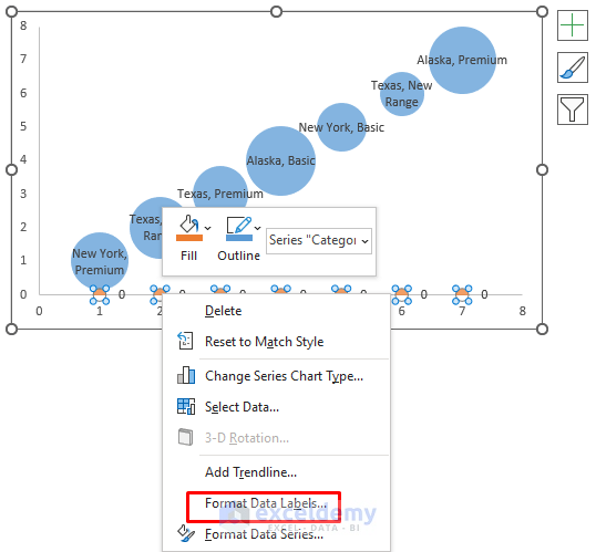
- To add the Time Category, open the Format Data Labels and select Value From Cells…
- Select E14:E20 for labeling, which is the Time Category range in the Data Label Range dialog box.
- Click OK.
- Uncheck the Y Value and Show Leader Lines options for convenience.
- Select Below for the Label Position.
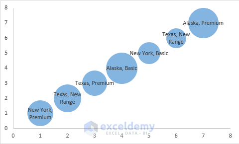
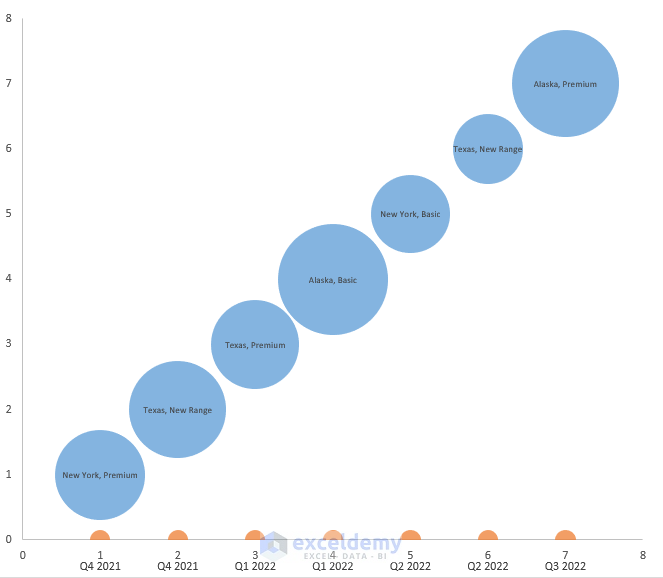
Our Bubble Chart with categorical data is complete.
- Spread the chart so that the bubbles and Axis Labels don’t overlap.
- Change the font size of the text if you wish.

We have successfully created an Excel Bubble Chart for categorical data.
Note:
To change the scale of the bubble size:
- Right-click on any of the bubbles and select Format Data Series…
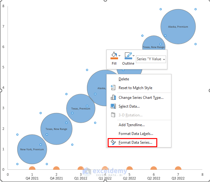
- Scale the bubble size to your choice. Here, we set it to 81.
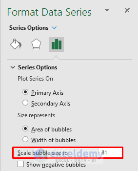
The Bubble Chart becomes more understandable.
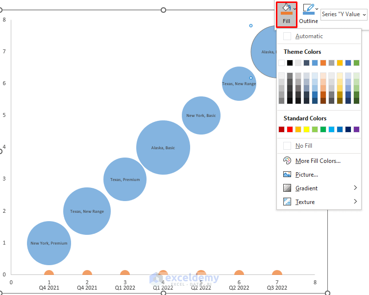
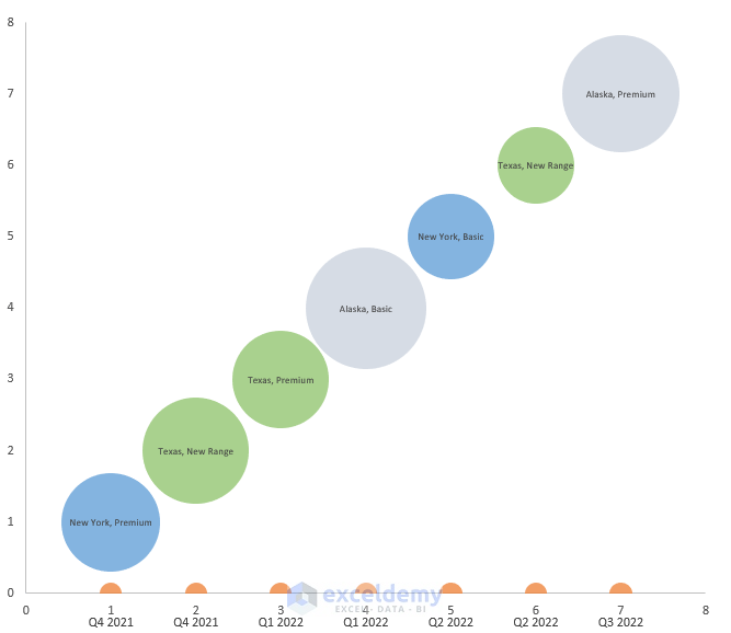
To separate the regions by color:
- Select a bubble and right-click on it.
- Select Fill and choose any color.
Our bubble chart looks more compelling and professional.
Download Practice Workbook
Related Articles
- Create Bubble Chart in Excel with Multiple Series
- Excel Bubble Chart Size Based on Value
- How to Color Excel Bubble Chart Based on Value
<< Go Back To Bubble Chart in Excel | Excel Charts | Learn Excel
Get FREE Advanced Excel Exercises with Solutions!
