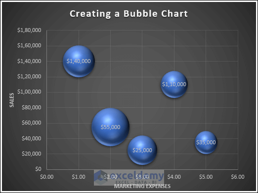
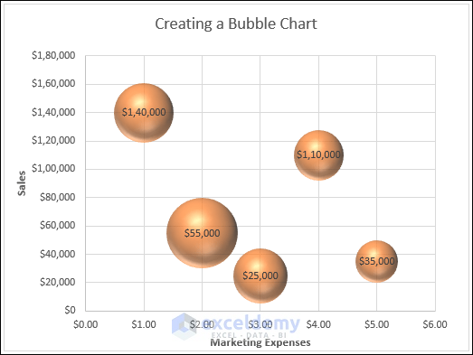
Bubble charts are a great way to visualize and compare three sets of data simultaneously. They’re particularly useful when you have a dataset with three variables.
1. Creating a Bubble Chart
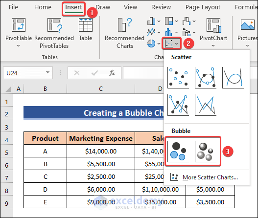
- Go to the Insert tab in Excel.
- Click on Insert Scatter (X, Y) or Bubble Chart.
- Choose either Bubble or 3-D Bubble.
- A blank chart will be created.
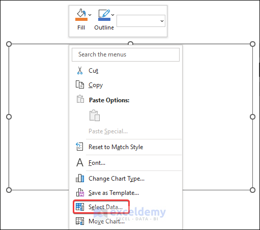
- Right-click on the blank chart and choose Select Data.
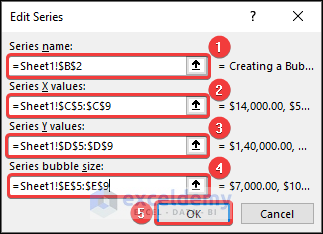
- Click on Add to add series data.
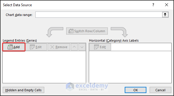
- Choose a Series name.
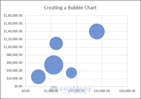
- Select the appropriate X and Y values (e.g., C5:C9 for X and D5:D9 for Y).
- Choose the bubble size (e.g., E5:E9) and click OK.
- This will create a 2-D bubble chart.
- If you prefer a 3-D bubble chart, select that option from the chart settings.
2. Customizing the Bubble Chart in Excel
2.1 Add data Labels
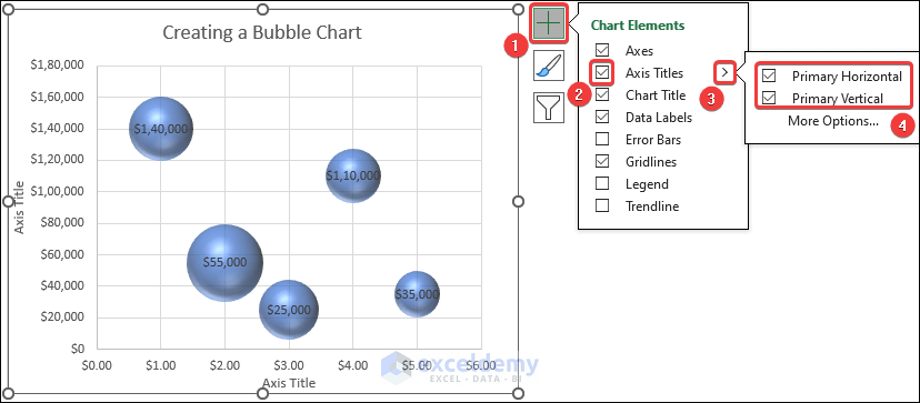
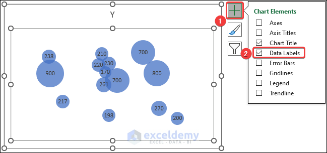
- Click on the Chart Elements icon and check the box for Data Labels.
- Position the labels as needed.

2.2 Add Axis Title
- Check the box for Axis Titles in the Chart Elements menu.
- Customize the axis titles based on your preference.
2.3 Apply a Different layout
- Go to the Chart Design tab.
- Choose a chart layout that suits your requirements.
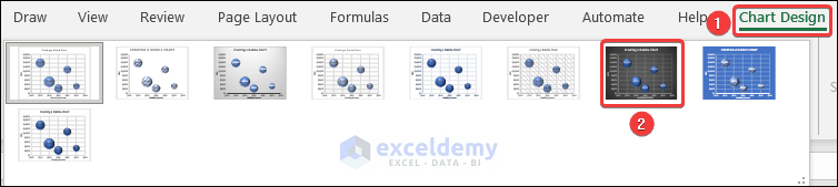
- The chart layout will update accordingly.
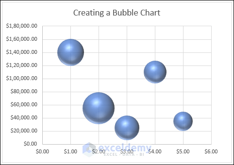
2.4 Change Color, Outline and Effects
- Click on the Chart Styles icon and select the Color tab.
- Choose a color combination to change the bubble colors.

- The bubbles in the chart will have your chosen color.
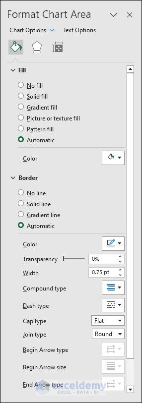
- You can further format the chart by double-clicking on it to open a side panel with additional options (e.g., Fill, Border).
Read More: How to Color Excel Bubble Chart Based on Value
3. Creating a Bubble Map in Excel
- Select the cells containing your data (e.g., B4 to C18).
- Go to Insert, select Insert Scatter (X, Y) or Bubble Chart and choose Scatter.
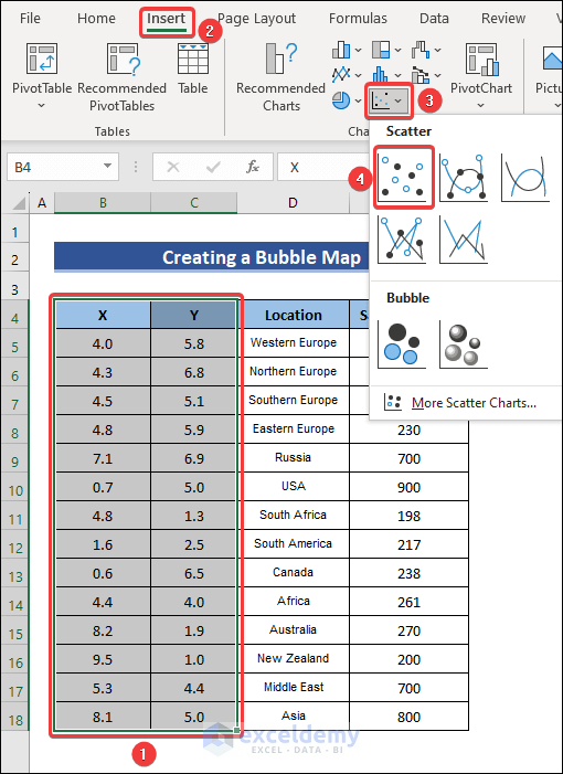
- Right-click on the chart and choose Change Chart Type.
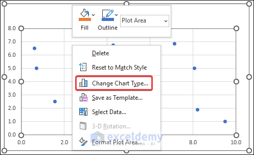
- Select X Y (Scatter) and then choose Bubble.
- Press OK to convert it into a bubble chart.

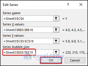
- Right-click on the chart and choose Select Data.

- Click on Edit to open the Edit Series box.

- Choose the bubble size (e.g., E5:E18) and press OK.
- Add Data Labels as before.
Adding a World Map Image:
- Double-click on the plot area to open the Format Plot Area side panel.
- Click on the Fill & Line icon and select Picture or Texture Fill.
- Click Insert under the Picture Source option.
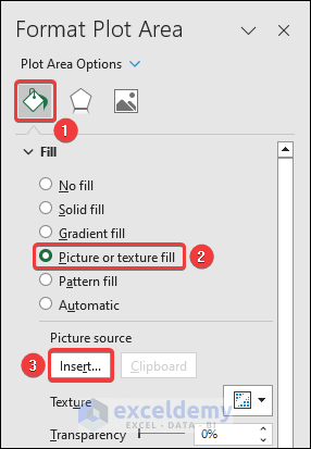
- Insert an image of the world map (from your PC or online).

- You now have your desired bubble map.

Read More: How to Create Bubble Chart in Excel
Download Practice Workbook
You can download the practice workbook from here:
Things to Remember
- Format data labels, bubble size, and color to enhance chart readability.
- Ensure correct X and Y values so that bubbles overlap correctly.
Frequently Asked Questions (FAQs)
- What is a Bubble Chart in Data Visualization?
- A bubble chart is a useful way to visualize data with two to four dimensions. In this chart:
- Two dimensions are visualized as coordinates (typically X and Y).
- The third dimension is represented by the color of the bubbles.
- The fourth dimension is reflected in the size of the bubbles.
- A bubble chart is a useful way to visualize data with two to four dimensions. In this chart:
- Difference Between Bubbles and Scatter Plots:
- Scatter plots are ideal for datasets with two variables. They show the relationship between these two variables.
- Bubble charts, on the other hand, are used when you need to present and analyze a dataset that has three variables. They provide additional information through bubble size and color.
- Advantages of Bubble Charts in Excel:
- Bubble charts help:
- Explain complex data patterns.
- Analyze data involving three variables.
- Make datasets more comprehensible by visualizing multiple dimensions.
- Bubble charts help:
Bubble Chart in Excel: Knowledge Hub
<< Go Back To Excel Charts | Learn Excel
Get FREE Advanced Excel Exercises with Solutions!
