In this tutorial, we will show how to insert and customize markers in Excel. We will also show how to add pictures as data markers and how to add markers in Sparklines.
Download Practice Workbook
How to Insert Markers in Excel Chart
Steps:
- Select the Insert tab.
- Click the Scatter Chart drop-down icon.
- Choose the Scatter with Smooth Lines and Markers chart.
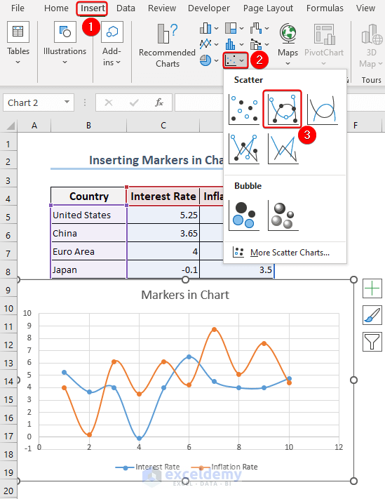
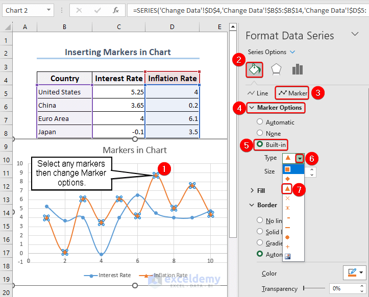
- Double-click the desired marker first.
The Format Data Series box will appear.
- Go to the Fill & Line section.
- Click the Marker field.
- Select Marker Options. By default, Automatic is selected. Change it to a Built-in option and set other formatting components such as Type, Size, etc as desired.
How to Customize Markers in Excel
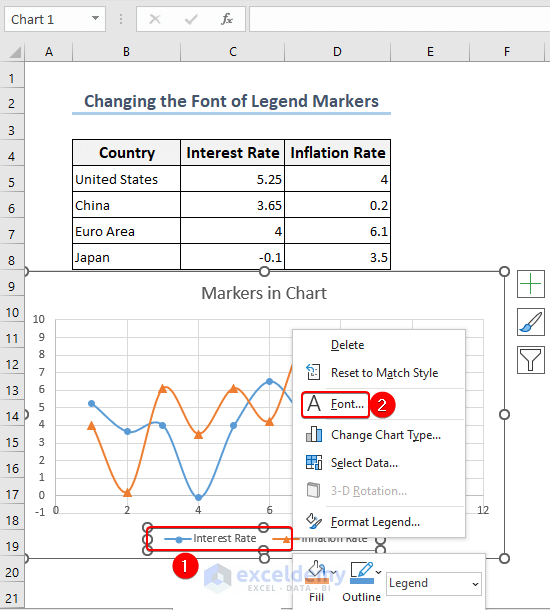
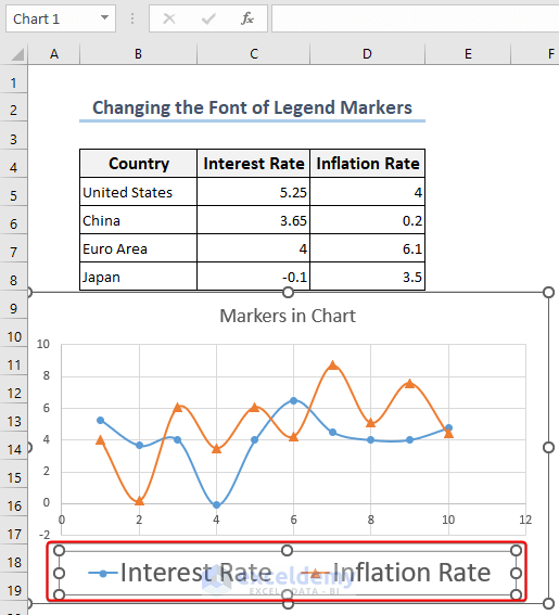
Method 1 – Customizing the Font of Legend Markers
- To access the context menu, right-click on the Legend Box.
- Select Font to open the Font dialog box.
- Change the font Size to 20 or as desired.
- Click OK.
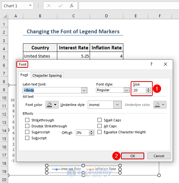
The legend markers on the chart will now be larger. Similarly, you can change the color of your markers.
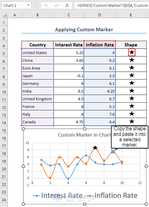
Method 2 – Using Custom Marker to Change Marker Shape
Steps:
- Select Shapes from the Insert tab.
- From the many options, select a Star shape.
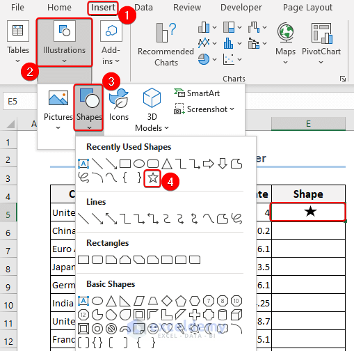
- Copy the shape from the cell with Ctrl+C, and paste it into a chosen marker with Ctrl+V.
How to Use a Picture as a Data Marker in Excel
To insert the flag as a data marker:
- Select the cells in the Geography column.
- Go to the Data tab >> Data Types >> Geography.
- Select Insert Data icon >> Image.
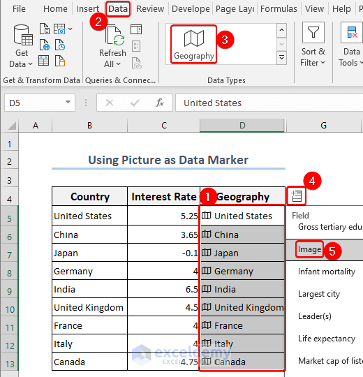
After choosing the Image, the flags of the corresponding countries will be displayed.
- Copy the flags with Ctrl+C and Paste as Picture either from the right-click context menu or from the Paste button on the Home tab.
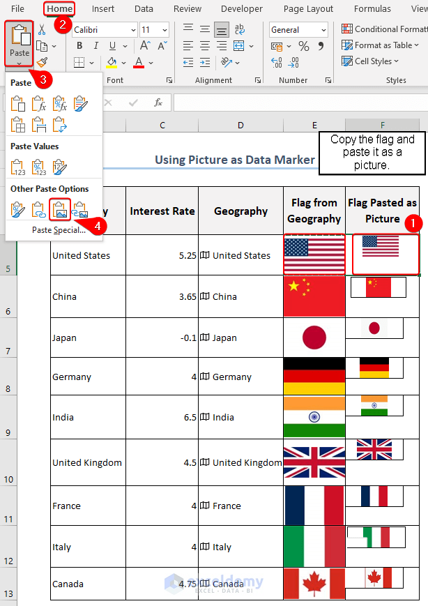
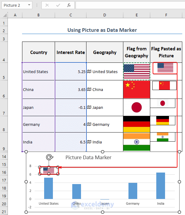
- Now the flags marked Pasted as Picture can be used as data markers either by dragging or copying and pasting to the corresponding bar in the chart, like in the following image.
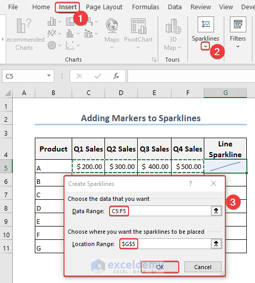
How to Add Markers to Sparklines in Excel
Steps:
- Navigate to the Insert tab on the ribbon.
- Choose Sparklines.
- Select Lines from the drop-down menu.
A Create Sparklines dialog box will now appear.
- Select the Data Range and Location Range and click OK.
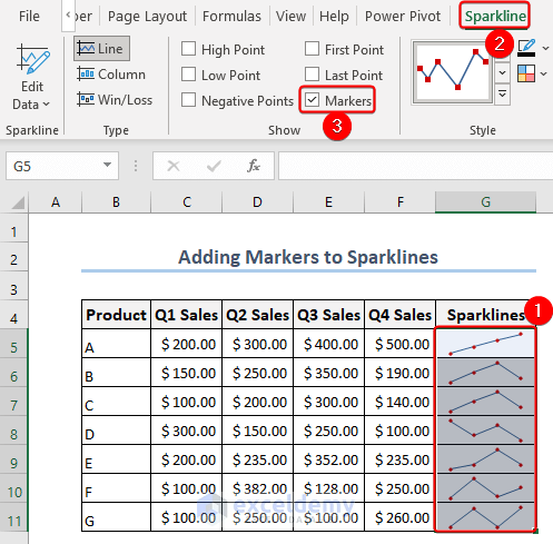
- Select the column with Sparklines.
- Go to the Sparklines tab.
- Check the box next to the Markers option.
Things to Remember
- Marker Definition: Markers in Excel are the icons or data points that are used to display data on a chart. They may take the form of shapes, symbols, or icons that are positioned at particular data values on the chart to highlight and separate data points.
- Marker Data Series: To distinguish each data series visually when working with multiple data series on a chart, give each series a unique marker.
- Marker Placement and Clutter: Be mindful of where you place markers on the chart to avoid unnecessary clutter. To manage markers and preserve clarity in your visual representation, consider using data filtering, grouping, or other techniques.
Frequently Asked Questions (FAQs)
1. What do the markers in Excel charts mean?
Answer: A marker is a data point that is displayed on a chart to draw attention to a particular value. They can be presented on the chart as symbols or shapes, such as squares or circles, placed at the relevant data points.
2. Can I change how markers appear in Excel charts?
Answer: Yes, Excel offers several formatting options to select various marker types, sizes, colors, and styles.
3. How do I get rid of or conceal markers from an Excel chart?
Answer: Access the formatting options for the chart and turn off the marker option for the relevant data series. Alternatively, change the marker size to zero, which would make them invisible.
Markers in Excel: Knowledge Hub
- How to Add Data Markers in Excel
- How to Add Markers for Each Month in Excel
- How to Change Marker Shape in Excel Graph
- How to Make Legend Markers Bigger in Excel
<< Go Back To Excel Charts | Learn Excel
Get FREE Advanced Excel Exercises with Solutions!
