Excel is a powerful software. We can perform numerous operations on our datasets using Excel tools and features. Using various charts and graphs, you can present survey results very clearly and effectively. Many companies store their monthly data information in excel worksheets. At the end of the year, they like to see the monthly records and analyze where they need to improve. Using charts and markers for each month to display the records help the viewers to understand the information properly. This article will show you the step-by-step procedures to Add Markers for Each Month in Excel.
Add Markers for Each Month in Excel: Step by Step Procedure
Excel provides various charts and graphs by default. You can insert them according to your requirements and demands. Some charts have markers while others don’t. In that case, you have to add the markers. Again, you may want to make custom markers, instead of using the existing ones. Therefore, go through the steps below carefully to Add Markers for Each Month in Excel.
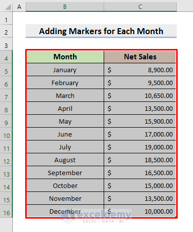
STEP 1: Input Data for Each Month
- First of all, we need to input accurate data for each month in the excel worksheet.
- In this example, we will use the monthly Net Sales record of a certain company.
- See the below dataset for a better understanding.

Read More: How to Add Data Markers in Excel
STEP 2: Insert Excel Chart
- Now, we have to insert the chart.
- In this regard, select the range B4:C16.
- Next, go to the Insert tab.
- Then, press the Scatter Chart drop-down icon as shown below.
- Subsequently, choose the Scatter chart.
- In this step, you can choose other different charts according to your wish.
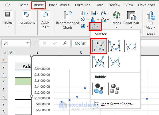
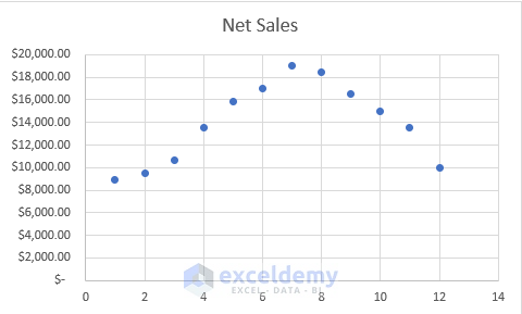
- Thus, you’ll get a scatter chart like the one in the below picture.
Read More: How to Change Marker Shape in Excel Graph
STEP 3: Format Chart
- We may need to format the chart to meet our needs.
- Here, we will set the Chart Title as Sales Trend.
- After that, we’ll reset the Y-axis bound to make the chart appear more smooth.
- For that purpose, click Y-axis.

- As a result, the Format Axis pane will appear on the right side.
- Consequently, type 6000 in the Minimum box under the Bounds section.
- Afterward, close the pane.

- Hence, your graph will turn out like the one displayed below.

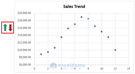
STEP 4: Add Markers for Each Month
Our major step starts here. Here, we’ll show you how to add markers or modify them.
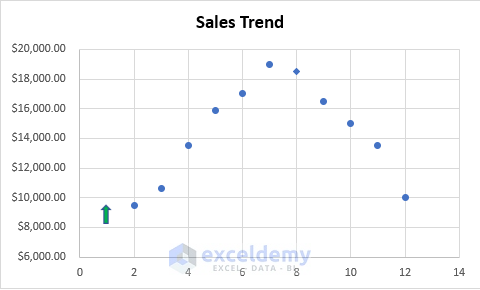
- Firstly, double-click the desired marker.
- Look at the below figure. There, only one of the markers is selected.
- Thus, the Format Data Point will emerge.
- Now, go to the Fille & Line section.
- Next, click the Marker field.
- Modify necessary parts like Type, Size, etc.

- Moreover, if you want to add other shapes or even pictures, you can also do that.
- In that case, go to Insert ➤ Illustrations ➤ Pictures/Shapes.
- In this example, choose Shapes.
- Then, select the desired shape.
- Here, we choose the Up Arrow.

- Similarly, select as many shapes as you want following the same steps.
- Insert the shapes in the worksheet first.
- Now, copy the desired shape.
- Double-click the marker and press the Ctrl and V keys together to paste it.
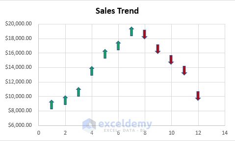
- In the below chart, we’ll place the upper arrow for the increasing sales amounts.
- And we’ll insert the down arrow for the decreasing amounts.
- Thus, we can generate monthly sales trends.
Read More: How to Make Legend Markers Bigger in Excel
Final Output
- Lastly, select the Gridlines in the chart and delete them by pressing Delete.
- This will make the chart more presentable.
- Hence, our chart is ready to demonstrate.
- Look at the following chart which is our final output.

Download Practice Workbook
Download the following workbook to practice by yourself.
Conclusion
Henceforth, you will be able to Add Markers for Each Month in Excel following the above-described procedures. Keep using them and let us know if you have more ways to do the task. Don’t forget to drop comments, suggestions, or queries if you have any in the comment section below.
<< Go Back To Markers in Excel | Excel Charts | Learn Excel
Get FREE Advanced Excel Exercises with Solutions!
