Example 1 – Adding Data Markers in a Line Chart
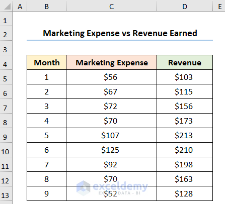
We have the following dataset shown in the B4:D13 cells below. The dataset shows the Month number, the Marketing Expense, and the Revenue in USD, respectively.
Steps:
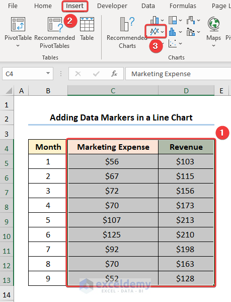
- Select the C4:D13 cells.
- Go to the Insert tab.
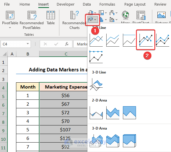
- Click the Insert Line or Area Chart dropdown.
- Choose the Line with Markers option.
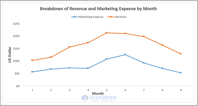
You can format the chart using the Chart Elements option.
- Enable the Axes Title to provide axes names. Here, it is the Month and US Dollar.
- Add the Chart Title, for example, Breakdown of Revenue and Marketing Expense by Month.
- Insert the Legend option to show the two series.
- Disable the Gridlines option to give your chart a clean look.
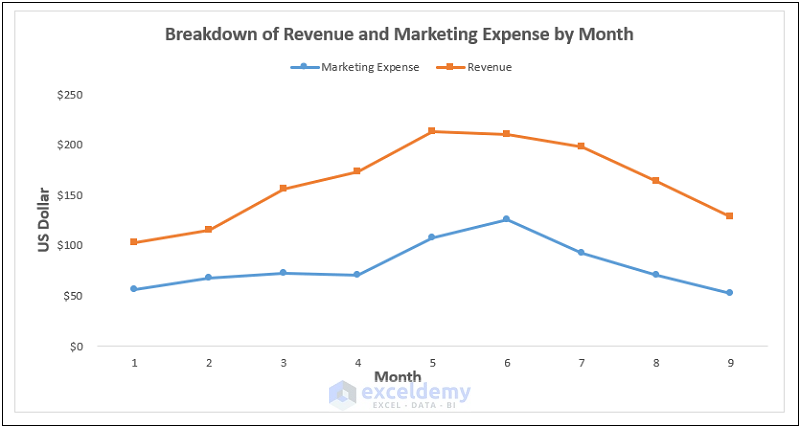
This should generate the chart as shown in the picture below.
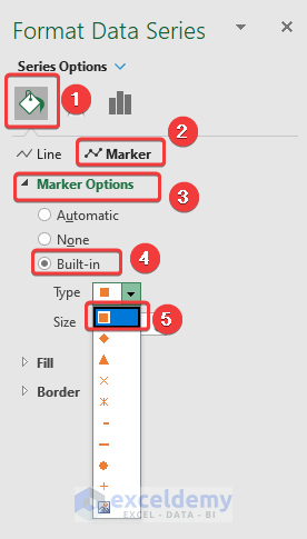
- Right-click on any of the circular markers and go to the Format Data Series option.
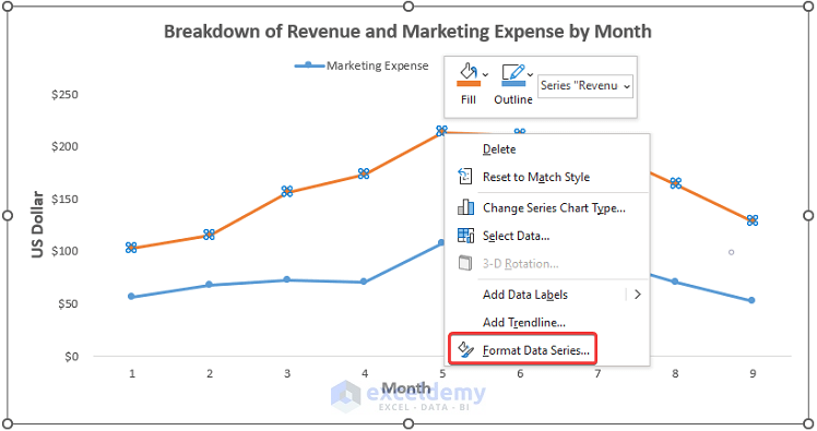
- Choose Marker Options.
- Check the Built-in option .
- Select the Type of marker (here, it is a Rectangular marker).
Here are the markers.
Read More: How to Add Markers for Each Month in Excel
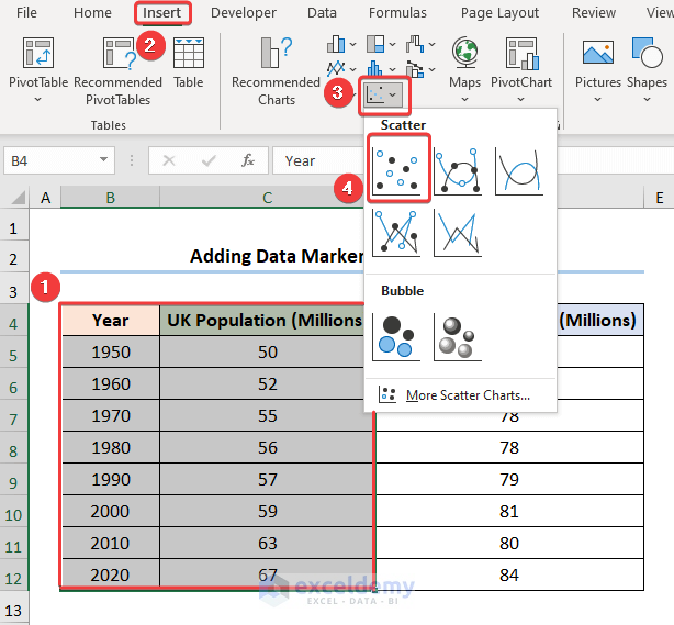
Example 2 – Adding Data Markers in a Scatter Plot
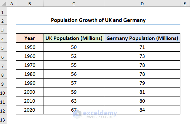
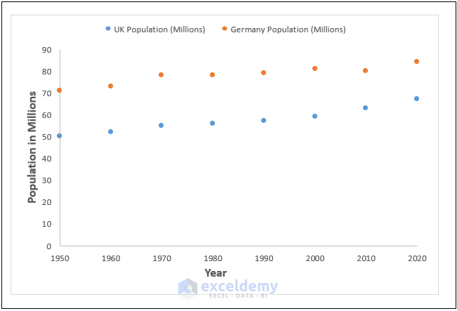
Consider the Population Growth of UK and Germany dataset shown in the B4:D12 cells. The dataset shows each decade starting from the Year 1950 and the Populations of the UK and Germany in millions.
Step 1 – Adding a Scatter Plot
- Select the B4:C12 cells.
- Go to the Insert tab.
- Click the Insert Scatter (X,Y) or Bubble Chart drop-down.
- Choose the Scatter option.
You can edit the chart using the Chart Elements option.
- Enable the Axes Title to provide axes names. Here, it is the Year and Population in Millions.
- Insert the Legend option to show the series.
- Disable the Gridlines option.

Step 2 – Adding a Second Series
- Select the chart and right-click, then choose the Select Data option.
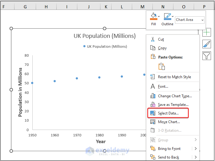
- Click the Add button to add the new series to the chart.
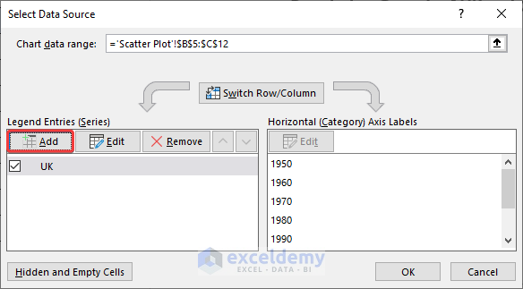
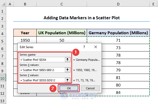
This opens the Edit Series dialog box.
- Enter the Series Name (here it is Germany’s Population)
- Enter the Series X values, for example, the Years.
- Enter the Series Y values, for instance, Germany’s Population.
- Press the OK button.
After completing the steps, the results should look like the screenshot given below.
Step 3 – Adding Data Markers
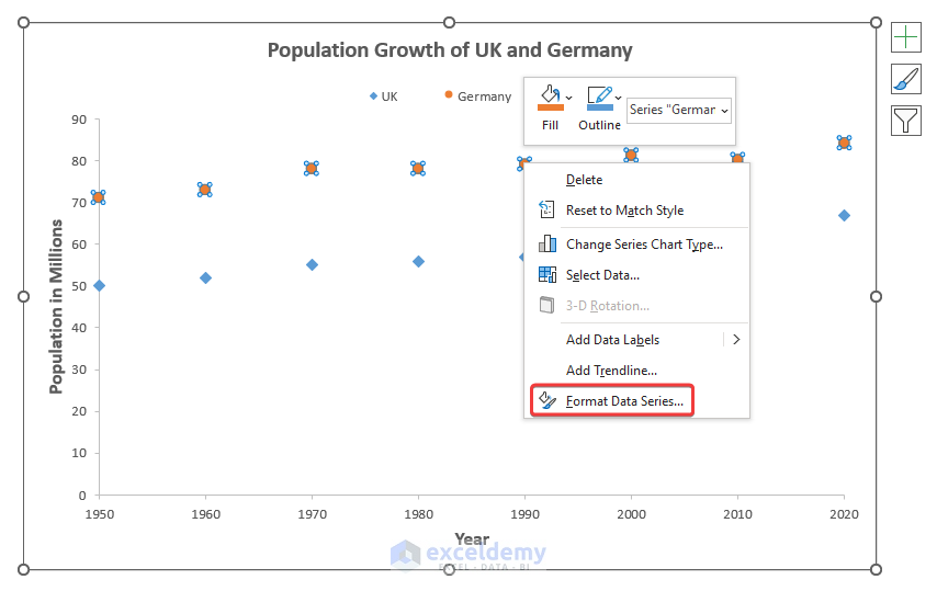
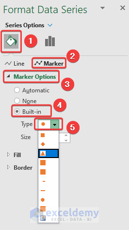
- Right-click on a single data value and go to the Format Data Series option.
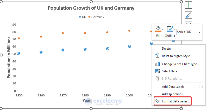
- In the Marker section, click the Marker Options.
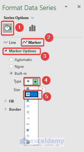
- Check the Built-in option.
- Select the Type of marker (here, it is a Diamond marker).
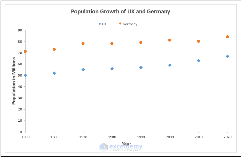
Here are the sample results for our dataset.
Read More: How to Change Marker Shape in Excel Graph
How to Change Data Markers
Steps:
- Select the chart.
- Right-click and choose the Format Data Series option.
- Go to the Marker Options and choose the Built-in option.
- From the Type drop-down, select the new shape for your data markers.
Here’s a sample result.

Read More: How to Make Legend Markers Bigger in Excel
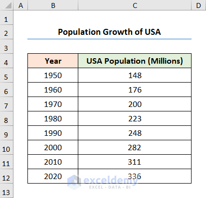
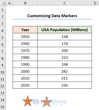
How to Make a Custom Data Marker
We have the Year column starting from 1950 and the Population in millions, respectively.
Step 1 – Add a Line Chart
- Select the C4:C12 cells.
- Go to the Insert Line or Area Chart dropdown.
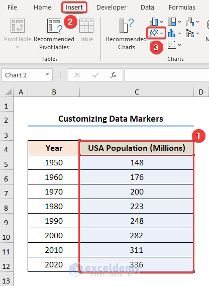
- Choose the Line with Markers option.
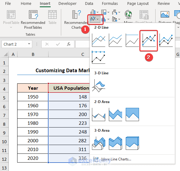
Format the chart with Chart Elements.

Step 2 – Insert Shapes
- Go to the Insert tab.
- Select the Shapes drop-down.
- Choose any shape you like (we chose the Star shape).
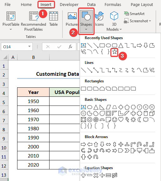
- Insert this shape and press the Ctrl + C key to copy it.
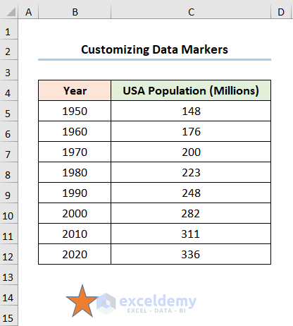
- In the adjacent cell, right-click and go to Paste Options.
- Select the Paste as Picture option.
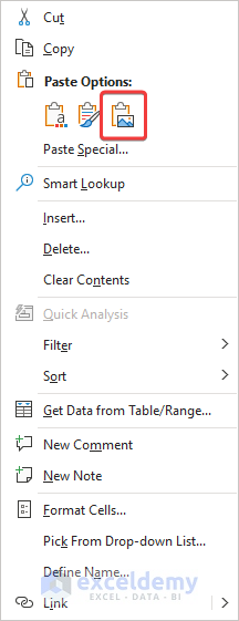
This produces an identical copy of the shape as a picture.
Step 3 – Use a Picture as a Data Marker
- Copy the picture with Ctrl + C.
- Go to the Format Data Series window.
- In the Marker section, choose the Fill option.
- Check Picture or texture fill button.
- Press Clipboard.
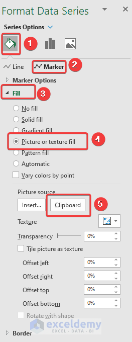
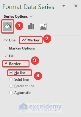
- In the Border section, select the No line option.
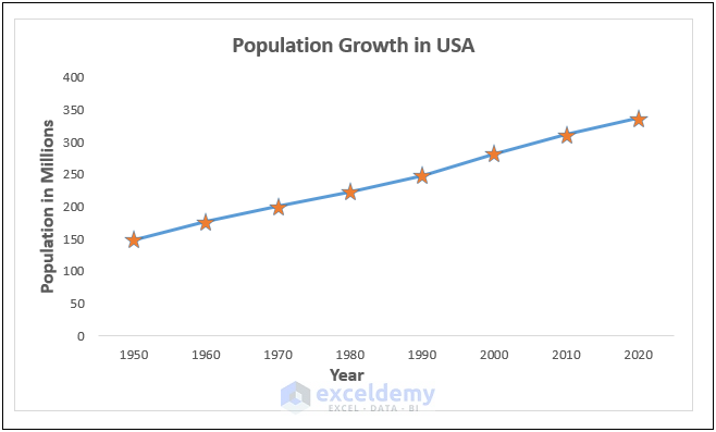
Here are our custom data markers.
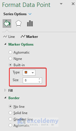
How to Add Different Data Markers in an Excel Chart
Steps:
- Select the chart.
- Right-click and choose the Format Data Points option.
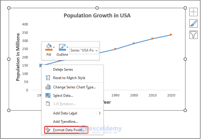
- Navigate to the Marker Options and choose the Built-in option.
- From the Type drop-down, select the shapes for your data marker.
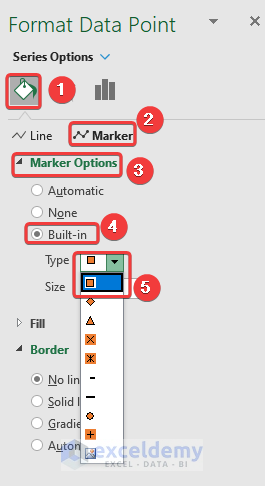
- We’ve chosen the rectangular shape and a marker size of 8.
Repeat the process for each of the data markers, and you should get the output as shown in the image below.

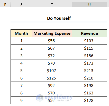
Practice Section
We have provided a Practice section like below in each sheet on the right side so you can test these methods.
Download the Practice Workbook
<< Go Back To Markers in Excel | Excel Charts | Learn Excel
Get FREE Advanced Excel Exercises with Solutions!
