While working in Microsoft Excel with the sales-related worksheets, sometimes we need to give formatting data series. The chart shows you a trend in the share of total sales that they contribute, NOT a trend in their absolute value. Formatting data series in an Excel chart is an easy task. This is a time-saving task also. Today, in this article, we’ll learn two quick and suitable ways to format data series in Excel effectively with appropriate illustrations.
How to Format Data Series in Excel: 2 Quick Steps
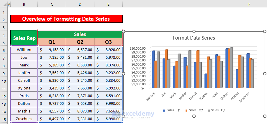
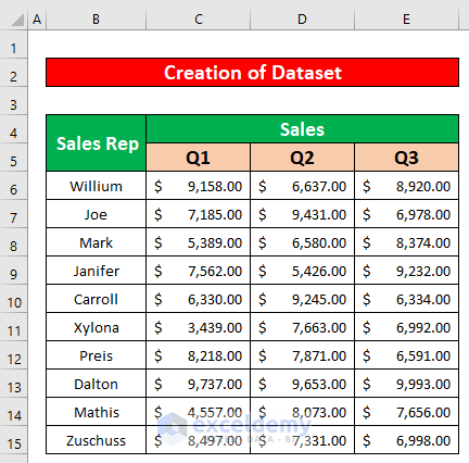
Let’s say, we have a dataset that contains information about several Sales representatives of XYZ group. The name of the Sales representatives and their sales in several quarters are given in columns B, C, D, and E respectively. From our dataset, we will create a chart to give formatting data series, and we will apply the Insert ribbon to format the data series of a chart in Excel. Here’s an overview of the dataset for our today’s task.
Step 1: Create a Dataset with Proper Parameters
In this portion, we will create a dataset to format data series chart in Excel. We will make a dataset that contains information about several Sales representatives of the Armani group. We will give formatting data series of the Sales representatives. So, our dataset becomes.
Step 2: Format Data Series Using Chart Option in Excel
Using Insert ribbon, we will import a chart from our dataset to format the data series. This is an easy task. This is a time-saving task also. Let’s follow the instructions below to create a progress monitoring chart in Excel!
- First of all, select the range of data to draw a chart. From our dataset, we select B4 to E15 for the convenience of our work. After selecting the data range, from your Insert ribbon, go to,
Insert → Charts → 3-D Column
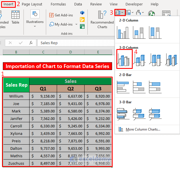
- As a result, you will be able to create a 3-D column chart which has been given in the below screenshot.
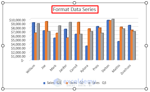
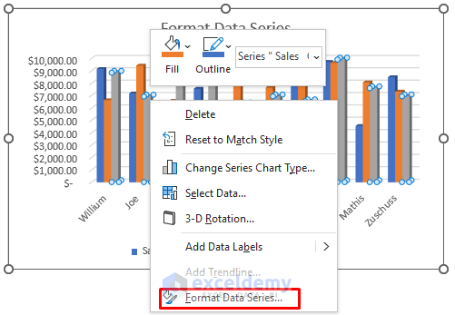
- Now, we will give formatting data series of the chart. Firstly, press left-click on any column of Quarter 3. Secondly, press right-click on the column of Quarter 3. As a result, a window will appear in front of you. From the window, select the Format Data Series option.
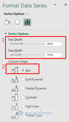
- Hence, a Format Data Series pops up. Now, from the Series Options, give Gap Depth 180% and Gap width 150%. After that, check the Box under the Column shape option.
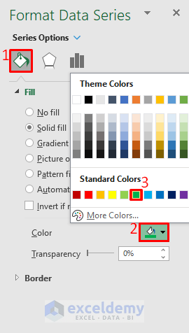
- After that, we will change the column color. We will change the column color from gray to green in the below screenshot.
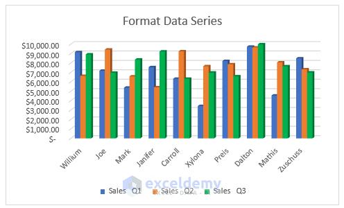
- As a result, you will be able to Format Data Series of a 3-D column chart which has been given in the below screenshot.
Read More: How to Rename Series in Excel
Things to Remember
👉 #N/A! error arises when the formula or a function in the formula fails to find the referenced data.
👉 #DIV/0! error happens when a value is divided by zero(0) or the cell reference is blank.
Download Practice Workbook
Download this practice workbook to exercise while you are reading this article.
Conclusion
I hope all of the suitable steps mentioned above to format the data series in the chart will now provoke you to apply them in your Excel spreadsheets with more productivity. You are most welcome to feel free to comment if you have any questions or queries.
Related Articles
<< Go Back To Data Series in Excel | Excel Charts | Learn Excel
Get FREE Advanced Excel Exercises with Solutions!
