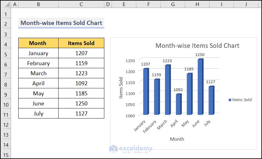
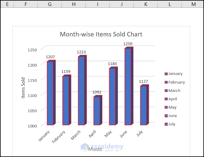
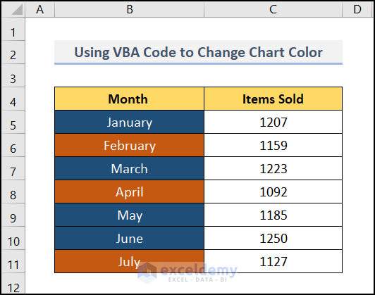
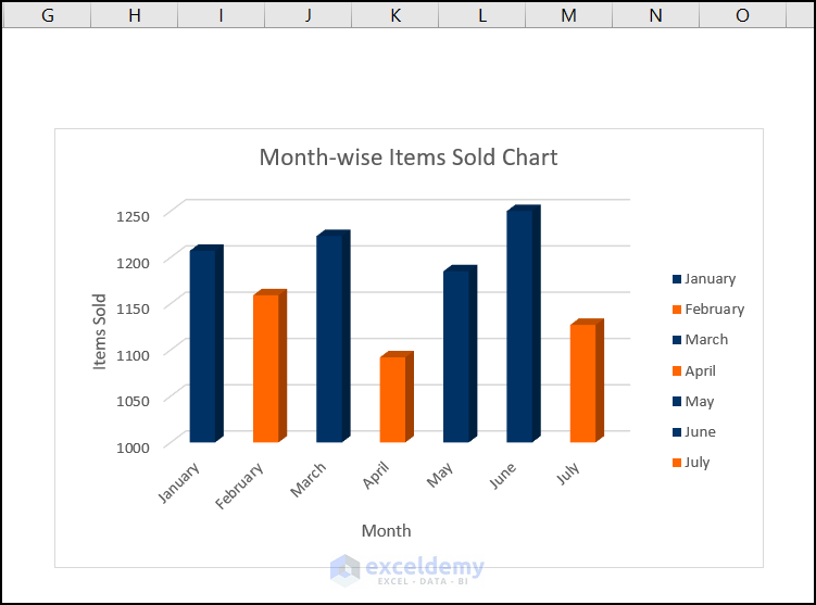
The image below showcases a chart of Month-wise Items Sold. The first 7 months of the year and items sold were used to create a chart.
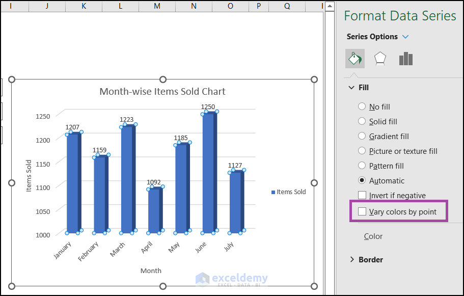
Method 1 – Changing the Color Fill in the Bars
- Click any bar in the chart to open Format Data Series.
- In Series Options, select Fill.
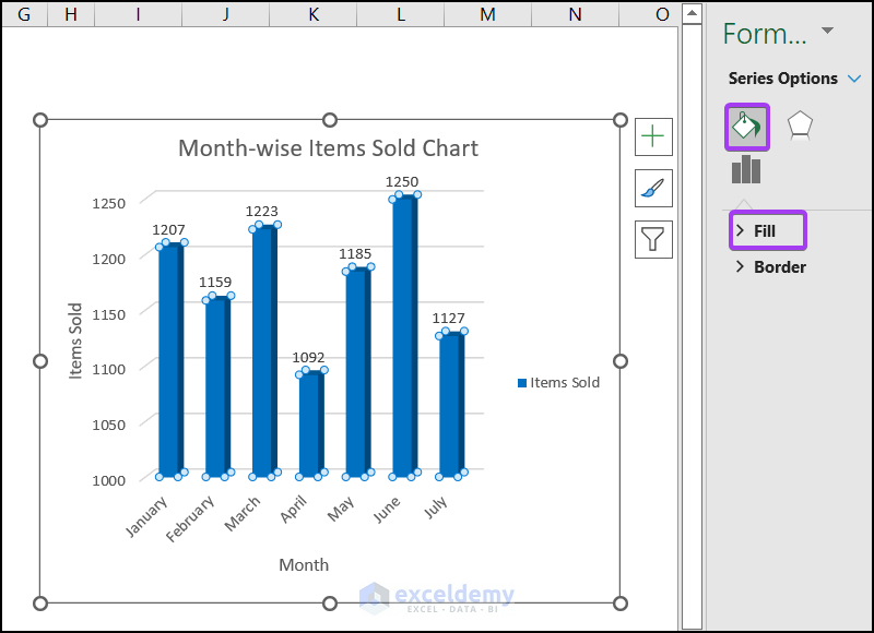
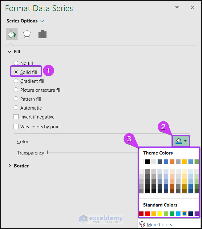
- Select Solid fill.
- Choose a color from the Theme Colors.
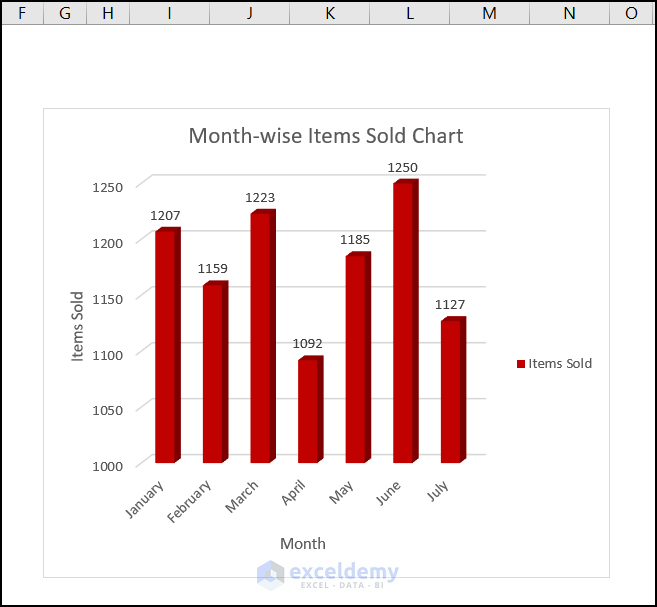
The color of your bar will change.
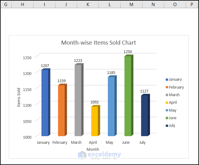
Method 2 – Using Different Colors for Each Bar
Steps:
- Click the chart >> go to Format Data Series >> select Fill.
- In Fill, check Vary colors by point.
This is the output.
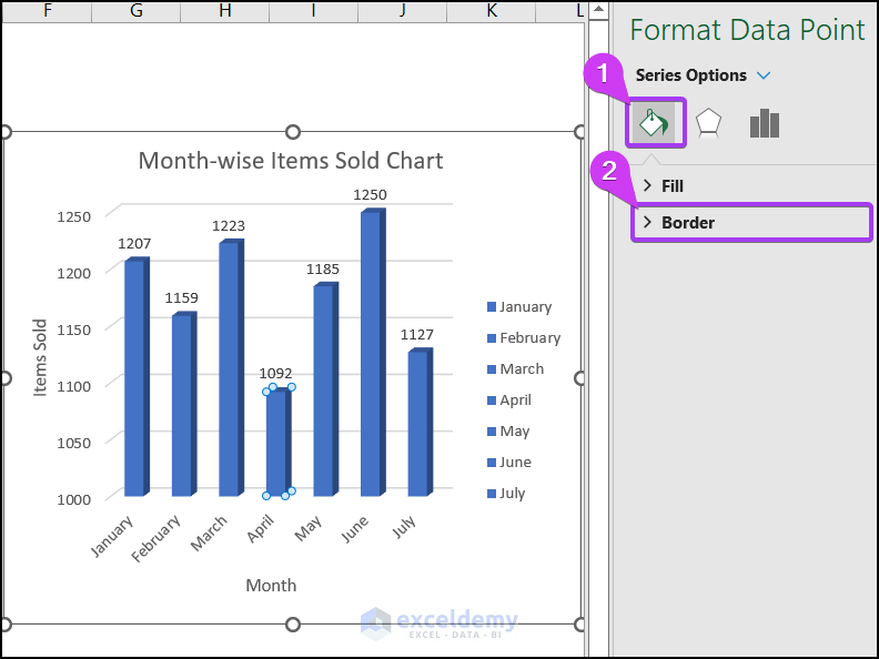
Method 3 – Adjusting the Borders of the Chart Bars
Steps:
- Select a bar and go to the Series Options in Format Data Point.
- Select Border.
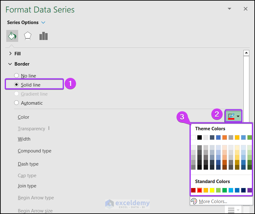
- In Border, select Solid line.
- In Theme Colors, choose a color (red, here).
This is the output.
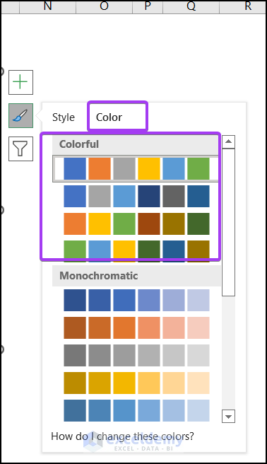
Method 4 – Using the Chart Styles
Steps:
- Select the chart. Three options will be displayed: Data Elements, Chart Styles, and Chart Filters.
- Choose Chart Styles.
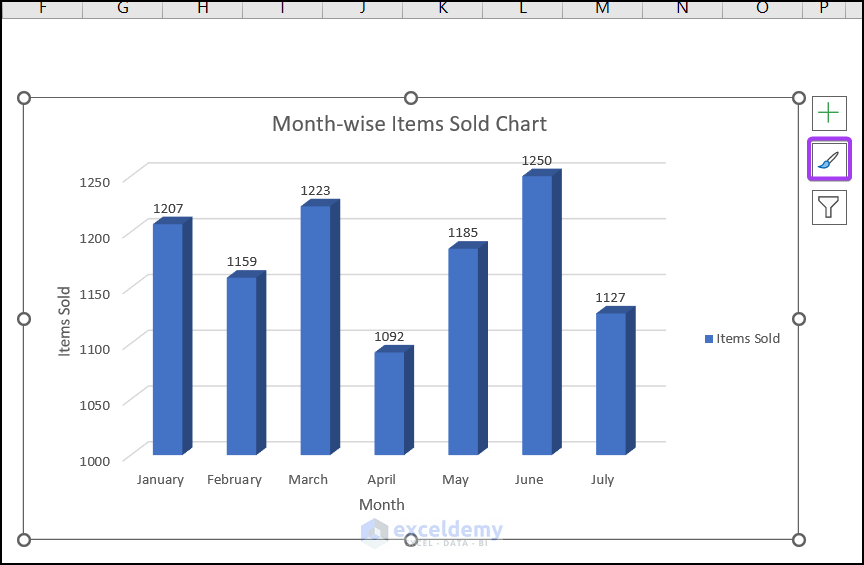
- Select a Color.
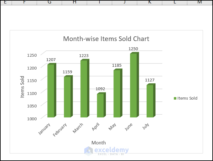
This is the output.
Read More: How to Format Data Series in Excel
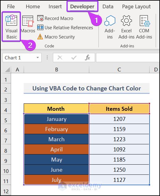
Method 5 – Using a VBA Code to Change the Series Color in an Excel Chart
Steps:
- Go to the Developer tab (You can enable the Developer tab from the File option) >> select Visual Basic.
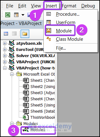
- In the new window, select Insert >> Module >> Module1.
- Enter the VBA code below.
- Press F5 to run the code.
Sub Series_Color_VBA()
Dim rn As Range
Dim s As String
Dim b As Integer
Dim a As Integer
For b = 1 To ActiveSheet.ChartObjects.Count
s = ActiveSheet.ChartObjects(b).Name
With Sheet5.ChartObjects(s).Chart.SeriesCollection(1)
Set rng = ActiveSheet.Range(Split(Split(.Formula, ",")(1), "!")(1))
For a = 1 To rng.Cells.Count
.Points(a).Format.Fill.ForeColor.RGB = ThisWorkbook.Colors(rng.Cells(a).Interior.ColorIndex)
Next a
End With
Next b
End Sub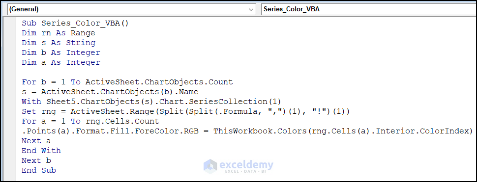
This is the output.
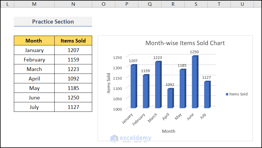
Practice Section
Practice here.
Download Practice Workbook
Download the practice workbook.
Related Articles
<< Go Back To Data Series in Excel | Excel Charts | Learn Excel
Get FREE Advanced Excel Exercises with Solutions!
