This is an overview.

Download Excel Workbook
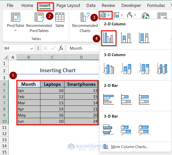
How to Add a Chart in Excel
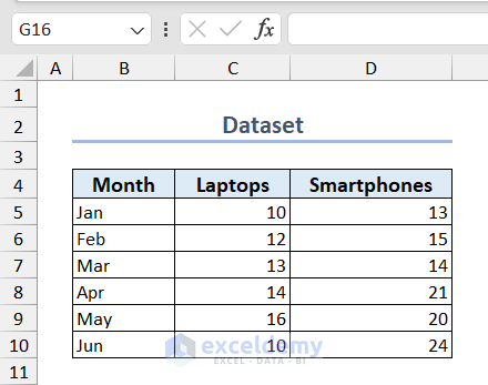
The sample dataset contains the number of Laptops and Smartphones a company sold in the first 6 months of the year. To add a chart:
- Select the dataset >> go to the Insert tab >> click Insert Column Chart >> select a chart.
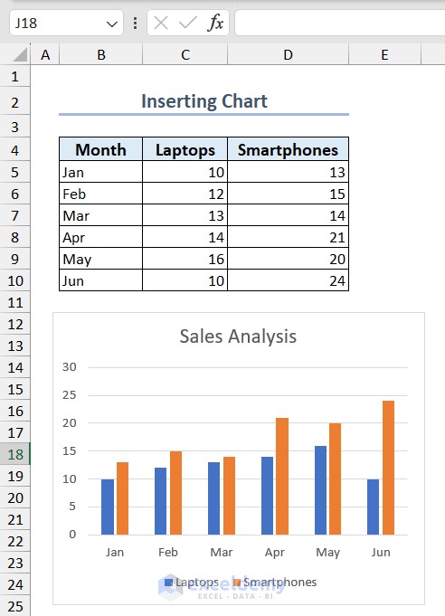
- You can change the Chart Title.
This is the output.
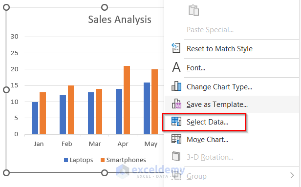
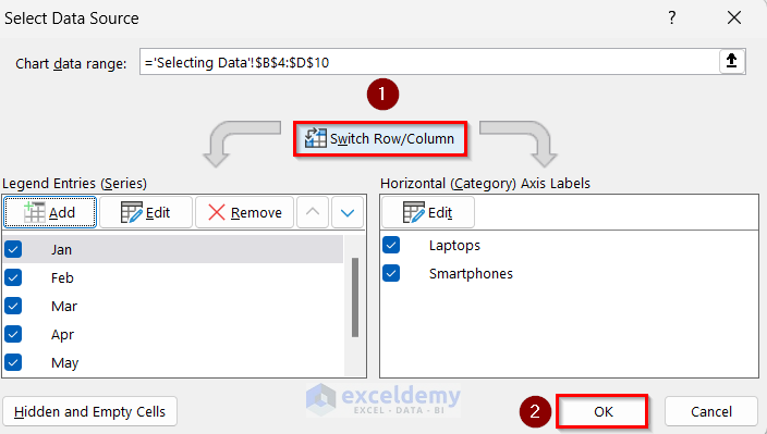
How to Select Data for an Excel Chart
Change the data series by switching rows and columns:
- Select the chart and right-click.
- Click Select Data.
- Click Switch Row/Column.
- Click OK.
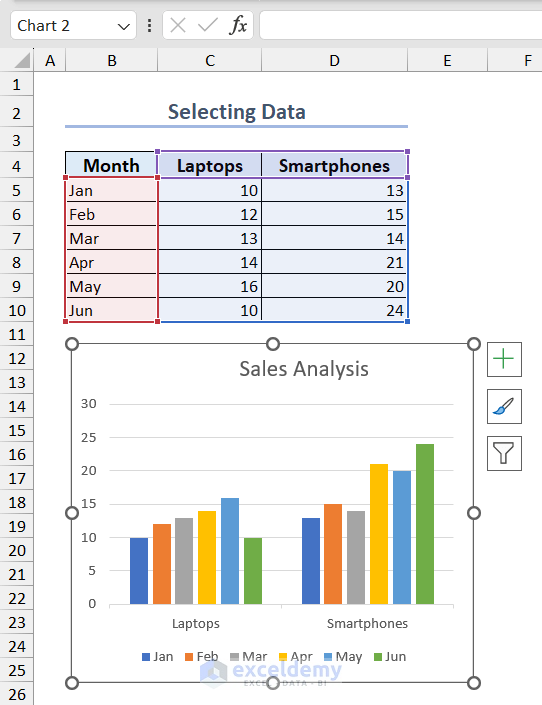
This is the output.
How to Add, Edit, Move and Remove a Data Series
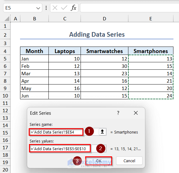
1. Add a Data Series to an Existing Chart
- Click Add in Select Data Source.
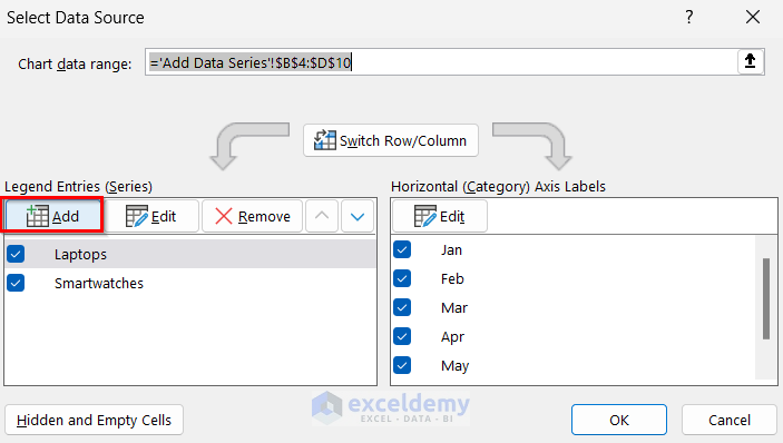
- Enter the Series name and values in Edit Series.
- Click OK.
This is the output.
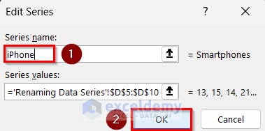
2. Rename a Data Series
- Select the data series >> click Edit.
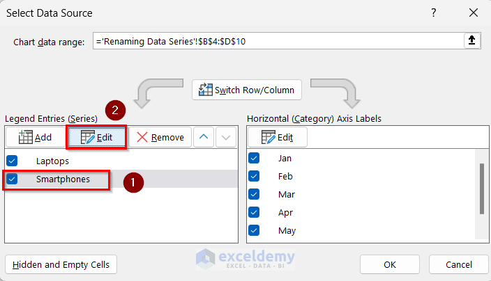
- Change the Series name from Smartphones to iPhone.
- Click OK.
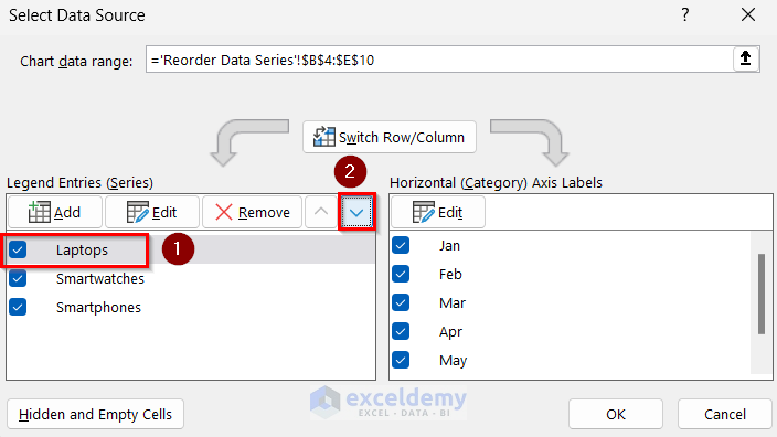
3. Reorder Data Series in an Existing Chart
- In Select Data Source, select the data series you want to reorder.
- Click Move Up or Move Down.
- Click OK.
Read More: How to Sort Data in Excel Chart
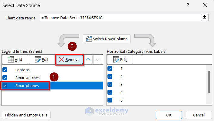
4. Remove a Data series in a Chart
- In Select Data Source, click Remove.
- Click OK.
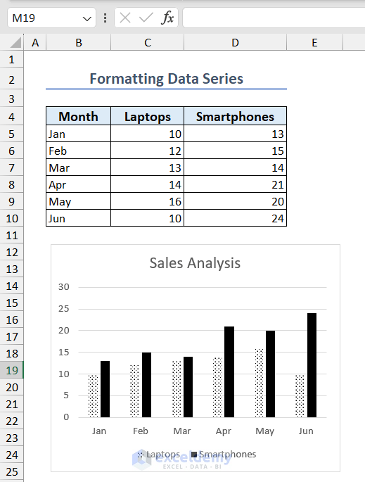
How to Format a Data Series in an Excel Chart
- Click a data point in the series to select the data series.
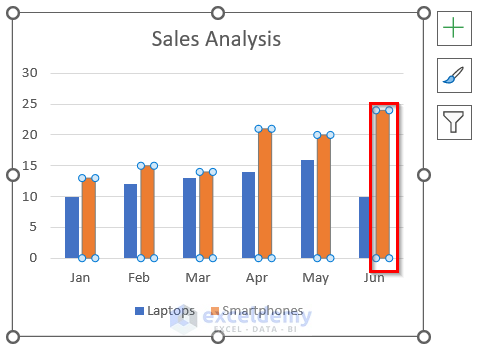
- In Format Data Series, select Fill.
- Select Pattern Fill and choose a pattern.
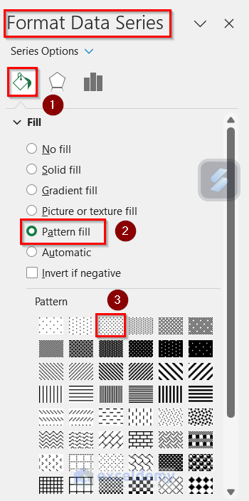
- Choose Solid Fill for the other data series.
Read More: How to Format Data Table in Excel Chart
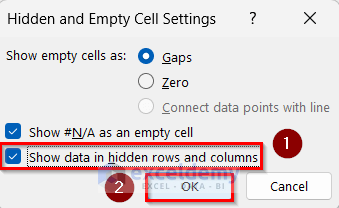
How to Show Hidden Data in an Excel Chart
- In Select Data Source >> click Hidden and Empty Cells.
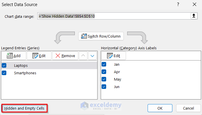
- Check Show data in hidden rows and columns.
- Click OK.
Read More: How to Hide Chart Data in Excel
Data for Excel Chart: Knowledge Hub
<< Go Back to Excel Charts | Learn Excel
Get FREE Advanced Excel Exercises with Solutions!
