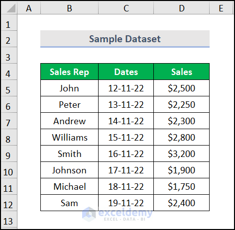
Here, we have taken a dataset of “Date-wise Sales” of “Sales Rep.” We want to create a chart showing the dates, but they are not displaying in our chart. We are going to solve this issue.
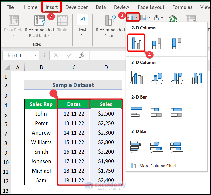
Step 1: Insert an Excel Chart
- Create a chart with our dataset.
- Select the entire column range with whom you want to make the chart.
- Go to the Insert tab >> Insert Column or Bar chart dropdown >> pick Clustered Column.
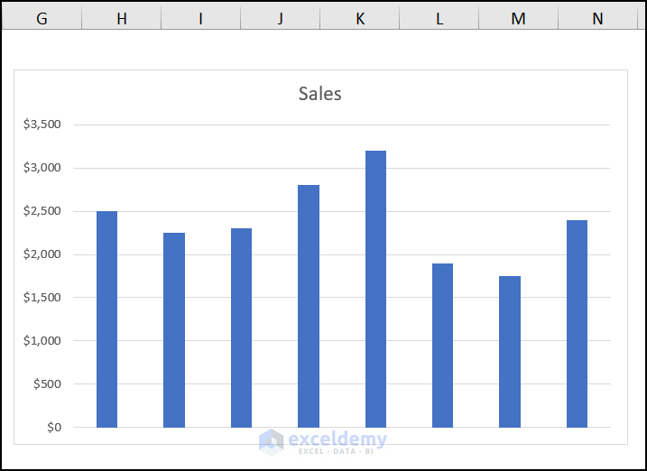
A bar chart is formed with the data, like the image below. But the dates aren’t showing on the horizontal axis.
Read More: How to Create Graph from List of Dates in Excel
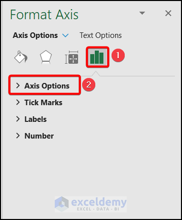
Step 2: Use the Format Axis Option
- To show the date, click on the chart and select the Format Plot Area option.

- The Format Axis window appears on the right side of the Excel worksheet. Move to Axis Options there.
Read More: How to Change X-Axis Values in Excel
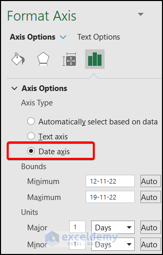
Step 3: Select the Date Axis
- Select the Date axis in the Axis Options.
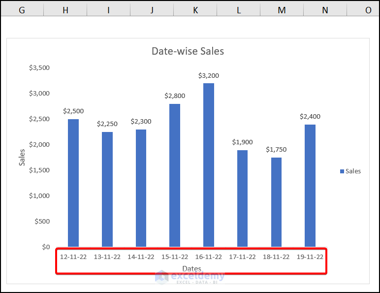
Your Excel chart shows the dates on the horizontal axis with data, as shown in the image below.
How to Show Only Dates with Available Data in Excel Chart
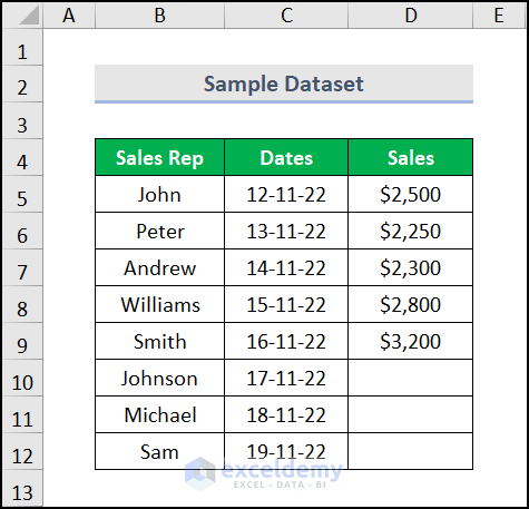
Here, we have taken the same dataset, but some of our Sales data is missing.
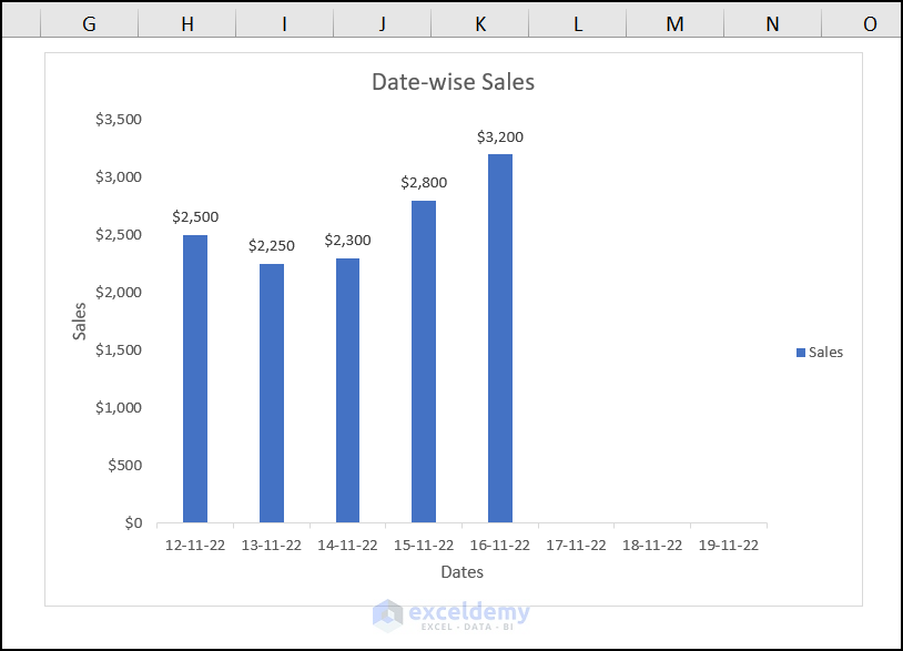
When we plot a chart using the same procedure as in Step 1, we find dates on the X-axis while the ordinate values are blank.
We have tried to solve this problem. To do this, click on the chart area and select the Select Data option.
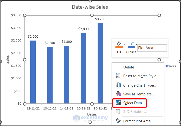
The Select Data Source dialog box appears. From there, uncheck the dates that don’t carry a value from the Horizontal (Category) Axis Labels. Press OK.
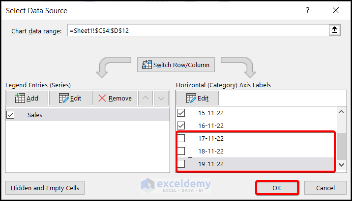
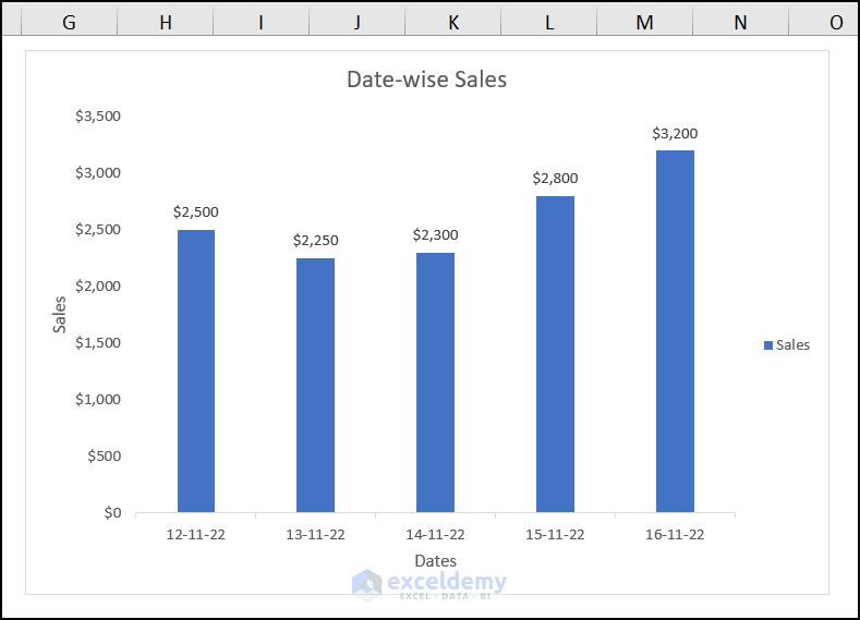
Our Excel chart shows that the blank cells have been removed (see the image).
Read More: How to Combine Daily and Monthly Data in Excel Chart
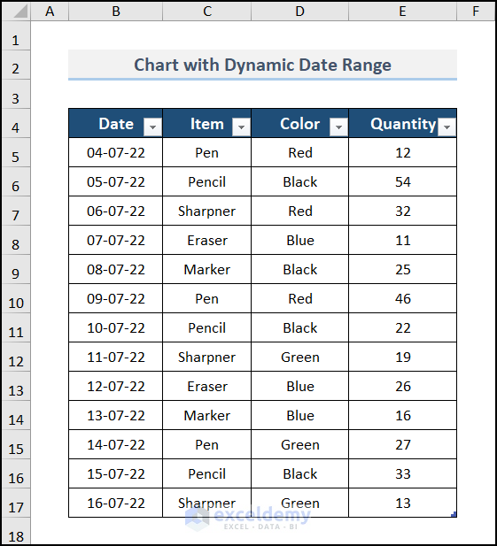
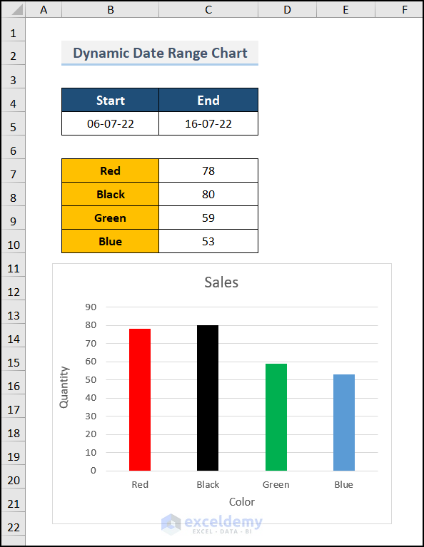
How to Apply Dynamic Date Range in Excel Chart
For the following dataset, you want to create a dynamic date range that will apply to the Excel chart.
STEPS:
- Make the dataset dynamic. And you can do it in two ways.
- The first method involves creating an Excel table and renaming it (e.g., DATElist). Alternatively, you can utilize the OFFSET function with the Named Manager.
- Add two options to pick the start and end date ranges with the help of the Data Validation tool.
- Link the drop-down lists with the dynamic dataset using the SUMIFS function.
Your Excel chart now applies to the dynamic date range. You’ll get the desired chart if you assign a start date and end date.
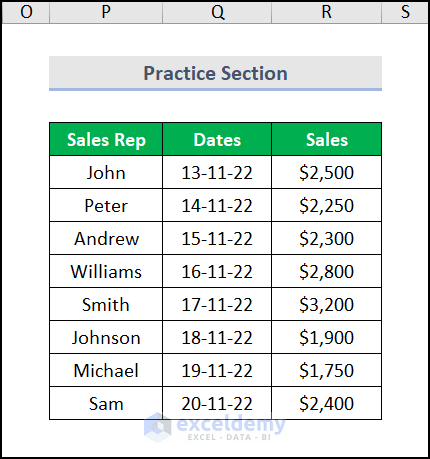
Practice Section
We have provided a practice section on each sheet on the right side for your practice.
Download the Practice Workbook
Download the following workbook to practice.
Related Articles
<< Go Back to Data for Excel Charts | Excel Charts | Learn Excel
Get FREE Advanced Excel Exercises with Solutions!
