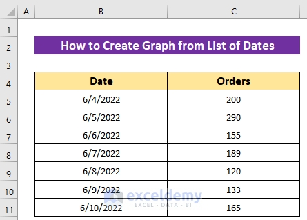
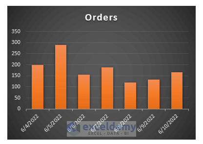
The sample dataset represents an online shop’s daily order data for a week.
Steps:
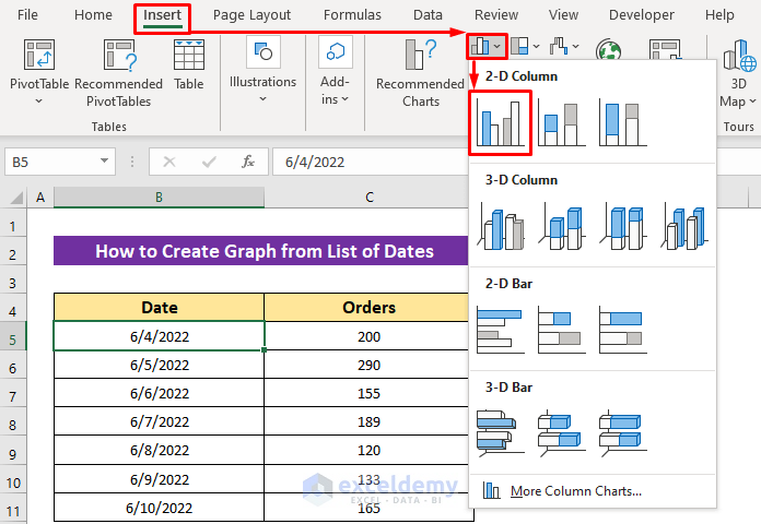
- Click on any data from the dataset.
- Click on the Insert ribbon and select any graph from the Chart section. I selected the Clustered Column from the Insert Column or Bar Chart option.
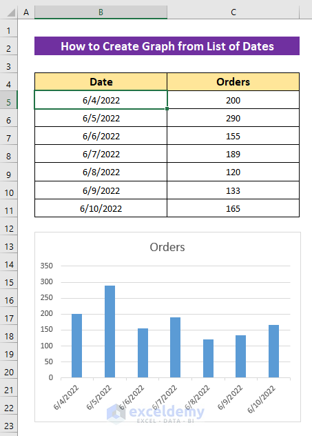
Excel will create a graph in your current sheet. You can drag and reposition it anywhere.
How to Customize Graph of Dates in Excel
Excel graphs come with a default design, but you can personalize them for better visuals or clarity. Here are some common customization options:
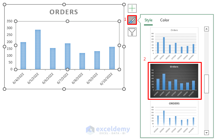
Change Design
Steps:
- Click on the graph and then click the Chart Design ribbon.
- Select any design from the Chart Styles section.
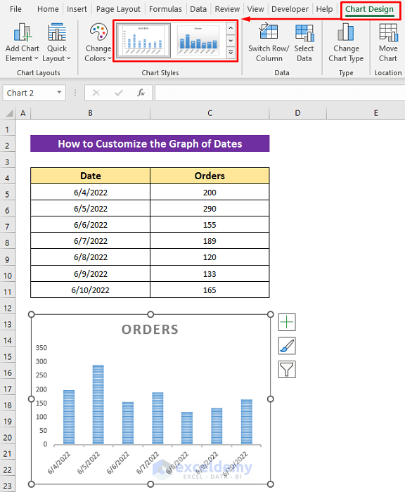
- Alternatively, click on the Chart Styles icon from your graph that you will get by clicking anywhere in the graph.
- Select a chart style from the list. I selected Style 9.
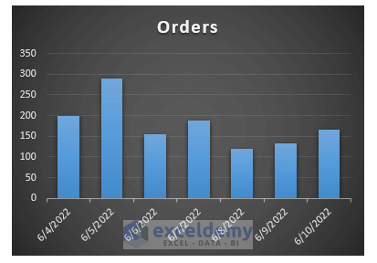
The newly selected design looks like this.
Read More: How to Show Only Dates with Data in Excel Chart
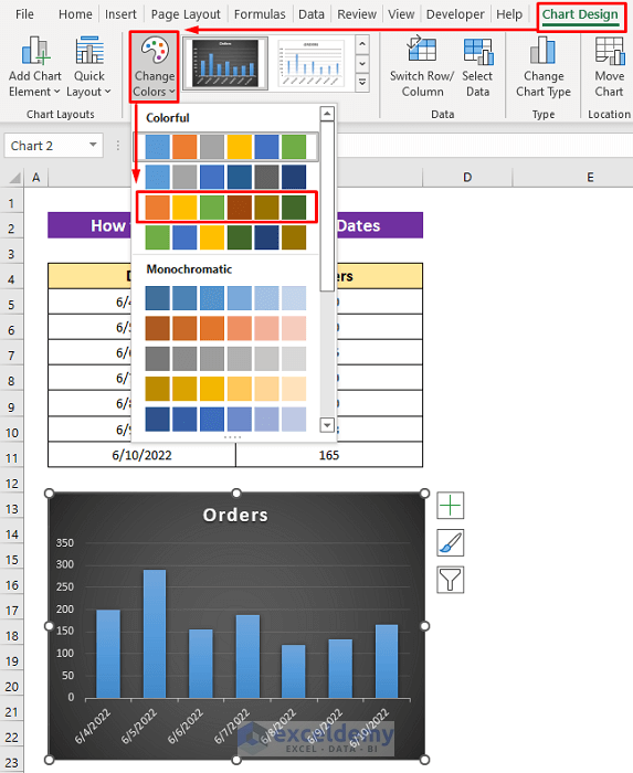
Change Color
Steps:
- Click anywhere on the graph.
- Click Chart Design > Change Colors.
- Select a color template from the list. I chose Colorful Palette 3.
Alternatively,
- Click on the Chart Styles icon, select the Color section.
- Select the color template.
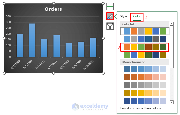
The graph will change to the selected color.
Read More: How to Change Date Range in Excel Chart
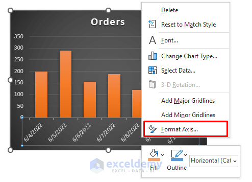
Change Axis Bound
Steps:
- Right-click on the Date label.
- Select Format Axis from the context menu. Or, double-click on the date label.
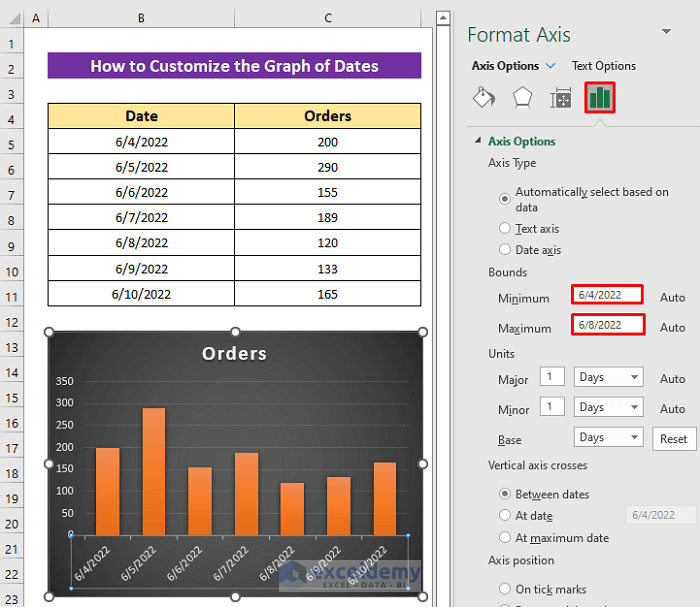
The Format Axis field will open on the right side of your sheet.
- From the Axis Options, set the minimum and maximum limits. I kept the minimum limit the same and set the maximum limit to 6/8/2022.
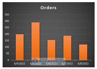
The graph will be recreated according to the new bounds.
Change Alignment of Dates
Steps:
- Follow the first two steps from the previous section to open the Format Axis field.
- Click on the Size & Properties section.
- Select Rotate all text 270° from the Text direction drop-down box.
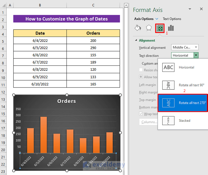
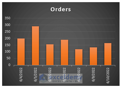
You will get the output like the image below.
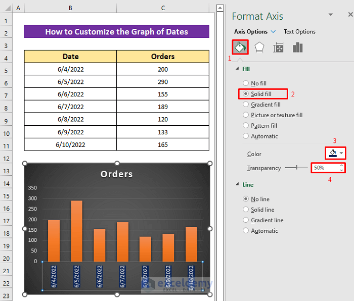
Change Fill Color of Dates
Steps:
- Follow the first two steps from the Change Axis Bound section to get the Format Axis.
- Click on Fill & Line option.
- Mark Solid fill, set color, and transparency. I chose dark blue color and 50% transparency.
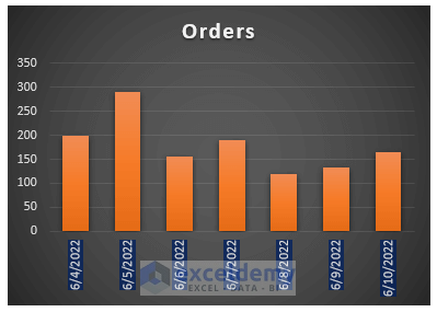
Here’s our final output.
Related Articles
<< Go Back to Data for Excel Charts | Excel Charts | Learn Excel
Get FREE Advanced Excel Exercises with Solutions!
