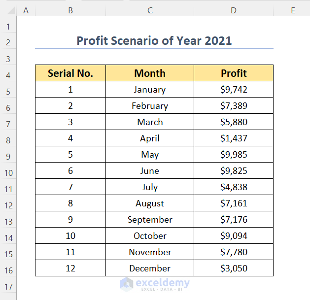
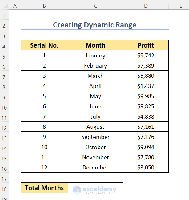
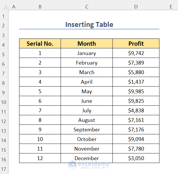
We have the following dataset containing the records of profits for 12 months of the year 2021.
Method 1 – Using the Chart Filters Feature
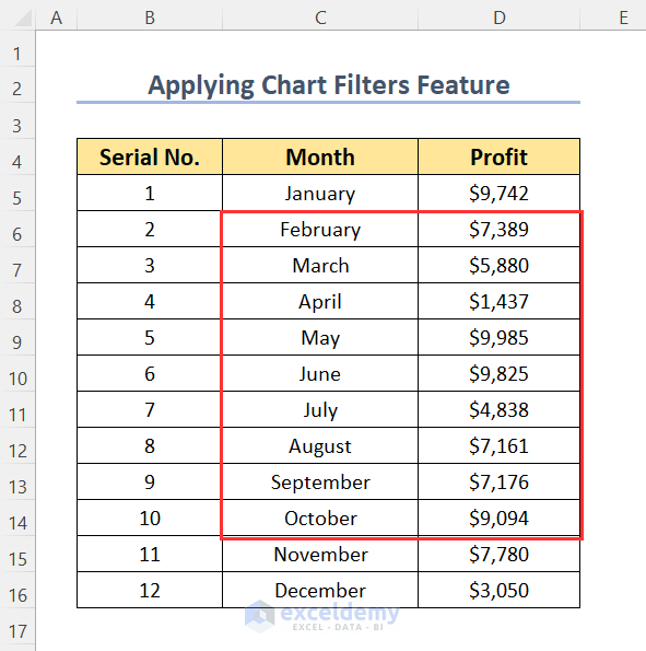
We will draw the graphs for profits between February and October.
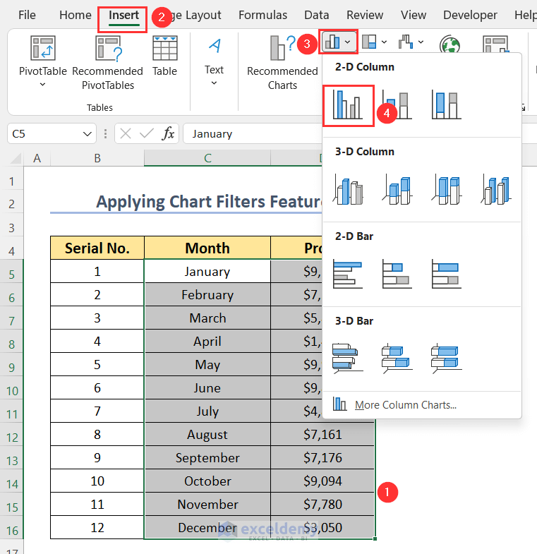
- Select the range you want to chart.
- Go to the Insert tab, select the Insert Column or Bar Chart dropdown.
- Choose a 2-D Clustered Column.
The chart will have all of the profit values from January to December.
- Click on the Chart Filters icon.
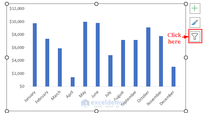
You will get a list of month names that are selected as they have been plotted.
- As we don’t want to see the profit for January, so we unchecked this option.
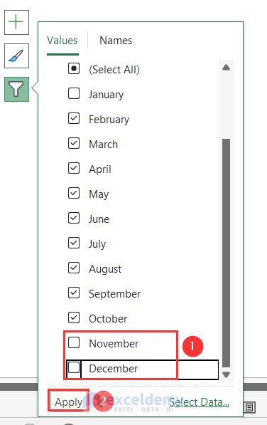
- Scroll down to unselect the last two months.
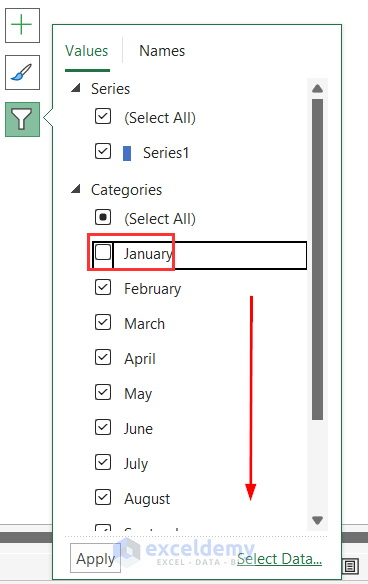
- Deselect November and October.
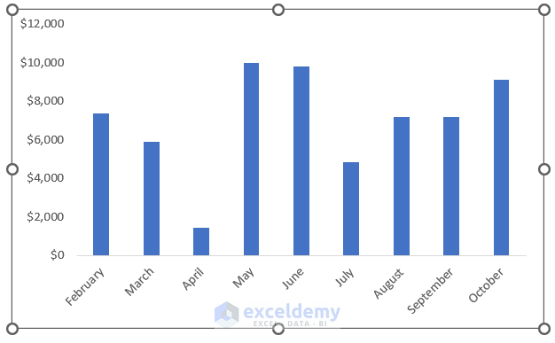
We obtained our required graph showing the profits from February to October.
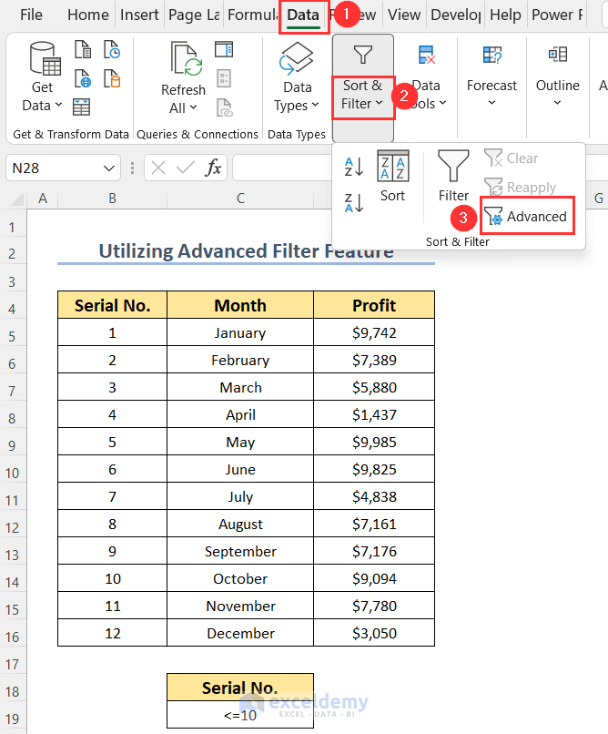
Method 2 – Applying the Advanced Filter Feature to Limit the Data Range in an Excel Chart
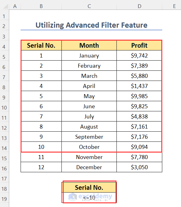
To define the criterion for this filter, we have defined our criterion below this dataset, which is defining the range of the serial number up to which we will filter our dataset.
- Go to the Data tab, choose the Sort & Filter dropdown, and click Advanced.
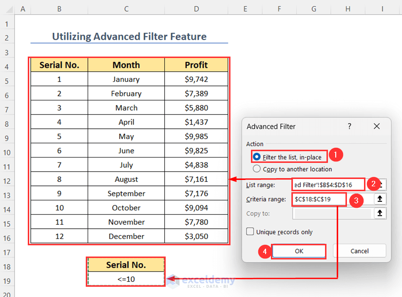
The Advanced Filter dialog box will appear.
- Select Filter the list, in-place as Action.
- Choose the List range and Criteria range, then press OK.
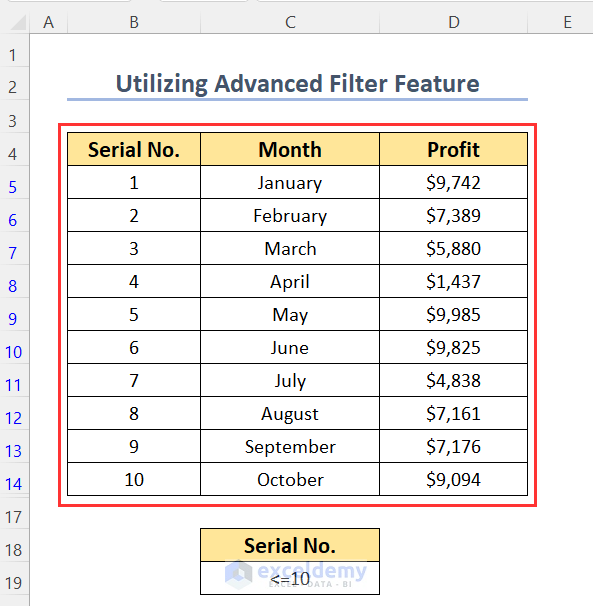
You will get the following filtered dataset.
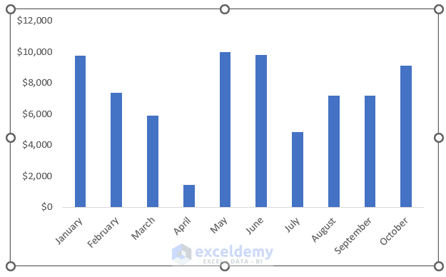
- Using our filtered dataset, we have created the following column graph like the previous method.
If you are facing the issue of showing all of the visible and non-visible cells in your chart, you can follow this step.
- Right-click on your chart and choose Select Data.
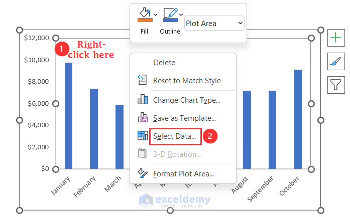
The Select Data Source dialog box will pop up.
- Click on Hidden and Empty Cells.
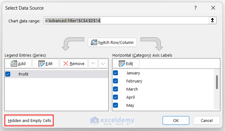
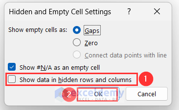
The Hidden and Empty Cell Settings wizard will open up.
- Uncheck the option Show data in hidden rows and columns.
- Press OK.
Read More: How to Remove One Data Point from Excel Chart
Method 3 – Defining a Dynamic Range to Limit the Data Range in an Excel Chart
We will create a dynamic range to limit the range in an Excel chart.
Step 1 – Applying TODAY and MONTH Functions
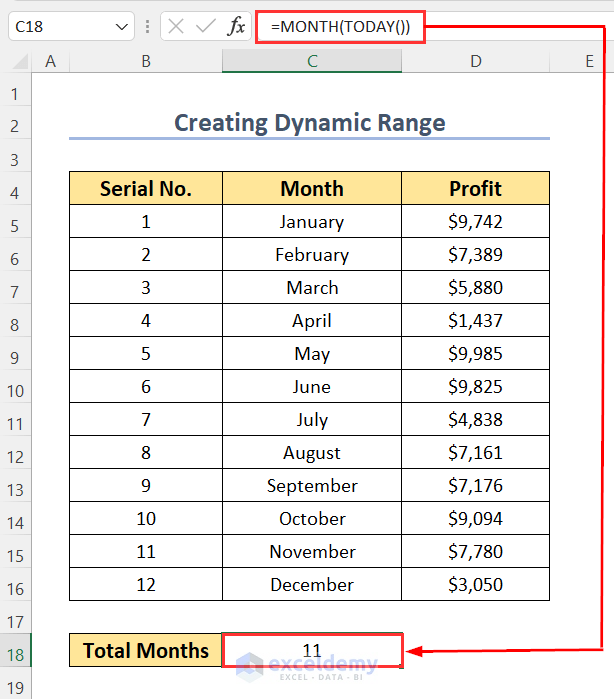
- We want to plot the data up to the month of today’s date, so we have used the following formula in cell C18.
=MONTH(TODAY())Here, the TODAY function will return today’s date, and then the MONTH function will determine the month number of this date.
As today’s date is 11/17/2022 (mm/dd/yyyy format), we are getting output as 11.
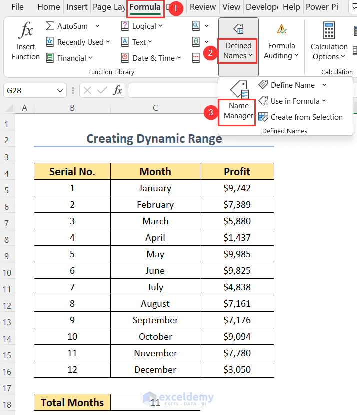
Step 2 – Creating Dynamic Ranges
- Go to the Formula tab and the Defined Names group, then select Name Manager.
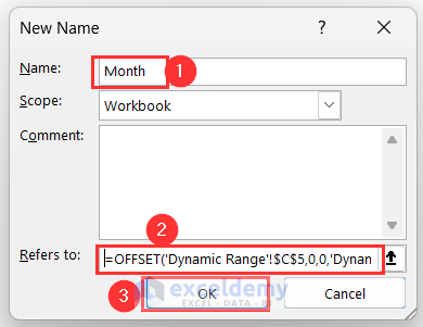
- You will get the New Name dialog box.
- Write down the Name as Month and put down the following formula in the Refers to box:
=OFFSET('Dynamic Range'!$C$5,0,0,'Dynamic Range'!$C$18,1)Formula Breakdown
- ‘Dynamic Range’!$C$5 → it is the start cell of the Month
- ‘Dynamic Range’!$C$18 → which is 11 here, represents the height of the extracted range.
- 1 → represents the width of this extracted range.
- Press OK.
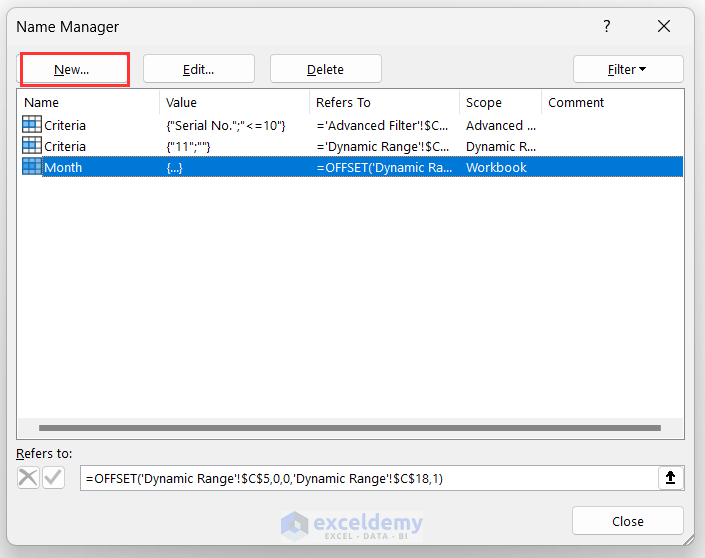
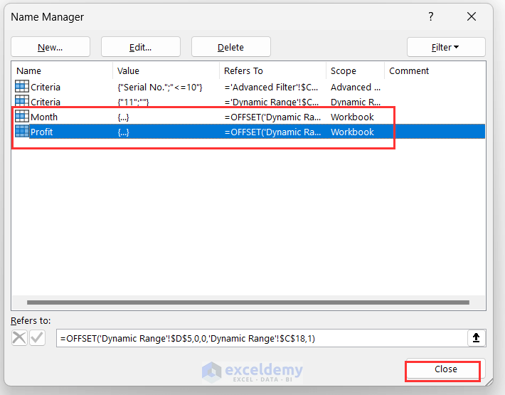
You will return to the Name Manager dialog box where you can see the created named range Month.
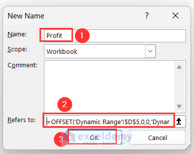
- Press the New button to add another named range.
- Type the Name as Profit and put down the following formula in the Refers to box:
=OFFSET('Dynamic Range'!$D$5,0,0,'Dynamic Range'!$C$18,1)Formula Breakdown
- ‘Dynamic Range’!$D$5 → it is the start cell of the Profit
- ‘Dynamic Range’!$C$18 → which is 11 here, represents the height of the extracted range.
- 1 → represents the width of this extracted range.
- Press OK.
You will return to the Name Manager again, where you can see the newly created named ranges.
- Press Close.
Step 3 – Inserting the Chart
- Like Method 1, insert a column chart.
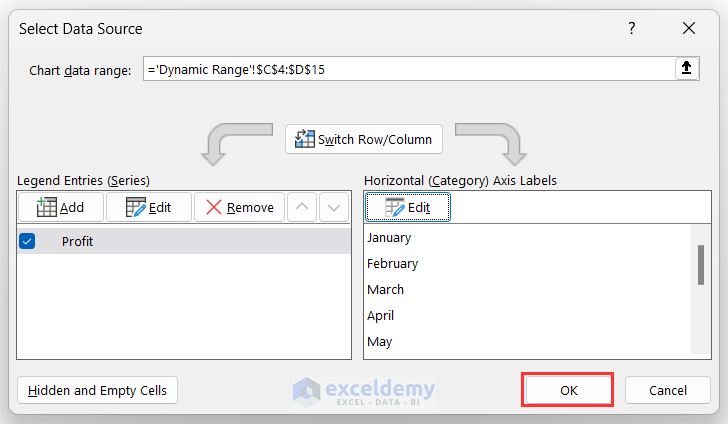
- Right-click on the chart and choose the Select Data option.
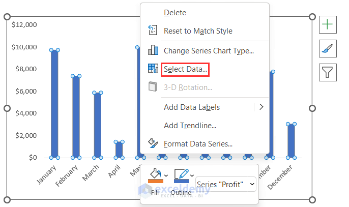
You will be taken to the Select Data Source wizard.
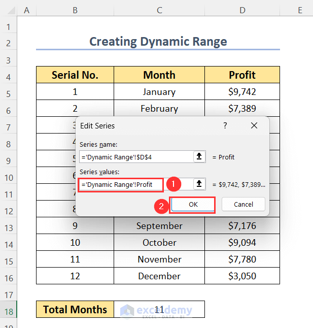
- Choose the Profit series and click on Edit.
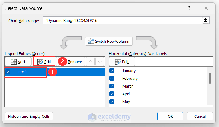
The Edit Series dialog box will pop up.
- Change the Series values to =’Dynamic Range’!Profit, where Profit is the dynamic range.
- Press OK.
- After returning to the Select Data Source dialog box, under the Horizontal (Category) Axis Labels, click on Edit.
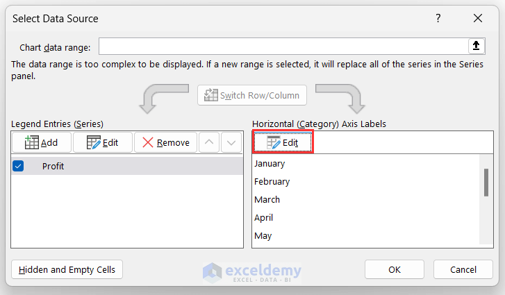
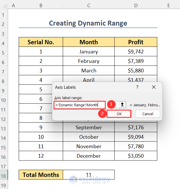
The Axis Labels wizard will pop up.
- Change the Axis label range to =’Dynamic Range’!Month, where Month is the dynamic range.
- Press OK.
- In the Select Data Source dialog box, press OK.
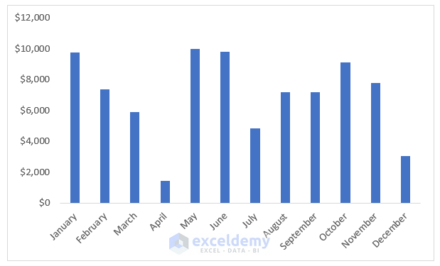
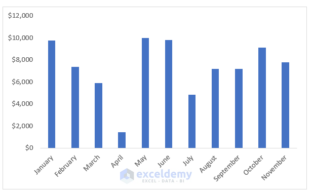
You will get the column charts for profits up to November.
Read More: How to Change X-Axis Values in Excel
How to Change the Charts Dynamically Depending on the Data Range in Excel
We will create a Table to automatically change the chart range after deleting or inserting a row in the dataset.
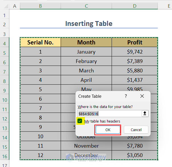
- Select the data range, go to the Insert tab, then choose Table.
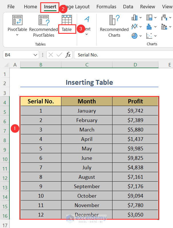
The Create Table wizard will open up.
- Check the option My table has headers and press OK.
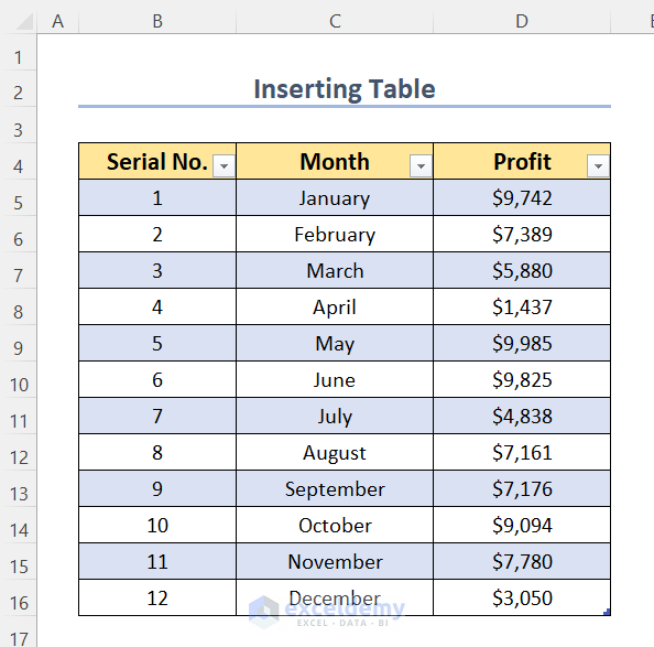
This will create the following table.
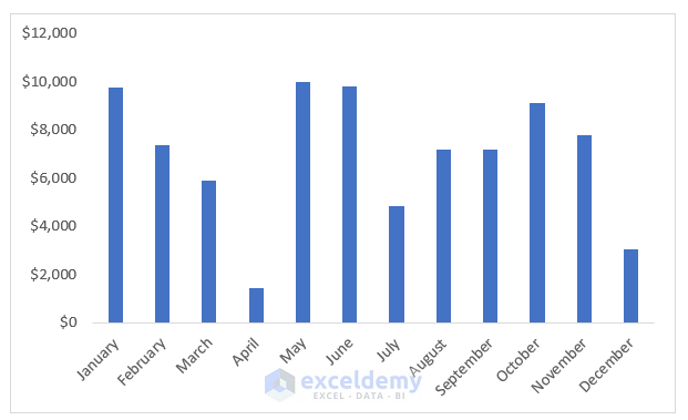
We created the following column chart.
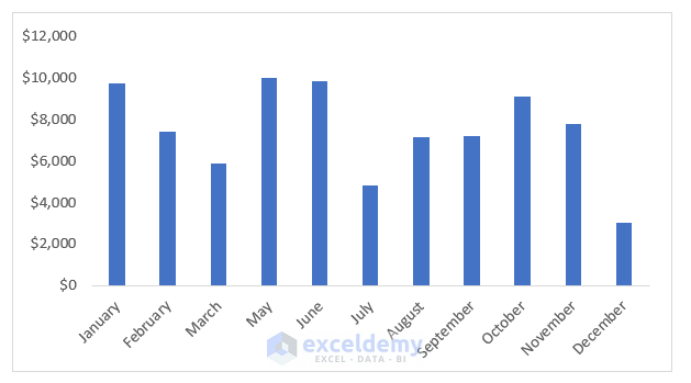
- Delete the row for the month of April.
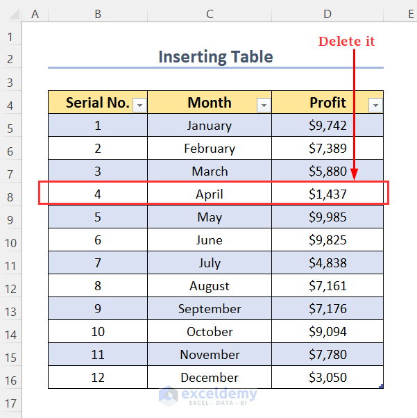
Our chart has been automatically updated by removing the column for April.
- Insert a row below the row for the month of March to put down the data for April here again.
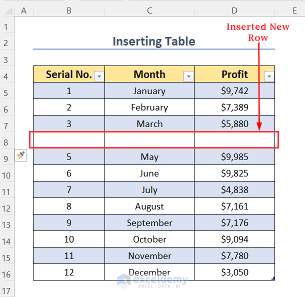
- Put down the profit for April.
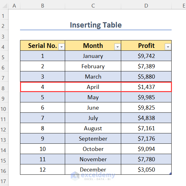
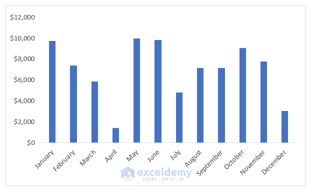
The profit column for April will appear here again.
Read More: How to Change Chart Data Range Automatically in Excel
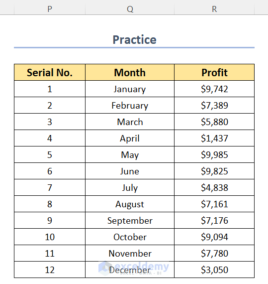
Practice Section
To practice by yourself, we have created a Practice section on the right side of each sheet.
Download the Practice Workbook
Related Articles
- How to Change Chart Data Range in Excel
- How to Edit Data Table in Excel Chart
- How to Change Data Source in Excel Chart
- How to Edit Chart Data in Excel
- How to Sort Data in Excel Chart
- How to Group Data in Excel Chart
- How to Skip Data Points in an Excel Graph
- How to Hide Chart Data in Excel
<< Go Back to Data for Excel Charts | Excel Charts | Learn Excel
Get FREE Advanced Excel Exercises with Solutions!
