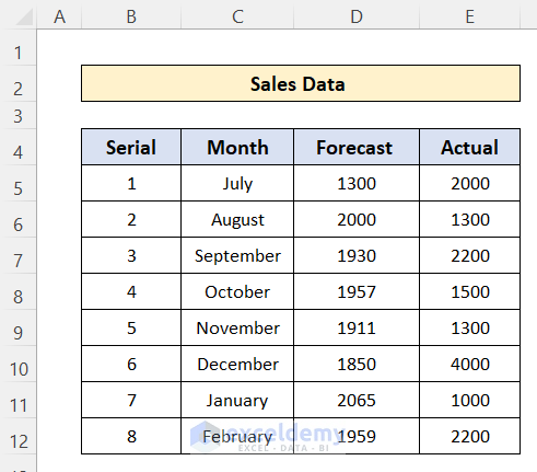
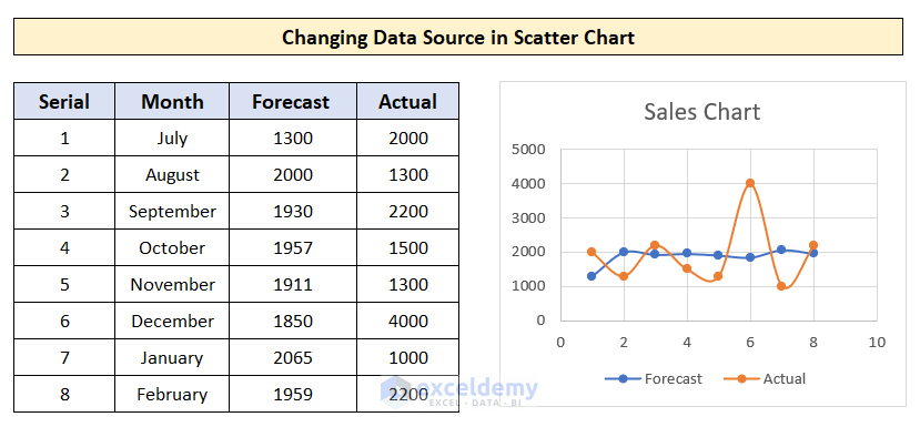
We have the forecasted and actual sales data for some months of a product. We’ll change the chart to include one or the other.
Example 1 – Change the Data Source in a Scatter Chart
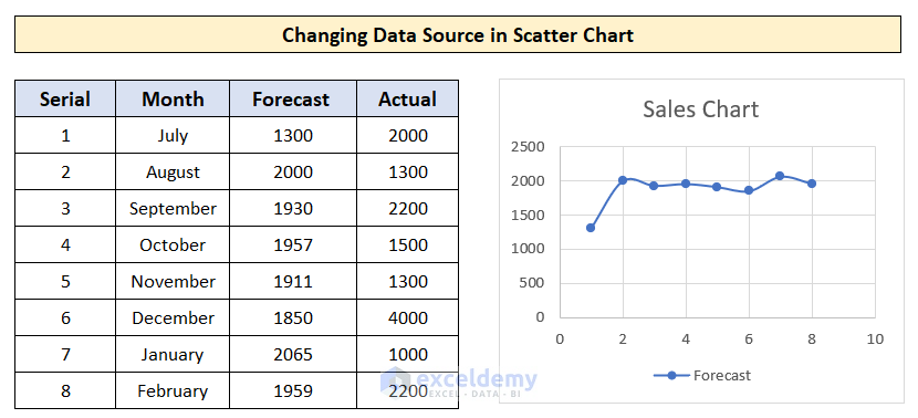
We have created a scatter chart to show the forecast data and want to add Actual sales data to the chart.
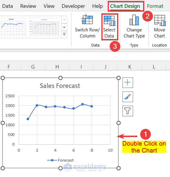
- Double-click on the chart.
- Go to the Chart Design tab on the ribbon.
- Click on the Select Data option.
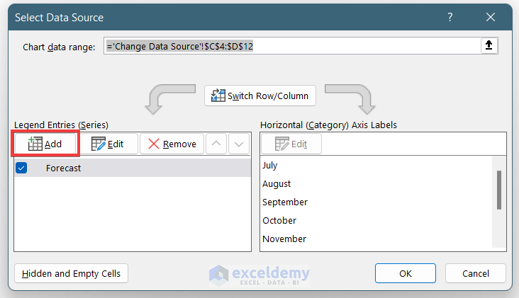
You can add data series, remove data series, and edit the already added series. You will find these options in the “Select Data Source” window.
Case 1 – Add the New Data Series
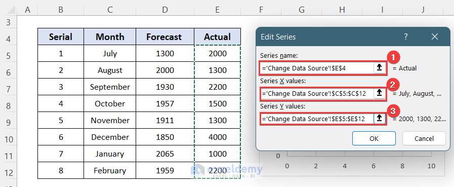
- Click on the Add option in Select Data Source.
- A new window named Edit Series will appear.
- Select cell E4 in the Series Name box. It requires the name of the column.
- Select cells C5:C12 as the Series X Value, which will be the X-axis of the chart.
- Select cells E5:E23 as the Series Y Value, which will be the Y-axis of the chart.
- Press OK.
- You will see a new line on the chart which represents the actual sales data.
Case 2 – Remove a Data Series
- Go to the Select Data Source window in a similar way mentioned before.
- Select the data series from the list.
- Click on the Remove button
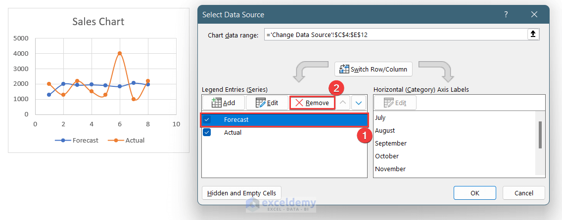
- The curve for the removed data series will be erased.
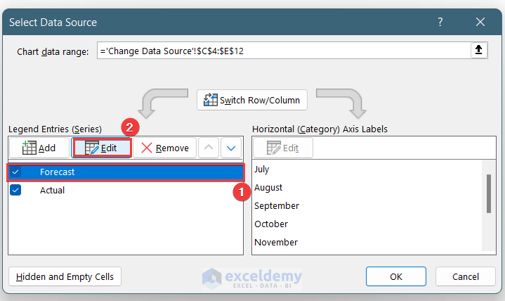
Case 3 – Edit Existing Data Series
- Go to Select Data Source by double-clicking on the chart.
- Select the data series to edit.
- Click on the Edit option.
Read More: How to Change Chart Data Range in Excel
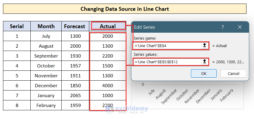
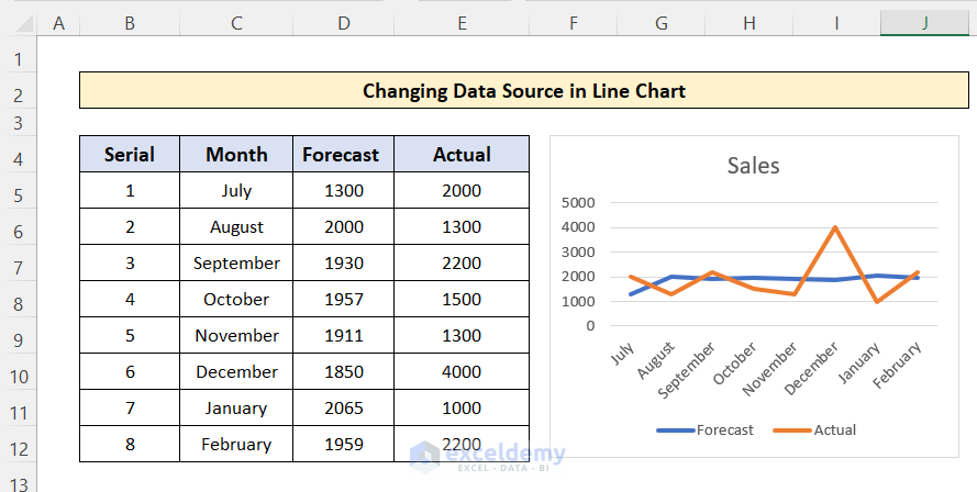
Example 2 – Change the Data Source in a Line Chart
Steps:
- Double-click on the line chart and go to the Select Data option in the top ribbon.
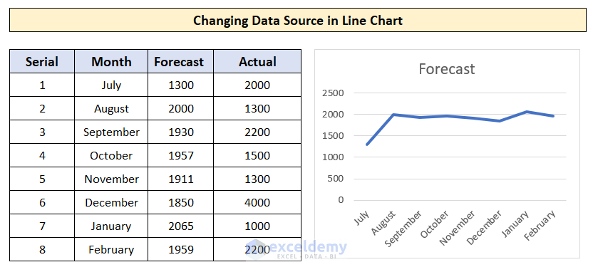
- Click on the Add button to add a new data series.
- The Edit Series window will appear.
- You will see 2 insert boxes but in the scatter chart.
- Select the E4 cell as the Series Name.
- Select cells E5:E12 as the Series Values, which will be the Y-axis.
You don’t have to add the X-axis data series as the line chart will use the X-axis of the previously added data series.
- A new curve will be added to the line chart.
You can remove and edit data sources in a line chart in a similar way to the scatter chart.
Read More: How to Change Chart Data Range Automatically in Excel
Example 3 – Change a Data Source in a Bar/Column Chart
Steps:
- Go to the Chart Design tab.
- Choose Select Data and go to the Add option.
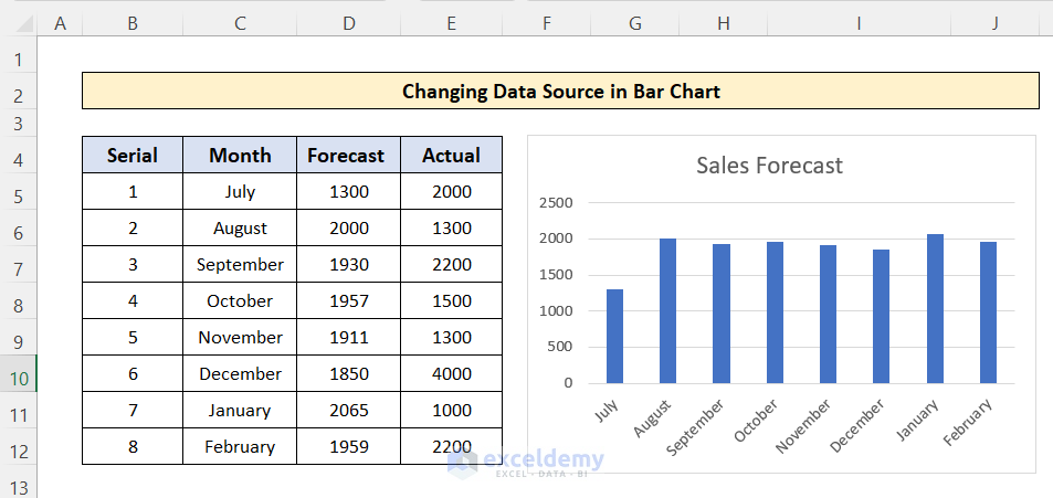
- In the =Edit Series window, select cell E4 as Series Name.
- Select the cells E5:E12 as Series Values.
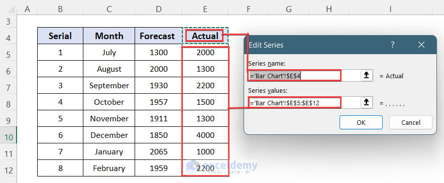
- This adds a new data series to the bar chart.
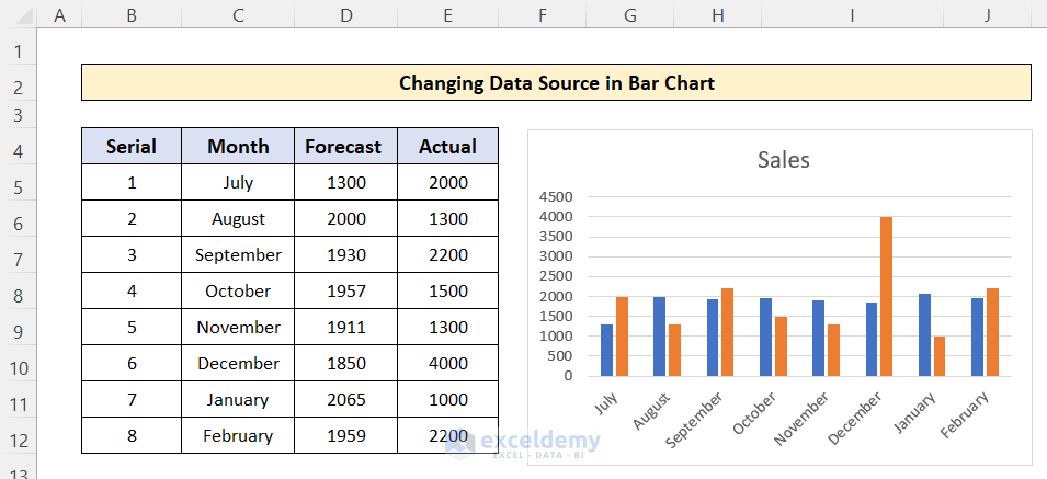
You can remove and edit the data source in the bar chart in a similar way as shown for the Scatter chart.
Download the Practice Workbook
Related Articles
- How to Edit Data Table in Excel Chart
- How to Edit Chart Data in Excel
- How to Change X-Axis Values in Excel
- How to Sort Data in Excel Chart
- How to Group Data in Excel Chart
- How to Limit Data Range in Excel Chart
- How to Skip Data Points in an Excel Graph
- How to Remove One Data Point from Excel Chart
- How to Hide Chart Data in Excel
<< Go Back to Edit Chart Data | Excel Chart Data | Excel Charts | Learn Excel
Get FREE Advanced Excel Exercises with Solutions!
