In this article, we will learn to change the chart data range automatically in Excel. Generally, the range becomes static when we create a chart in Excel. The chart doesn’t update automatically if you add more values in the range. But, today we will show 2 methods. Using these methods, you can easily change the chart data range and update the chart automatically. So, without any delay, let’s start the discussion.
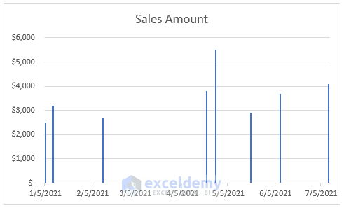
To explain the methods, we will use a dataset that contains information about the Sales Amount for some Dates of a company. We will plot these values in a Column Chart. After plotting them, we will change the chart data range and update the chart automatically. We will use the same dataset throughout the article.

1. Using Excel Table to Change Chart Data Range Automatically
In the first method, we will use the table method. You can convert the dataset into a table and change the chart data range automatically in Excel. This is a simple method and the steps are also easy. It is simple because you don’t need to apply any formula or perform any difficult task to implement the steps. So, without further ado, let’s pay attention to the steps below.
STEPS:
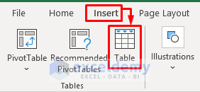
- In the first place, select a cell in your dataset.
- Secondly, go to the Insert tab and select the Table icon. Or, you can press Ctrl + T on the keyboard.
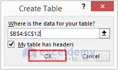
- A message box will pop up.
- Click OK to proceed.
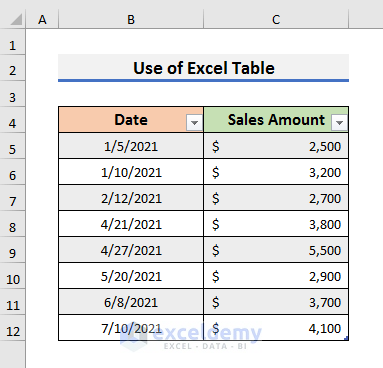
- As a result, the dataset will turn into an Excel table.
- Thirdly, navigate to the Insert tab and select Insert Column or Bar Chart icon. A drop-down menu will appear.
- Select the Stacked Column icon from there.

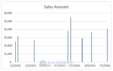
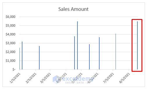
- Instantly, you will see the Sales Amount chart on the excel sheet.
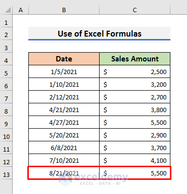
- Finally, insert the new Date and Sales Amount in Cell B13 and C13 respectively.
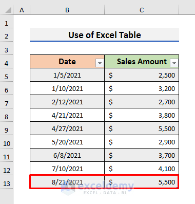
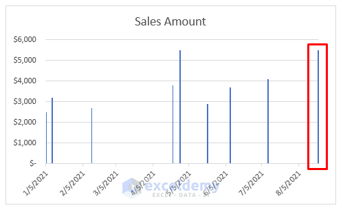
- As a result, the Excel chart data range will change automatically and display the added information on the chart.
Read More: How to Change Data Source in Excel Chart
2. Changing Chart Data Range Automatically with Excel Formulas
We can also use some formulas to change chart data range automatically in Excel. In this method, we will perform the tasks in two parts. In the first part, we will add formulas in the Name Manager, and in the second part, we will update the formulas in the chart. This process is also simple but lengthy. So, you need to keep patience and be careful while going through the steps. Because some small details can produce errors if you miss anything.
Let’s follow the steps below to learn the whole method.
STEPS:
- Firstly, open the sheet that contains the dataset.
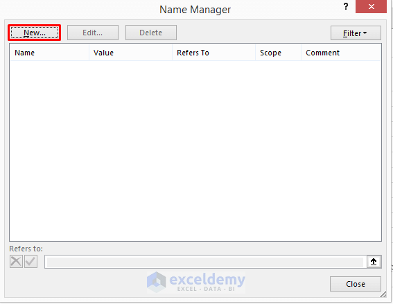
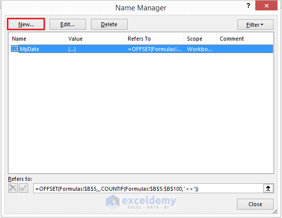
- Go to the Formulas tab and select Name Manager.

- Secondly, select New in the Name Manager window.
- In the New Name message box, type MyDate in the Name box. You can type any name you want.
- Then, copy the formula below and paste it into the ‘Refers to’ box:
=OFFSET(Formulas!$B$5,,,COUNTIF(Formulas!$B$5:$B$100,"<>"))- Click OK to move forward.
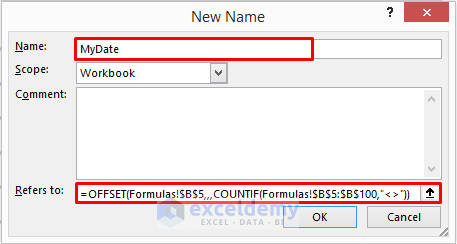
In this formula, we have used the combination of the OFFSET and COUNTIF functions together. This formula represents the Dates. We have specified Cell B5 as the reference cell. The OFFSET function extends starts from Cell B5 and extends to Cell B100 in this case. You must follow the writing convention here. You need to mention the name of the sheet inside the formula. In our case, the sheet name is ‘Formulas’. So, we have written Formulas!$B$5 and Formulas!$B$5:$B$100 here.
- Again, click on New in the Name Manager window.
- Like previously, type SalesAmount in the Name icon. You can type any name you want.
- Then, copy the formula below and paste it into the ‘Refers to’ box:
=OFFSET(Formulas!$C$5,,,COUNTIF(Formulas!$C$5:$C$100,"<>"))- Click OK to proceed.
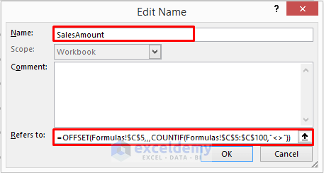
This formula works as the previous one but it represents the Sales Amount.
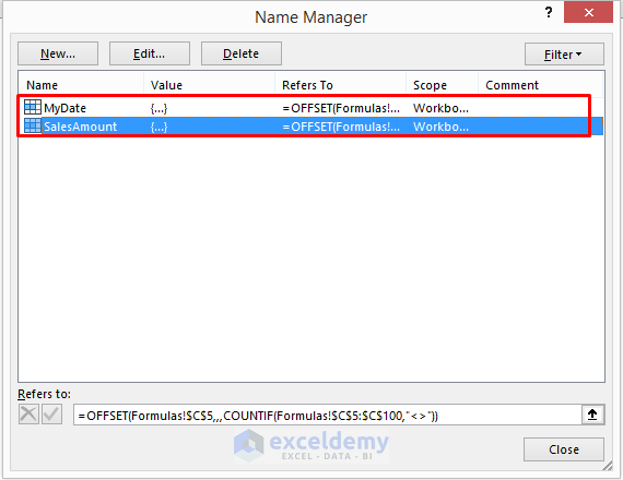
- After that, click on Close in the Name Manager window.
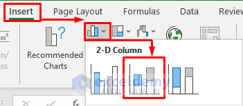
- In the following step, go to the Insert tab and select Insert Column or Bar Chart icon. A drop-down menu will appear.
- Select the Stacked Column icon from there.
- As a result, you will see the Sales Amount chart on the excel sheet.
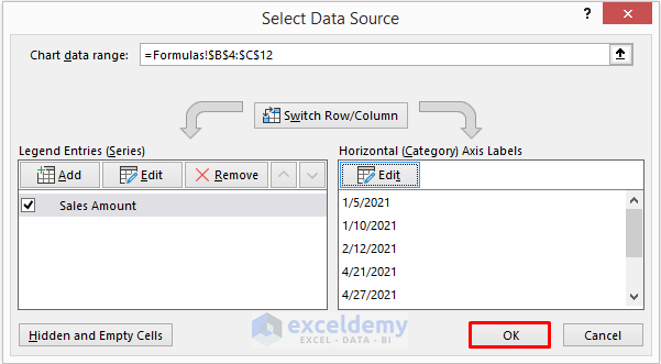
- At this moment, right–click on the chart and click on Select Data from the Context Menu. It will open the Select Data Source window.

- In the Select Data Source window, click on Edit in the Legend Entries box.

- In the Edit Series dialog box, type =Formulas!$C$4 in the Series name box. Or you can simply type ‘=Sales Amount’.
- Also, type =Formulas!SalesAmount in the Series values box.
- Click OK to proceed.

Note: In the Series values box, you need to type =Sheet Name!Formula Name that is given in Name Manage. Because excel will show a warning message if you just enter the formula name. The sheet also must be entered like the above-mentioned pattern.
- Similarly, click on Edit in the Horizontal Axis Labels box.

- In the Axis Labels dialog box, type =Formulas!MyDate and click OK to proceed.

- After that, click OK in the Select Data Source window.
- At this moment, type the new Date and Sales Amount in Cell B13 and C13 respectively.
- Finally, the Excel chart data range will change automatically and display the added information on the chart.
Read More: How to Ignore Blank Cells with Formulas in Excel Chart
Download Practice Book
You can download the practice book from here.
Conclusion
In this article, we have discussed 2 easy methods to Change Chart Data Range Automatically in Excel. I hope this article will help you to perform your tasks easily. Moreover, using Method-1 you can change the chart data range very easily. Furthermore, we have also added the practice book at the beginning of the article. To test your skills, you can download it to exercise. Last of all, if you have any suggestions or queries, feel free to ask in the comment section below.
Related Articles
- How to Change Chart Data Range in Excel
- How to Edit Data Table in Excel Chart
- How to Edit Chart Data in Excel
- How to Change X-Axis Values in Excel
- How to Sort Data in Excel Chart
- How to Group Data in Excel Chart
- How to Limit Data Range in Excel Chart
- How to Skip Data Points in an Excel Graph
- How to Remove One Data Point from Excel Chart
- How to Hide Chart Data in Excel
<< Go Back to Edit Chart Data | Excel Chart Data | Excel Charts | Learn Excel
Get FREE Advanced Excel Exercises with Solutions!
