Column Charts can be used to show how data changes over time or to show comparisons between things. In Column Charts, the categories are usually lined up along the horizontal axis, and the values are usually lined up along the vertical axis. In this article, we’ll show you how to create a column chart in Excel using the Charts tool quickly and easily.
What is a Column Chart in Excel?
A column chart is a type of chart used for the graphical representation of data using rectangles or columns. You can also say this vertical bar chart. This chart is used to show data change over a time period or to compare different items. Some common uses of column charts are given below:
- Easy to create just using a few clicks.
- Easily understandable.
- A wide range of customization options is available.
- Some advanced features are available like trendlines, and secondary axis.
How to Create a Column Chart in Excel: 2 Methods
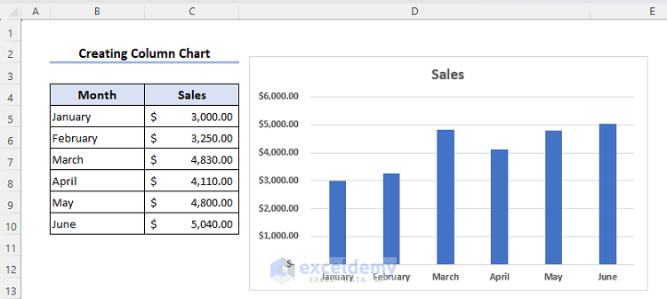
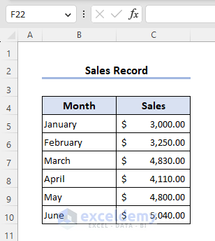
There are several chart options available in Excel. The column chart is one of the most widely used. This section will explain how to create a column chart in Excel. We will consider the following dataset showing six months’ sales of a super shop to create the column chart.
Based on dimension column charts are two types. Both of them will explain in the later section.
1. How to Create a Column Chart in Excel: 2-D Column Chart
In this section, we will discuss how to create a column chart in Excel of type 2-D.
📌 Steps:
- First, select range B4:C10.
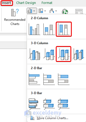
- Go to Insert >> Insert Column or Bar Chart from the Charts group.
- Choose any of the charts from the 2-D Column section.

- Look at the dataset to see the newly created chart.
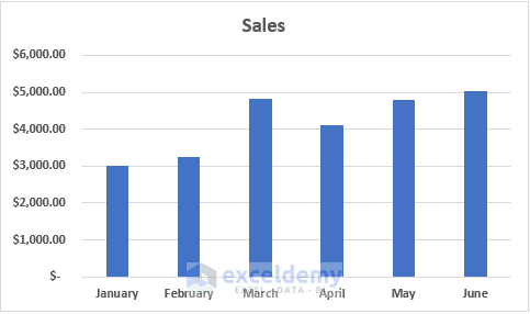
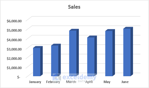
This is a simple 2-D column chart.
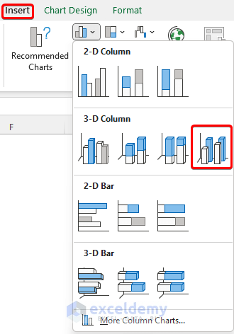
2. How to Create a Column Chart in Excel: 3-D Column Chart
In this section, we will discuss how to create a 3-D column chart in Excel. See the section below.
📌 Steps:
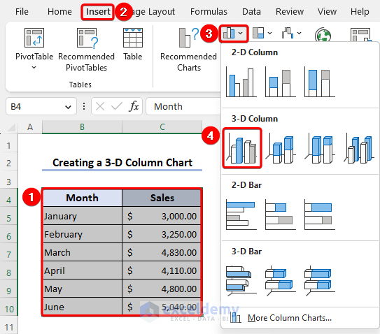
- First, select the range B4:C10 to create the chart.
- Go to Insert >> Charts group >> Insert Column or Bar Chart.
- Now, select any chart option from the 3-D Column section.
- Back to the worksheet to see the 3-D chart.
This is the 3-D chart based on the dataset.
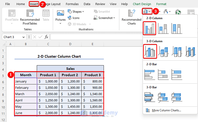
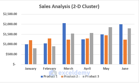
How to Create a Column Chart in Excel with Multiple Bars
We already showed how to create a column chart in Excel. But the previously created charts consist of a single column or bar. Now, we will create a column chart with multiple bars in Excel.

📌 Steps:
- Select range B5:E11 for multiple columns to compare.
- Follow Insert >> Insert Column or Bar Chart of the Charts group.
- Select any of the shown charts from the 2-D or 3-D Column section.
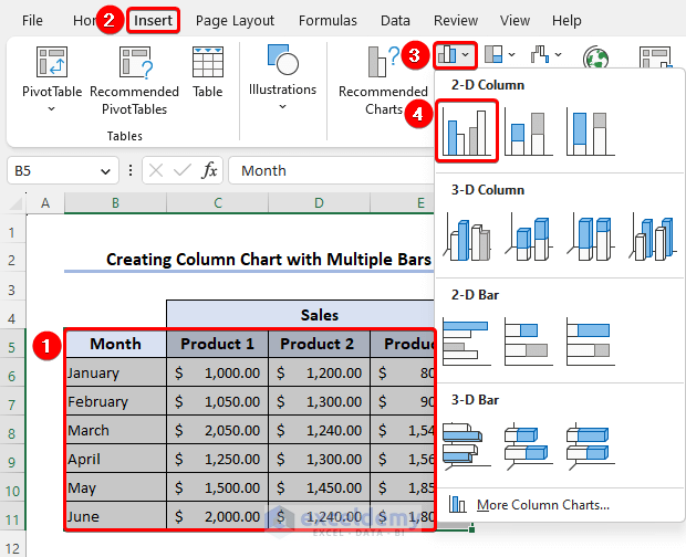
- Look at the chart.
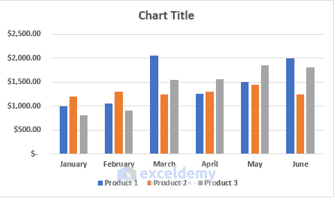
This column chart consists of multiple columns or vertical bars for each month. Columns of each month are filled with different colors so that we can identify them easily. There is also a legend below the chart for better understandability of the chart.
How to Customize Column Chart in Excel
There are lots of customization options available for column charts in Excel. Read the below section to see the basic customization options of a column chart in Excel.
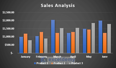
1. Modify the Chart Title
We can modify the chart title. By default, Chart Title shows in a chart. Here, we have modified the chart title by Sales Analysis.
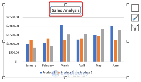
The chart title is given based on the data and their relationship to understand the chart easily.
2. Change the Chart Design
The above chart is created with the default chart design. But we can modify the chart design according to our requirements.
- For that, click on the chart and the Chart Design tab will show in the main tab.
- Then, select any of the styles from the Chart Styles group.
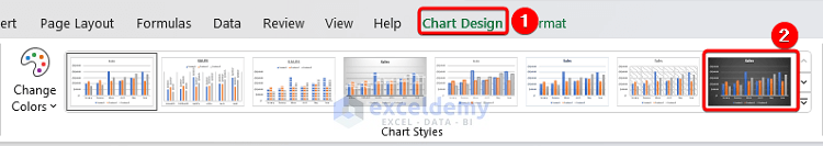
- Look at the below chart.
The chart design has been changed here.
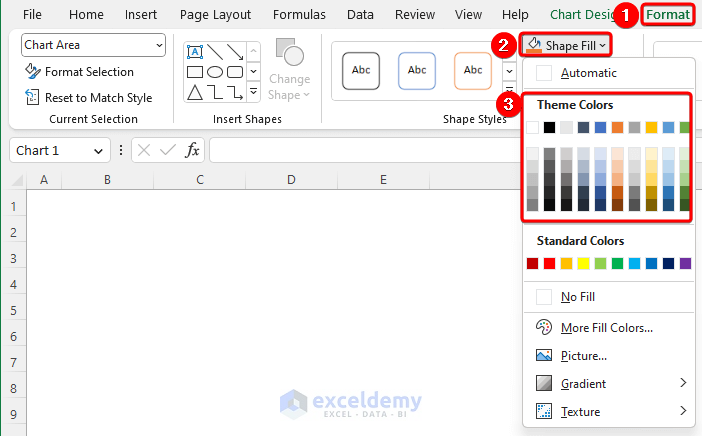
3. Change the Chart Text Color
We can change the text color of any column chart easily. There are two options. We can change the text color of a specific section or the whole chart.
- If we want to change text color of the whole chart then select the chart. Or if we want to change the color of a specific section like the vertical axis, horizontal axis, title, legend, etc. then select the desired section.
- Follow Format >> Shape Fill from the Shape Styles.
- Now, choose any of the colors from the Theme Colors section.
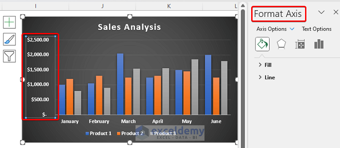
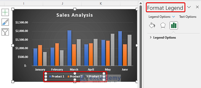
4. Change the Legend and Axes Text
We can easily customize the legend and axes of a column chart in Excel.
- Click on any axis of the chart and you will get the Format Axis window on the right side of the worksheet.
- Now, you will get lots of options to customize the chart as per your requirement.
- Similarly, click on the Legend section of the chart, and the Format Legend window appears on the right side again.
- From this window, you can customize the Legend feature of the chart.
Different Types of Column Charts are Available in Excel
Column charts are classified into two types based on the dimension and discussed in the above section. But based on the presentation style, other varieties are available for both 2-D and 3-D column charts. For further, look at the section below.
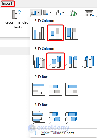
1. Clustered Column Chart
This is the most common column chart. It is the representation of grouped data into multiple columns for each item or section. Look at the below section for 2-D and 3-D clustered column charts in Excel.
- Select the desired range B5:E11 and go to the chart section as shown previously for creating a column chart.
We can see the cluster column option in both the 2-D and 3-D Column sections.
2-D Clustered Column Chart:
3-D Clustered Column Chart:

Read More: Examples of Column Chart in Excel
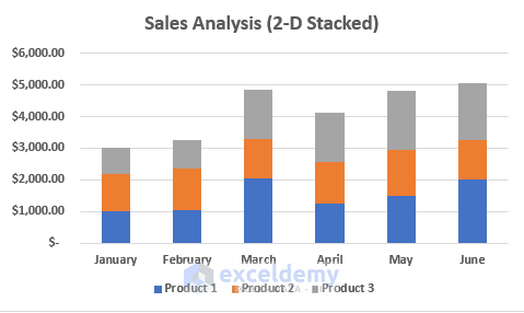
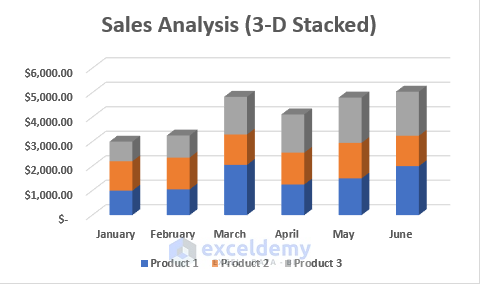
2. Stacked Column Chart
A stacked column chart is a chart shown in a single column with stacks of different elements marked. This chart does not create a separate column for each element on the vertical axis.
- We can see the Stacked Chart option in both the 2-D and 3-D Column sections.
2-D Stacked Column Chart:
3-D Stacked Column Chart:
Read More: How to Create Graphs in Excel with Multiple Columns
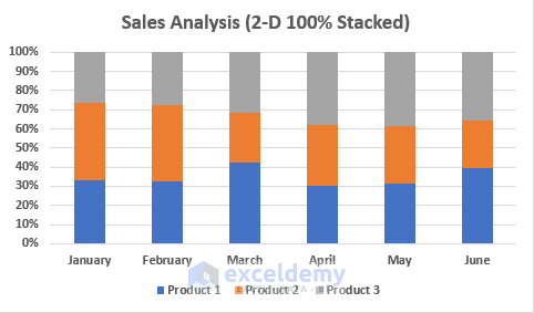
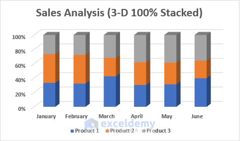
3. 100% Stacked Column Chart
The 100% Stacked Column chart is a form of the stacked column chart. The stacked column chart shows the cumulative magnitude of the different elements. The 100% Stacked Column stands for percentage value, assuming the percentage value is 100%.
- There are also 100% Stacked Column charts in 2-D and 3-D Column sections.
100% 2-D Stacked Column Chart:
100% 3-D Stacked Column Chart:
Read More: How to Create a Comparison Column Chart in Excel
4. Unstacked 3-D Column Chart (Using Z-Axis)
This is a default 3-D column chart of Excel.
- You will get this in the 3-D Column section.
- Look at the 3-D column chart.

Read More: How to Sort Column Chart in Descending Order in Excel
How to Add Trendline in Excel Column Chart?
Trendline is a line drawn in a chart showing the trend of the dataset. This is the best fit line that is used for forecasting the dataset.
The column chart has a default option to add a trendline in Excel.
- Click on the chart and you will see a plus (+) symbol at the upper-right side of the chart.
- You will get the Chart Elements section and mark the Trendline option.
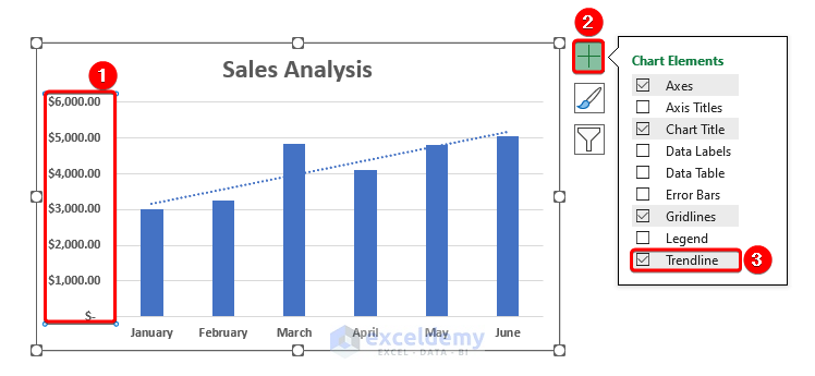
The blue dotted line of the chart is the trendline here.
Read More: How to Change Width of Column in Excel Chart
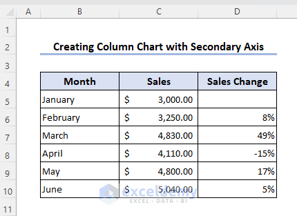
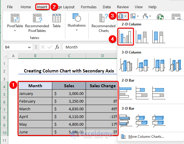
How to Create a Column Chart with Secondary Axis?
We can add a secondary axis in a column chart or create a column chart with a secondary axis.
For that, we have modified the dataset. The 1st column shows the sales and the 2nd column is for the sales change in percentage. We will show both data in a single chart. Sales will be the primary axis, and Sales Change will be the secondary axis.
📌 Steps:
- Select range B4:D10 and create a column chart as shown before.
- Look at the chart.
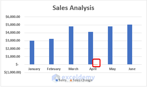
We can see the Sales data properly, but sales change is not showing. We will make the sales change data column the secondary axis.
- Select the chart and press the right button of the mouse.
- Choose the Change Chart Type option from the Context menu.
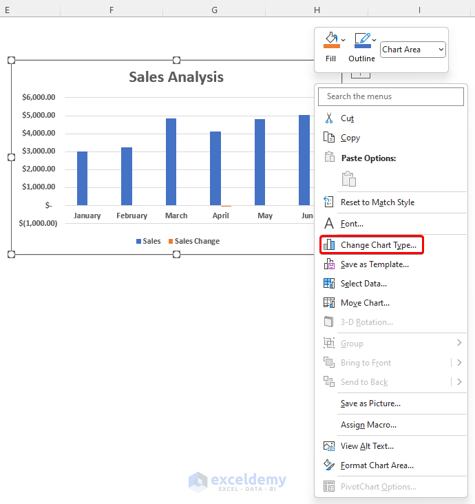
- Select Combo chart from the Change Chart Type window.
- Mark the corresponding Secondary Axis box of the Sales Change series or column.

- Finally, press the OK button and look at the combo chart.
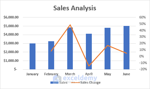
Both data are easily visible in the dataset.
Read More: How to Create a Variable Width Column Chart in Excel
Frequently Asked Questions
1. How do I save my column chart as an image?
Ans: You can save your column chart as an image using any graphics software or using Microsoft’s default Paint application.
- First, copy the chart from the worksheet.
- Open the Paint application and paste that chart.
- After that, save that file into the required format like PNG, JPEG, or any other format.
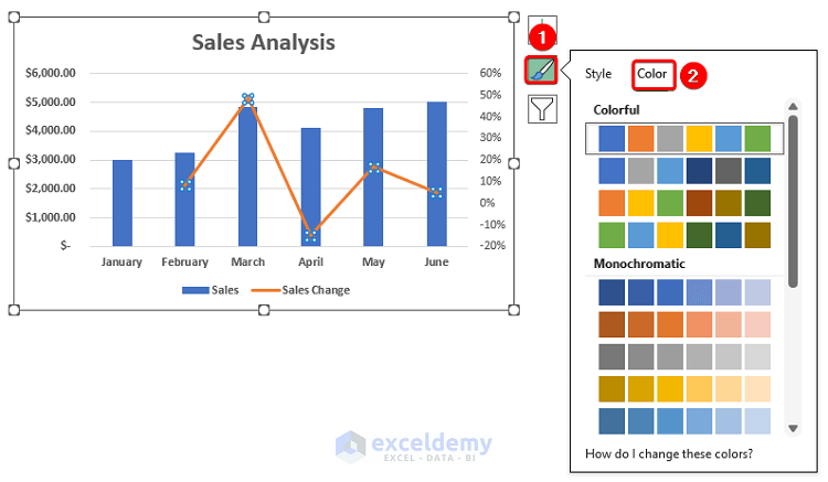
2. How to change column color of chart in Excel?
Ans: We can change the column color of a column chart easily.
- Just click on the chart, and you will get some options at the upper right side of the chart.
- Click on the Chart Style option and go to the Color section.
- Now, choose the desired color.
Things to Remember
- For all of these types of charts, all the steps are the same except for choosing the chart type.
- Switch Row/Column will change the Column Chart not the given data in Excel.
- 3-D Column is only available for 3-D type.
- We must select the entire data before selecting the chart type.
- For the 100% Stacked Column Chart, the height of all the columns is the same since every field is considered in percentage and the total is 100%.
Download this practice workbook to exercise while you are reading this article.
Conclusion
Column Charts are a very useful feature in Excel if we want to analyze or differentiate our data. In this article, we described how to create a column chart in Excel of different types based on dimension and presentation. We also discussed how to customize a chart, add a secondary axis and trendline in Excel column charts. I hope this will satisfy your needs.
<< Go Back To Column Chart in Excel | Excel Charts | Learn Excel
Get FREE Advanced Excel Exercises with Solutions!
