Usually, column charts can be used to show how data changes over time or to show comparisons between things. In column charts, the categories are usually lined up along the horizontal axis, and the values are usually lined up along the vertical axis. In this article, I will show you 3 suitable examples of column chart in Microsoft Excel. However, go through the article in order to learn more.
Usually, there are mainly two types of column charts available in Excel. They are 2-D and 3-D column charts. For any kind of given data, we can plot these two types of charts. Hence, the steps to create these charts are described below.
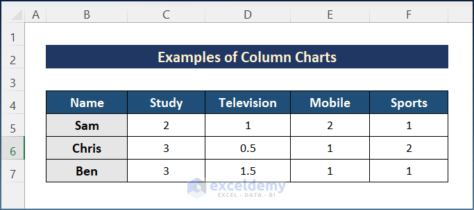
For column charts, it’s best to have data that comes in a certain order. It’s also better if each row of data has a heading for both the rows and the columns. However, we should set up our data this way, so it is easier to plot. For better understanding, we will follow the sample dataset showing how 3 people spend their time daily in Study, watching Television, using Mobile, and Sports.
Example 1: Creating a 2-D Column Chart in Excel
2-D charts are the most commonly used charts. Moreover, it is easier to see the differences and relations with 2-D charts. Hence, follow the steps to easily create a 2-D Column Chart in Excel.
📌 Steps:
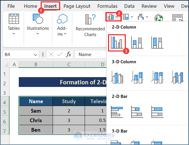
- First, select the entire data set.
- Next, go to the Insert tab, and in the Charts area, select the Column or Bar Chart option.
- After that, select the first option in the 2-D Column section in the Column or Bar Chart option.
- Finally, we will get a simple column chart like the below image. However, you can modify the chart according to your choice.

Read More: How to Create a Column Chart in Excel
Example 2: Generating 3-D Column Chart
To create a 3-D Column Chart in Excel, I will follow the same steps as creating a 2-D chart. But while selecting chart type, you must select the first option in the 3-D Column area. Usually, the 3-D graph looks better. However, you need to go through the steps below.
📌 Steps:
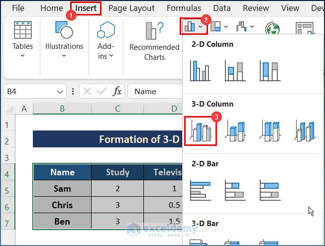
- Initially, select the entire data set.
- Secondly, go to the Insert tab and select the Column or Bar Chart option from the Charts area.
- Thirdly, select the first option in the 3-D Column section in the Column or Bar Chart option.
- Lastly, the chart will appear as in the image below.

Read More: How to Create Graphs in Excel with Multiple Columns
Example 3: Drawing Different Types of Column Charts in Excel
Furthermore, there are different chart types to choose from when creating a Column Chart in Excel. Each one shows a different way of comparing and relating. Below, I will discuss various types of column charts. For the purpose of demonstration, I have used the same sample dataset. So, follow the process where we demonstrate an example of a column chart in Excel.
3.1 Formation of Clustered Column Chart
The clustered Column is the first type to be selected in the column chart selection. It comes in both 2-D and 3-D types in Excel. To create such a chart, we should follow the steps below.
📌 Steps:
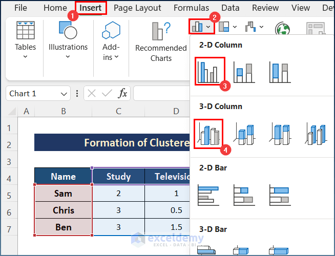
- At first, we will select our data.
- Then in the Insert tab, we will select one of the Clustered Column Chart options in the column chart in the Charts tool.
- Finally, for choosing 2-D we will get the chart below.

- And for choosing 3-D we will get the following.

Read More: How to Create a Comparison Column Chart in Excel
3.2 Generate Stacked Column Chart
Furthermore, these charts illustrate a field’s total and its contributors. Sam, Chris, and Ben spend a total of 8 hours on the Study. Here, the overall Study time and individual contributions are indicated by color. The procedures below will guide you about creating a Stacked Column Chart.
📌 Steps:
- First, you need to select one of the options, like the image below, since this feature is available in both 2-D and 3-D.
- Then choosing 2-D will result in creating a chart like this.

- Finally, if you choose 3-D, you will get the following.

Read More: How to Sort Column Chart in Descending Order in Excel
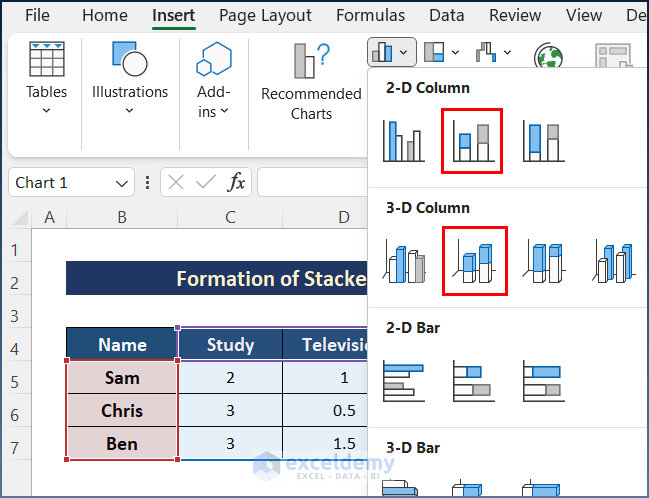
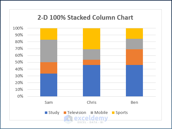
3.3 Formation of 100% Stacked Column Chart
It is simply the Stacked Column, but the total is 100%, and each person’s contribution is in percentage. To get it, you need to follow the following steps.
📌 Steps:
- Initially, select one of the following options in the Charts section since this feature is available in both 2-D and 3-D type charts.
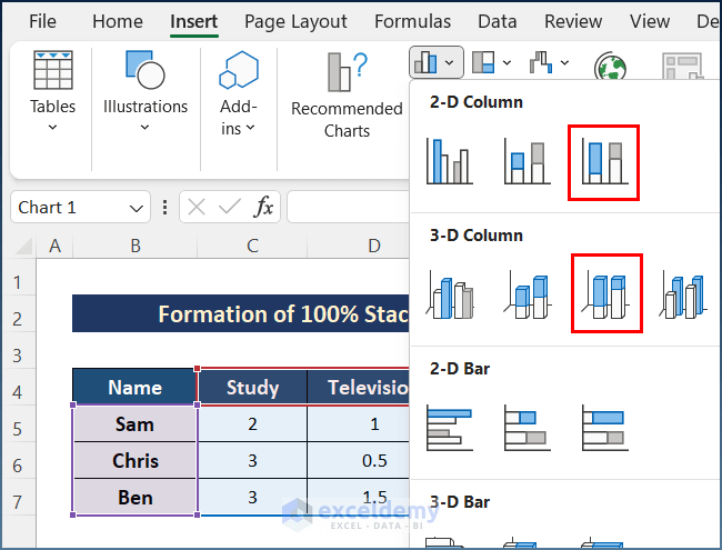
- Next, for choosing 2-D, you will get a chart like the following.
- Lastly, for 3-D, you will receive this chart below.

Read More: How to Change Width of Column in Excel Chart
3.4 Create 3-D Column Chart
Last but not least, you can create a 3-D column chart easily. However, follow the steps below in order to create a column chart in Excel.
📌 Steps:
- First, select the 3-D Column option in the Charts tool.

- Finally, the chart will appear as in the image below.

Read More: How to Create a Variable Width Column Chart in Excel
💬 Things to Remember
- Firstly, for all of these types of charts, all the steps are the same except for choosing the chart type.
- Secondly, switching Row/Column will change the column chart not the given data in Excel.
- Thirdly, 3-D Column is only available for 3-Dtype.
- Fourthly, you must select the entire data before selecting the chart type.
- Moreover, you can modify the charts according to your preferences.
- Finally, for the 100% Stacked Column Chart, the height of all the columns is the same since every field is considered in percentage and the total is 100%.
Download Practice Workbook
You can download the workbook used for the demonstration from the download link below.
Conclusion
These are all the examples you can follow to create a column chart in Excel. Hopefully, you can now easily create the needed adjustments. I sincerely hope you learned something and enjoyed this guide. Please let us know in the comments section below if you have any queries or recommendations.
<< Go Back To Column Chart in Excel | Excel Charts | Learn Excel
Get FREE Advanced Excel Exercises with Solutions!
