In column charts, the values are typically aligned along the vertical axis and the categories are typically aligned along the horizontal axis. Column charts are used to display comparisons between several data categories and how data changes over time.
Download the Practice Workbook
What Is a Column Chart in Excel?
A column chart in Excel is a type of graph that uses vertical bars or columns to represent the values of the data. It is usually used to observe changes over time or to compare and visualize data from many categories. In a column chart, each column represents a specific category and each column’s height reflects the value it stands for.
Types of Column Charts in Excel
- Clustered Column Chart: In an Excel clustered column chart, vertical bars that represent various data series or categories are shown side by side. The columns for each series are unique, and the bars within each series are organized into groups.
- Stacked Column Chart: In the stacked column chart, the columns are placed on top of one another to indicate the total value for each category. This type of chart is helpful for comparing the contributions of several categories to the overall structure and visualizing how each one is made up.
- 100% Stacked Column Chart: In a 100% stacked column chart, the columns are stacked on top of one another and the height of each column indicates the corresponding percentage of each category. The individual segments inside each column show the percentage of each data series compared to the total.
How to Create a Column Chart in Excel
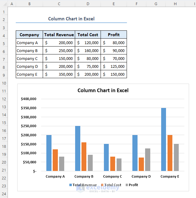
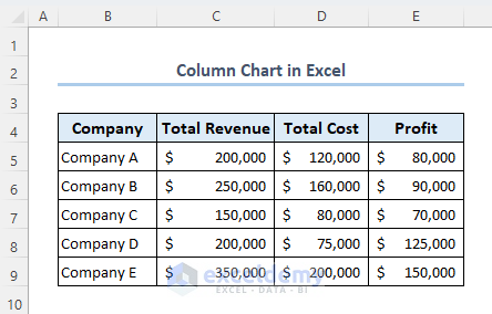
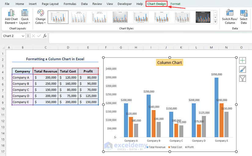
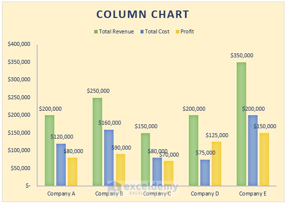
We will be using the following dataset as an example to demonstrate methods in this article. The dataset is representing some company’s total revenue, total cost, and profit of a specific year.
Example 1 – Create a Clustered Column Chart in Excel
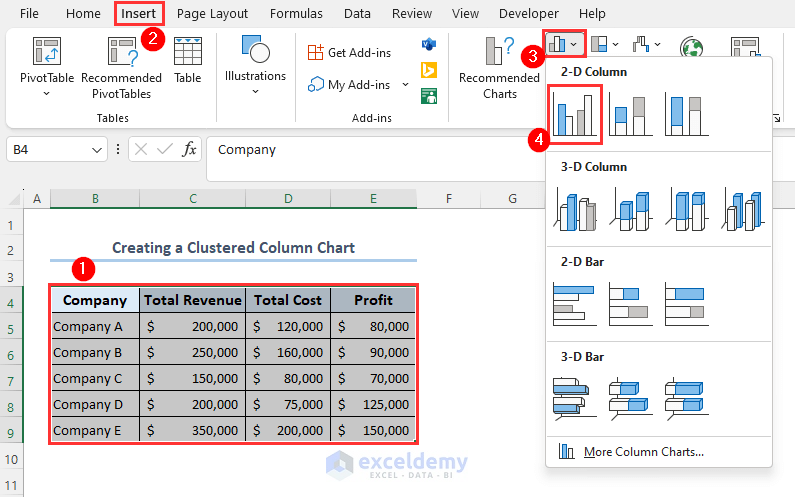
- Select the range B4:E9.
- Go to the Insert tab.
- Click on the Insert Column or Bar Chart drop-down menu and select Clustered Column.
- This will create a Clustered Column Chart as follows.
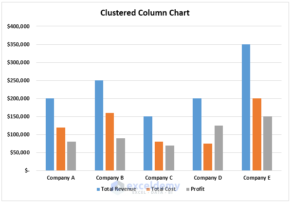
The blue, orange, and gray columns represent the total revenue, total cost, and profit values, respectively. By analyzing the height/length of each column, you can easily get an idea of each company’s business strategy.
Example 2 – Create a Stacked Column Chart in Excel
- Select the range B4:E9.
- Click on the Insert tab.
- Go to the Insert Column or Bar Chart menu.
- Select Stacked Column.
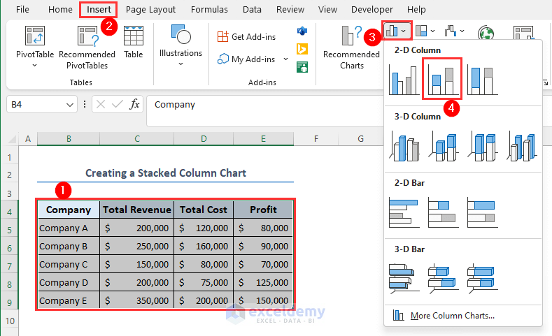
- A Stacked Column Chart will be created as follows.
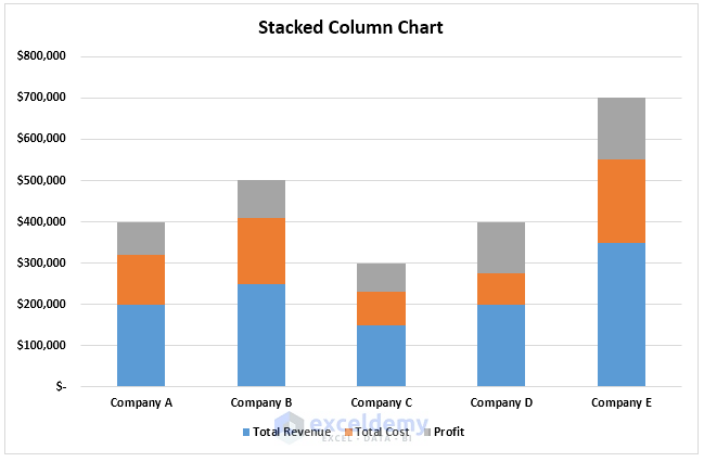
You can easily analyze each company’s total revenue, total cost, and profit variation over time.
Example 3 – Make a 100% Stacked Column Chart
- Select range B4:E9.
- Go to the Insert tab.
- Click on the Insert Column or Bar Chart menu.
- Select 100% Stacked Column.
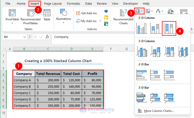
- This will create a 100% stacked column chart as follows.
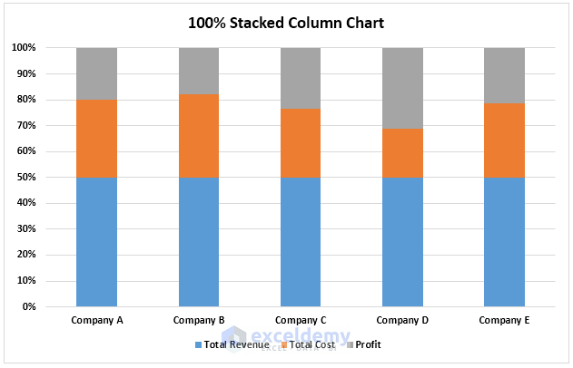
You can easily compare the percentage of each company’s total revenue, total cost, and profit as a total. This type of chart allows you to analyze how the percentage of each value that contributes changes over time.
Read More: How to Make a 100% Stacked Column Chart in Excel
How to Format a Column Chart in Excel
Method 1 – Add and Remove Column Chart Elements
- Click on the chart.
- At the top-right corner of your chart, click on the plus (+) sign.
- You can add a chart element by marking it and remove a chart element by unmarking it.
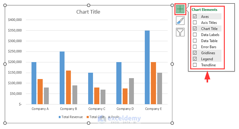
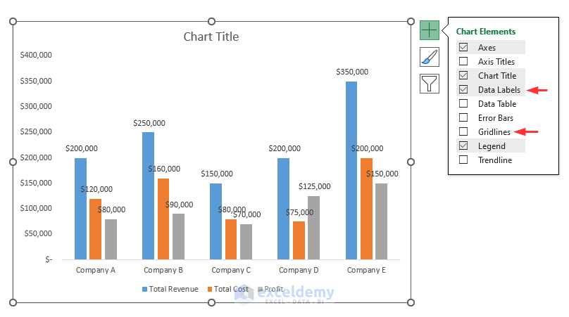
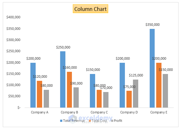
- We’ll unmark the Gridlines and mark the Data Labels, and our chart will look as follows.
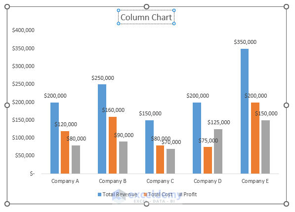
Method 2 – Customize the Chart Title
- Click on the title and set a new one.
- You can modify the style of your chart title. Right-click on the title and you will have several options that will allow you to customize your chart title.
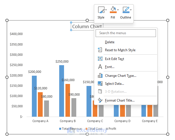
- We have clicked on the Style option and selected the Gold Subtle Effect.
- Our chart title will appear as follows.
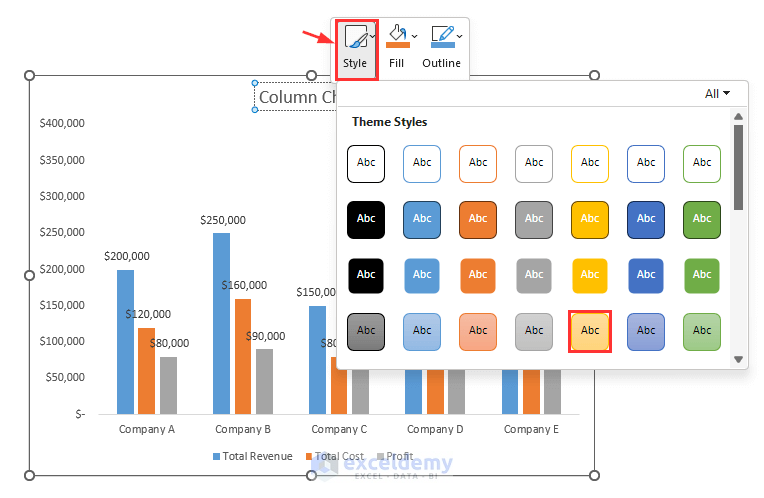
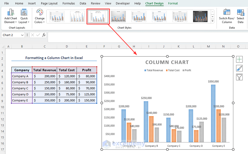
Method 3 – Modify the Chart Design
- Use the Chart Styles group in the Chart Design tab.
- We have clicked on Style 3 and our chart will look as below.
 Read More: How to Change Width of Column in Excel Chart
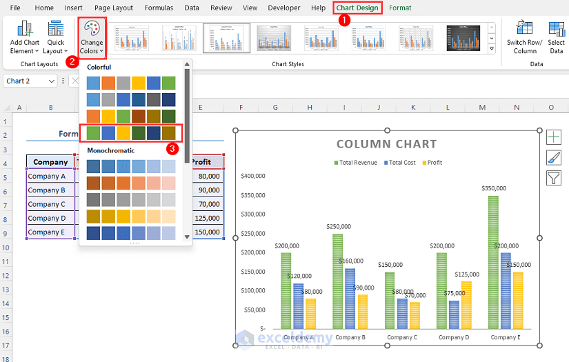
Method 4 – Change the Column Colors
- Select the chart.
- From the Chart Design tab, click on Change Colors.
- We have selected Color Palette 4. The columns are now appearing as follows.
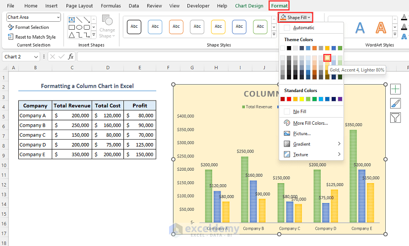
Method 5 – Customize the Background Color of the Chart
- Click on the chart.
- Go to the Format tab.
- Click on the Shape Fill menu and choose any color you want. We have chosen the Gold, Accent 4, Lighter 80% color.
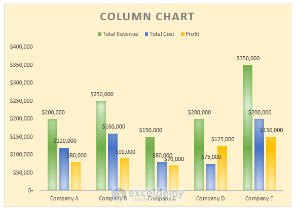
- Our chart’s background is changed as follows.
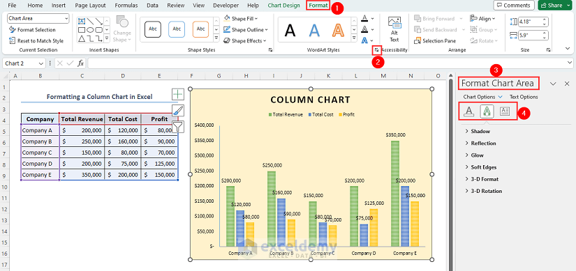
Method 6 – Adjust Chart Texts
- Select the chart and go to the Format tab.
- In the WordArt Style group, click on the arrow symbol.
- A sidebar titled Format Chart Area will appear on the right of the worksheet.
- Using the options there, you can customize the texts of your chart.
We want to change the colors of the texts.
- Click on Text Fill & Outline.
- Mark Solid Fill.
- Click on Fill Color and choose any color you want. We have selected Navy Blue color.
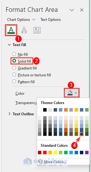
- The texts of the chart will look as follows.
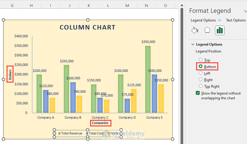
Method 7 – Change the Legend and Axes Texts
- Click on the plus (+) icon then mark the Axis Titles and Legend.
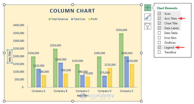
- Change the Axis Titles texts by clicking on them and retyping. We have named the Y-axis title as Dollars and the X-axis title as Companies.
- If you click on the legend of your chart, the Format Legend sidebar will appear as follows. You can modify the legend of your chart.
- We want to set the legend position at the bottom of your chart. Click on Legend Options from the Format Legend sidebar, then mark Bottom.
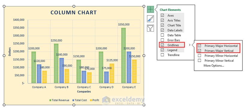
Method 8 – Customize Gridlines in the Chart
We want to add gridlines to your column chart.
- Click on the chart’s top right-most plus (+) icon.
- Mark the Gridlines.
- If you hold the mouse cursor over it, more options will appear. Mark Primary Major Horizontal and Primary Major Vertical from the Chart Elements.
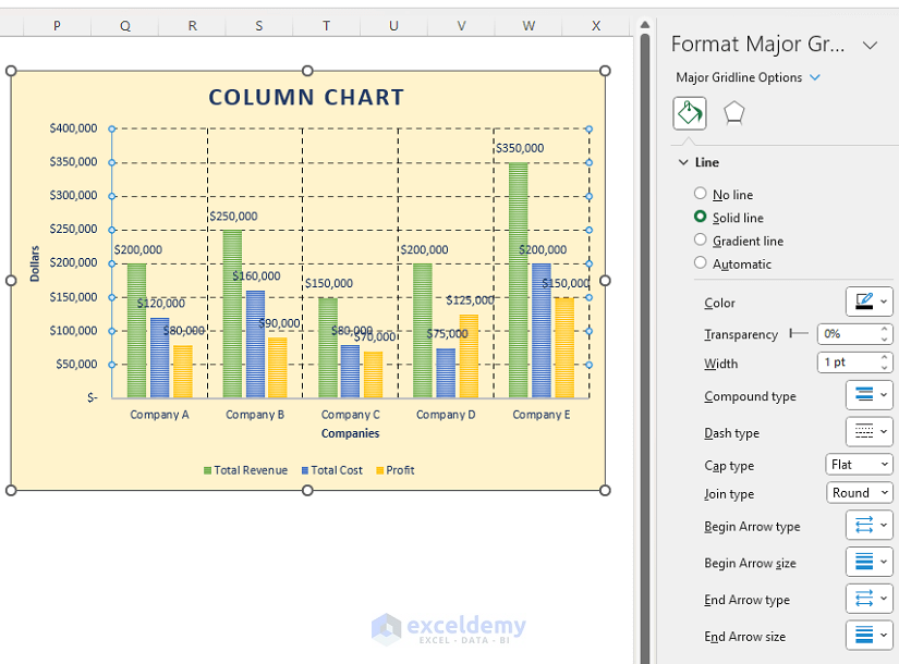
After adding Gridlines to your chart, you can customize them.
- Click on the gridlines.
- The Format Major Gridlines sidebar will appear on your worksheet.
- Customize your gridlines as you want. We’ve created dashed gridlines with 1 pt width.
Read More: How to Adjust Chart Spacing in Excel Clustered Column
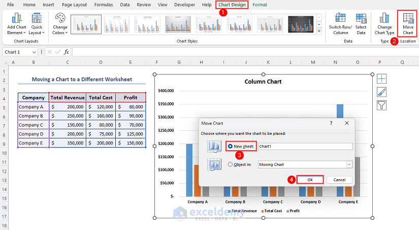
How to Move a Chart to a Different Worksheet
- Go to the Chart Design tab.
- Click on Move Chart.
- A dialog box titled Move Chart will appear on your screen.
- Mark the New sheet option and set the name of the worksheet where you want to move your chart. Here we have named the new worksheet Chart1.
- Click on OK.
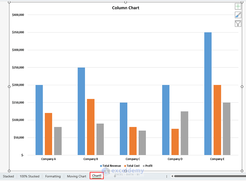
- You will see that the column chart is moved to a new worksheet named Chart1.
What Are Benefits and Drawbacks of a Column Chart in Excel
Benefits:
- Column charts offer a clear representation of data and are really aesthetic. You can easily compare values and analyze your data efficiently by just looking at a column chart.
- Column charts are great for displaying patterns over time. Finding patterns, changes, or growth trends is made simpler by showing data points in a certain order.
- Column chart in Excel allows you to add data labels, data table, legend, gridlines, axes, and much more to the graph. Those make it easier to analyze the values represented by each column. This enhances the understanding of your data.
- Column charts are excellent for comparing data across various categories or time periods. The vertical bars make it simple to compare values quickly.
- A stacked column chart shows the proportions or relative quantities of various groups. Additionally, negative numbers are represented using these types of charts.
Drawbacks:
- Not all forms of data are appropriate for column charts. They perform best when given numerical or categorical information that may be simply represented by vertical bars. Other chart types can be more suitable for complex data sets or non-numeric data.
- Column charts can become hard and challenging to understand when large datasets with many data points are used. The chart may get complicated and lose its usefulness if there are too many categories of data.
- Though column charts can visualize data trends, it is not as useful as line charts for that.
Frequently Asked Questions
What are column charts and line charts?
A column chart uses vertical bars or columns to represent the data, with each bar’s length corresponding to the value it represents. You can utilize it for analyzing data from various categories that change over time.
On the other hand, in a line chart, lines that are connected represent the data points. It is primarily for showing the relationship between two variables or to demonstrate trends and patterns over time.
In general, column charts and line charts are both common chart styles with different uses. While line charts are useful for demonstrating continuous data or highlighting trends and patterns, column charts are useful for comparing different categories.
What is the use of column bar in Excel?
There are several uses of column bars in a chart in Excel. These column bars give users a better visualization of data comparison, data trends, and data analysis. These columns present data in an effective way to the audience so that they can easily understand the whole thing.
What is a column chart in data visualization?
A column chart is a type of data visualization that shows data values as vertical bars or columns. It is used to compare data from various categories that change over time. The height or length of each column is equal to the value it reflects and each column represents a single data category. Column chart simplifies data in a way so that the user can easily visualize, analyze and compare large data.
Column Chart in Excel: Knowledge Hub
<< Go Back To Excel Charts | Learn Excel
Get FREE Advanced Excel Exercises with Solutions!

Great work have learnt something new
Hello Florence,
Thanks for your feedback. Glad to hear you learnt something new from our article. Keep learning Excel with ExcelDemy!
Regards
ExcelDemy