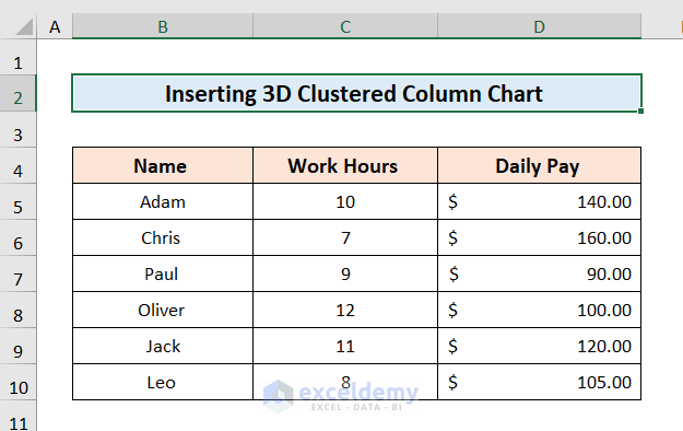
Method 1 – Arrange Dataset for 3D Clustered Column Chart
Here’s a dataset of people with their Work Hours in Column C and Daily Pay in Column D. You want to insert a 3D clustered column chart.
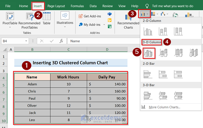
Method 2 – Inserting 3D Clustered Column Chart
- Select the whole table and click on the Insert tab.
- Go to Insert Column or Bar Chart and select the 3-D Column option.
- The 3-D Column chart will appear on the display screen.
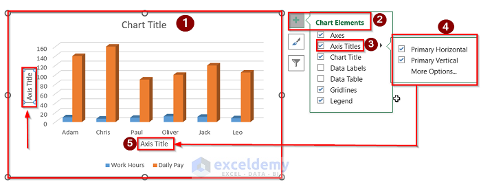
Method 3 – Labeling Axis
- Select the whole graph chart.
- Select the option Chart Elements.
- Click on Axis Titles and select both the Primary Horizontal and Primary Vertical.
- Axis Title will appear on your chart like the below image.
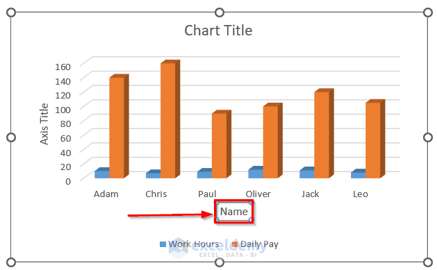
- Link the chart with table data using Select Axis Title> Formula Bar> Select Cell.
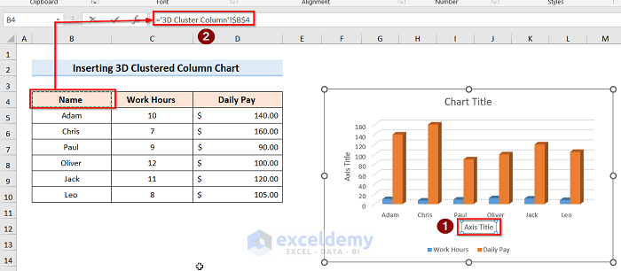
- If you followed all the steps, you will get a result like the image below.
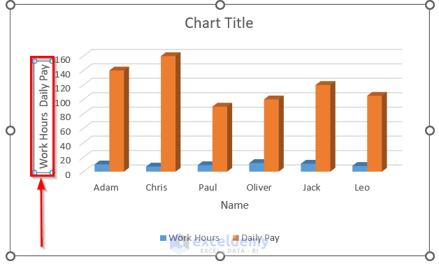
- You can label the vertical axis performing similar steps and get the following result.
Method 4 – Labeling Data
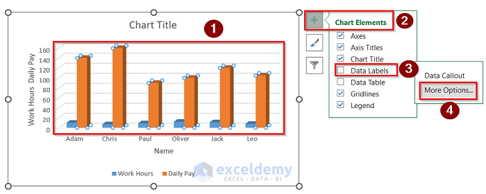
- Select the chart and go to Chart Elements.
- Click the Data Labels option and select More Options.
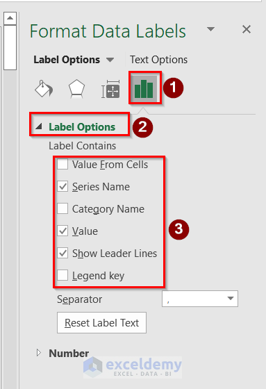
- The Format Data Labels tab will appear on the right side of your window.
- Go to Label Options and choose accordingly.
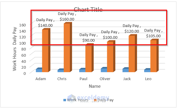
- After pressing Enter, you will get the proper result shown in the image below.
Method 5 – Formatting Data Label and Series
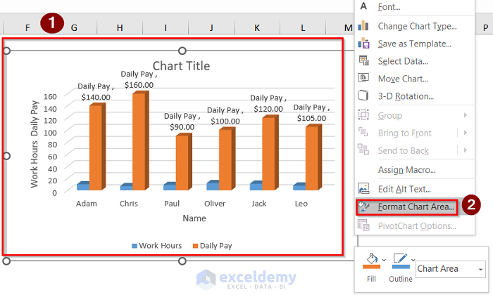
- Select the whole chart at first.
- Right-click the chart and select Format Chart Area.
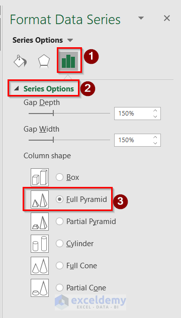
- Go to the Series Option and change Gap Depth, Gap Width, or Column shape.
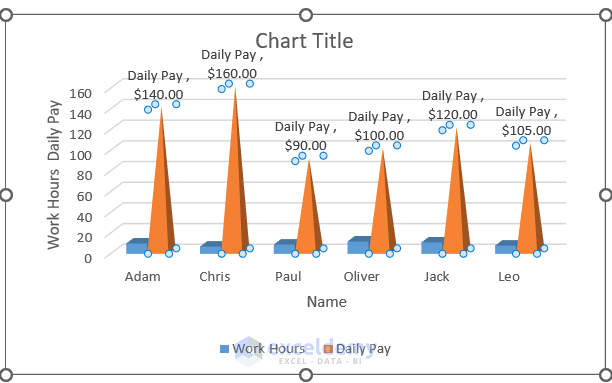
- Get the following result.
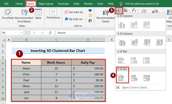
Insert 3D Clustered Bar Chart in Excel
Steps:
- Select the table and go to the Insert tab.
- Click the Insert Column or Bar Chart and select the 3-D Bar option.
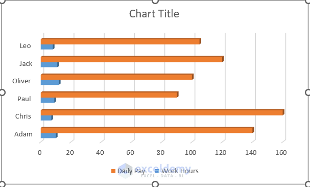
- The 3-D Bar chart will appear on the display screen.
- After selecting the option, you will get this result.
Things to Remember
- To link the graph with the table, in the Formula Bar, you have to use ‘=’ and then select the desired column.
- In Step 4, in the Format Data Labels section, you must select your chart data; otherwise, the Label options won’t show up on the screen.
Related Articles
- How to Insert a Clustered Column Chart in Excel
- How to Create a Stacked Column Chart in Excel
- How to Make a 100% Stacked Column Chart in Excel
<< Go Back To Column Chart in Excel | Excel Charts | Learn Excel
Get FREE Advanced Excel Exercises with Solutions!
