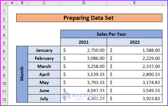
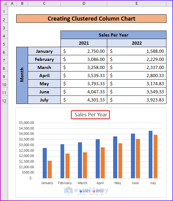
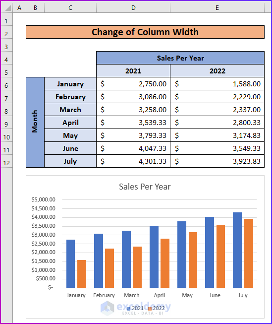
Step 1 – Prepare Data Set with Additional Information
- We have the following sample dataset where we have the sales data of a general store for two years.
- We will create a column chart using this data and change its width.
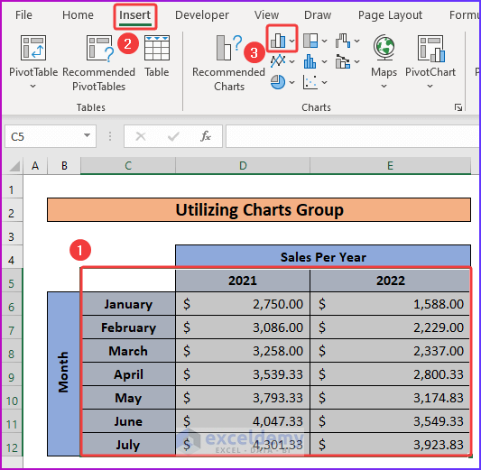
Step 2 – Utilize Charts Group
- Select the data range C5:E12.
- Go to the Charts group in the Insert tab of the ribbon.
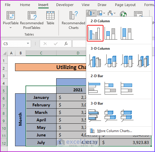
- Select the Insert Column or Bar Chart command from the group.
- You will find a list of column and bar charts.
- Under the 2-D Column label, select Clustered Column.
Read More: How to Create a Variable Width Column Chart in Excel
Step 3: Create Clustered Column Chart
- After selecting the Clustered Column command from the previous step, a Clustered Column will be inserted into your worksheet.
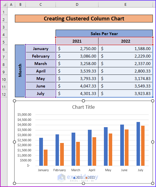
- Set the title of the column chart as Sales Per Year.
Read More: Examples of Column Chart in Excel
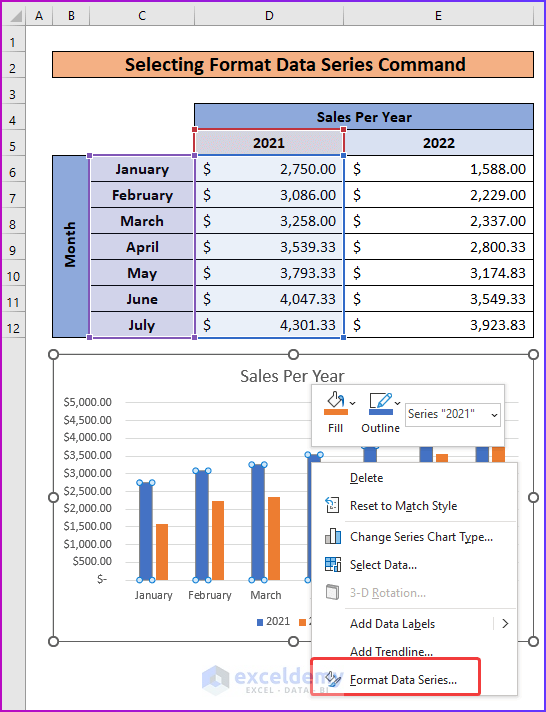
Step 4 – Select Format Data Series Command
- Click on any of the data bars in the chart.
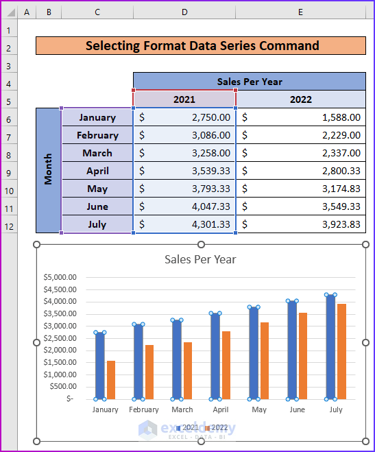
- Right-click on the selected bars.
- From the context menu, select Format Data Series.
Read More: How to Create Graphs in Excel with Multiple Columns
Step 5 – Change Gap Width of Data Bars
- You will see the Format Data Series window pane in your worksheet after the previous step.
- Go to the Gap Width command under the Series Options label.
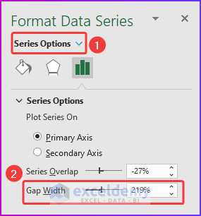
- You can use the zoom bar to decrease or increase the width of the bar.
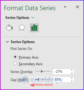
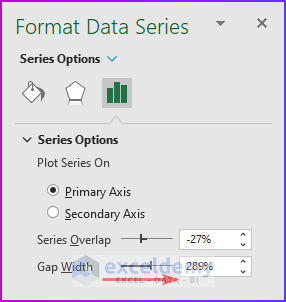
- Slide the zoom bar to the right to increase the gap width.
Read More: How to Create a Comparison Column Chart in Excel
Step 6 – Change of Column Width
- The following image shows that the data bars are wider than the actual bars shown in Step 3.
- This suggest that after decreasing the Gap Width, the width of the bar will increase.
- After increasing the Gap Width, you will see thinner bars on your column chart like in the following image.

Download Practice Workbook
<< Go Back To Column Chart in Excel | Excel Charts | Learn Excel
Get FREE Advanced Excel Exercises with Solutions!
