Watch Video – Create Graphs in Excel with Multiple Columns
Method 1 – Create 2-D Graph with Multiple Columns in Excel
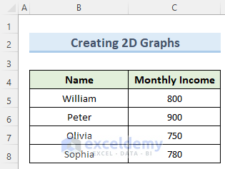
Ther is a sample dataset of monthly income, so, we have two variables in our dataset.
Steps:
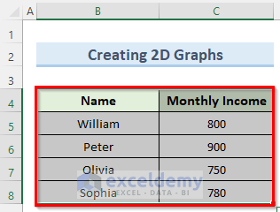
- Click on cell B4.
- Press Ctrl+Shift+Down arrow.
- While pressing Ctrl+Shift, press the Right arrow. So, this will select the whole data table.
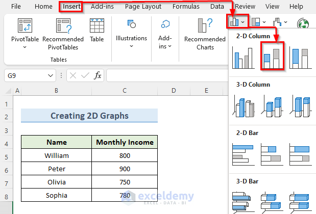
- Go to the Insert tab and click on the Chart option.
- Click on the Stacked Column option.
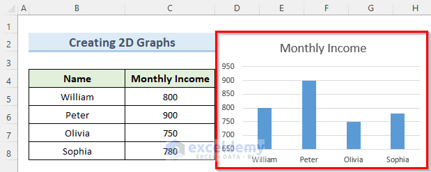
- A graph with multiple columns is returned.
Read More: How to Create a Variable Width Column Chart in Excel
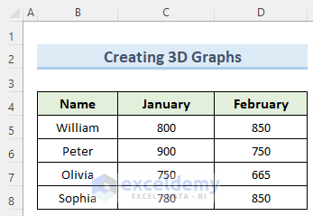
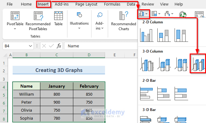
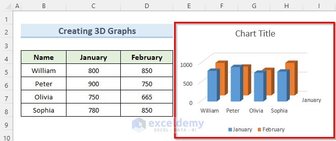
Method 2 – Insert 3-D Graph in Excel with Multiple Columns
The dataset shows the changed salary of 4 people from January to February.
Steps:
- Select the dataset as before or use the mouse to select the dataset.
- Navigate to the Insert tab and select the 3D Column as below.
- This will insert a 3D column chart beside the dataset.
Read More: How to Change Width of Column in Excel Chart
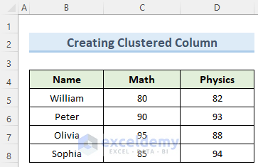
Method 3 – Create Graph with Clustered Multiple Columns in Excel
The sample dataset contains the exam marks of four students for Physics and Math. The clustered column chart is suitable where there are more than two variables.
Steps:
- Click on cell B4 and drag the mouse to cell D8.
- Go to the Insert tab on the ribbon.
- From the 2-D chart option, select the Clustered Column option.
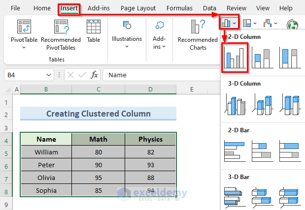
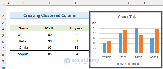
- Excel will plot a clustered chart.
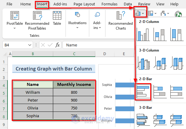
Method 4 – Generate Graph with Bar Column Chart
Steps:
- Select your whole dataset either using mouse or keyboard shortcuts.
- Select the Insert tab.
- From the Insert tab options, click on the Column Chart icon.
- Choose the 2-D Bar option.
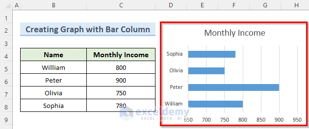
- A 2-D bar chart will be returned.
Read More: How to Create a Comparison Column Chart in Excel
Method 5 – Format Columns in Graph
Steps:
- Select thechart and click two times on any of the columns to be formatted.
- Navigate to the Format tab and select it.
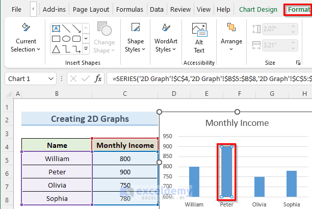
- The format ribbon appear.
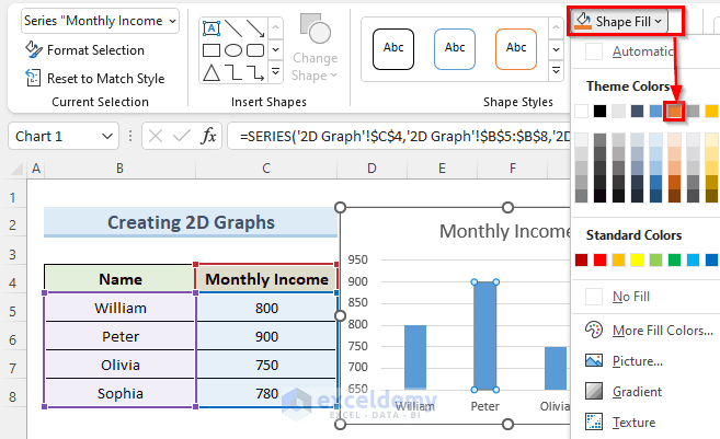
- Click on the Shape Fill drop-down and pick a color – orange is selected in this example.
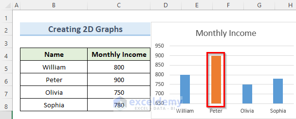
- The selected column is now orange.
You can download the practice workbook from here.
Related Articles
<< Go Back To Column Chart in Excel | Excel Charts | Learn Excel
Get FREE Advanced Excel Exercises with Solutions!
