What Is a 100% Stacked Column Chart?
If you want to compare parts of a whole, then a 100% Stacked Column chart is the way to go. This type of chart shows how each category contributes to the total and what its percentage is of the total.
For example, let’s say you wanted to compare the revenue of four different product lines for your company. A 100% Stacked Column chart would let you see not only the revenue for each product line but also what percentage of the total revenue each product line brings in.
Steps to Make a 100% Stacked Column Chart in Excel
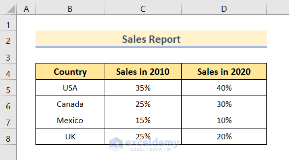
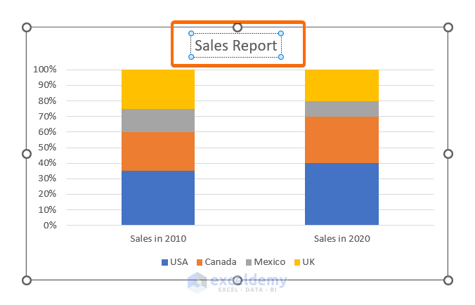
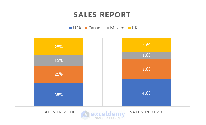
We will use the following Sales Report to show how to make a 100% Stacked Column chart in Excel. The dataset contains the sales data in percentage for 4 countries 10 years apart.
Step 1 – Insert a 100% Stacked Column Chart
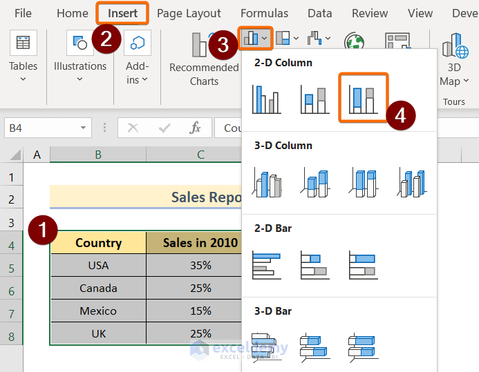
- Select the entire dataset.
- Go to Insert and select Charts.
- Click on the Insert Column or Bar Chart drop-down.
- Select the 100% Stacked Column in the 2-D Column section.
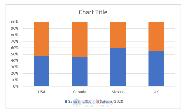
Excel will generate a column chart based on your data selection. The stacked columns have been generated based on counties.
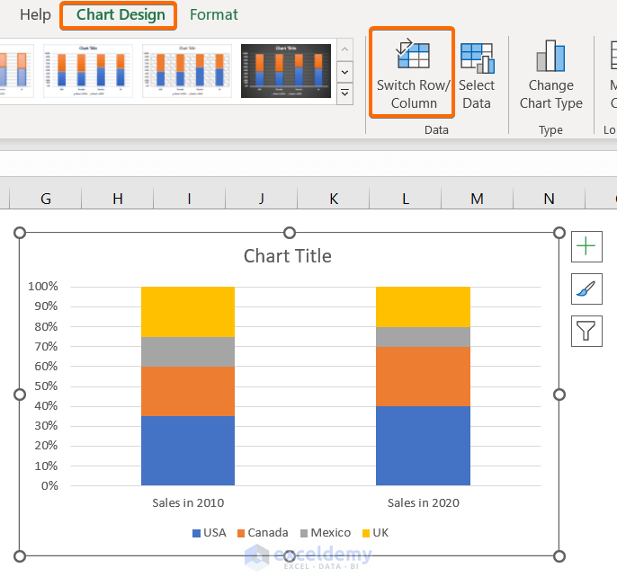
- Click on the chart.
- Go to Chart Design, then to Data, and select Switch Row/Column.
The stack columns are showing based on Sales in 2010 and Sales in 2020.
Read More: How to Create a Stacked Column Chart in Excel
Step 2 – Format the 100% Stacked Column Chart
- Edit the text in the Chart Title.
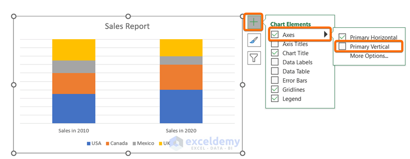
- Click on the plus icon at the top-right corner of the chart.
- From Chart Elements, select Axes.
- Deselect Primary Vertical.
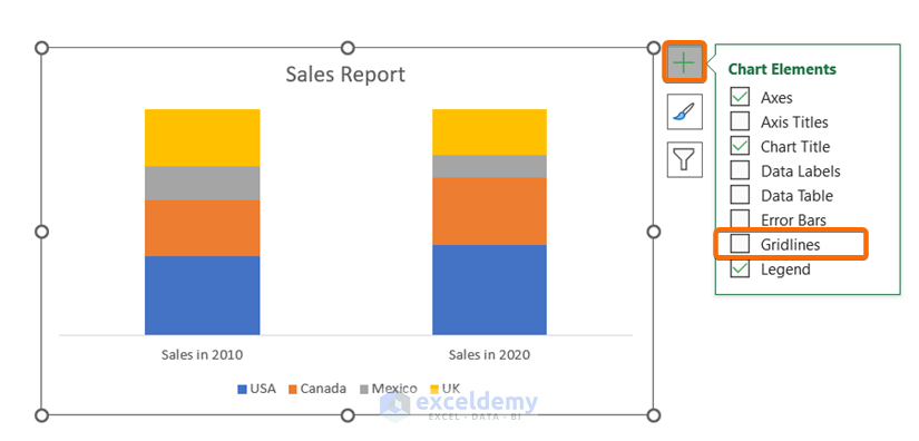
- Click on the plus icon at the top-right corner of the chart.
- From Chart Elements, deselect the Gridlines.
Read More: How to Create a 2D Clustered Column Chart in Excel
Step 3 – Add Data Labels to the Chart
To add data labels on the stacked columns,
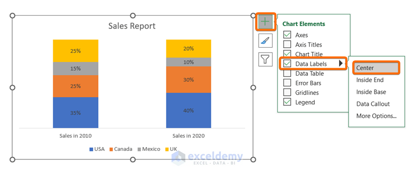
- Click on the plus icon at the top-right corner of the chart.
- In Chart Elements, go to Data Labels.
Now you will see different positioning options such as,
- Center
- Inside End
- Inside Base
- Data Callout
You can select any of them as per your requirement, but we’re selecting Center here.
Step 4 – Apply a Chart Style
- Click on the chart.
- Go to Chart Design.
- From the Chart Styles group, select any of the chart styles.
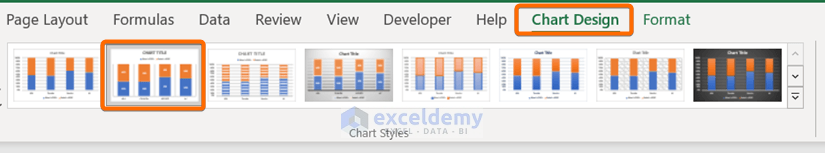
After applying a built-in chart style, the 100% Stacked Column chart will look like this:
Practice Section
You will get an Excel sheet like the following screenshot at the end of the provided Excel file where you can practice all the topics discussed in this article.
Download the Practice Workbook
Related Articles
- How to Insert a Clustered Column Chart in Excel
- How to Insert a 3D Clustered Column Chart in Excel
- How to Adjust Chart Spacing in Excel Clustered Column
<< Go Back To Column Chart in Excel | Excel Charts | Learn Excel
Get FREE Advanced Excel Exercises with Solutions!
