Column Chart in Excel

3 Suitable Examples of Column Chart in Excel

Usually, column charts can be used to show how data changes over time or to show comparisons between things. In column charts, the categories are ...

How to Sort Column Chart in Descending Order in Excel

Column chart is one of the most powerful tools for visualizing data in Excel. But sometimes, we need to change the order of our dataset into ...

How to Adjust Chart Spacing in Excel Clustered Column

Microsoft Excel is a powerful program. We can perform numerous tasks on datasets using Excel tools and features. There are many default Excel ...

How to Change Width of Column in Excel Chart (with Easy Steps)

In Microsoft Excel, you can perform numerous tasks in a few minutes. Apart from calculating or using various functions for problem-solving, users can ...

How to Create a Comparison Column Chart in Excel

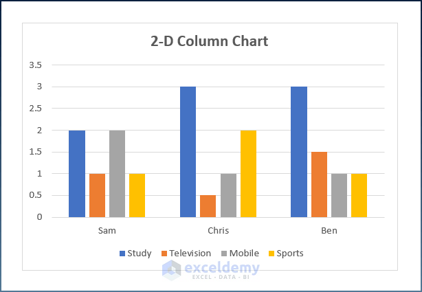
In this tutorial, I am going to show you step-by-step procedures to create a comparison column chart in Excel. You can use these steps even in large ...

How to Create a Variable Width Column Chart in Excel

A variable width column chart portrays data in a more convenient way as the columns correspond to the values in the dataset, unlike a simple column ...

How to Make a 100% Stacked Column Chart in Excel

100% Stacked Column charts are a great way to compare proportions within categories. When using this chart type, it is important to consider the ...

How to Create a 2D Clustered Column Chart in Excel

Column charts help to analyze and compare data. By creating a 2D clustered column chart in Excel, users can compare data from different variables. In ...

How to Create a Stacked Column Chart in Excel (4 Suitable Ways)

A stacked column chart is an Excel basic chart that can show comparisons over time or categories. It can stack one data on top of the other in ...

How to Insert a 3D Clustered Column Chart in Excel (with Easy Steps)

This tutorial will demonstrate the steps to insert a 3D clustered column chart in Excel. A clustered column chart presents more than one data series ...

How to Create Graphs in Excel with Multiple Columns (3 Easy Methods)

In this tutorial, you will learn various easy methods to create graphs in Excel with multiple columns. Vertical bars are used in column charts to ...

How to Create a Column Chart in Excel (2 Suitable Ways)

Column Charts can be used to show how data changes over time or to show comparisons between things. In Column Charts, the categories are usually ...

Show Percentage in 100 Stacked Column Chart in Excel

Looking for ways to show the percentage in 100 stacked column chart in Excel? Then this is the right article for you. You can show the percentage ...

How to Insert a Clustered Column Chart in Excel

Without a doubt, charts in Excel are an outstanding tool to portray any data graphically instead of showing a complex table with lots of fields. More ...

Advanced Excel Exercises with Solutions PDF


ExcelDemy
Logo