Method 1 – Create a Clustered Column Chart for Region-Wise Quarterly Sales data
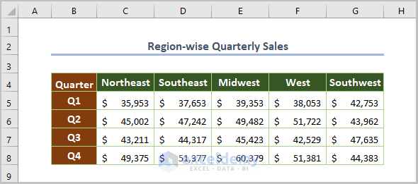
This is the sample dataset.
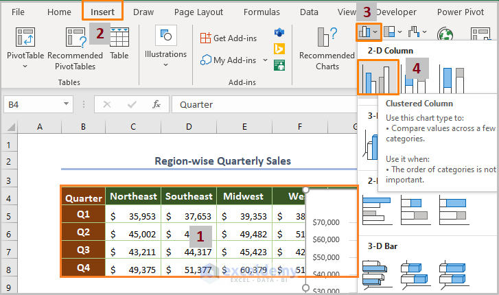
Step 1: Inserting a Clustered Column Chart
- Select the whole dataset.
- Go to the Insert tab > Insert Column/Bar Chart > choose Clustered Column in 2-D Column.
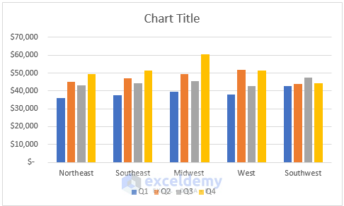
The chart is displayed.
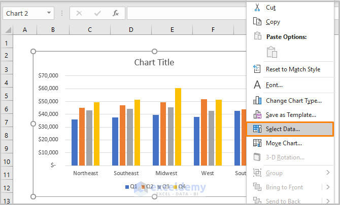
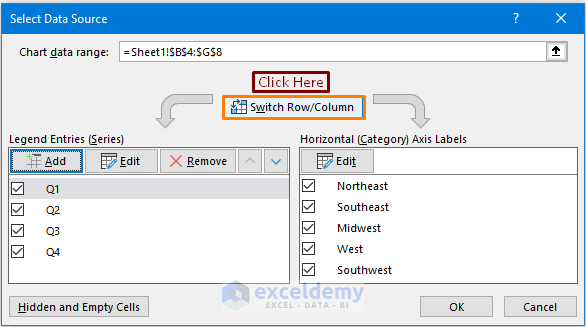
Step 2: Switching Row/Column
The data series (regions) is in the horizontal axis. To switch it to the vertical axis:
- Right-click the chart and choose Select Data.
- Click Switch Row/Column.
- Click OK.
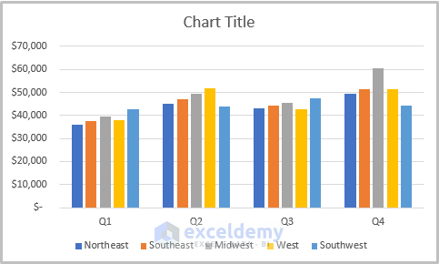
This is the output.
Step 3: Adding the Axis and the Chart Titles
- Click the Plus (+) sign at the upper-right corner of the chart.
- Check Axis Titles.
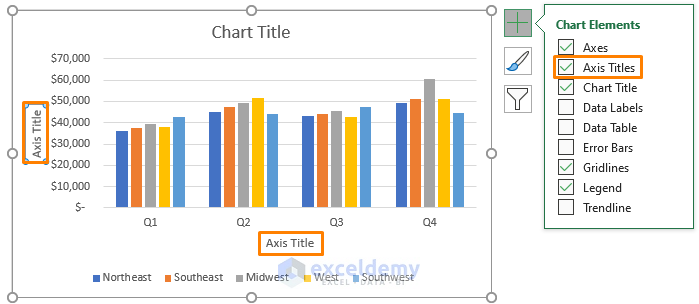
- Enter the titles of the axis and the chart.
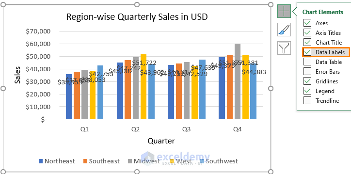
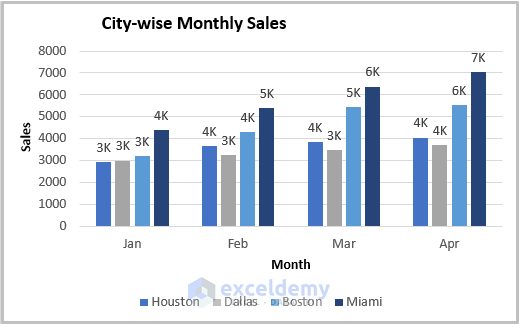
Step 4: Adding Data Labels
- Click Data Labels.
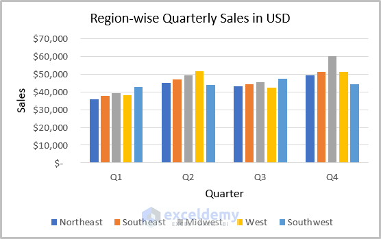
This is the output.
- Click the values.
- Select Format Data Labels.
- Click Number.
- Choose Custom and enter the following in Format Code.
[>=1000]#,##0,"K";0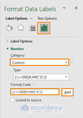
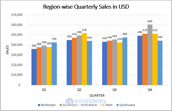
This is the output.
Read More: How to Create a 2D Clustered Column Chart in Excel
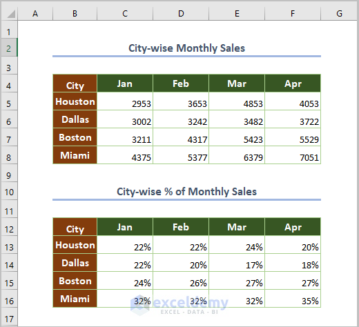
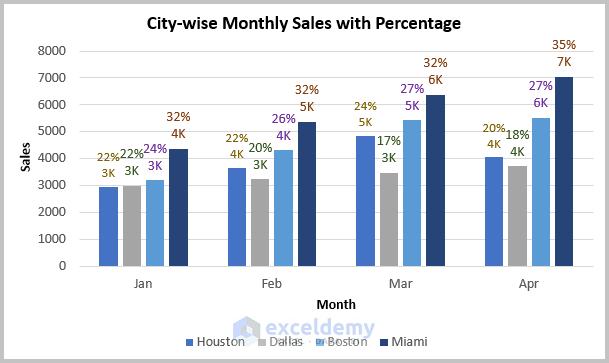
Method 2 – City-Wise Monthly Sales Variation in Percentage
The dataset showcases monthly sales in 4 cities and the percentage of monthly sales in each region.
- To calculate the monthly percentage, use the following formula in C13.
=C5/SUM(C5:C8)C5 is the sales in Houston in Jan, C5:C8 is the total sales in Jan. The SUM function sums the sales values.
Step 1:
- Insert a clustered column chart for the monthly sales data (follow the steps described in Method 1).
Step 2:
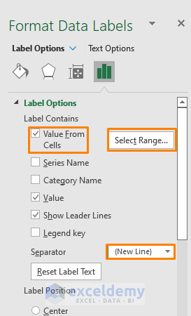
- Select Label Options in Format Data Labels.
- Check Value From Cells.
- Set New Line as Separator.
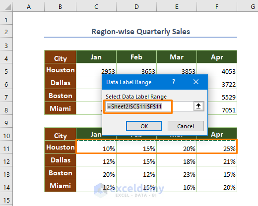
- Click Select Range.
- Enter the Data Label Range: $C$11:$F$11.
- Click OK.
- Repeat the procedure for other categories (cities).
This is the output.
Read More: How to Create a Stacked Column Chart in Excel
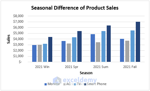
Method 3 – Seasonal Difference of Product Sales
In the dataset below, product sales are based on the 2021 seasons.
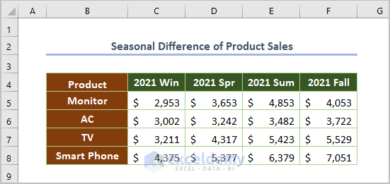
- Insert a clustered column chart.
Read More: How to Make a 100% Stacked Column Chart in Excel
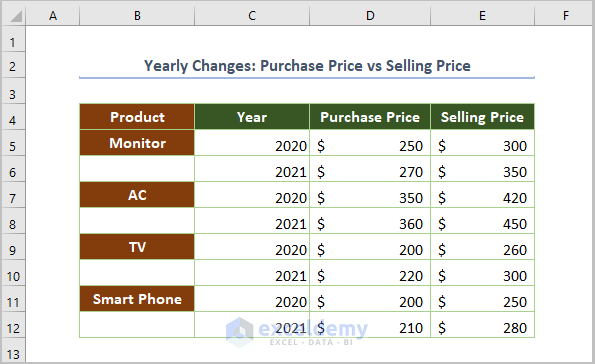
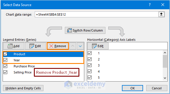
4. Yearly Purchase Price vs Selling Price across States
The dataset showcases purchase and selling prices in 2020 and 2021.
Step 1:
- Insert a chart.
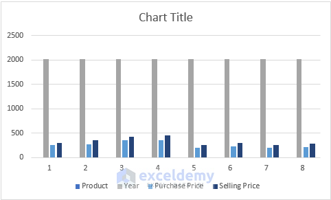
Step 2:
To remove the Product and Year categories in the Legend Entries (displayed by default):
- Right-click the chart.
- Choose Select Data to open the Select Data Source dialog box.
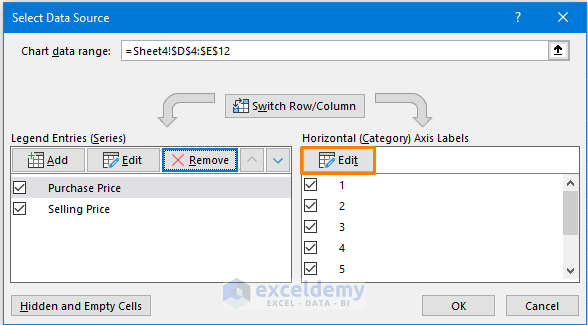
Step 3:
To set Product and Year as Category (horizontal axis):
- Click Edit.
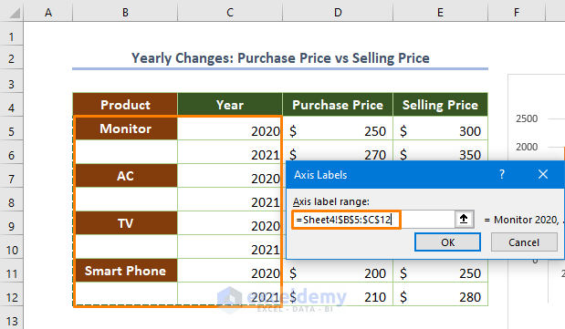
- Enter $B$5:$C$12 in Axis label range.
- Click OK.
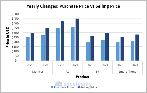
This is the output.
Read More: How to Insert a 3D Clustered Column Chart in Excel
Related Article
<< Go Back To Column Chart in Excel | Excel Charts | Learn Excel
Get FREE Advanced Excel Exercises with Solutions!
