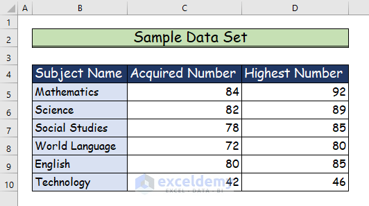
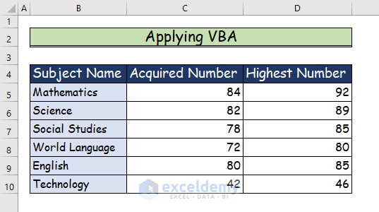
This is the sample dataset.
Method 1 – Creating a Data Set to Create a 2D Clustered Column Chart
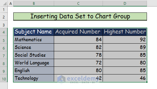
Step 1:
- Select your entire dataset. Here, B4:D10.
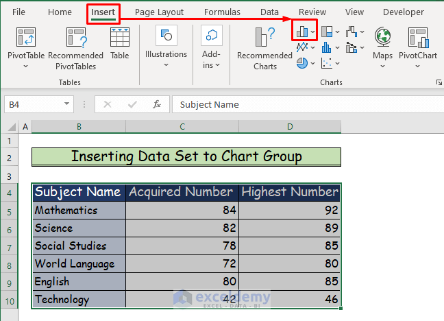
Step 2:
- Go to the Insert.
- Select Insert Column or Bar Chart in Chart.
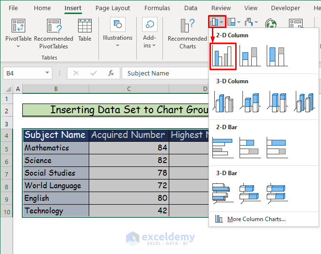
Step 3:
- In 2-D Column, choose Clustered Column.
Step 4:
- The 2D clustered column chart is created.

Step 5:
- In Style, format the chart.

- This is the output.

Read More: How to Insert a Clustered Column Chart in Excel
Method 2 – Applying VBA to Create a 2D Clustered Column Chart
Step 1:
- Select the following dataset.
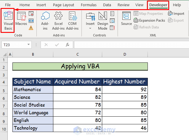
Step 2:
- Go to the Developer tab.
- Choose Visual Basic in Code.
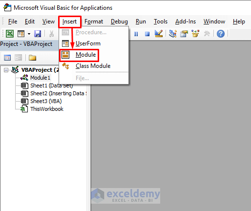
Step 3:
- Choose Module in the Insert tab.
Step 4:
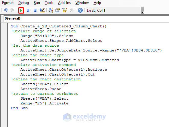
- Enter the following VBA Code into the Module.
Sub Create_a_2D_Clustered_Column_Chart()
'Declare range of selection
Range("B4:D10").Select
ActiveSheet.Shapes.AddChart.Select
'Set the data source
ActiveChart.SetSourceData Source:=Range("'VBA'!$B$4:$D$10")
'define the chart type
ActiveChart.ChartType = xlColumnClustered
'declare activation command
ActiveSheet.ChartObjects(1).Activate
ActiveSheet.ChartObjects(1).Cut
'define the chart destination
Sheets("VBA").Select
ActiveSheet.Paste
'return to current worksheet
Sheets("VBA").Select
Range("E5").Activate
End Sub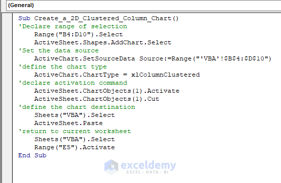
- Save it and click the play button to run the code.
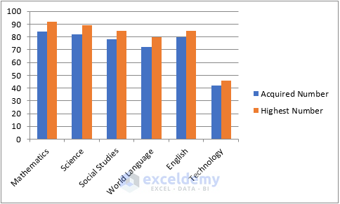
Step 5:
- The 2D clustered column chart is created.
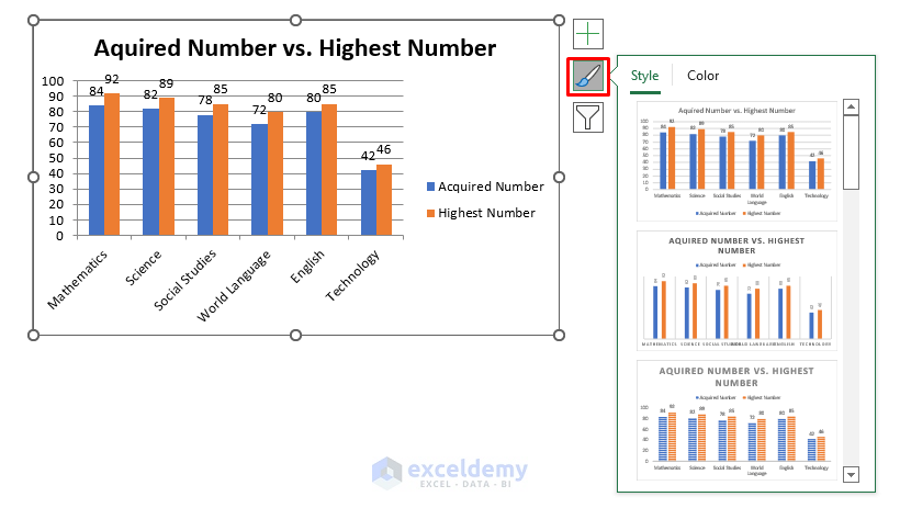
Step 6:
- Format the chart in Style.
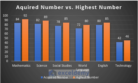
- This is the output.
Read More: How to Insert a 3D Clustered Column Chart in Excel
Download the free Excel workbook.
Related Articles
- How to Create a Stacked Column Chart in Excel
- How to Make a 100% Stacked Column Chart in Excel
- How to Adjust Chart Spacing in Excel Clustered Column
<< Go Back To Column Chart in Excel | Excel Charts | Learn Excel
Get FREE Advanced Excel Exercises with Solutions!
