Example 1 – Create a Basic Stacked Column Chart in Excel
Steps:
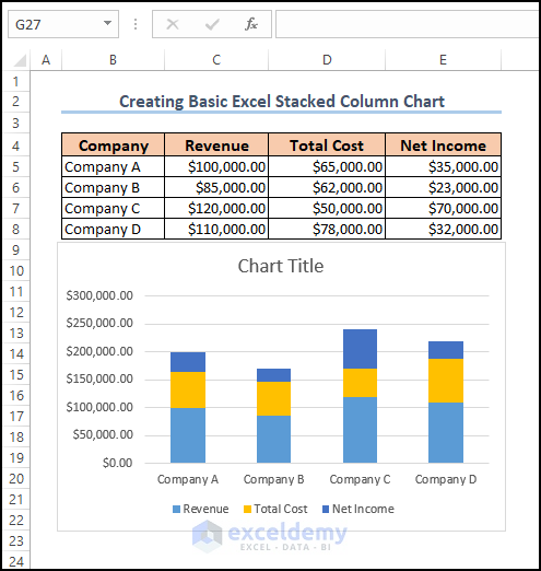
- Open the worksheet which contains the dataset.
- Select the required range of cells (example, C5:E8).
- Click on the Insert tab >> Insert Column or Bar Chart drop-down >> Stacked Column Chart option.
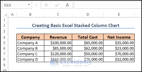
- A stacked column chart of the data will be inserted in the sheet.
Read More: How to Insert a Clustered Column Chart in Excel
Example 2 – Make a 100% Stacked Column Chart in Excel
Steps:
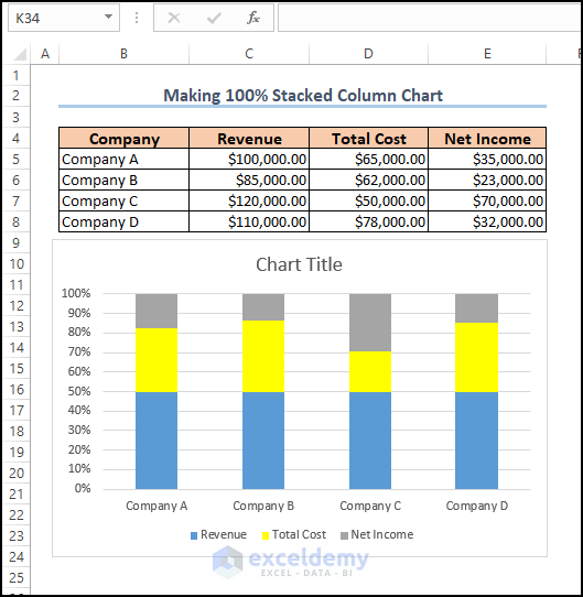
- Open the worksheet which contains the dataset.
- Select the required cells (example, C5:E8).
- Click on the Insert tab >> Insert Column or Bar Chart drop-down >> 100% Stacked Column Chart option.
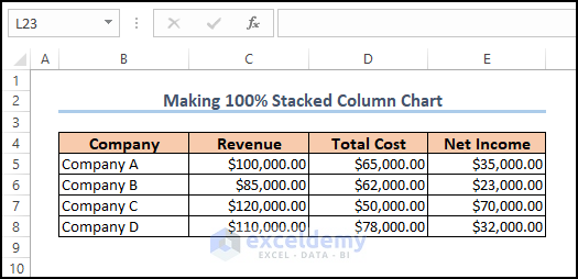
- A 100% stacked column chart of the data will be inserted.
Read More: How to Insert a 3D Clustered Column Chart in Excel
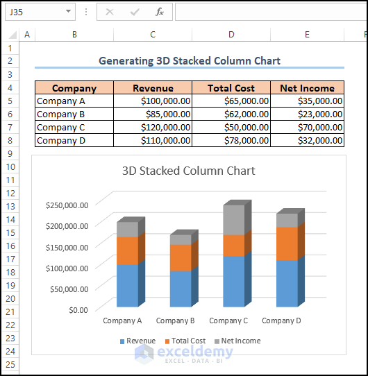
Example 3 – Generate Excel 3D Stacked Column Chart
Steps:
- Open the worksheet which contains the dataset.
- Select the required cells (example, C5:E8).
- Click on the Insert tab >> Insert Column or Bar Chart drop-down >> 3D Stacked Column Chart option.
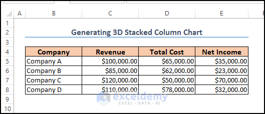
- A 3D stacked column chart of the data will be inserted.
Example 4 – Create 3D 100% Stacked Column Chart
Steps:
- Open the worksheet which contains the dataset.
- Select the required cells (example, C5:E8).
- Click on the Insert tab >> Insert Column or Bar Chart drop-down >> 3D 100% Stacked Column Chart option.

- A 3D 100% stacked column chart of the data will be inserted.
You can download the Excel workbook from here.
Related Articles
- How to Create a 2D Clustered Column Chart in Excel
- How to Adjust Chart Spacing in Excel Clustered Column
<< Go Back To Column Chart in Excel | Excel Charts | Learn Excel
Get FREE Advanced Excel Exercises with Solutions!
